Is your web magazine design paying homage to the magazine experience customers expect, or out on an island of its own?
I have complete confidence in saying this: “your web magazine design is not very good.”
And why does this roll off the tongue so easily as such a blanket statement? Because we’re in the midst of a massive research study on the state of web magazines, and out of 300 of the top B2B and B2C magazines, only 13 had what we consider to be a best-practice web magazine. We were sure the study would encompass at least 100, but we’re currently on the hunt to fill that number out to at least 25 and are finding hope in—surprise—niche magazines.
Our guidelines to be considered “best practice” for this study are by no means other-worldly, we’d consider them common sense, both for the publisher to deploy and the user to expect. To be considered a web magazine, your online magazine must, at a minimum:
- Offer scrollable HTML articles (not a PDF, although the user may also download the PDF)
- Be issue-based (so you know if you’re in the November issue or the December issue)
- Have a table of contents, preferably staying with the reader on every page of the issue OR has some other way to make clear what issue they’re in and how to easily visit other articles from the same magazine.
Five years ago, the biggest blunder on the list would be that the publishers we inspected only had PDF magazines, or digital magazine apps. This is still very common, but it’s not what surprised us most.
[text_ad]
In our research we found many publishers that probably think they have great web magazines. A couple weeks ago I wrote about Food Network Magazine in a short spotlight on When Web Magazines Go Wrong. But in the time since, we’ve found dozens more that we believe truly think that they have user-friendly web magazine design when their magazine is anything but.
For example, let’s look at Every Day with Rachel Ray. She has an issue index that shows all of the magazine covers and tells you to click to see what’s in the issue. Once inside you see a Instagram photo of their cover, and then a list below of five “highlights” to the magazine. You also get a link to view all recipes from the magazine. This is not a table of contents, it’s more of a summary page, but let’s see where it goes.
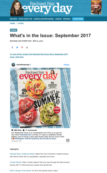
If you click on one of the issue “highlights” you’re brought to an article on the website which loses all sense of navigation. If you want to find your way back to the issue or finding other articles from the issue, good luck, hope you dropped breadcrumbs.
If you click on the recipe index from the September issue, it looks promising. It’s no table of contents, but it does show all the recipes from the magazine in a visually appealing way in which only a food magazine can.
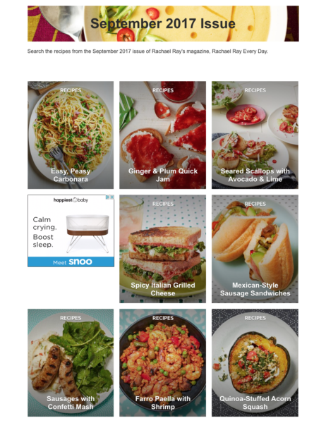
Unfortunately clicking on one of those recipes brings you to a recipe page that looks no different from the rest of the site. And only at the very bottom, hidden in a blurb of text in the tiniest font you’ll never read, will you find that it’s from the September Issue.
For some magazines, we might have passed this off as a web magazine because they do, in their own way, have that link that says where the recipe came from, but the lack of a table of contents that is consistent with the magazine issue completely depletes the digital magazine reading experience. There is nothing linear about reading this online edition.
5 ways you’re failing your customers with your web magazine design
The five points below have a lot less to do with our opinions on your web magazine design, and more to do with how you’re failing your subscribers by offering a confangled web magazine that has no beginning, middle or end.
The web is great for so many things. It makes content accessible, it helps us generate more revenue with it, and it gives us all the tools we need to publish content. But you can’t deploy a web magazine the same way you do the rest of your content, or you are devaluing all of your hard work. If you want an example of two web magazines done right on opposite sides of the spectrum, check out TIME and I Like Crochet.
- Your content isn’t scrollable. This means you’re expecting digital subscribers to download PDFs onto their devices. On a desktop, PDFs aren’t too bad but when you need to pinch and zoom to read an article on a mobile device, the user experience gets shabby.
- Content isn’t organized by issue. Not a lot, but some publishers organize their web magazine content by articles and not by issue. This makes it impossible for subscribers to consume the “latest issue” in any kind of satisfying way, and make it nearly impossible to find something they might remember from an old issue if all they remember is the month.
- Your user has no idea they’re in an issue of the magazine. Having a table of contents is just the first step. Once they leave and click into an article, do they know how to view other articles from the same issue without hitting the back button? Or do they think they’re back on your free Portal website?
- There’s no beginning, middle, and end. If a user can’t “complete” an issue of a magazine on your website, then they don’t get the satisfaction they come to expect from a digital edition. Subscribers want to know they can access the whole issue in one place, and can easily find and digest each piece of content.
- You’re not offering an all-access pass. The average consumers now spends 10 hours per day consuming media, much of it online. So it’s no wonder why subscribers these days expect to be able to buy a bundle where they get print and digital access together, not just one or the other, or just an app versus print. Web access is no-brainer when so much time is spent online across all devices.
Do you have a web magazine design that follows our best practice? Let us know in the comments so we can include you in our list!
Would you LIKE a web magazine that follows our best practices and can provide you with a new source of magazine income? Schedule a time with me to talk more about your publishing business.


