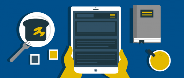
Readability and scrolling text should come first in tablet and native edition digital magazine design
Since we started our annual Digital Magazine Survey to help publishers home in on digital magazine design, the number one feature desired by digital magazine readers is readability, followed by scrollable text. This is text that you don’t need to pinch and zoom like a PDF that you’ll find in basic replica editions, but in more advanced editions like reflow-plus.
To recap, tablet editions of digital magazines come in many varieties. There’s the simple replica and the replica plus. Then there’s the reflow, the reflow plus, and the digital-only, which has no legacy print publication to compare it to or to constrain its designers.
Additionally, there’s the native web magazine, which we wholly recommend to every publisher. It requires no app, it simply works and looks the same on desktops and tablet because it’s designed to adjust responsively to different screens.
[text_ad]
However, you can’t deny the huge tablet app marketplace out there, so while we recommend building a native web magazine, we also recommend building a mobile app for most of our clients.
The simple replica and replica plus editions do not have scrollable text, they have basic added functionality beyond a printed magazine, and they certainly don’t please the 71% of users who told us in our annual American Magazine Reader Study & Handbook survey that readable text is their “very important” functionality, the #1 feature request by a large margin, only followed by 50% saying they thought scrollable text was “very important.” So it’s easy to say that replica and replica plus magazines won’t please the majority of digital magazine readers because the font can’t be changed, optimized, enlarged, or scrolled.
In 2016 when we began work on our annual study, we set out to understand how the demographics of a multiplatform consumer (one who reported consuming both print and digital magazines) differed from digital-only readers and print-only readers. We learned that multiplatform consumers had a higher household income than their print-only and digital-only counterparts, while non-readers had the lowest household income. Multiplatform consumers were also older than their digital-only peers.
It’s no wonder that older readers may be looking for text that can be read more easily and scrolled.
Reflow-plus and vertical reflow are your best app bets for scrolling text in digital magazine design
In terms of tablet editions, the two editions we see publishers doing well are the reflow-plus and the vertical reflow.
A reflowed magazine has been designed so the text and images are enlarged but still fit onto a mobile device screen horizontally, instead of forcing a magazine page-full of content onto the smaller screen by shrinking everything, as the replica does. Content that doesn’t fit on one page is simply flowed onto the next, and scrolls.
This means the reflowed version is vastly superior to a simple replica where a magazine page-full of content is shrunk down enough to fit as one page on a mobile device screen, especially to folks whose eyes aren’t quite what they used to be.
And there are two ways to reflow your content: Keep it flowing horizontally so the reader simply reads your entire magazine horizontally from newly flowed page to newly flowed page as she would a print magazine.
Then there’s the vertical reflow, also known as vertical swipe. In this version, the content in each article, if it doesn’t fit on one page, flows downward, and is accessed by swiping up.
The reader swipes horizontally to navigate from article to article, and vertically to read articles longer than one tablet-sized page. Note that when you reach the bottom of a vertically swiped page, you don’t have to scroll back to the top to swipe horizontally to the next article. That can be done from anywhere within the long vertical page. Magic!
Native web magazines are your best responsive bets for scrolling text in digital magazine design
As much as we love native web magazines because they’re so flexible, they do require an internet connection to connect. But once you’re over that hurdle, with the abundance of free wifi in the world, and all-over connectivity (can you hear me now?) native web magazines are the future of digital magazine display because they act and respond like a website, but they’re built to be read like a magazine that can be paged through with a consistent table of contents.
It responds to the device type, so that makes it wonderful from a user experience. And the other big huge benefit of course, is that you can actually drive traffic straight into it, whereas these others, you can’t easily drive your web and email traffic into your app edition or into your print edition. You can put the URL on the bottom of your pages, and that’s all well and good, but the web edition allows you to actually link straight to those articles, which opens up a really great marketing opportunity.
It took the advent of the iPad to get us really thinking about what a web magazine in HTML should look like. We’ve been preaching about this for about three or four years, and recently we’ve seen some of the very large magazine publishers swing around, using the same research we have access to – in some cases actually our research – and they’re formatting content natively. Our proudest moment was when we saw Time magazine swing around with a fully responsive web edition.
I should mention of course, that just like your magazine apps, a native magazine’s content is behind a paywall. Many publishers choose to show non-subscribers the main index of issues, and the table of contents of each issue, but when a user goes to click on an article in the table of contents, they’re shown an access-challenge page that asks them to log in or subscribe.
The only instance where we support free content on a native web magazine is when it’s sponsored. If you have advertisers paying for native content, by all means make it accessible to as many people as possible. This makes the content shareable in emails and social media, too.
Want to talk more about readable and scrollable digital magazine design? Schedule a call with us to chat.


