
Your website isn’t optimized until it’s building a list of email subscribers while you sleep

Do you know why you’ve hired editors to recycle your magazine content online?
Probably because you want to attract lots and lots of web visitors. Naive publishers might think that the transactional process starts with some highly SEO’d content that brings readers to their websites and then POOF! they’re overwhelmed by orders.
That doesn’t usually happen, so the middleman becomes your email list. Do what you can to build your email list, and your buyer list will grow with it. Put away your (well-intentioned) aspirations of converting every visitor into a magazine subscriber and focus on the long tail instead. You’ll be much more likely to convert a new visitor into a free email subscriber than a paid magazine subscriber.
[text_ad]
And what happens once someone is an email subscriber? Well, then you can try to sell them your magazine. Once you’ve built a relationship with them through email, through good content, they’re much more likely to buy from you.
The very successful publishers that we always turn to when evaluating our best practices have used some or all of the following strategies to convert website visitors into email subscribers. Not to say that they don’t also use ample space on their website to sell new magazine subscriptions, they’ve just also spent the time to build their website appropriately so that web to email conversion is a cinch.
These 12 strategies are what those successful publishers are building into their websites to convert visitors into email subscribers. Many of them involve coming up with one or several free e-books or reports to give away in exchange for an email address.
- Rapid Conversion Landing Page
- Page Access Challenge
- Email Capture Navigation Links
- Interrupter Text Ads
- Free Download Index Page
- Free Download Index Widget
- Curated Downloads Widget
- Order Form in Editorial (OFIE)
- Order Form in Navigation (OFIN)
- Free Offer Floaters
- Online Buyers
- Order Flow Abandons
[text_ad]
1. Rapid Conversion Landing Page
A Rapid Conversion Landing Page (RCLP) has the structure of a sales letter, except that it gives away something for free. To complete the transaction, nobody has to buy anything, they only need to enter their email address. This copy on the page, and the name of the free product being distributed through this page, is keyword-optimized. The copy length on an RCLP is usually 1,200 words or more. At our recent Digital Publishing and Marketing Intensive, Don said, “When you talk about conversion architecture, this is the king of conversions. You might need one, or you might need one for every category on your portal. It’s the holy grail of maximizing conversions.” This is an example of something that every Mequoda System client has built into their system when they launch.
Here’s a great example from Bible History Daily promoting their Top 10 Biblical Archaeology Discoveries e-book.

2. Access Challenge
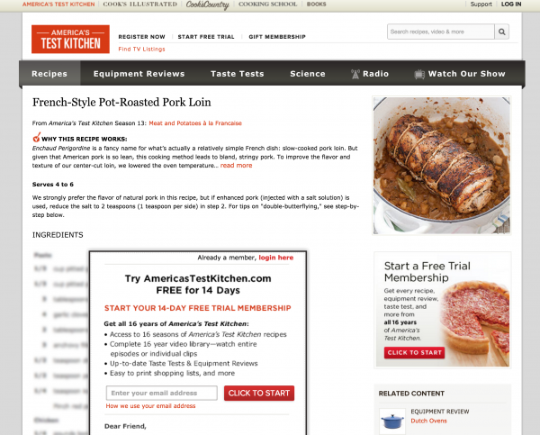
And then there’s the value-added content giveaway with a bigger barrier and a bigger return. America’s Test Kitchen has 4 million unique TV viewers per month and generates a ton of traffic to his website. ATK sees the importance of email too, so in order to convert those visitors into email subscribers, they limit access to the website by asking people to register before they can see the content and recipes. Registration is free, they just require your email address. If you’re logged in, you won’t get the Access Challenge. To please the search engines, they give away just enough to get ranked, but blur out the rest until you give up your email address. Seems fair, right?
3. Email Capture Navigation Links
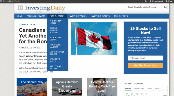
Investing Daily‘s Phil Ash, one of our Mequoda Masters, finds that his e-letters are so important and well-segmented, they belong in the navigation. Each email newsletter gets its own RCLP with its own 1,200 words and is treated just as if it were a paid newsletter. In addition, to amp up SEO, he also has free reports that he gives away in exchange for their email address.
4. Interruptor Text Ads
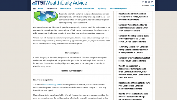
TSI Wealth Network, another savvy Mequoda operator, uses Interruptor Text Ads flawlessly. Inside each editorial article, they include text links that bring the reader to an RCLP. The text ads are inserted half-way through the article (hence the interruption). They are also aligned with whatever category that the article is in. The key is alignment; you want the report being given away and the article to be aligned, which works best with an automated text include manager.
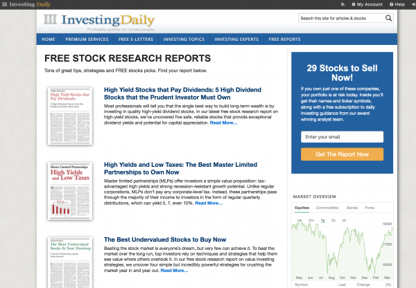
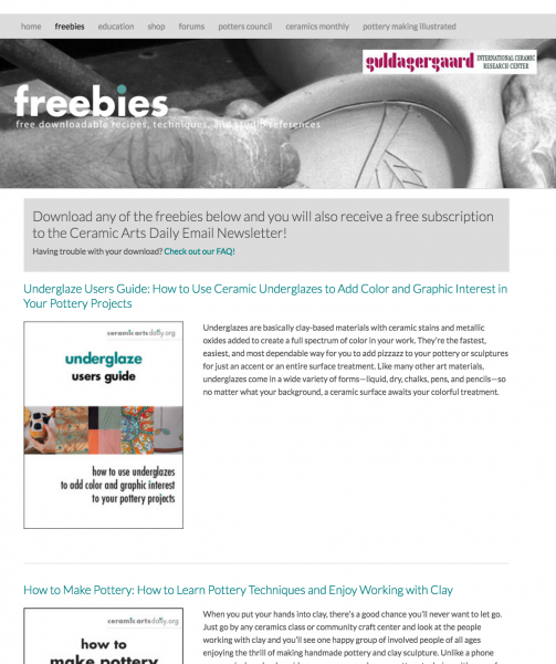
5. Free Download Index Page
Ceramic Arts Daily is one of the first sites we ever created and one of our favorite success stories. From what I’ve heard, the Ceramic Arts Society gave Charlie Spahr the Ceramics brand when it didn’t have a big online presence or strategy, like most magazines at the time. He tripled revenues with the new site.
One page on the site crucial to his online strategy is his Freebies page. People may have gotten numb to the words “free report” or “free white paper,” but everybody still loves a freebie! On this Free Download Index Page (a rose by any other name, right?) Charlie lists all of his freebies and all of them have SEO-optimized titles and RCLPs to go with them.
[text_ad]
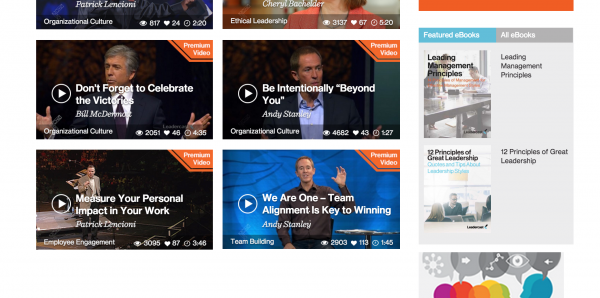
6. Free Download Index Widget
On Leadercast, beside their content, which largely consists of videos, they offer a list of their free ebook downloads on the right side of the page. A widget is used to display the list, so that it shows up consistently across content sections of the site. The goal of using this widget is to increase the number of internal inbound links to those pages for SEO purposes, but also to give website visitors an extra portal to those RCLPs.
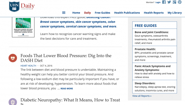
7. Curated Download Widget
Another version of this offers a more “curated” list of your free giveaways. If you have a lot of freebies, like Ceramic Arts Daily, for example, website visitors might not be able to focus on such a large list. But if you give them a list of your top five to seven on the right-hand side of your navigation, as University Health Publishing does below, you’ll be doing them the favor of curation.
8. Order Form in Editorial (OFIE)
Coined by our friends at Time Inc., OFIEs were invented to present themselves like magazine blow-in cards embedded into editorial content. Many publishers still use them to sell subscriptions and other paid products, but we usually task them to collect email addresses so that we can sell to email subscribers at a later date. Like Text Ads, we align OFIEs with the editorial content and you’ll find them on just about every editorial page on a Mequoda-designed site.
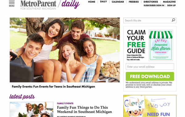
9. Order Form in Navigation (OFIN)
If we can have an OFIE, why not an OFIN? Same premise, different location – in the sidebar navigation. Here’s our client Metro Parent doing it well.
10. Free Offer Floater
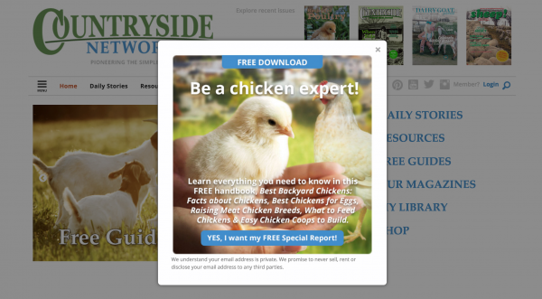
This is not a pop-up because it’s built in HTML and cannot be blocked by pop-up blockers. Some marketers and publishers refer to it as a road block or a floater. Better Homes & Gardens might have been the first, or one of the first to invent these. They were routinely popping up for any new visitors and asking those visitors to sign up for any of their 17 free email newsletters (at the time – they only have a few now).
We love this example from Countryside Network, which Don calls the “Death Star Floater,” because it darkens out the background in order to emphasize the offer.
11. Online Buyers
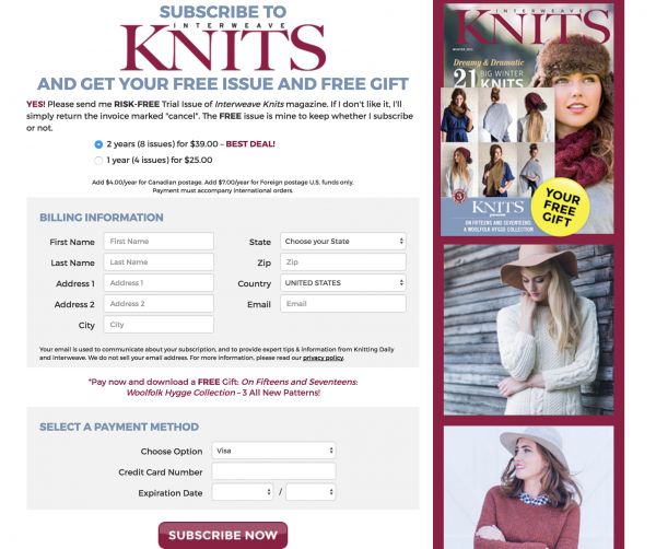
Let’s say you converted a website visitor into a paid customer on your first try. Don’t you want them to buy again? Interweave Knits uses their magazine signup as an opportunity to catch those buyers and automatically opt them into their email list.
The fine print on this form says, “Your email is used to communicate about your subscription, and to provide expert tips & information from Knitting Daily and Interweave.” Buyers are more likely to buy again, so don’t miss this opportunity to get your most loyal customers on your list!
12. Order Flow Abandons
When you give away a free trial that requires a credit card, 10% of people who click through will enter their credit card information and the other 90% will bail. When a client of ours discovered this, seeing that people would come in for a free issue, but abandon on the next page when asked for their credit card, he decided to capture their email on the first page.
In his sales letter for a free trial offer, they asked for their name and email address. Once entered, they’d get the page that asks for their credit card. This way, even if they bail, the publisher already has them on his list. To prevent frustration, he simply sends them an opt-in email letting them know that they’re getting the free email newsletter anyway, even though they decided not to opt into the trial. Within 30 days, the publisher using this strategy saw an extra 10% of users convert to the paid product in addition to those who converted on the initial sales letter.
Are you convinced that capturing someone’s email is crucial to your long-term strategy? A buyer is likely to buy more, so why not add them to a communication channel where you can contact them a few times per week? You’ll sell them just by promoting your good, thoughtful content every day.


