There are a Few Common Factors that Contribute to Improving Landing Page Readability—Notably, the Choice of Typeface
If a Web landing page is comfortable and easy to read, your prospects are far more likely to keep reading and respond to your sales message. Much of this is the responsibility of the copywriter, whose job it is to keep the message flowing in interesting and easily assimilated (bite-sized) chunks, but there are other factors that contribute to making a website comfortable and easy to read—notably, the choice of typeface.
More than 25 years ago an article entitled Why Johnny Can’t Read by Vrest Orton in The National Review argued that sans-serif typefaces make printed text unreadable.
This is Baskerville type.
This is Garamond type.
This is Georgia type.
This is Caslon type.
This is Arial type.
This is Helvetica type.
This is Verdana type.
Mr. Orton, born in 1897 in Hardwick, Vermont, founded the Vermont Country Store in 1946. That year, he also began publishing its catalog, The Voice of the Mountains. When Mr. Orton died 40 years later, his son Lyman, continued both the store and the catalog, which is still set, as it has been from the beginning, in Times Roman type (a serif face).
[text_ad]
About 12 years ago, Target Marketing magazine revisited the argument and concluded that, had Vrest Orton written for a direct marketing publication, the article might have been titled Why Johnny Doesn’t Order.
Mr. Orton’s argument goes along these lines. The major reason children can pass through the primary schools and even graduate from high school without being able to read has to do with printing. He insisted that a “bold, blunt, hard, stark, rigid style of type called sans serif” is grotesque. He claimed that this style of type “not only repels and insults the eye, but actually makes printed matter almost impossible to read.”
Mr. Orton favored typefaces such as Caslon, Baskerville and Garamond, because the “letters fit together in such a way that the reader is never conscious of each letter, but only of word and sentence.”
In his textbook, Introduction to Online Journalism, Dr. Roland De Wolk says it is important to keep in mind the following considerations when writing online:
—People do not read carefully online—they scan. If it takes too long to find what they want, they leave.
—”Too long” is a matter of seconds, not of minutes or of word counts. Chances they will stay on one page for more than 60 seconds are remote.
—The remote control is essentially the same as a computer mouse. People will move on fast unless captured by a story.
—People come to the Web for information. Therefore it must be a quick, pleasant and useful task.
—Bulleted lists and other clear graphic elements are essential for getting information quickly.
—Writing in brief, bright bursts of light works best.
—Visuals need to be connected to the story. The image must fit the words or the brain rejects the words.
—Always edit, edit, edit. Re-tell the main point of the paragraph, story or page in one sentence.
—The writing toward the end of each document or page should read like the end of a movie scene—it should lead the reader on.
Excerpted from Introduction to Online Journalism: Publishing News and Information by Roland De Wolk. Needham Heights: Allyn & Bacon, 2001
Enter the World of Online Publishing
For more than 20 years now, people have been reading letters and words on CRTs (cathode ray tubes, also know as monitors). For about 10 years, many of us have been reading words on CRTs that reflect the content of Internet websites, and many of these are constructed with sans serif typefaces. So what happened to Mr. Orton’s theory about the evils of sans serif typography for text?
The answer has to do with the dot size of your computer monitor and the overall size of the typeface you are viewing. Paradoxically, on the CRT screen, sans serif faces such as Arial and Helvetica are more popular than Times Roman.
But these typefaces are not the most legible online either, because they were designed in another era, for a different medium. Some years ago, Microsoft decided to address the problem and had two new typefaces design specifically for use online. They are Verdana, a sans serif typeface named for the verdant Seattle area and Georgia, a brilliant serif typeface allegedly named after a tabloid headline about alien heads found in Georgia. Georgia is recommended for online headlines, while Verdana seems to work best for online text.
Verdana is extended; it has extra space between characters so they don’t touch. It also has a large “X” height, making the characters appear larger on the screen.
Georgia is a sturdy but friendly typeface that is attractive and comfortable to read. It holds up equally well in print as it does online and has become a favorite.
Initially, Microsoft made these typefaces available as free downloads. These days, they arrive free with Windows XP and some versions of Internet Explorer. Verdana and Georgia have become favorites among website designers and they add tremendously to the readability of webpages.
Cascading Style Sheets are the best way to specify fonts and typographic layout within webpages. Microsoft Internet Explorer and the newer versions of Netscape’s browser support them both.
Whatever you choose, the typeface of your landing page should be familiar, comforting and easy to read online. On most websites, that means using a family of sans-serif typefaces including Arial, Verdana and Helvetica. Your landing page layout should be uncluttered and easy to follow, making adequate use of white space. Graphics should be well integrated with the sales letter flow.
These are responsibilities for a professional graphic designer with Web design experience. Not all graphic designers who cut their teeth in the print world have made a good transition to designing webpages. And too many webpage designers have never mastered the fundamentals of good graphics that are fundamental to outstanding print designers.
So seek out a designer who understands the online medium and won’t impose graphics on your site that overpower the sales message.
Remember, it’s not creative unless it sells.
Making Websites Senior-Friendly
If the target market for your online newsletter is older Americans, you might want to heed this advice on senior-friendly websites from the National Institute on Aging. If fact, you might find these suggestions are worthwhile for any group squinting at the computer screen.
Plain text, plain type and plain terms are plainly effective ways to broaden the reach of a website to an older audience.
Growing numbers of people 60 and older are computer users and information seekers on the World Wide Web, according to the National Institute on Aging and the National Library of Medicine.
These two components of the National Institutes of Health are providing a free booklet, Making Your Web Site Senior Friendly: A Checklist, to help Web designers tailor all websites—old and new—for use by older people.
The checklist is based on results of scholarly research showing that age is no hindrance to computer or Internet use. While normal, gradual, age-associated declines in vision and cognitive abilities may be impediments to the use of electronic technology, the checklist ticks off ways to design readable text and navigational features that can shape up a website for older people.
It also covers suggestions for style and for incorporating popular features like photos, videos and audio. It wraps up with an extensive list of research references and suggested reading to address in-depth Web design issues.
“By implementing this checklist, Web designers can help open the Internet to great numbers of people over 60 who want to know more about their health and aging,” says NIA director, Dr. Richard J. Hodes.
“We have found that people age 60 and over now constitute the fastest growing group of computer users,” notes NLM director, Dr. Donald A.B. Lindberg.
Single copies of Making Your Web Site Senior Friendly: A Checklist are available as a PDF download.
Criteria for a senior-friendly website
- Phrasing: uses the active voice
- Scrolling: avoids automatically scrolling text and provides scrolling icon
- Mouse: uses single clicks to access information
- Lettering: uses upper and lower case for body text and reserves all capitals for headlines
- Justification: uses left justified text
- Style: uses positive phrasing and presents information in a clear manner without need for inferences
- Menus: uses pull down and cascading menus sparingly
- Simplicity: uses simple language for text; glossary provided for technical terms
- Typeface: uses san serif typeface that is not condensed
- Color: avoids using yellow, blue and green in proximity
- Backgrounds: uses light text on dark backgrounds or visa versa; avoids patterns
- Consistent Layout: uses standard page design and navigation is the same on each page
- Organization: uses a standard format; lengthy documents broken into short sections
- Navigation: uses explicit step-by-step navigation procedures; simple and straightforward
- Help & Information: offers a tutorial on website or offers contact information
- Icons & Buttons: uses large buttons; text is incorporated with icon when possible
- Text Alternatives: provides text alternatives for all other media types
- Illustrations & Photos: uses text-relevant images only
- Type Weight: uses medium or bold face type
- Type Size: uses 12 or 14 point for body text
- Site Maps: uses a site map to show how site is organized
- Hyperlinks: uses icons with text as hyperlinks
- Animation, Video & Audio: uses short segments to reduce download time
- Back/Forward Navigation: uses buttons such a “previous” and “next” for reviewing text
- Physical Spacing: uses double spacing in body text
Noteworthy Examples of Readability & Content Density
The 21st Century Investor landing page employs effective use of typeface and a design that is both inviting and not distracting. On the investor education link the designer used an animated photo of Alan “Mr. Happy Face” Greenspan which is probably more animated than The Fed Man is in real life. It certainly gets your attention and shows that 21st Century Investor has a sense of fun, particularly when it comes to investor education.

The 21st Century Investor landing page
The American Writers & Artists Institute landing page is an extremely readable sales letter. A lot of letters with this much copy are daunting. The use here of one-line paragraphs and other content density tricks make this a pleasure to read.
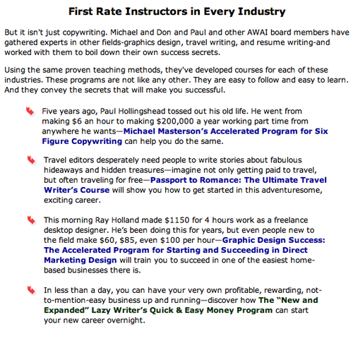
The American Writers & Artists Institute landing page
The typeface and layout at Cleveland Clinic Heart Advisor landing page are familiar, common and easy to read. The copy is made readable with the use of subheads, links, bullets and dual columns—there’s a wide central column with the main message, and additional selling copy and graphics to the left. When you click on the graphic of the newsletter cover in the left column, you can download a PDF of the latest issue.
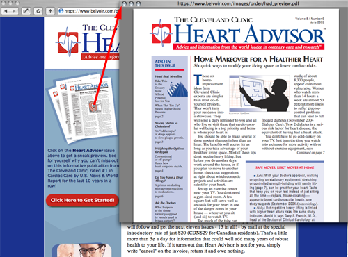
Cleveland Clinic Heart Advisor landing page
The Whole Dog Journal landing page typography is very comfortable with nothing strange or weird. The layout is clean and crisp with reasonable use of white space and graphics that are completely appropriate for the task. The site is a good preview of how the electronic version of the magazine looks.


