Mequoda recently did an Internet Hub Case Study on America’s Test Kitchen. A brief recap: the company takes the 2.9 million viewers from their TV show, America’s Test Kitchen, and pushes them to www.AmericasTestKitchen.com, a Mequoda Internet Hub, where viewers can get recipes featured on the show for free.
To get the recipes, you must register on the site by entering your email address. This Internet marketing strategy creates a huge database of qualified names. America’s Test Kitchen promotes their paid products, includingCook’s Illustrated magazine, to these names. In this landing page review, I’ll be commenting on the two pages used to monetize site visitors: the homepage and the registration page at www.AmericasTestKitchen.com/login.asp.
- The homepage has a dual purpose: a) offer viewers content related to the TV show and b) get them to register.
- The homepage does a good job of positioning the website, offering the visitor value, and highlighting valuable content.
- Every time you force the reader to click to another page, some of them abandon the transaction. In this instance, the two could be combined, eliminating dual pages and preventing drop off.
- Since the show runs on public television, it probably aims at a somewhat upscale audience, so the clean, clear site design is appropriate.
- America’s Test Kitchen and its landing page strategy is a case of the whole being greater than the sum of its parts. The site components, while all competent to good, work extremely well as a whole.
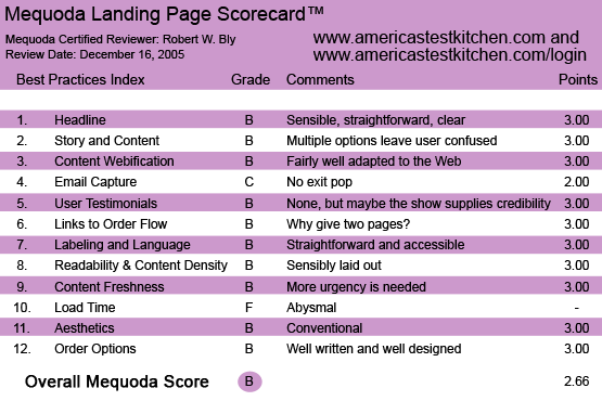
AmericasTestKitchen.com’s Landing Page Scorecard
1. Headline (Strategic Intent) – B
The homepage has a dual purpose: a) offer viewers content related to the TV show and b) get them to register.
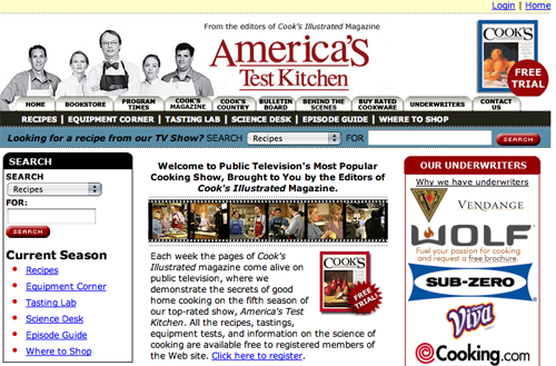
The banner at the top of the page has a masthead with a photo of the TV show’s on-camera personalities.
In the main text, there are several hyperlinks designed to capture the visitor’s email address, which we will comment on a bit later in this review.
The homepage headline is of the “welcome” variety: “Welcome to Public Television’s Most Popular Cooking Show, Brought to You by the Editors of Cook’s Illustrated Magazine.”
[text_ad]
I rate this headline a B because it’s sensible, straightforward and clear. You understand where you are, and are introduced to the central, paid content offer, the magazine.
But “Welcome” is never the strongest option, and I might rework along these lines: “Get Mouth-Watering Recipes, Tips and a FREE Sample Issue of Cook’s Illustrated from the Stars of Public Television’s Most Popular Cooking Show!”
2. Story and Content – B
The homepage is written and designed in tabloid style, meaning there are multiple content sections.
It does a good job of positioning the website, offering the visitor value, and highlighting valuable content.
What’s slightly confusing is the multiple click options. One is “click here to join now” and below that is “Free Trial Issue.”
They go to two different landing pages, yet both are basically the same offer: register to gain access to password-protected Web content and request a free sample issue of the magazine. It would therefore seem more sensible to use one link and landing page.
3. Content Webification – B
The content is fairly well adapted to the Web. Numerous areas of content—recipes, equipment, episode guide, shopping, publications—are each given separate pages with well-labeled hyperlinks to reach them.
There are also numerous click buttons within the top banner linking to products, services and information of interest. For instance, one button takes you “Behind the Scenes” of the TV show.
4. Email Capture – C
When you are on the website, there are numerous free offers where you are given content in exchange for your email address. However, if you leave without taking any of these offers, you are not served a pop-under that makes a final offer (e.g., “Don’t leave yet … you can still claim your FREE SAMPLE ISSUE”). According to our Mequoda guidelines, that’s a flaw.
5. User Testimonials – B
There are no user testimonials. Perhaps they are not as important here as with most other websites, because so many visitors (but certainly not all) are familiar with the show. Therefore, the TV show supplies the credibility.
However, many visitors attracted by organic search may not be viewers of the show, but merely looking for cooking information. The tie-in with the show adds credibility for them, too. But testimonials, especially for the magazine, which is probably less familiar to visitors, would also help.
6. Links to Order Flow – B
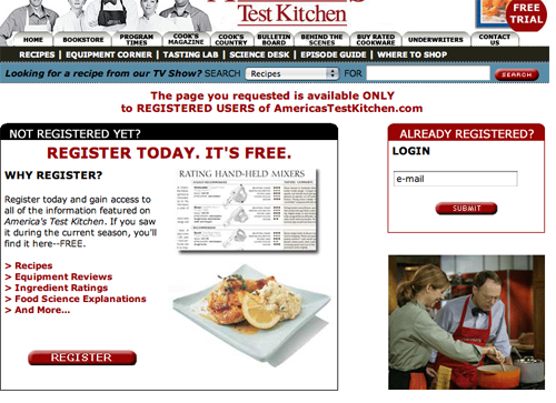
When you click on “Click here to join,” you go to a very short landing page that says “Not Registered Yet? Register Today. It’s Free.” The page has a short paragraph and five short bullets.
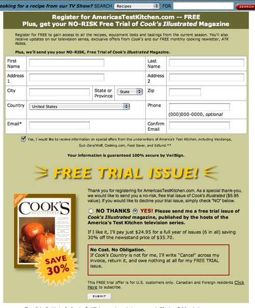
When you click on “Register” below the bullets, you go to a second, longer landing page to get your free access to Web content, free trial issue of the cooking magazine and a free bonus gift.
Every time you force the reader to click to another page, some of them abandon the transaction. In this instance, the first short landing page is completely unnecessary. The two could be combined, eliminating dual pages and preventing drop off.
When you click on “FREE Trial Issue,” you go to yet another landing page with a picture of the magazine and the headline “FREE Trial Issue.” This page sells the magazine, but says nothing about the free content you can access as a registered user.
Yet if you accept the free trial, I assume you are also registered as a site user. If not you should be. Why, then, have a separate landing page for these offers? The offer should be, for every link, the site access, free magazine and free bonus—and one combined landing page could cover all three.
7. Labeling and Language – B
The buttons on the website are clearly labeled in common online language the user understands: home, bookstore, bulletin board, recipes. Everything is straightforward and accessible.
8. Readability and Content Design – B
The site elements are sensibly laid out: a banner at the top of the homepage, with a menu of click buttons underneath. Click on those buttons and you go to various major sections.
The layout under the banner has a column at left and the main text at right—a common layout for webpages.
The main text is divided into sections. The first section is an introduction to the site and promotes the free registration to capture the visitor’s email address.
Below the introductory section are a series of short sections, each with its own headline, highlighting new offers and content.
9. Content Freshness and Urgency – B
As just mentioned, the main section of the website has, under the introductory text, short blurbs on content and offer. Many of them are clearly current offers, news and new content, e.g., an offer to register for a sweepstakes and a sneak preview of the new season of the TV show.
10. Load Time – F
To measure how quickly a website downloads on various Internet connections, we turn to our online tool at WebSiteOptimization.com.
The America’s Test Kitchen URL www.americastestkitchen.com scored a pitiful 139.03, which at first lead me to believe the system was not operating correctly the day I tested it. That’s because on my broadband connection, it downloads in an instant.
But after checking it again a week or so later, we found the same load time.
11. Aesthetics – B
The layout, design and typography are very standard and conventional, which is what makes them work so well.
Since the show runs on public television, it probably aims at a somewhat upscale audience, so the clean, clear site design is appropriate.
If the show was aimed at more of a middle America audience, say tabloid readers or soap opera watchers, I might make the fact that the site is connected to the TV show even more prominent—perhaps with the familiar white letters in red box “as seen on TV” logo used to promote infomercial merchandise in print ads and retail outlets.
12. Order Options – B
As mentioned, there are multiple offers, options, links and pages, all seemingly with the same intent: capture the visitor’s email address in exchange for access to site content and a free magazine.
While one can argue that these offers and landing pages are redundant and could be unified, they are well written and well designed, and seem to be working well for the site owner.
Conclusion – B
Despite the fact that, when ranked against our Mequoda criteria, the site scored a B in most areas with one C, I rate it overall a B.
How is this possible? Through the time-tested concept of “synergy.”
America’s Test Kitchen is a case of the whole being greater than the sum of its parts.
The site components, while all competent to good, work extremely well as a whole.
For visitors who watch the TV show, the site provides an online extension of their favorite cooking show, extending the viewing experience and offering rich content. Whenever you watch a cooking show, for instance, you want the recipes, and you can get them on this site.
For visitors who do not watch the TV show, they are served a content-rich cooking site, backed by the credibility of television.
Either scenario is a win-win scenario.
And despite my minor complaint about multiple unclear paths to registration and email address capture, I would guess that the site works pretty well, captures boatloads of email addresses and achieves a high conversion to paid subscribers of the magazine.
And results are always more important than perfection.


I’m returning an issue of Cook’s Country magazine and a DVD. It was disturbing to me because I didn’t order it.
I was sent a CH62 ATK TV show cooknseason 12 invo# 1001 for $29.95 with shipping of $3.95 for a total of $33.90. I DID NOT ORDER. Do I have to pay to ship this book back to you. I WILL NOT PAY SHIPPING for book that I DID NOT ORDER tell me what to do???.
Thank You
Gayle.
Hi Gayle,
We have no affiliation with ATK. I’d recommend you contact their customer service department directly. I hope that helps you.
-Chris