My friend Fred Gleeck, the Internet marketing guru, says that if all you do to get people to sign up for your free e-zine is have a tiny box on your main website in which they enter their email address, you are probably failing to build your e-list as rapidly and cost-effectively as you could. “I get people all the time who tell me they have 300,000 visitors a month, and when I ask how many sign-ups they get for their e-zine from all that traffic, it’s something like 300,” says Fred. “They think that’s terrific, but it’s really abysmal.”
Fred recommends driving traffic not to the homepage of your main website, typically a brochure or portal website, but to a dedicated URL designed specifically to generate a large volume of sign-ups to your free e-zine. And that’s exactly the strategy used at RealtorMarketingTips.com, the subject of this month’s landing page review.
- I like the idea that this e-newsletter gives you content that previously cost $147. It establishes a dollar value for the e-newsletter, something most e-zine publishers, including myself, fail to do.
- Online copywriter Harlan Kilstein warns that having a link too early in the sales copy on your landing page can actually depress conversion rates—what happens, says Harlan, is that someone clicks to the order form before he is sold and when he gets to the order page, he is not ready to buy, and abandons both the transaction and the landing page.
- The site operator should replace the annoying pop-up with a pop-under. That way, visitors can read the site copy unobstructed and if they attempt to leave without subscribing to the e-newsletter, they would be served a pop-under telling them to sign up for their free newsletter.
- The major flaw of the RealtorMarketingTips.com site is that it claims email marketing is a great lead generating tool for realtors—but it fails to prove that this is true.
- This is a better-than-average but not stellar example of a landing page dedicated 100 percent to a free e-newsletter subscription offer.
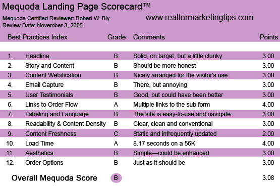
RealtorMarketingTips.com’s Landing Page Scorecard
1. Headline (Strategic Intent) – B
The copy for the headline is solid and on target, if perhaps a little clunky.
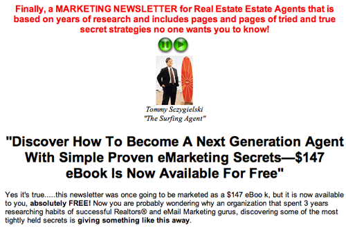
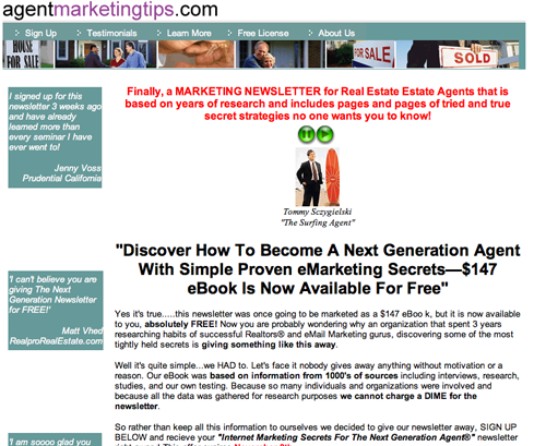
The “eyebrow”—the introductory copy above the main headline—reads, “Finally, a MARKETING NEWSLETTER for Real Estate Agents that is based on research and includes pages and pages of tried and true secrets no one wants you to know.”
Let’s analyze this copy phrase by phrase, starting with “finally,” which is a strong word, because it lets readers know that this is new and exclusive.
[text_ad]
“Marketing Newsletter” is a weak phase. Nobody needs another newsletter. Much better would be terms like tips, strategies, techniques, system, method, and ideas—all signifying value and potential benefit (e.g., “a proven marketing system for real estate agents”).
Also, the newsletter is free, so the word FREE should be prominent in the eyebrow copy.
“Based on true research” is good, but saying that these tips are based on proven, real-world selling methods of extremely successful real estate agents would be better.
“Pages and pages” is a turn off. The busy reader does not want e-newsletters to go on for pages and pages. He wants quick, pithy, pragmatic tips.
I would change “secrets no one wants you to know” to “secrets your competitors don’t want you to know.”
Now let’s look at the headline, “Discover how to become a next generation agent with proven eMarketing secrets—a $147 eBook is now available free.”
“Discover” is a strong action verb. But I have no idea what a “next-generation agent” is. I would change it to read, “Discover How to Become a Million-Dollar Real Estate Agent….”
Instead of “proven eMarketing secrets,” just say “proven marketing secrets.” I would wait a bit to reveal the fact that these strategies are all about email marketing. Tipping your hand too early turns off real estate agents who want to make more money, but who are not yet into Internet marketing.
I do like the idea that this e-newsletter gives you content that previously cost $147. It establishes a dollar value for the e-newsletter, something most e-zine publishers, including myself, fail to do.
Let’s analyze this copy, starting with “finally,” which is a strong word, because it lets readers know that this is new and exclusive. “Marketing Newsletter” is a weak phase. Nobody needs another newsletter. Much better would be terms like tips, strategies, techniques, system, method, and ideas—all signifying value and poten- tial benefit (e.g., “a proven marketing system for real estate agents”). Also, the newsletter is free, so the word FREE should be prominent in the eyebrow copy.
2. Story and Content – B
The lead paragraph expands on the value proposition: the content given here has been sold for $147 to others, but now you are getting it free.
Further proof of its value is that the publisher spent three years researching the marketing methods presented.
The copy explaining why the site is giving away its $147 eBook content for free isn’t clear to me.
The copy says, “We HAD to.” But it is never really explained why, in fact, they feel compelled to give this content away.
The visitor is not naïve. He knows the website operator is giving away a free e-newsletter to sell something else, or make money in some other way.
A more honest and credible approach would have been to reveal the business model for the website. Visitors don’t mind knowing you are making money by giving them content, as long as you are honest about it.
3. Content Webification – B
The material on this site is nicely arranged for the visitor’s use.
The main section of the site is a long-copy (actually, more of a medium-copy) sales letter promoting the free e-newsletter.
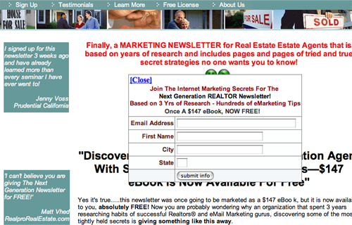
There is a link at the end of the sales copy you can click on to subscribe to the e-newsletter. But there is also a sign-up box presented earlier in the text, plus another “Sign Up” link at the top of the page.
Having multiple sign-up links within a long-copy landing page usually but not always increases conversions. The idea is that the person who needs to read a lot of copy to be sold can do so—and sign up when he is done. But the person who is ready to order now can click to sign up immediately, without being forced to scroll through all that copy.
However, online copywriter Harlan Kilstein warns that having a link too early in the sales copy can actually depress conversion rates. What happens, says Harlan, is that someone clicks to the order form before he is sold. When he gets to the order page, he is not ready to buy, and abandons both the transaction and the landing page.
So you should test where and how many links to the transaction page to have in any long-copy landing page.
Below the eyebrow and above the headline is a photo of Tommy Sczygielski, identified only as “The Surfing Agent.”
But the sales letter is not signed by Tommy. So why is he shown here? What is his relation to the e-newsletter? Is he the editor, author, or publisher?
Also, what exactly does “The Surfing Agent” mean? Does he sell search engine traffic to real estate agents looking for leads? Or does he run a surf shop?
There are buttons above Tommy’s picture that look like an audio player. But when I clicked on them, they didn’t work. If they activate an audio, the copy “Click here to play audio” should appear near the buttons.
At the top, there are some menu choices. In addition to the Sign Up link, you can click to view testimonials, learn more, license the e-newsletter to your site or find out more about the site operator.
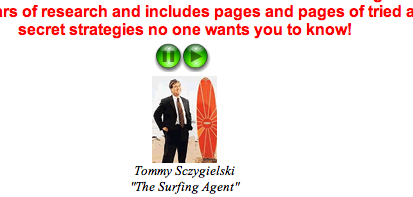
Below the eyebrow and above the headline is a photo of Tommy Sczygielski, identified only as “The Surfing Agent.” But the sales letter is not signed by Tommy. So why is he shown here? What is his relation to the e-newsletter? Is he the editor, author, or publisher? There are buttons above Tommy’s picture that look like an audio player. But when I clicked on them, they didn’t work. If they activate an audio, the copy “Click hereto play audio” should appear near the buttons.
4. Email Capture – B
As soon as you click onto the site, an annoying pop-up window—containing a sign-up box for the e-newsletter—slides down from the top, blocking your view of the screen.
Amazingly, I was unable to fill in this subscription box: it kept moving down as I moved my cursor, and I wasn’t allowed to complete all of the fields.
The site operator should get rid of this pop-up and replace it with a pop-under.
That way, visitors can read the site copy unobstructed. If they attempt to leave the site without subscribing to the e-newsletter, then they would be served a pop-under window telling them to sign up for their free newsletter before they leave.
However, one can “Close” this box out, and the signup is offered again in the main body of the story.
As soon as you click onto the site, an annoying pop-up window—containing a sign-up box for the e-newsletter—slides down from the top, blocking your view of the screen.
5. User Testimonials – B
There are testimonials on the left column of the homepage as well as more testimonials on a separate page you can access by clicking on the Testimonials button at the top of the homepage.
I rate these testimonials a B instead of an A. They are a B because they praise the newsletter being offered. They would have been an A if the realtors giving the testimonials said they had actually made more money using the advice in the e-newsletter.
6. Links to Order Flow – A
As mentioned, there are multiple links from the homepage to the subscription form—at the top, early in the sales copy, and at the end of the sales letter. So wherever you are on the site, it’s quick and easy to decide, “I want to get this,” click on a link, fill in your information, and subscribe to the newsletter.
7. Labeling and Language – B
The various sections and links are labeled using conventional language the user is familiar with and understands: sign up, testimonials, about us. The site is easy to use and navigate.
8. Readability and Content Design – B
The layout for this landing page is clear, clean and conventional. The main flaw is that there is no connection made between the copy and the photo of Tommy. If this is his site, and these are his methods and tips—based on his super-successful career as a real estate agent who has mastered Internet marketing—the reader doesn’t know about it.
9. Content Freshness and Urgency – C
Most e-newsletter sign-up sites are fairly static and infrequently updated—and that looks to be the case here.
The copywriter has missed an opportunity to create a sense of urgency, which is this: if you are a real estate agent, email marketing can be an extremely effective tool for you. But most real estate agents haven’t discovered it.
If you sign up now and start using these email marketing techniques, you can get in ahead of your competitors and scoop up the early profits. If you wait, the Internet will become flooded with real estate email marketing—as it is already overcrowded with mortgage and Viagra spam—and you will have lost out on a ground floor opportunity.
10. Load Time – A
To measure how quickly a website downloads on various Internet connections, we turn to our trusty online tool, the Web Page Analyzer.
According to this tool, the landing page downloads in 8.17 seconds over a 56K Internet connection. Not surprising, given that the site has a simple purpose—getting e-newsletter subscriptions—and therefore is relatively small.
11. Aesthetics – B
The simplicity of the site design fits its purpose—sign-ups for a free e-newsletter—so I give it a B. The visual appeal could certainly be enhanced with the appropriate graphics: testimonials with photos from realtors praising the system, or reproductions of fat commission checks they earned with these methods.
RealtorMarketingTips.com
12. Order Options – B
The only “order” option is to sign up for the e-newsletter, and the entire site is focused on driving visitors to the online subscription sign-up form—just as it should be.
Conclusion
This is a better-than-average but not stellar example of a website dedicated 100 percent to a free e-newsletter subscription offer.
Aside from the other criticisms already noted, the major flaw of the site is that it claims email marketing is a great lead generating tool for realtors—but it fails to prove that this is true.
I was impressed to learn that Internet users search for realtors online more than 10 million times a month, and yet less than five percent of realtors use email marketing. Clearly there is an opportunity here to gain an edge as a realtor using the Internet.
But the proof points showing that email marketing works, such as the DoubleClick study cited in the copy, all apply to email marketing in general. What’s missing is specific proof that email marketing actually works in generating leads and commissions for working real estate agents today.


