When Don Nicholas asked me to review the landing page for the Rocket French home-study foreign language course, I took on the assignment with mixed feelings because of a personal fact he didn’t know about me.
The fact is that I am virtually incapable of learning a foreign language.
It’s true. I studied Spanish in high school, Hebrew in Hebrew School and German in college. And I can’t speak or read any one of them.
In particular, I was so bad at Hebrew—although I had an A average in elementary school—that my teacher asked my mother whether I was retarded. When I showed him my sixth grade report card, with As in every subject, he was absolutely stunned.
Fortunately for me, I have no desire to learn foreign languages. For better or worse, it’s just something that never stimulated my interest—and because I don’t travel overseas for business or pleasure, not knowing a foreign language hasn’t held me back in life—at least not much.
But if I did want to learn French, would the landing page for the French Rocket convince me to buy their course? Let’s take a look.
- Understand why the headline, while not brilliant, shocking or compelling, still works – page 7
- Learn how Bob Bly would re-do the lead if it were his and how he’d improve the product’s branding with one simple change – page 8
- Discover three split tests Bly would’ve done to the graphic image and why – page 10
- Find out why this landing page’s use of email capture mechanisms are weak – page 11
- Discover the techniques this landing page could be using to increase the author’s credibility – page 16
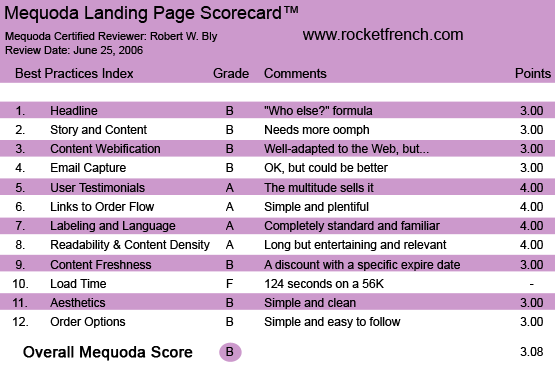
RocketFrench.com’s Landing Page Scorecard
1. Headline (Strategic Intent) – B
The headline—”Who Else Wants to Speak French Confidently and Fluently in the Shortest Possible Time”—is a formula: the “who else” formula.
But people use formulas for a reason, and the reason is that they work. The headline, while not brilliant, shocking or hypnotically compelling, is relevant and attention-getting to those interested in learning French.
[text_ad]
The subhead tells the visitor both to read the landing page as well as register for the free ecourse, which is offered in an embedded registration form within the body of the landing page—an increasingly popular method of capturing visitor email addresses.
The strategic intent is clearly to a) get the visitor to read the long copy and b) capture his email address. The headline/subhead combination achieves both goals with admirable brevity.
2. Story and Content – B
The lead starts off by discussing, both in a bullet list under the headline as well as another bullet list under the salutation, the reasons one would like to speak French, and by extension, the benefits of speaking French.
That makes sense, but if I come to this site through search or an online ad, doesn’t that mean I already want to speak French, and am deciding a) whether to take the next step and commit to studying French and b) which course to take?
And isn’t the sale really made on point b—convincing the reader that yours is the program he should take?
If so, I would focus the lead more on the frustration of taking courses that don’t work—most of us took foreign language in school, and most of us can’t speak the language we studied—and how the “Rocket French” approach to learning is different and superior.
Also, if you’re going to call it “Rocket French,” I would think the word “Rocket” has specific meaning—e.g., your language skills will take off like a rocket—and tie the name into the system description in the copy.
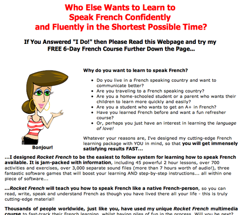
The lead starts off by discussing, both in a bullet list under the headline as well as another bullet list under the salutation, the reasons one would like to speak French, and by extension, the benefits of speaking French.
3. Content Webification – B
The content is well adapted to the Web in general and to the landing page format in particular.
I don’t like the cartoon image of the woman, and I would split test three different images: a) a photo of the program’s creator, b) a photo of the product and c) a photo of a young, attractive couple sitting in a café in Paris speaking French to the waitress.
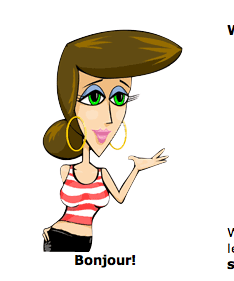
I don’t like the cartoon image of the woman.
4. Email Capture – B
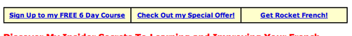
The email capture method used here is the “email capture sidebar.” This is the form built into the main landing page as a sidebar, with the headline “Sign up to get my FREE 6-Day French Course!”
This sidebar offers a free e-course in exchange for your email address. You can continue reading the main landing page whether you fill in this form or not.
The weakness of the email capture sidebar strategy is that, unlike a squeeze page, the user is not required to give you his email address to read your full long-copy landing page.
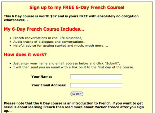
This sidebar offers a free e-course in exchange for your email address.
5. User Testimonials – A
There’s a ton of testimonials on this site. The sheer number is an effective sales tool: you skim the page and think, “If so many people love the course, it MUST be good.” The actual content of the testimonials almost becomes secondary to their volume.
The Rocket French people could improve upon what they have by adding video testimonials, a technique that is rapidly becoming a “best practice” for Internet marketing.
6. Links to Order Flow – A
About once every screen or so, there is a horizontal table with one row and three columns. The left column goes to a sign-up page for the free e-course; the middle and right link to the order page for the product. As you get toward the end of the landing page, the copy asks for the order directly several times, each with a “buy now” button prominently featured.
About once every screen or so, there is a horizontal table with one row and three columns.
7. Labeling and Language – A
No surprises here: everything is completely standard and familiar.
The landing page begins as a standard sales letter, but about halfway into it, switches into a tutorial with three sections (game one, game two, game three) showing how the system works, with screen shots illustrating the functionality of the software.
8. Readability and Content Design – A
The copy is extremely long, but it works, because it’s entertaining, relevant and readable from start to finish. It never stalls, flounders or gets boring.
The letter is signed by Marie-Claire Riviere, who seems to be either the creator or publisher of the course. If I were writing this landing page, I would have done more to build her credibility.
For starters, I’d show her photo on page one of the landing page. In addition, I’d detail the experience, credentials and expertise that qualify her to create and market this course with confidence. Is she French? Did she live in Paris for a year? Was she a translator for the UN?
9. Content Freshness and Urgency – B
I’m not sure that content freshness is a requisite for a landing page selling a course in French. After all, unlike some subjects—computer programming, homeland security, investment advice—the French language doesn’t change that much or that often, as far as I know.
As for a sense of urgency, there is a special discount offer on the program with a specific expiration date. But you don’t discover this until you are well into the copy. I would replace the current pre-head on the first screen (“Learn to Speak French with Rocket French”) with “Special 83% discount offer … expires midnight, July 13, 2006” (or whatever the expiration date is).
The headline promises to teach you French in “the shortest possible time.” Another way to add a sense of urgency would be to make the time element more specific, perhaps tied in with the guarantee, e.g., “Speak French Confidently and Fluently in 60 Days Guaranteed—or Your Money Back!”
10. Load Time – F
On the Webpage Analyzer, the site took 124.13 seconds to download at 56 kbps, and 3.49 seconds on a T1 connection.
I have a cable modem connection and when I put the URL www.rocketfrench.com in my Explorer browser, it downloaded in a snap. Still, 124 seconds is way too slow for a 56K.
11. Aesthetics – B
The site has a simple, clean, easy-to-read layout. Judicious use of standard design tools—heads, subheads, boxes and bullets—allows you to read straight through or pick up key points on a quick scan.
12. Order Options – B
The order page is simple and easy to follow. A bullet list on the order page summarizes all the elements included with your purchase. It also clearly shows the list price of the downloadable version and the discount you are getting when you order now.
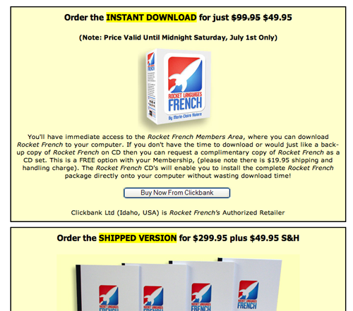
The order page is simple and easy to follow.
Conclusion
My gut instinct, having not actually spoken with the Rocket French people, is that this landing page probably generates a solid conversion rate and healthy sales for their downloadable Rocket French course.
The biggest strength is the clarity of presentation, the straightforward, hype-free tone of the copy and the strong emphasis on benefits.
The biggest flaws are the lack of a unique selling proposition in the headline and lead and failure to establish the qualifications and credentials of the course creator or publisher.
My advice to the Rocket French company… I also think there might be a missed opportunity in not starting with where the reader already might be in her search for French mastery: frustrated by failure in high school, college, and other programs.
If you can quickly and easily convince the visitor that your course can succeed where others fail, and make a convincing case why this is so, then your sales of foreign language courses might take off like a rocket.


