Publishers of The Economist Consider Economist.com a Strategic Corporate Asset and Offer Visitors a Highly Usable and Accessible Website Design, Enabling Users to Achieve Their Objectives Quickly and Efficiently
“…to take part in a severe contest between intelligence, which presses forward, and an unworthy, timid ignorance obstructing our progress.”
The Economist is the premier weekly news and international affairs publication with an average circulation of over one million copies a week. The Economist began publishing in 1843. According to its contents page, its goal is to “take part in a severe contest between intelligence, which presses forward, and an unworthy, timid ignorance obstructing our progress.” Subjects covered include international news, economics, politics, business, finance, science and technology and the arts.
The publication is targeted at the high-end “prestige” segment of the market and counts among its audience influential business and government decision-makers. It takes a strongly argued editorial stance on many issues, especially support for fiscal conservatism. The Economist strongly supports the free market, while also supporting more liberal issues like gun control and gay marriage. As one of the most respected publications in the world, The Economist attributes its success to “…the outstanding reputation it has for high-quality, relevant analysis.” It is the rather formidable task of bringing this outstanding reputation to the Web that The Economist has taken on in its website, Economist.com.
- The Economist.com website design achieves simplicity in that its mission is clear and focused.
- The publishers of this site take extensive advantage of the interactive characteristics to ensure that visitors have a varied and successful site experience.
- The Economist.com is packed with content, and there are several opportunities for the user to become confused about navigating the site
- The professionalism of design is achieved largely through the judicious use of color, the use of complementary colors and the liberal use of white space.
- Economist.com has hit all the right notes in creating an online venue that is successful both for advertisers and visitors.
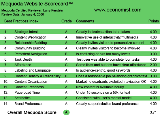
Economist.com’s Mequoda Scorecard
[text_ad]
1. Strategic Intent, or Purpose – A
In its 2004 Annual Report, the Economist Group reports that Economist.com is considered a major digital asset. Growth in online advertising has been significant, with a 24 percent increase in advertising revenues. In addition, revenues from online subscriptions have been substantive. Latest reported site traffic has reached as many as 1.9 million unique visitors per month. The strategy that the Economist.com has employed to achieve these outcomes revolves around transferring brand to the Web. The Economist.com offers visitors the highest in content quality, the traditional Economist editorial perspective, and a highly usable and accessible website design, enabling visitors to achieve their objectives quickly and efficiently.
The Economist.com site achieves simplicity in that its mission is clear and focused. Visitors come to the site to find engaging and well written content that adds to their understanding of the world. The publishers of this site want to drive as much traffic to the site as possible, so that those visitors will be exposed to site advertising and subscribe to the site’s premium content.
2. Content Webification – A
Economist.com is full of interactive elements. The publishers of this site take extensive advantage of the interactive characteristics to ensure that visitors have a varied and successful site experience. The site offers extensive search capability, including site search, and archive search, as well as a roster of valuable research tools. The site offers a number of newsletters covering a variety of topics, enabling visitors to engage in an ongoing relationship with The Economist, and offering The Economist the opportunity to present offers to its subscribers without requiring that they visit the website. The site also provides location-based content, enabling visitors to customize the content they view, based on their geographical location. Finally, the Economist.com provides access to a series of audio interviews, taking advantage of the digital capabilities of the Web and providing visitors with not only the words of various important executive newsmakers, but their voices as well.
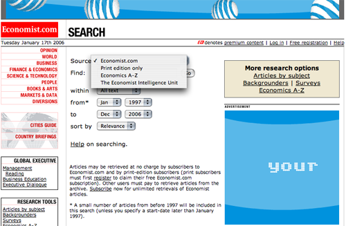
The site offers extensive search capability, including site search, and archive search.
3. Relationship Building – A
Economist.com offers visitors the opportunity to sign up for email subscriptions, as well as subscriptions for premium content, both on site and off site to visitors’ handheld computers. In both of these instances, the site publishers are encouraging visitors to establish ongoing relationships with The Economist. These relationships represent value to both parties. Visitors who subscribe to either a newsletter or to premium site content obtain access to high quality content that reflects the traditional Economist editorial perspective. A subscription to the Economist.com provides visitors with personalized access to the editorial staff of one of the most highly respected publications in the world. On the other hand, visitor subscriptions provide The Economist and its advertisers with an ever increasing list of potential customers that are well qualified and ready to buy. This synergy produces the impressive growth in visits and revenue that the Economist.com has experienced month over month.
4. Community Building – A
Readers of the Economist.com have characteristics that would suggest potential for a high level of communication and interaction. Visitors come to the site seeking information and understanding. They come to test their views and the views of others. They engage in dialogue with the site, or at least would do if they had the opportunity. And make no mistake, the opportunity to engage visitors in dialogue with the site publisher and with other visitors can be extremely valuable. The more communication, the more visitors become engaged, the more likely they are to get in the habit of visiting the site on a regular basis. Unfortunately, the Economist.com has missed the boat on this count. There are few, if any opportunities for visitors to engage in dialogue. Visitors to this site don’t get the opportunity to answer the question, “What do I do with all this knowledge and useful information once I have consumed it?” A feedback link at the bottom of each article, weekly Web discussions led by The Economist editorial staff, occasional guest “speakers” who offer a unique point of view. All of these techniques could provide Economist visitors with the opportunity for interaction that the site currently lacks. Oh well. I guess no website is perfect, not even the Economist.com!
5. Persistent Navigation – B
The Economist.com does a reasonably good job of maintaining continuity in navigation from page to page and section to section. The left hand navigation is always where you expect it to be. And the page layout is typically consistent from page to page. The site is organized in directory fashion, supplementing the continuous left hand navigation with links organized by subject in the main content window. The right hand column is used effectively to present related items, and always, always to display banner ads. At the top level of the site, the left hand navigation consists of drop down menus and active links. One level down, there are another set of menu links that reflect the same content as the higher level navigation menu, but in more succinct fashion. Because these two menu presentations look different, that they present largely the same content can be lost on the visitor.
6. User Task Depth – A
As primarily a publishing site, the Economist.com must make it easy for visitors to accomplish their objectives, that is, to find and read content. Spend some time with the site and you will find the content you want quickly and easily. The site makes it quite clear how to navigate to your article of interest. Should you choose to purchase a subscription, the subscription process is simple and straightforward. There are numerous opportunities to subscribe, all of which are associated with the process of finding or consuming content. In addition, the Economist.com provides for the customer support requirements of its visitors. Subscribers can change settings, keep track of pay-per-view credits, manage a print subscription to The Economist and gift subscriptions.
7. Affordance – C
The Economist.com uses a variety of navigation elements with a variety of design characteristics. Some menu links are rollovers, while others are not. Some are black while others are red. Some navigation elements are simple links while others are drop down menus. There is some inconsistency in the use of colors and associated links. Some menu items, for example, that are presented in red font are live links, while others are not. Some links use a red mouseover, while others appear in blue. The Economist.com is packed with content, and there are several opportunities for the user to become confused about navigating the site. There are instances in which this site makes it “the user’s problem.” The visitor is on occasion put in the position of having to guess where to go next or how to get there.
8. Labeling and Language – A
The Economist is about communications. Its purpose is to report, analyze and synthesize information from a variety of sources, and to do so in a way that is uniquely accessible. For those subscribers and regular readers of the magazine, its breadth, depth and communicative qualities make reading The Economist a unique experience. The Economist sets the standard for well written, accurate reporting of the world news. Coverage is global and significantly broader than most business magazines. It’s purposely opinionated, written with subtle good humor and has remarkably fresh language for such a serious news source. Those who read this publication know that news doesn’t have to be a duty.
9. Content Density and Readability – B
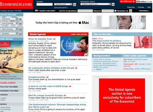
The Economist.com offers more content than can be consumed at any one sitting. In fact, the site may present too much content. It takes multiple visits to the site to “learn” how to navigate the various categories of reported information. The front page uses a three column layout in a typical fashion. Menu selections are presented in the left column. The center and right hand columns offer highlighted material. Banner ads appear at the top, as well as in each of the three columns. While there is visual consistency on the page, the volume of content requires a certain amount of time to get oriented. On interior pages, the three column grid is maintained, but the center column is dedicated to content, increasing the visual continuity and accessibility of the page.
On interior pages, the three column grid is maintained, but the center column is dedicated to content, increasing the visual continuity and accessibility of the page.
10. Organization – A
The three column grid format of the Economist.com offers numerous opportunities to display advertising and marketing material. The site makes extensive use of the top page area to display banner ads. There is also space for another banner ad in the right hand column, although most of this banner does not extend above the fold. But, that’s not a problem, as the content will keep visitors scrolling down the page. As such, visitors to this site will have the opportunity to be exposed to all the banners on the site. This site does a good job of following recommended online marketing organizational concepts. Visitors are generally not required to scroll to see important content or, equally important marketing messages. But, more importantly, visitors to this site will continue scrolling because they will be motivated by content, and isn’t that the point, after all.
11. Content Freshness – A
The Economist is published on a weekly basis. The Economist.com website presents both website-only content as well as content from the print magazine. As such, this site is continually refreshed, although not on a daily basis. For other websites, this might present a problem, creating a less-than-dynamic visitor experience. For this website, however, there is such volume and variety of content that visitors need hardly worry about becoming bored with the site. Devoting a good week to this site will get you through most of these thought-provoking and intelligent stories and articles. Although the site doesn’t update daily, I’m going to give the Economist.com the highest grade in this category. This grade is justified by the high traffic volume and high degree of repeat visits to this site.
12. Load Time – A
The load time for the Economist.com home page is 2.27 seconds over a 56K connection. The total number of HTML requests is limited, and there are 2413 images that are loaded with the page, including banners and navigation menu rollovers, and yet the load time for this page is well within the desired range. The total size of the homepage is over 110K, and the optimum size for rapid download is below 100K. Layering content by loading the most relevant content for users first, helps reduce the perceived delay in download time.
13. Aesthetics – A
The Economist.com is clean looking, information rich and intuitive. As such, the design of the site will meet most people’s expectation for professionalism. The site reflects the design of the print magazine, borrowing its color scheme and overall professional-looking presentation. The professionalism of design is achieved largely through the judicious use of color, the use of complementary colors and the liberal use of white space. The design of this site reflects the priority assigned to information consumption. The pastels used on this site convey a feeling of comfort and invitation, while the selective use of red highlights content in a limited, but effective, fashion.
The site is clean looking, information rich and intuitive.
14. Brand Preference – A
The Economist.com strongly reinforces the brand equity of The Economist magazine. This reinforcement results from direct association with, and reference to, the print magazine as well as the focus on the part of the website designers on ensuring that visitors to this site experience success. The Economist.com does an excellent job of reinforcing brand by providing visitors with an easy to use, intuitive website. This site also takes advantage of content written by talented and highly respected authors. In some sense, given the strength of The Economist brand, the Economist.com could do little to strengthen the brand, but could certainly tarnish The Economist brand, with bad execution on the website. This, however, is not the case. Online brand equity is safely and effectively maintained by the Economist.com.
Conclusion
“Bringing you the world since 1843,” The Economist has been and continues to be one of the few news publications to have retained its credibility in a world where sensationalism passes for legitimate news on a daily basis. Thoughtful analysis, in-depth investigation and excellent writing make reading The Economist as pleasurable as it is informative. To their credit, the publishers of The Economist have transported all this quality and value to the Web in the form of the Economist.com. They have hit all the right notes in creating an online venue that is successful both for advertisers and visitors. As noted earlier, the publishers of the Economist consider the Economist.com a strategic corporate asset. The execution of this site, as well as its success in driving ever-increasing advertising revenues, demonstrate that the digital strategy of The Economist continues to meet with success.


