When you’re preparing a Powerpoint presentation for that important sales meeting, and you just can’t figure how to get your bullets to line up just so, wouldn’t it be great to have the answer at your fingertips? Well, that’s what the Element K Journals website wants to do for you. Whether you are a business professional, a design maven or a technology geek, this site has the answers you seek.
Element K Journals offers a variety of information products, including publications, CDs, tutorials and quick reference guides, that provide the most current, up-to-date information about the applications or technologies that most people need to know about. The big question, however, is whether this information is credible and of value. Can Element K Journals convince visitors to the website that its publications and its authors can come up with the goods? Because you only get one chance to establish your credibility with such a demanding audience.
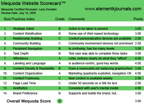
ElementKJournals.com’s Mequoda Scorecard
[text_ad]
1. Strategic Intent, or Purpose – B
There are few absolutes in life. The Web, however, is not like real life and on the Web, there are absolutes. One such absolute is that website visitors will not spend any time getting to know you or your website if you don’t give them an obvious reason to do so. You must tell them who you are and what you do and why they should care. Take this website, for instance. As there are no clear and obvious answers to these questions, I am left to guess the answers. So, let’s start with the name of the site—elementk Journals. Not much help there. I have consulted my periodic table and have found no element k. I could assume that the “k” stands for knowledge, but you know what happens when we assume. And how about the homepage content? Not much help there either. I can tell that the site is intended for three categories of visitors, but I don’t know exactly what goodness the site has to offer me.

I can tell that the site is intended for three categories of visitors, but that’s about it.
As it turns out, the site has tremendous value. While their quality is somewhat inconsistent, the publications made available on this site have to breadth and depth necessary to be of great value to practitioners. A simple statement on the front page revealing this value would be compelling.
2. Content Webification – B
The Element K Journals website is, at heart, an online catalog. It is hierarchically organized and provides both menu and directory navigation methods. It doesn’t tend to waste the visitor’s time, helping visitors find content rapidly. As such, it provides for the needs of both first time, and experienced, visitors. The site also provides “Free Weekly Tips” that reinforce and give credibility to the more extensive publications that the site sells. Finally, the Element K Journals site does an excellent job of presenting much compelling information about its publications in a concise and interactive presentation. The site does an excellent job of using the Web’s innate capability to organize and present information in an accessible and consumable fashion.
3. Relationship Building – C
The Element K Journals website relies on its weekly tips to establish ongoing communications with prospects and customers. This is both good news and bad news. The good news is that the tips the Element K Journals makes available on a weekly basis are practical, informative and useful. As such, these tips do an excellent job of conveying value and reinforcing the credibility of the Element K Journals’ website. The bad news is that these tips are self-contained little nuggets of information that completely fulfill their promise. As such, the recipient has no reason to act beyond reading and consuming the information contained within each time. In short, the free weekly tip has no call to action, nothing to get recipients to return to the Element K Journals website and make a purchase, which after all, is the object of the exercise.
The tips the Element K Journals makes available on a weekly basis are practical, informative and useful—but they have no call to action, nothing to encourage return visits to the site.
4. Community Building – C
The Element K Journals site has a natural constituency. The problem is that the members of this constituency interact with the website only when they purchase, and only when the need arises. The site needs a mechanism to create “pull.” Luckily, that mechanism exists in the form of “EKJ” Forums. These are threaded discussion forums that provide visitors with the ability to ask questions of fellow visitors or EKJ staff. This feature is used by site visitors on an ad-hoc basis. However, the EKJ forums have a lot of potential to increase the “stickiness” of this site. For example, EKJ could sponsor discussions or chat sessions conducted by staff or guest experts. These sessions would provide an excellent opportunity to communicate with the whole EKJ community via email, at the same time promoting special offers or other marketing communications. The site could use these events to promote membership and, ultimately, the purchase of their publications. At this time, however, the discussion forums are not featured prominently on the site, as they are accessible only from a link in the global navigation menu.
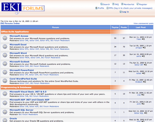
The site has a mechanism to create “pull”—”EKJ” Forums. These are threaded discussion forums that provide visitors with the ability to ask questions of fellow visitors or EKJ staff.
5. Persistent Navigation – B
The navigation scheme for this site is relatively simple and straightforward. The two navigation bars located at the top of every page remain a constant source of orientation, as does the left-hand column menu. However, there is really no unifying theme on the top of page menus. I would recommend a reorganization of these menus to group menu items more logically. Also, I would suggest that the “Store” menu selection be moved from the top menu to the left-hand column menu. This is where the action is, so to speak. Putting the “Store” menu selection in the left-hand column gives it much more visibility, and in the end, will get visitors to the store more readily. And isn’t that the point, after all?
The site uses mouseover menus in the left-hand column, and this is not recommended. The menu is generated dynamically using a combination of mouseover and asp. I must admit I have a personal and particular bias against this type of menu presentation. These types of menus, as frequently as they are used, drive me crazy. One the one hand, they are persistent. That is, when you want them to go a way they don’t, and they block the content behind them as they expand across the page. On the other hand, you have to have a steady hand and a well calibrated mouse to get them to behave properly, especially as you drag your mouse further to the right. If it takes me more than two tries to make a menu selection, I’m ready to quit. Finally, just so you don’t think I’m all about personal bias, this type of menu presentation makes the submenu items invisible, both to humans visiting the site and to search engines trying to index the site. As a result, the unsuspecting search engine spider will index only the top-level pages, and never find the rich content below.
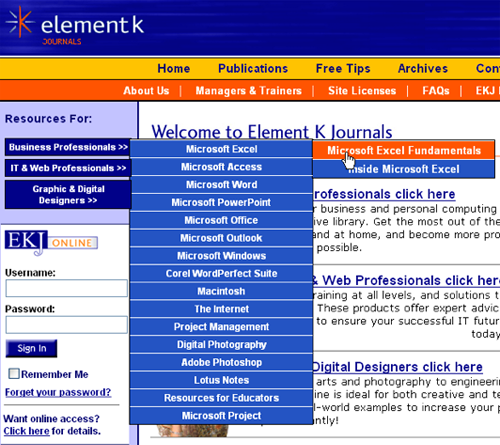
The site uses mouseover menus in the left-hand column, and this is not recommended.
6. User Task Depth – B
This site provides access to a selected publication, CD or reference card within two clicks. For the visitor that knows what they want, that’s great. You can’t beat two clicks. And when the visitor gets to the product page, they are rewarded with a well-laid out presentation that provides all the information necessary to make a purchasing decision. I particularly like the tabbed display at the bottom of the product page. This technique is becoming more and more popular, and I applaud its use. It is a concise and effective way to present benefit, feature and special pricing information in a simple, user selectable presentation. The product page also provides featured product and top seller information in the right-hand column, which is a highly recommended. The right-hand column is ideal for promotional and/or confidence building content.
Unfortunately, for the visitor who doesn’t know exactly what they want, this site is somewhat lacking. The directory pages, which visitors will use to browse through the various publications available on this site, are bare bones, and do not provide visitors with enough context to move forward. I would recommend short, benefit-oriented descriptions for each publication displayed on these directory pages. This information will give visitors browsing the site enough confidence to drill more deeply and find the real value.
Finally, most product description pages include the ability to download sample publications. These samples are the clincher. Once a visitor sees the sample publications, in most instances, they will buy. Access to these samples needs to be made available from the homepage.
7. Affordance – A
With the above-noted exception of the left-hand column navigation menu, this site does an excellent job of identifying and making readily visible all active links and buttons. All links are underlined, and are typically blue in color. Buttons are clearly identified as such. On the product page, the labels at the bottom of the page are presented as tabs and are underlined. The main exception to this rule is the top-most navigation bar on the page, which uses mouseovers exclusively, without carrying through the underline presentation.
8. Labeling and Language – A
Here is, metaphorically speaking, where the rubber meets the road for this site. The subject matter of the Element K Journals publications can be highly technical. However, the buying process, in many cases, shouldn’t be bogged down with technical detail, with one exception. The content needs to be relevant and “technical” enough to convince visitors that these publications are credible. A database administrator, for example, needs to feel comfortable that he is getting value for his money, and that these publications are sufficiently detailed as to be useful.
This site does a good job of balancing these competing requirements. This balance is achieved through a combination of effective copy and efficient page design. The following text is a good example of how the site copy is both credible and understandable:
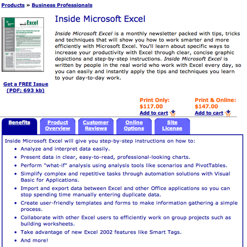
This text is a good example of how the site copy is both credible and understandable.
9. Readability (Content Density) – B
The readability of this site is generally adequate. The homepage and category/product listing pages tend to be densely packed and cluttered. This cuts down on the readability of these pages in favor of an attempt to cram as much information per page as possible. Also, the site does not highlight important words or phrases and does not include embedded linking in the page copy. These are both techniques that can effectively meet the needs of the majority of visitors who tend to scan pages looking for relevant and resonant content.
Once visitors drill into the site, things get better. The gallery pages are clean and well laid out. However, as noted earlier, these pages could benefit from the addition of descriptive copy. Also as noted earlier, the product pages are very well laid out, achieving an effective balance between uncluttered display and information density.
10. Organization – A
The Element K Journals website does a very good job of employing a consistent page layout based on a three column grid. Primary content is consistently presented in the “active window,” in the center column. In each instance, the most relevant page content is presented above-the-fold. The right-hand column consistently displays the main navigation menu. The left-hand column is used to present promotional, community-building and confidence-building content. As the visitor scans the homepage, she will most likely click on one of the three links presented in the active window, starting her on her path through the site. As noted, the site is consistent in its use of a three-column grid from page to page, simplifying the task of navigating the site.
Overall, the Element K Journals website is logically organized. Visitors can readily obtain access to the publication catalog. Publications are organized by product or technology. It might be useful, from the perspective of visitors, to organize publications according to problem and solution. This would be particularly useful to visitors who are seeking help for a particular problem.
11. Content Freshness – C
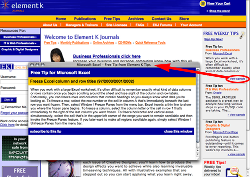
The success of the Element K Journals site is dependent upon its credibility. An important aspect of credibility, and especially in this case, is currency. The publications this site offers for sale are all technology oriented. Technology, by definition, is constantly changing. In order for this website to be credible, it must demonstrate that its publications are keeping up with technology. The homepage prominently displays “Free Weekly Tips” in the right-hand column, clearly demonstrating the “currency” of this site. And of course, this information gives visitors a taste of the more extensive, up-to-date information available in the site’s publications.
Also note that many of the publications available from this site are published monthly, adding to the overall currency and credibility of this site.
12. Load Time – C
The load time for the Element K Journals home page is 55.59 seconds over a 56Kbps connection. While the total number of HTML requests is 32, there are 26 images that are loaded with the page, including banners and navigation menu rollovers, and this is increasing the download time for the homepage, as well as interior pages. The total size of the homepage is over 200Kbytes, while the optimum size for rapid download is around 100Kbytes. Layering content by loading the most relevant content for users first will help reduce the perceived delay in download time.
13. Aesthetics – A
The Element K Journals website has a very simple and straightforward objective. It’s intent is to provide rapid access to a catalog presenting a series of information products offered for sale. In keeping with this simple objective, the design of the site is also very simple and straightforward. There are two levels of navigation that are presented consistently across all pages. As noted earlier, the site employs a two and three column grid, with judicial use of white space to produce a clean and professional-looking site. The homepage does a good job of making use of the active window, displaying compelling images and embedded linking, both of which help engage visitors to this site. Given these characteristics, the design of the Element K Journals website is utilitarian and does a good job of supporting the purpose of the site. As important, there are no surprises for visitors to this site, providing the consistency to enable visitors to establish a mental model to guide them through the site.
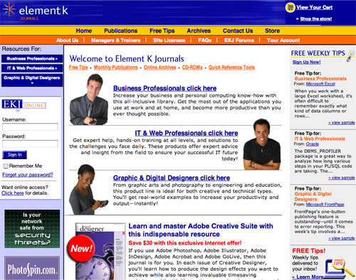
The homepage does a good job of making use of the active window, displaying compelling images and embedded linking, both of which help engage visitors to this site.
14. Brand Preference – B
On the Web, brand preference is established and reinforced by providing visitors with successful user experiences. Ease of use, relevance, visual consonance, credibility and confidence all contribute to a successful user experience. Unlike traditional media, indirect branding is seldom effective in the online environment. The Element K Journals site does an excellent job of reinforcing brand in that the site offers visitors a satisfying and productive experience. Visitors to this site can find information quickly, and can meet their objectives without being hindered by bad information architecture and design. However, this site relies too much on the brand recognition of the products and technologies described in its publications. While Microsoft is an immediately recognizable brand, Element K Journals is not. Brand reinforcing elements, such as user testimonials, client lists, and third-party endorsements would go a long way toward establishing brand preference. In addition, the clear and compelling articulation of a Unique Value Proposition on the Element K Journals homepage is essential and would further reinforce the site’s brand.
Conclusion
If you were a technology professional or a business person in need of help with your favorite application or system, the Element K Journals website has great value to offer you. The publications and information products offered from this website are the real thing. You can actually find practical, detailed and specific answers to your questions in the publications and information products available on this site. If only the publishers of this site would make this value more immediately obvious to site visitors. The site fails to answer the most important question for site visitors, i.e., what’s in it for me? The site offers compelling evidence of its value, in that it allows, in most cases, downloads of sample publications. One reading of these sample publications provides all the evidence necessary of the value the site offers. But, visitors have to be persuaded to drill into the site to obtain this evidence. This is where the site falls down. The good news is that this is a relatively easy problem to solve.


