Ragan.com is Strictly Business
Few organizations have done more to improve the quality of corporate communications than Chicago’s Ragan Communications.
And, I suspect, few firms have done as much to maintain the morale of corporate communicators than Ragan Communications.
Started in 1970 by Lawrence Ragan, the firm is a leading provider of information and skills-building techniques. It publishes a variety of newsletters, audios, special reports and teleseminars. The firm also conducts face-to-face training throughout the year via seminars and workshops.
The firm’s “doorway to the world” is located at www.ragan.com, a business-to-business site intended to sell its subscription newsletters and ongoing series of teleseminars, webinars and in-person conferences and workshops, as well as one-to-one coaching and consulting services.
 |
|
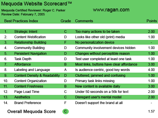
Ragan.com’s Mequoda Scorecard
|
[text_ad]
1. Strategic Intent, or Purpose – C
The first role of a website is to introduce itself to the visitor. The goal is to answer questions like: “Who are we?” “How can we help you?” “What will you gain by exploring our website?”
Upon reaching www.ragan.com, visitors encounter a dark blue banner extending three-quarters of the way across the page. Discretely reversed out of this text, set flush-right, is Ragan’s positioning statement: “Serving Corporate Communicators for 35 years.”
The plusses of this statement include:
- The market, corporate communicators, is clearly identified.
- The 35 years offers evidence of credibility.
The minuses of this statement, however, is that it doesn’t define how Ragan Communications has been serving corporate communicators. Visitors have to look through the links on the page to find out exactly what assistance Ragan Communications offers. Ragan’s role as an educational resource devoted to raising the standards and helping corporate communicators work more efficiently and get the respect they deserve is not verbalized, although it certainly is a major part of the Ragan Communications story.
2. Content Webification – D
Although based on Active Server Pages, the Ragan site makes little use of technology beyond Adobe Acrobat downloads. There are no audio downloads of attendee comments from previous seminar, no immediately viewable and readable Flash Paper samples of newsletters and no personal greeting from the firm’s principals and teleseminar leaders.
Since conferences and workshops have been videotaped for decades, short video downloads could visually communicate the excitement of attending a Ragan event in Chicago, or regionally throughout the United States.
3. Relationship Building – F
The tone of the website appears to be designed to keep visitors at a distance, until they are qualified and become part of the Ragan family.
There is a “Members Area” link, but nowhere was it made obvious what the benefits were.
There is a “Join Mailing list” link, but the sign-up form was long and there was no explanation of why to join—the benefits of joining. The implication was that you would be contacted (hence, “sold”), which may qualify those who fill out the form, but this also diminishes response of fence-sitters who don’t want to make a commitment for an uncertain benefit.
There is less “free content” on the site, in terms of Open Content informative articles and reports, than expected. There were four free stories available when I visited: one of which was a portfolio showing thumbnails of the winners of a recent Ragan publication contest. (Although the names of the winning publications were included, along with the firms’ names, there was no other explanation of why they won, and the thumbnails could not be clicked for viewing at larger size.)
Instead of multiple free articles, Ragan offers PDF samples of its numerous subscription newsletters. No sign-up is required; the newsletter samples immediately load. Obviously, Ragan prefers to focus attention on free samples of its subscription newsletters, and let the content of the newsletters speak for itself, rather than give away too much. An order blank for the newsletters appears on the back page of each newsletter sample.
4. Community Building – D
The primary community-building resource obvious as a visitor was a link to Ragan’s Member Forums. Just what the forums consisted of, who the members were and how active the forums are, was neither promoted nor revealed.
Membership is free, but the benefits remained hidden.
At first glance, the Frequently Asked Questions pages appeared fairly daunting and technical, with HTML references and emoticon listings, etc.
5. Persistent Navigation – D
There are some frustrating aspects to the site navigation. A horizontal navigation bar along the top of the page offers quick access to key “information buckets,” and a vertical navigation bar along the left-hand margin of the page offers links to various publications. The contents of this bar change depending on the current page location.
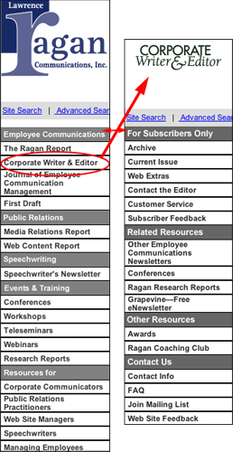 |
| Ragan.com’s Bait-and-Switch Site Navigation |
The page is surprisingly slow, (even on SuperBowl Sunday!). The site was accessed on several occasions via DSL, and there is a definite hesitation before the ASP pages snap into view—even though their graphics are both rare and small.
There were several instances of misleading cues, specifically design elements that looked like links, but weren’t. The primary graphics horizontally dividing the wide text area in the middle of the page looked like graphics, because they sometimes resembled tabs, but weren’t.
There were inconsistencies regarding publication thumbnails. Sometimes, clicking a thumbnail downloaded the publication and opened Adobe Acrobat, in other cases, it didn’t—one had to click an adjacent “Download PDF” link.
Double-clicking to launch an immediately readable Flash Paper version of the publication would have added both impact and efficiency to the visitor experience. (For more information about Flash Paper, see Showcasing Newsletters on Your Web Site.)
On the Ragan site, most links open new windows, making it necessary to close the windows, a bit harder (and probably CPU memory-intensive) than clicking the “back” button. (I soon had six windows open.)
6. Task Depth – D
In addition to being able to download PDF samples of its primary newsletters, visitors can sign up for Ragan’s Grapevine, a weekly, monthly newsletter filled with tips and suggestions. The sign-up for the newsletter was considerably easier than the generic sign-up, requiring only name, email address and zip code.
The problem was that there was no real incentive to sign up for the email newsletter! Although the Grapevine logo is very attractive—like all of the nameplates and logos associated with each of Ragan’s newsletters—visitors cannot sample the newsletter by viewing a copy before signing-up. The lack of a convenient and immediate preview of the Grapevine newsletter must surely discourage sign-ups.
 |
Although the Grapevine logo is very attractive—like all of the nameplates and logos associated with each of Ragan’s newsletters—visitors cannot sample the newsletter by viewing a copy before signing-up.
|
7. Affordance – B
The majority of the links are clearly identified. However, one could argue that the “Feature of the week” is a bit of a stretch, since the link is not to an informative article, but to a description of an upcoming three-city seminar program. Otherwise, most links take you to expected destinations.
8. Labeling and Language – A
The language used throughout the Ragan.com site is—as would be expected, given the firm’s experience in corporate communications—clear and familiar. The site is free from jargon and acronyms in both content and navigation.
9. Readability – D
Text readability was a problem. On a machine running Microsoft Windows on a 17-inch LCD monitor, using both Microsoft Internet Explorer and Mozilla Firefox, text was painfully small. Worse, increasing “text size” did nothing to make the small body copy easier to read.
This is partially offset by the intelligent use of subheads and generous paragraph spacing, but this is definitely not a website for the vision impaired—or visitors with aging eyes.
Also, on the plus side, site colors and animation did not distract from reading the headlines, subheads and text.
10. Content Organization – D
Like many information-filled sites, there is no single point of entry for the first-time visitors.
Repeat visitors can click on the “Sign in” link, but there is no “welcoming statement” or attempt to do more than show a potpourri of linked options. Key stories are introduced with text links and a few sentences of “teaser” copy, but there is no attempt to set up a dialog.
There is no headline or story to provide a segue between “stranger” and “pick your link!”
The assumption is that visitors will either explore the 30-plus links on their own, or will know what they want by either the publication title or event listing.
Visitors have to click on the “About us” link to find the firm’s mission statement buried in the middle of the page: “Ragan Communications, Inc., delivers practical advice, real-world solutions and field-tested strategies for today’s corporate communicator.”
 |
|
Repeat visitors can click on the “Sign in” link, but there is no “welcoming statement” or attempt to do more than show a potpourri of linked options.
|
11. Content Freshness – B
There was one timely link—to the President’s State of the Union Message—and several references to upcoming conferences and teleconferences. But, this is definitely not a “news” site, it is a site for selling newsletter subscriptions.
The tragedy, of course, is that there may be a WORLD of timely and useful information on the site—reserved for members and subscribers—but because there is not even a hint of this information accessible with sign-up, there is little incentive to sign-up!
New content is posted weekly. However, I could not locate links to content from the previous week. Rotating site content means that articles that previously appeared on the site are no longer available, this reduces the site’s utility and reason for visitors to remain longer.
12. Page Load Time – C
All pages, including the home page, loaded surprisingly slowly, even on high-speed cable Web access. Part of the problem might be the way so many new windows opened on screen, as many navigation links opened additional windows. According to the Web Page Analyzer, on a 56 K modem, Ragan loaded in 40.47 seconds. This scores them a C on the Mequoda scorecard.
13. Aesthetics – C
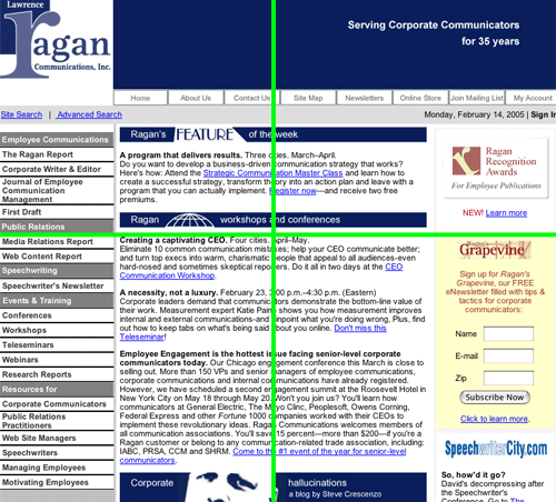
The Ragan site follows the now-common three-column approach: a narrow left-hand column of navigation links, a wide column of text links and teaser copy in the middle, plus a narrow column on the right containing both graphic and text links. Column widths are set, so horizontal scrolling is needed on smaller monitors.
The blue banner at the top of the page is a bit deeper than on many sites. Next to it, on the left, is The Lawrence Ragan Communications logo—with an attractive oversize R. Unfortunately, the blue background behind the right-hand banner doesn’t extend behind the entire Ragan logo (just behind the founder’s name, Lawrence). The result is a bit more clutter than might have resulted if the attractive Ragan logo was completely reversed out of the blue, which would simplify the top of the website and create a more cohesive image.
The top banner was a repeat element on each page, however in many cases it changed, depending on the page you were visiting. The color and design of each of the banners at the top of the page changed for each of the newsletters. This further weakened the site’s branding.
 |
Unfortunately, the blue background behind the right-hand banner doesn’t extend behind the entire Ragan logo (just behind the founder ‘s name, Lawrence). |
14. Brand Preference – F
I experienced little feeling of “connection” with the Ragan site. I know the organization and respect them greatly, but the site lacks enthusiasm and personality.
Granted, the firm’s 35-year reputation speaks for itself.
But, new people enter the corporate communications field every day. Ragan is competing with information marketers who project friendlier and more accessible faces to the world and who offer more specific reasons for action to submit their name and email address.
The lack of site personality and relative paucity of free content may discourage others from revisiting the site.
- If the site had a hard-hitting article or editorial about the State of the Union Address, the impact of Super Bowl coverage on corporate changes, or a deeper exploration of the role of corporate communicators in an environment pointed by scandals and trials, I might frequently revisit the site.
- If the site reflected more empathy towards the role of corporate communicators in a cost-cutting world, and if numerous examples of this empathy were available as Open Content any visitor could access, I might revisit more frequently.
But, all too often, clicking on a link led to notices that the promised content was limited to subscribers. Since there were not more free articles available, I might not be as “sold” on subscribing as I would if Ragan proved the value of the resources in advance of subscribing.
 |
|
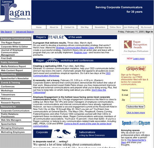
Ragan Communications Home Page
|
Conclusion
Overall, this site scored a C. It is difficult to critique the website of a firm that is as credible, successful and plays as vital a role to a key market segment as Ragan Communications does.
The quality of Ragan Communication’s publications and print direct marketing efforts set the standard for the corporate communications field. Their critiques are both masterful and highly useful. Ragan Communications continues to be a positive influence in their field. I am proud to have been associated with them.
However, as the above paragraphs show, their website does not reflect the Ragan that I know from their publications. The enthusiasm, passion, personality and information density of their publications and information products is not effectively reflected in their website.
Overall, the site fails to live up to its potential as an accurate reflection of the firm’s products and services. The site would benefit from technology used to effectively communicate content and personality.
[text_ad]


