The Publishers of the Wine Enthusiast Magazine Have Done it Right. They Have Created a Series of Websites that Complement Each Other and Effectively Lead Visitors to Make a Buying Decision.
WineEnthusiast.com is an online catalog that offers a comprehensive selection of all things wine related. The only thing the site doesn’t offer is wine. But that’s just fine, as the publishers of this site depend on a motivated visitor who is enthusiastic enough about wine to want the very best in wine accessories.
This site is not for the wine novice. It’s for visitors who know, appreciate and spend a fair amount of money on wine and wine-related products. This site speaks to the need to enhance and protect the investment visitors to this site have made in their wine collections. This is the destination for visitors who have read all the magazines and have had numerous discussions with their Wine Enthusiast friends, and are ready to buy those products that will make their wine collections complete.
The challenge facing the publishers of WineEnthusiast.com is to build an ecommerce website that does not practice sales prevention. There are so many ways a site like this can go wrong. It’s so easy to get the copy wrong, use low quality images and most damaging, to build scenarios that lead the buyer nowhere. The challenge facing the publishers of WineEnthusiast.com is to provide visitors with a user experience that enhances, rather than diminishes, the wine collector’s enthusiasm.
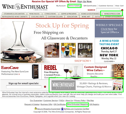
- Upon arriving at the WineEnthusiast.com, it is immediately apparent to the visitor that this site is a well organized online catalog devoted to the Wine Enthusiast.
- WineEnthusiast.com is an excellent example of an online catalog
- The publishers of this website should consider providing the passionate visitors to this site with an opportunity to express their passions with every visit they make.
- This site presents a nice combination of utility, supporting the commerce elements of the site, and accessibility of design, ensuring ease of access and readability for published content.
- Visitors to this website will be rewarded with a successful online experience as they seek to purchase from a collection of products that reflects those visitors’ desire for quality and value.
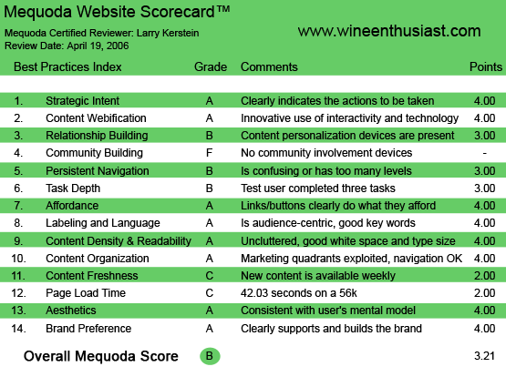
WineEnthusiast.com’s Mequoda Scorecard
1. Strategic Intent, or Purpose – A
Now that you’ve found that perfect Pinot Grigio, and you have some prized bottles in your possession, it’s time to buy those wine-related products that will turn a few wine bottles into a collection. Upon arriving at the WineEnthusiast.com, it is immediately apparent to the visitor that this site is a well organized online catalog devoted to the Wine Enthusiast. Visitors come to this site to find and purchase products they need to enhance their wine collections and this site makes it easy to fulfill that objective. This site falls into the ecommerce category and focuses all of its attention on facilitating the purchasing process for the visitor.
The site does a good job of merchandising it products. The site design provides numerous opportunities to select products that are highlighted by price, feature or their recent addition to the catalog. This site’s financial model is a simple one. Visitors are monetized through their purchases on the site. There is no content to speak of, other than the products offered for sale and the information about those products.
[text_ad]
For those visitors who want to stay up to date on the latest trends in wine and read about all things wine related, there is a companion site, The Wine Enthusiast Online that is the online analog of the printed Wine Enthusiast magazine. And for those visitors that want to actually buy their wine online, this site provides access to the Wine Express site, which is an online wine catalog. To the credit of the publishers of these three sites, they have cleanly and clearly separated content from commerce, while ensuring that visitors to each of these sites can find their desired destination.
To the credit of the publishers of these three sites, they have cleanly and clearly separated content from commerce, while ensuring that visitors to each of these sites can find their desired destination.
2. Content Webification – A
WineEnthusiast.com is an excellent example of an online catalog. This site takes extensive advantage of the interactive and information management capabilities of the Web. As such, this site falls into the category of a highly functional and customer-pleasing online catalog.
First, it offers a selection of products not readily available from a single brick-and-mortar venue. The scope and depth of products offered by this site is sure to impress the most enthusiastic wine collector. In addition, the structure and design of the site offers great flexibility and makes the visitor experience satisfying.
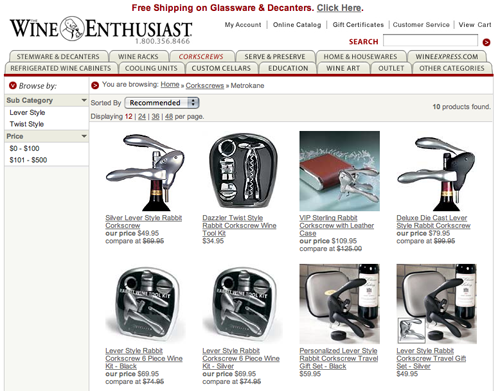
For example, visitors can sort catalog pages by recommended items, name, price high-to-low and price low-to-high. In addition, visitors can choose to display a limited number of items per page, or all items in a given category. Catalog pages offer pertinent information about products displayed, including high resolution images, short descriptions, prices and special deals.
Finally, this site goes to great lengths to accommodate all viewing styles. You can actually view an electronic copy of the printed catalog, with animated page turning, offering an experience that emulates perusing a printed catalog. When an item is selected from this “electronic catalog,” a product page is displayed that is the same as that displayed in the online catalog, with the addition of a link back to the “electronic catalog.” This is very cool! The publishers of this site have merged the online and offline experience in a seamless and highly effective way.
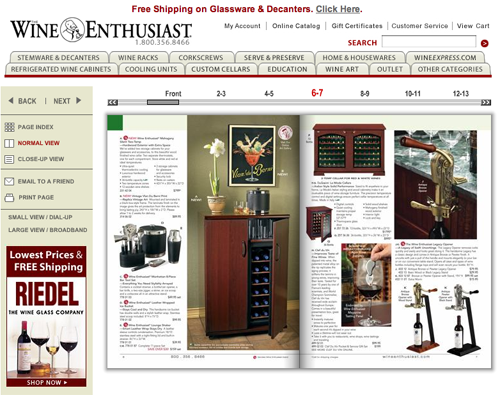
You can actually view an electronic copy of the printed catalog, with animated page turning, offering an experience that emulates perusing a printed catalog.
3. Relationship Building – B
The main technique available to WineEnthusiast.com to build relationships with its visitors is in the form of a satisfying buying experience. Simply put, the easier it is for visitors to find what they want when they want it, the more likely it is that they will return to the site. As noted above, for the most part, this site meets this criteria. However, in addition to this powerful characteristic, WineEnthusiast.com also offers visitors the opportunity to register for an email subscription. Through this subscription, visitors can be notified of specials, promotions and other pertinent and timely communications. By proving this opportunity for visitors to identify themselves and create a mechanism for communication with the website, the publishers of this site create an ongoing relationship that is so important and that multiplies the impact of the various marketing messages generated from the site.
On the other hand, the opportunity to subscribe to an online newsletter, with substantive content, readily available form sister websites like the Wine Enthusiast Online, could be even more compelling and effective in building those ongoing relationships.
4. Community Building – F
My guess is that wine collectors have a lot to say. They are, in all likelihood, a very opinionated group of people. Because wine collecting is as much an expression of identity as of preference, collectors tend to be passionate about their wine. And passionate people are inclined to express their passion. Indeed, passionate people are compelled to profess their passion. This tendency could be exploited to the benefit of the publishers of this site. By providing a means for interaction between visitors to this site, opportunities to review products, provide suggestions and advice to other visitors, visitors to this site will develop greater loyalty and increase the likelihood of repeat visits to the site.
Unfortunately, the publishers of this site have chosen not to offer visitors a way to build and participate in an online community. One need only observe the leading commerce websites to see how effective community can be in creating a successful commerce destination. The publishers of this website should consider providing the passionate visitors to this site with an opportunity to express their passions with every visit they make.
5. Persistent Navigation – B
WineEnthusiast.com does an excellent job of maintaining continuity in main navigation from page to page and section to section. The navigation scheme on this site is really quite simple and implemented in a persistent fashion. The main navigation at top of page is absolutely consistent from page to page. The design of the site employs tabs for main navigation. There are differences of opinion about the effectiveness of navigation tabs, however in this case, site designers avoided using drop-down menus, and that is a very good thing.
Navigation on interior pages is presented always in the left hand column. From category to category, these menus vary only as necessary in order to reflect the unique characteristics of a given category or product. Interior pages do use drop-down menus, but these menus are kept short and so do limited damage.
All other links are presented in typically recognizable fashion, with the traditional underline as the visual cue for the visitors to this site.
6. User Task Depth – B
For a commerce site like the WineEnthusiast.com, this category is a measure of the ease of transaction. We evaluate the ease with which visitors can find and purchase the products they seek. As noted above, the WineEnthusiast.com catalog is easy to navigate, provides the user with much flexibility and allows users to search for products in a customized manner. The gallery pages are well organized and informative. Thumbnail images are clear and compelling. Each image is accompanied by explanatory text, providing additional context for catalog browsers.
The product pages offer adequate visual and written information about the selected product. In each instance, the mechanism for taking the next step is clear and obvious. The WineEnthusiast.com shopping cart is somewhat spare, although it does include a link back to the product page, always a good idea. The publishers of this site should consider including a thumbnail image of any products in the shopping cart, as this would enhance shopping cart effectiveness. Also, the shopping cart should display shipping and tax amounts, so that the buyer knows exactly, or at least approximately, what the cost of the item will be. The idea is to reduce the number of decision points the buyer has to experience.
The shopping cart does offer a clear mechanism for removing items from the cart, and this is a buyer-friendly feature. The checkout process, however, presents a major barrier to sales. New customers must register with the site before being able to make a purchase. Typically, this is the point in the checkout process that produces the greatest number of dropoffs, and it is exactly the point at which the buyer is most vulnerable. Leave registration for after the sale and maximize the number of completed sales.
One final point. The product, shopping cart and checkout pages should include “confidence building” content, such as links to the company’s privacy policy, logos from security vendors like Verisign, evidence of Better Business Bureau recommendation and a satisfaction guarantee. These content elements are proven to increase buyer confidence, and correspondingly, buyer conversion rate.
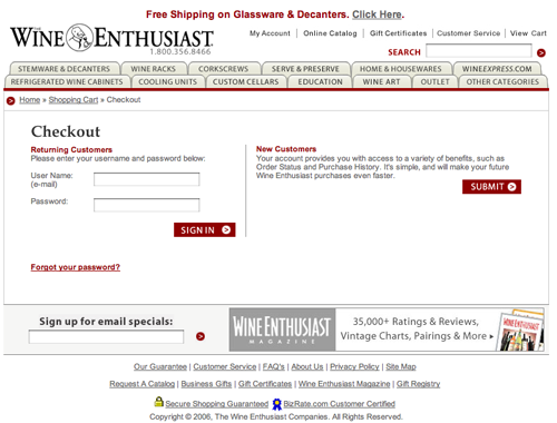
The checkout process, however, presents a major barrier to sales. New customers must register with the site before being able to make a purchase. Typically, this is the point in the checkout process that produces the greatest number of dropoffs, and it is exactly the point at which the buyer is most vulnerable. Leave registration for after the sale and maximize the number of completed sales.
7. Affordance – A
As noted earlier, all inline links are presented in traditional format, with underlines. Main navigation links are presented in tab format, and this works reasonably well because the navigation scheme is simple and logical. Internal page navigation is presented in a series of drop-down menus, all of which are reasonably succinct and use mouseovers as visual cues. On the whole, navigation on WineEnthusiast.com is intuitive and obvious.
8. Labeling and Language – A
WineEnthusiast.com emphasizes simplicity of design and content. There are few elements on the site, including navigation and content, that aren’t presented in a simple, clear and understandable fashion. The product descriptions highlight the unique and desirable characteristics of each product in a readily understandable fashion. That is, the copy sells. While the site could easily have fallen into the trap of using wine jargon, it does not. As a result, the site is as accessible to the non-wine enthusiast as to the collector.
9. Content Density and Readability – A
Success of WineEnthusiast.com is directly related to site conversion rate. That is, the more buyers complete their purchases, the more successful the site. In order to achieve this success, the site has to find a balance between site density and site accessibility. It is important for the site to present as much product as possible to ensure that there is sufficient selection.
At the same time, however, the content on the site has to be designed in as accessible a manner as possible, through the use of techniques like continuity, proximity and the liberal use of white space. The designers of this site have done an excellent job of meeting these criteria. While the front page is busy, and somewhat dense, each interior page is well laid out, leaving sufficient white space to ensure readability. This site presents a nice combination of utility, supporting the commerce elements of the site, and accessibility of design, ensuring ease of access and readability for published content.
While the front page is busy, and somewhat dense, each interior page is well laid out, leaving sufficient white space to ensure readability.
10. Organization – A
The pages on this site are organized using one-, two- and three-column grid formats. The front page uses a two-column display, providing maximum page geography for graphical presentation of highlighted products. Interior category pages use a three-column format that is optimized for the presentation of catalog items. Principles of eye tracking are adhered to throughout the site.
On category pages, the main action area of the page is dominated by images and copy that serves to increase interest and confidence in the selected products. Promotions are offered in the right-hand column, which is a secondary location on the page, but one which falls well within the field of vision as the visitor scans the page. On catalog pages, items are displayed in a consistent and well laid-out fashion, and presented in a two-column format, with nothing to draw the visitor’s attention away from products offered. The product pages are simply laid out, with image and copy presented in a single column format. Information is easily accessible to the prospective buyer. For those products that are not transactional, i.e., products with some complexity, a somewhat more flexible display is recommended. In these instances, I would suggest a Java presentation that allows the visitor to dynamically view product specifications, and perhaps testimonials, without leaving the product page.
11. Content Freshness – C
The freshness of this site is evident largely from the front page. Here, new products and new offers are presented with immediate visibility. In addition, the right-hand column of the front page displays weekly specials and upcoming wine-related events. In the interior of the site, though not immediately as evident, the contents of the catalog are updated incrementally over time. For this type of site, content freshness is important, but is likely to happen in the context of seasonal or other product-related events. Had the site incorporated opportunities for visitor feedback and discussion, it would be guaranteed of almost continuously refreshed content. On the other hand, visitors do have the opportunity to sign up for periodic email notifications. While this doesn’t relate directly to site content, it does give visitors a reason to return on a regular basis.
12. Load Time – C
The load time for the WineEnthusiast.com homepage is 42.03 seconds over a 56K connection. The total number of HTML requests is 46, and there are 46 images that are loaded with the page, including banners and navigation menu rollovers, and this is increasing the download time for the homepage, as well as interior pages. The total size of the homepage is over 209,864K, and the optimum size for rapid download is below 100K. Layering content by loading the most relevant content for users first helps reduce the perceived delay in download time.
13. Aesthetics – A
WineEnthusiast.com is an excellent example of a successful online catalog. It rounds out the set of websites published by the Wine Enthusiast, including the Wine Enthusiast Magazine online and the Wine Express website, by providing a clear, intuitive venue for purchasing a wide selection of products. The design is clean, professional and inviting. Visitors to the site will invariably have a satisfying buying experience and be motivated to return to this site repeatedly.
The design of this site strongly supports the purpose of the site. The clarity of presentation, the flexibility of navigation and the muted color palette all support and facilitate the buyer’s priority. That is, finding the product of interest and successfully completing the purchase process. What’s most effective about the aesthetic of this site is that it is designed to be utilitarian and consistent with the expectations and needs of prospective buyers. Is there anything else an online catalog can accomplish?
14. Brand Preference – A
WineEnthusiast.com strongly reinforces the brand equity of the Wine Enthusiast magazine marketing concept. The brand concept is transferred to the Web in a variety of ways.
First, the site offers a selection of products that reflect the sophistication and premium sensibility of the Wine Enthusiast subscriber. The site offers products from manufacturers that Wine Enthusiast subscribers are familiar with and with whom these subscribers feel very comfortable. Next, the design of the site reinforces, yet does not overwhelm, the user experience. As visitors have successful experiences on the site, they associate this feeling of success with the online brand. Finally, the site provides an ingenious simulation of the experience of browsing the printed catalog, creating a strong and direct connection to the overall Wine Enthusiast brand.
Conclusion
The publishers of the Wine Enthusiast magazine have done it right. They have created a series of websites that complement each other and effectively lead visitors to make a buying decision. WineEnthusiast.com attends to the mechanics of online commerce in an effective and compelling fashion. Visitors to this website will be rewarded with a successful online experience as they seek to purchase from a collection of products that reflects those visitors’ desire for quality and value.
This is no small accomplishment given the state of online commerce and the limited number of websites that achieve this level of quality. WineEnthusiast.com could become even more successful if the publishers of this site improve the checkout scenario, adding those elements recommended above that will surely increase the overall site conversion rate.


