Just because you’re the biggest kid on the Street, doesn’t mean you get an A
Reviewing WSJ.com, the “largest paid subscription news site on the Web,” feels a little like the being the kid in the children’s story “The Emperor’s New Clothes.” In the story, the proud Emperor had fallen for a sly tailor’s flattery. He was sold imaginary fabric: fabric that was so soft you couldn’t feel it, so fine you couldn’t see it.
He paraded his new finery through the city streets, but in reality, he wasn’t wearing anything at all. The admiring populace was too awed by his power and position to mention that they could see his unmentionables. We all know that The Wall Street Journal is the publication of record for the business world.
But we aren’t reviewing the quality of the brand, we’re reviewing the quality of one particular outfit. We’ll use the Mequoda Scorecard to determine how well WSJ.com stands up to scrutiny. Will we have to shout the naked truth to the crowds?
First, how big a ‘kid’ are we talking about? Dow Jones’s 2004 print publishing revenues were 948 million, with another 381 million in electronic publishing revenues. Properties include the flagship publication The Wall Street Journal, with European and Asian editions, as well as Dow Jones Newswires and Barron’s.
Looking deeper, the WSJ Online Network includes: CareerJournal.com, CollegeJournal.com, OpinionJournal.com, RealEstateJournal.com, StartupJournal.com and MarketWatch.com (Acquired Jan. 2005). Each of these sites has a different customer segment, and different site navigation.
Utilizing the Mequoda System we’ll untangle this network and focus on the branded WSJ.com site alone. Let’s look at the numbers:
- More than 1,000 news stories added per day
- 30 email options
- Company information and pricing on over 20,000 stocks and funds
- 712,000 online subscribers 2004
- 79 million in revenues 2004
WSJ.com previously won Mequoda’s own Marketing Excellence Award for Best Online Marketing Newspaper. Yes, we know what a good site it is. But even the best fall down sometimes. Applying the 14 Mequoda Website Scorecard guidelines, does WSJ.com live up to its numbers? Looking at the Overall Grade of B, it’s clear that the Emperor isn’t totally bare-bottomed, just needs a little tailoring. Where is the Imperial cloth frayed? Let’s take a look.
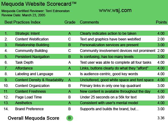
WSJ.com’s Mequoda Scorecard
1. Strategic Intent – A
You know why you read The Wall Street Journal—you want to be one of the Rulers of the Universe—or at least prevent yourself from being trampled by them. People go to WSJ.com for in depth business news and financial information. They want content, and they pay for it. Online subscriptions are $79, or $39 if you are also a print subscriber.
[text_ad]
WSJ.com does an excellent job of facilitating this transaction. Making a clear bridge from blocked content to subscribing is the key usability task for WSJ.com. As reviewed by Don Nicholas in “How WSJ.com Sells $84 Million in Subscriptions,” WSJ.com successfully sells millions of dollars in both print and online subscriptions from one website. It’s easy to see why when you browse around as a non-subscriber. I see multiple subscribe entry points on the homepage, in both the upper right quadrant and right side. The homepage scrolls down far, but with each turn of the screen there is always a subscribe pitch to click on.
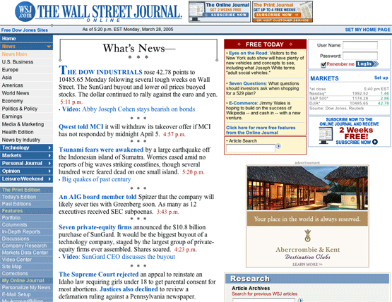
WSJ.com’s Homepage
There has been one notable change on the WSJ homepage since Don Nicholas’ article in December, 2004. Although paid online subscriptions increased by 3.3 percent in 2004, we see a tinkering with the balance between paid and free content. A new, red, “Free Today” box is prominently displayed on the unknown user homepage. Interesting to note, this box uses a color scheme similar to the competitor FT.com, which offers slightly more free content than WSJ.com.
The clearest path to subscribing happens when I click on a headline. I am given a very clear screen offering a login, and a subscription pitch. I see my price, term and even an online tour.
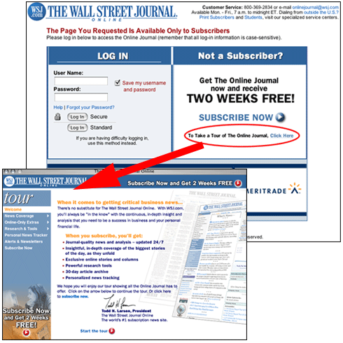
The clearest path to subscribing happens when I click on a headline. I am given a very clear screen offering a login, and a subscription pitch. I see my price, term and even an online tour.
However, as a quintessential Hybrid Model site, the paying audience isn’t the only revenue stream for WSJ.com. The second segment is made up of sponsors. Readers pay for access to content, and advertisers pay for access to readers. A beautiful world. But in terms of facilitating the completion of a purchase for the advertising segment, WSJ.com falls short. While the consumer segment is clearly directed towards subscribing, there isn’t a single link that clearly directs a potential advertiser on starting a commercial relationship. I had to go through the “Contact Us” page to find the link to “advertising.wsj.com.” That’s one level too many. WSJ.com has made a strategic decision to give the homepage to the Audience segment, and have left the Advertising segment in the cold. This is a wasted opportunity, at the very least a link clearly marked “To Advertise” should be displayed.
2. Content Webification – C
Some would argue—and these might be the younger of us—that websites are much better at organizing huge amounts of information than a pound of folded, inky, dirty cheap paper. I can use the Search function to find what I want on WSJ.com much faster than flipping through noisy newsprint. I can also scroll along the Navigation for favorite sections. I can even see the Print Edition online, for those days when my father tells me to look at an article on page B6. On all of this, WSJ.com has done an excellent job.
But nowadays, that’s just the starting line. There is much more to Content Webification to get an A in this category. Let’s look for the really innovative functionality. Oops—now we’re beginning to see the threads coming a bit undone. How has the traditional grey suit re-packaged itself to make the most of the online world? Not too well.
Take a look at the following Webification table
| Content Webification | Promotion (how easy is it to find) |
Implementation (how easy is it to use) |
| Database-driven Features | Good | Fair |
| Tools | Good | Excellent |
| Video Center | Good | Excellent |
| Audio | Fair | Poor |
| Interactive Presentations | Good | Fair |
| Web-exclusive Content | Good | Excellent |
I rated Promotion for most of the above items “Good” because most are accessible, linking from the left Navigation bar, and often presented in a box along with an article. However nothing received an Excellent, because these cool features were not well promoted. I felt much more encouraged to click on an additional article than to try an audio or video link, or to use an interactive tool. In general, while reading the WSJ online, the webification features feel like a secondary add-on.
Database Driven Features: The Wall Street Journal has a lot of data under its shirt. I had high hopes for the Market Data Center, found on the Left Navigation and included with articles. However, the destination page, the Market Data “homepage” is an unappealing laundry list of blue links. I am not given any help in determining what I can get from these links. How much data is in each page? What formats can I download data in? Which industries? How interactive are the databases? I had a dozen questions which could be answered with more attention to the copy and layout on this page.
I found the Shareholder Scoreboard where I was able to select specific data by company and industry and download it into Excel—but I couldn’t find that page when I looked a second time. (Eventually I did find it again under In-Depth Reports. Cool tool—hidden away. Tisk tisk.) The data is there, but it’s poorly presented and not interactive enough. I’ve had much more fun playing with data on competitor sites.
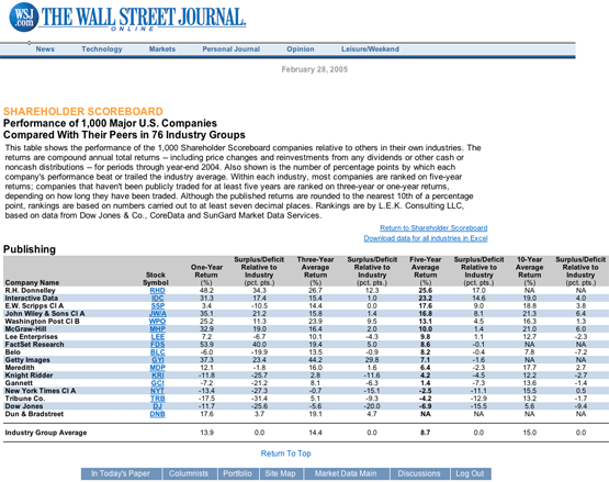
This is the Shareholder Scoreboard, where I was able to select specific data by company and industry. The data is there, but it’s poorly presented and not interactive enough.
Tools. A partnership with SmartMoney.com brings in calculators for everything from mortgages to taxes to college. Now I started having fun. But this was not well integrated with WSJ.com content. It is clearly branded SmartMoney, and doesn’t link back to any WSJ content. Why wouldn’t I just go to SmartMoney.com?
The Video Center, now we’re talking. With video clips from CNBC and Dow Jones Business video, these were high-quality video content, with the benefit of allowing me to choose what to watch and what not to, and when. Much better than the old-fashioned TV experience. I only wish there were more! Unfortunately the Audio was not as well managed, and the few clips I found were broken. It can happen to the best of us, but it isn’t going to get you any points.
In my Interactive portfolio I was surprised that I couldn’t see charts, like I can on Yahoo and many other sites that offer this functionality. I could select a wide range of data, but the way the data was displayed was a disappointment. . I appreciated the links directly to WSJ articles on my companies, and the download in other format options for PDA and Excel. But due to the lackluster presentation, I wouldn’t go to WSJ.com for my online portfolio tracking.
I’m happier with the Map of the Market, which is another import from SmartMoney.com. This interactive, clickable map uses green and red sections of a map to show gains and losses on specific stock by Industry. And again, I had trouble finding it a second time; this feature isn’t well integrated with the core of the site content.
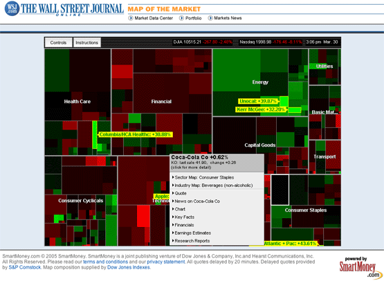
This is the Map of the Market, an import from SmartMoney.com. This interactive, clickable map uses green and red sections of a map to show gains and losses on specific stock by Industry.
After sorting through many more links, I found “Interactive Features: Analysis of News and Trends.” I thought that they might finally show me something innovative. Unfortunately not. I was given a list of links, which led to charts and graphs that looked like they were just picked up from the print edition. I couldn’t click on a map of the U.S. and see more detailed data by geographic region for example, or instantly customize a graph by date. Both activities I have done on other, truly interactive analysis sites.
Finally, WSJ.com comes back with their core competency, great content. Well marked Online Only content is of as high quality as that in the print edition. Thank goodness.
3. Relationship Building (Personalization) – B
WSJ.com builds their relationship with me through a personalized homepage, a personalized portfolio, a selection of RSS feeds and up to 30 email newsletters and alerts, along with the newly launched Latest Breaking Desktop News Alerts.
All of the above is useful, and I appreciate it. So why don’t they? None of these features are well promoted. Email sign ups are occasionally offered below the fold for a particular section, tucked under an ad, and not very noticeable or encouraging. RSS is offered in the Left Navigation but not typically within an article section. The small orange buttons work well on most other sites, as clear and helpful as a printer or email icon. WSJ has chosen not to use this standard. Personalized homepage is probably promoted the best out of this group. A link in the upper right is very visible when it appears. But it appears only occasionally and with no logical sense (at least not clearly explained to the user) about why it appears on one section and not on another, and what exactly would be added.The Latest Breaking Desktop News Alerts have just launched in March 2005. Set up like an IM on the desktop, you’ll get an instant alert for company news, or world events. A cool service that I look forward to trying. But it isn’t well promoted on the site.
I don’t think I would have known about most of these options if I didn’t look for them. And most people won’t look. The one action that prevents this section from a C, is that I have received several emails from WSJ telling me about the personalization options on the site. Email is a great promotion method, but they will have to make a stronger effort to use some good site real-estate to buoy promotion for a higher grade.
4. Community Building – C
The Mequoda criteria for Community Building ask us if we feel enthusiastic and loyal. Are we inspired with feelings of belonging and encouraged to contribute? Funny, but my answer to the above is a somewhat tentative, Yes.
It’s funny because the web tactics that should engender these feelings are below par. For example, I went to the Forums, called “Discussions,” on WSJ.com. But a discussion was exactly what I didn’t find. I read questions and votes posted by editors, and readers posted back. But unlike the best forums on the Web, there was no give-and-take between readers. Readers are coming, but not staying. Everyone posted as if talking to themselves, they don’t read or reply to each other’s posts. I’ve read more back and forth in a bathroom stall. I can’t blame this on the demographic either, as many of the topics were of general interest, and highly controversial. Other sites with a similar readership demographic have much more successful forums (MarketWatch.com for one). Not to mention that I was asked to re-register with an outside partner site to post—although it wasn’t clear if I had to or if it was optional. For me this creates a double negative—the section was unclear and un-fun.
Yes, WSJ.com has great customer loyalty, but not through any innovative or well executed Web device. Readers are loyal because the content is so good. You’re never ashamed to mention you read it in the WSJ, online or off. While this is a compliment to the quality, it doesn’t give them an A on community building. This is instead a sadly missed chance to build on a great brand.
5. Persistent Navigation – B
The left hand Navigation is a bit long, but it is clearly organized with head topics, subtopics, and section dividers. Mouseovers and colors are used appropriately. I can find what I’m looking for, both for content and administrative tasks, and I am offered options that interest me. And no matter where I am, “Article Search” and “Quotes & Research Search” are available to me right next to the Logo. Also LogOut and an Email/Print/MostPopular links have their own home on the top right.
Unfortunately there are a few trouble spots that prevent an “A” grade. Namely, the “Portfolio” section loses all the left Nav—I had to hit the Back button on my browser to return. Also Market Data section the navigation changes with no apparent reason, and besides that becomes ugly and confusing. Finally in the Quotes and Research section, which you are dropped into when you use the “Quotes & Research Search” form at the top of the page—everything turns green and the navigation changes completely. Why? These are Navigation changes with no obvious reason for the reader, and they cause confusion.
Finally in the Quotes and Research section, everything turns green and the navigation changes completely. These are Navigation changes with no obvious reason for the reader, and they cause confusion.
6. User Task Depth – A
I set myself these four tasks:
- Get more detail on a headline
- Complete a subscription purchase
- Browse for a particular company information
- Change my billing address
Getting more detail on a headline is the easiest thing to do on WSJ.com. They have organized the information hierarchy with category and subcategory. Also a lead in to an article is a clearly clickable link to the full story. They also list and link related articles next to a given article, both below the headline on the main page, and on the right side in the article page. Perfectly executed.
The four step subscription process was easy to get to and easy to follow. A lot of extra information was requested, but it was optional, therefore not preventing the privacy hawk from subscribing. The process also included opt-in for email and had a customer service number clear at the top of the page. Finally, I was given pricing options before being asked for my credit card. Again, well executed.
Since I already knew WSJ.com was great at doing content search by company name, I tried to give them something difficult. The results? Stellar. I chose a company that I new had had extensive media coverage, but had been bought in 2000 and no longer operated under the previous name. No results for the past 30 days, of course. But, here’s the good part. I was immediately offered an advanced search option. I had access to articles from as far back as 1996, for a clearly marked archive article fee. Then I click on a headline, they give the first two sentences and then ask me if I want my credit card automatically charged $2.95 to get the article immediately. Smart.
Now the fun stuff—change my billing information! Consumers know their information is stored in a database, and they want immediate, hassle free access to their information. I successfully managed my task. But the separation between the Print and Online customer service pages is not customer friendly. Most users are going to think of the two databases of information as the same, and won’t appreciate having to go to two separate places to change information.
7. Affordance – A
WSJ.com gets this one right. Links are underlined on a mouseover. The first words in a sentence are often blue and are clearly linking you to the full story. Even the advertisements are clearly—although subtly—marked. The ever present search form is clear and standard. Finally the use of icons for “email this” and “print this” follow usability standards.
In general, they do what you’d expect of a stodgy old market leader—follow the standards accurately and don’t mess around. And for good Affordance, that’s exactly what you want.
8. Labeling and Language – A
I had expected to catch them on this one, business buzzwords being ubiquitous and annoying. But they have stayed on the path, with only a few audience-appropriate section labels such as “earnings” and “commodities” within Finance. The only problem I found, is that I don’t understand how “Personal Journal” is different from the “Leisure Weekend” section. They have some of the same sub-categories such as Autos, Homes and Travel. I don’t grade them down on this because these are print brand decisions, and are necessary to maintain the product integrity across channels.
9. Content Density and Readability – A
The main center column is for reading. The text is black on white, 10 word minimum column width, with the advertisement on the right side. Colored text is used for Directory information. Font formats such as italics, all caps, grey text and varying font size are all used effectively to break up the text block, give me the information I need to immediately orient myself, and then get on with reading my content. This site is in general a pleasure to read. The one caveat is that I can’t say I’d be happy if I were an advertiser, Advertising placement options were far from optimal.
This site is in general a pleasure to read. The one caveat is that I can’t say I’d be happy if I were an advertiser, Advertising placement options were far from optimal.
10. Content Organization – B
As we’ve mentioned, WSJ is best in class at utilizing the home page quadrants for subscription marketing. After that, it’s a different story. As a paying subscriber, the only marketing message I get from them is an occasional “Email Sign up” for an individual section or columnist—always below the fold.
But more importantly, they are short shifting the Advertiser. This hybrid site, their goal is generating advertising as well as subscription revenues. At least I assume they want advertising revenue. While they do allow multimedia ads, there is only one per page above the fold, in the lower right quadrant. There are a few more advertising locations on the left and right columns below the fold. But the obvious point is made, unlike many free competitors these pages are designed for content, not marketing.
11. Content Freshness – A
WSJ.com content is continuously updated. Most articles on the front sections have the time as well as the date posted. On my RSS feed they’re a little less up-to-the-minute than Reuters, but not much.
12. Load Time – B
Using the Web Page Analyzer, we find a connection rate of 18.06 seconds for a 56K modem. That’s too high for an A, we have some room for improvement here.
13. Aesthetics – A
Ah, the aesthetics of a business journal. Black and white, shades of grey and blues that might as well be grey. There is a touch of orange for highlighting navigation and section information, and a dark red for emphasized content. In general, the quiet color scheme fits the user mental model quite well. Remember the hubbub when they started printing 4-color in the print edition? I think the current print publication might even be more colorful than the Online. It’s as if the HTML was stuck with the print world inks. For once, the advantage is going to the advertiser, as the ads are often the brightest color on the page.
14. Brand Preference – B
When you have a brand like The Wall Street Journal, you don’t mess around. I think the site is too cautious in their obvious fear of sullying the famous old name with less than Print Edition quality. They have a lot of great online-only content, but it’s treated like the ugly stepsister. Step Up WSJ.com! Be proud of your online-only content and functionality! You could be a digital age beauty! As it is, WSJ.com supports the print brand. I want to be wooed with a reason to come back to WSJ Online in particular before I give them an A on Brand Preference.
Conclusion
I wanted to give the Emperor an A. I wanted to be like the rest of the crowd and swoon over the fine fabrics and elegant tailoring of his clothes. I haven’t found a reason to claim the Emperor has no clothes, but neither can I give him praise. There are so many criteria that simply are not executed to the level we expect for a giant like the Wall Street Journal Online.
Many interactive elements have been added fairly recently, such as the Video Center. Other recent changes, such as the new addition of MarketWatch.com into the Network, give me hope for some fancy alterations. I hope to see next year’s review give WSJ.com an A.


