Instead of pulling tricks to sell magazine subscriptions, simply improve your conversion architecture in line with the user’s mental model
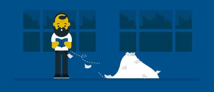
Have you ever received one of those birthday cards in the mail from one of your “funny” friends, where you open the envelope and glitter basically falls everywhere?
That’s close to how customers have always felt about magazine blow-in cards that try to sell magazine subscriptions. Maybe the cards don’t nestle themselves into the cracks of your hardwood floors to remind you forever of the hilarity, but they do fall over the floor whenever an innocent reader opens your magazine in the magazine aisle at Barnes & Noble or the end cap at the grocery store.
And it’s not usually just one blow-in card, it’s definitely five or six, and all of them ask the annoyed opener, who is scrambling to pick them up off the floor, to subscribe to your magazine.
If you’re lucky, the “subscribe now, pay later” message gets their attention, but more than likely if they’re in any public place testing you out for the first time, they’re scrambling to put your magazine back on the shelf before anything else falls out.
[text_ad]
The digital equivalent of a blow-in card online
 We think the digital equivalent of a blow-in card online is just as attention-catching, but not nearly as annoying. And we think when done right, they can be even more effective.
Instead of asking the nice people to subscribe the minute they meet you, we recommend giving away something for free, first, in exchange for their email address.
Once you meet politely through a freebie and say “hello” through your daily email newsletter, they may be more inclined to subscribe than by busting an envelope of glitter in their face upon first meeting.
Floaters, we find, are much kinder. And when publishers test them, they see a 20-50% lift in website conversions; in some cases, even more. For many Mequoda System clients, we find that more than 60% of those extra website conversions come through the floater (as opposed to the other elements we also recommend adding).
When website users are asked whether they like pop-ups, they say no. They’ll say they hate them. They’ll tell you they’re the most annoying things on the Internet. They might even tell you they never fill them out.
Well, I’ll politely call them fibbers, because every A/B test I’ve ever run and researched disagrees.
Although a floater looks like a separate document floating on top of a website page, it’s really just a layer in the HTML code. To the user, it looks a lot like a magazine blow-in card. Some more fun facts:
- Floaters are rapidly replacing pop-ups and pop-unders.
- Floaters are not affected by pop-up blockers.
- Floaters can be deployed contextually on a site-wide basis.
- Floaters can be configured to stop bothering frequent guests.
There are “paid floaters”, as in floaters that promote a paid product like the one Better Homes and Gardens’ BHG.com used to use. These are what most resemble what you think of as magazine blow-in cards.

However some publishers use them for their advertisers, also like blow-in cards can be bought by advertising partners.

But as mentioned, we prefer ones that promote free products (freemiums) so that we can build our email list and sell them the magazine in the future, once we’ve built some rapport with them.
We especially like it when they darken the background, which we refer to as the Death Star Floater.


 If you’re thinking that this is a recurring usability nightmare, don’t worry. The codes for floaters are designed to recognize users who have subscribed and spare them from having to see the floater again.
This provides all the benefits of a pop-up’s high conversion rate without the negative effects on the users’ experience with your website as you follow the rules for effective website floaters:
- Except for the home page, floaters must promote a contextual free product.
- Floaters must not appear to existing email subscribers who are already logged in.
- Floaters must take a hiatus from appearing after a reader has seen the floater X number of times and has not converted (also known as not annoying your readers).
- Floaters must be mobile-friendly so that they can be easily closed on a mobile device.
While printing blow-in cards and inserting them into print products is cheap, floaters, like their pop-up predecessors, are virtually cost-free. Like blow-ins and pop-ups, floaters can irritate users if over used or used to promote offers that seem out of context.
Why Floaters make such an impact on selling magazine subscriptions
 Unlike traditional direct mail, where the user experience is more linear, every page on your website is a potential landing page. That’s because a landing page is the first page a user sees when entering your site, and a user can enter your site and “land” almost anywhere.
The challenge is to “convert” the casual visitor; to entice them to enter into the coveted direct response transaction. This usually means offering up their email address and, in the case of paid transactions, the details of their credit card account.
The Internet is a direct response medium. Unlike print or broadcast, online marketing is a measurable medium. Whatever you prompt users to do on your website, you can quantify, whether you count page views, clicks, signups, downloads or purchases.
When designing floaters, the success of the transaction depends on:
- The user recognizing what it is that you want them to do, and
- Understanding the conversion architecture of your Floater that enables them to do it
Floaters that collect an email address or lead to a rapid conversion landing page are the best form of persistent conversion architecture because they are subtle, yet very effective ways to drive traffic to a rapid conversion landing page with the ultimate goal of increasing email database circulation so you can sell magazine subscriptions while you sleep.


