Using the right hero shot in your email newsletter can increase response rates by 20-30%
As humans, we are drawn to shiny things. You can have a 200-page book, but when you add pictures, examples and visual case studies to a page, you’re keeping the readers’ attention for longer, while they examine the image.
The same goes when you are selling a product. Someone recently asked us in our members-only Mequoda Pro Q&A forum:
“How important is it to have a product picture in your marketing emails?”
Let’s start by answering a question with a question. What if you went to Amazon.com and there were no product shots? I’ll show you exactly what would happen:
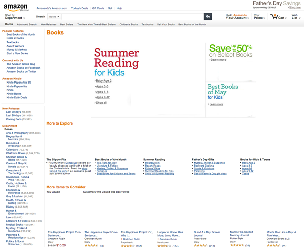
Now try adding images back in and you get a little more context.
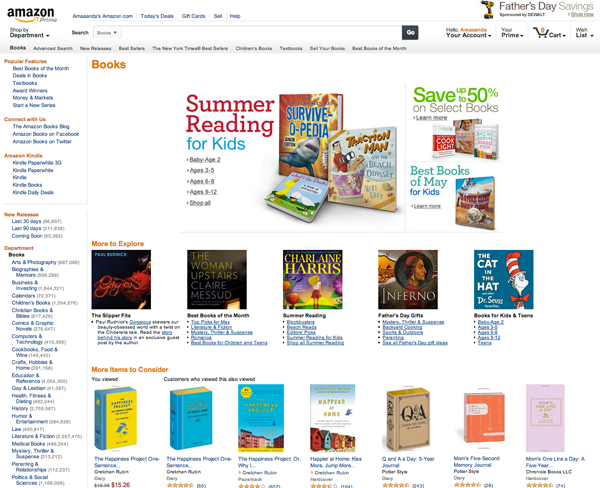
While you may be able to write some fantastic copy to sell your new handbook, product images give customers a visual description of the product you are selling.
[text_ad]
Hero shots, also known as product shots or glamour shots, contribute to the success of email newsletters, email promotions and product landing pages. Testing indicates the right graphic image can lift response by 20 to 30 percent; the wrong image can depress results by almost as much.
In tests we’ve conducted over the years, the product photo ranks third in importance, behind the headline and the nameplate, in its ability to change response rates and RPM (revenue per thousand).
Even if you’re not selling something, maybe you’re promoting an item that you’re giving away on your site to increase website traffic. Product images are standard visual aids in accomplishing both goals.
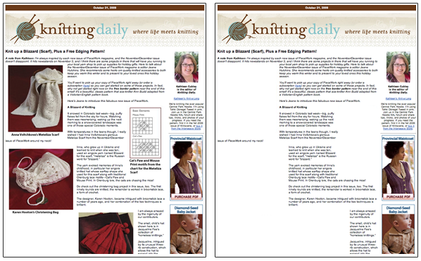
Look at these two email newsletters from Knitting Daily, promoting a knitting pattern from a new issue of PieceWork magazine.
These above hero shots give away just enough to encourage the reader to peruse the article in hopes of finding a link to the full pattern. Instead, the reader will find that it tells them to buy the latest issue of PieceWork magazine, which is the source of this new pattern.
It could have been very easy for Knitting Daily to use the wrong product shot. A more literal editor might have shown a graphic of the black and white patten, surrounded by text, which is technically what the reader is going to receive if they sign up for PieceWork magazine to get the free pattern.
Instead, they’ve shown a product shot of the end result—a beautiful scarf—which is much more enticing than showing the pattern itself.
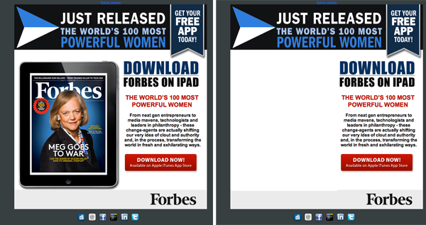
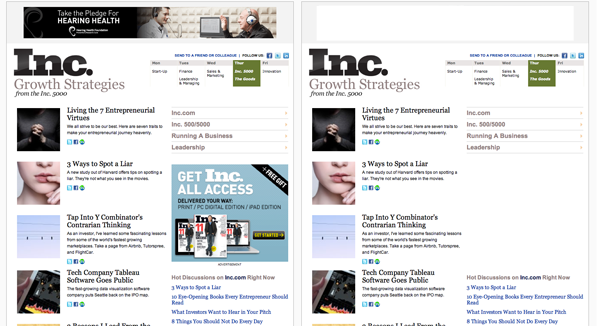
And what about these examples of publishers using hero shots (sometimes also, advertising spots):
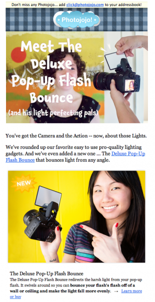
And now look at an email newsletter / advertorial from Photojojo (blog and e-retailer of photo gadgets) who practically replace copy with images. As a publisher of photography tips, projects and know-how, they understand the hero shot like no other. In fact, they use many in each email.
At Mequoda, we’re a services company, so the “product” you see is us, right up there at the top right-hand corner of the email. Then, at the bottom of the page, you see Don and an opportunity to chat with him for 30 minutes (if you haven’t taken us up on that, please do so – you won’t regret it).
How are you using product shots in your email newsletters? Are they working for you? Have you tried testing different ones and different placements? Let us know in the comments!
