How our industry is destroying magazines with poor web magazines
The magazine industry has lost their way.
It’s been a long time since the dawn of digital publishing and publishers bringing their content online, but at this point we hoped that the industry would catch on and be rigorously testing their digital products.
Unfortunately so much has stayed the same, and while many magazine publishers seem to be working towards putting together web magazines, most have failed, as we’ve explained in recent posts documenting our journey through more than 300 magazine websites and what they think are web magazines. If you haven’t already, read 5 Ways Your Web Magazine Design is Failing Your Readers.
[text_ad]
Here’s where the biggest issue lies: When you switch from print to digital, you can’t lose the core characteristics of your magazine.
When you moved from print to tablet, you didn’t lose them. The content stayed linear, a table of contents remained, and a user could complete an issue. Although we’re against PDF editions, they’re still better than most of the HTML web magazines we see out there because at the very least, they hold true to the magazine experience.
Reminder, here are the fundamental attributes of a best-practice web magazine:
- Offer scrollable HTML articles (not a PDF, although the user may also download the PDF)
- Be issue-based (so you know if you’re in the November issue or the December issue)
- Have a table of contents, preferably staying with the reader on every page of the issue OR has some other way to make clear what issue they’re in and how to easily visit other articles from the same magazine.
Ideally the magazine is designed to be responsive, so it can be viewed on any device. It doesn’t look like your print magazine, and it doesn’t look like your tablet magazine, but it contains all the same content, and in order to remain linear and digested as an “issue,” it follows the three rules above.
Out of the 300 magazine websites we’ve analyzed, we’ve only reached about 20 so far that follow the rules, and it includes The Atlantic, TIME and Harvard Business Review, so no small beans. But it leaves out so many more.
So, are you following the rules, or are you changing the fundamental characteristics of a magazine when you bring it online into a web edition?
When you take something that’s hundreds of years old and try to adapt it to a new medium one of two things tend to happen:
- You try to do it so exactly that you actually lose any benefits that the new medium has to offer (example: tablet magazines that are simply PDFs)
- You adapt it so closely to the new medium, that you lose the characteristics that make it unique (example: most of the web magazines we see that look just like the rest of their websites)
Do you have a web magazine, or a portal?
If your subscriber was to look at your web magazine, would they know the difference between premium magazine content and the articles they read for free on your main Portal?
In our analysis of over 300 magazine websites, the answer is usually “no.”
By melding your premium content into the same structure as your free content, or worse, giving it away for free side by side with it, you’re devaluing your magazine in a big way. And meanwhile, you’re losing the fundamental relationship between the subscriber and the magazine where it arrives each month, and they can finish it like a movie or a book.
If you keep treating your magazine content the same way you treat your free news and Portal content, one day you’ll wake up and no longer be a magazine publisher, you’ll just be a Portal publisher.
Are your digital strategies dooming your magazine?
If you’re taking magazine and putting it on the web like a free Portal, you’re destroying the integrity of your magazine, and the whole magazine industry. You’ve cut yourself off from the ability to charge for premium content based on the magazine experience of being periodic, linear and curated content.
Websites are not linear or periodic in the way a magazine is, which means a web magazine, which your subscribers should be paying for, can’t act the same way the rest of your website acts.
If you need examples of how a web magazine should look, take a look at three very different examples, The Atlantic, TIME and Harvard Business Review.
The Atlantic’s Web Magazine
The Atlantic is able to keep their magazine organized, periodic and linear with a table of contents. Each issue is dated by month, and starts with a table of contents. Although they’re not charging for their web magazine, at least they’re getting their ad dollars. The Atlantic famously counter-attacked ad-blockers by displaying a message to users that gave them an ultimatum: whitelist The Atlantic, or pay for an ad-free subscription.
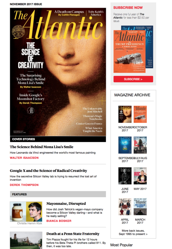
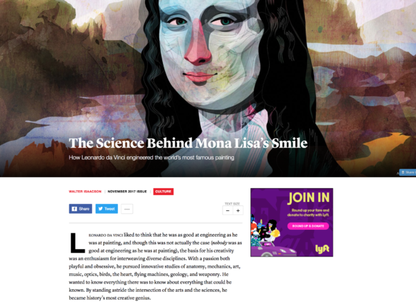
While we prefer each article in an issue keeps the TOC on the side of the issue, The Atlantic has a spot at the top of every article that says what issue it comes from, which links back to that month’s table of contents.
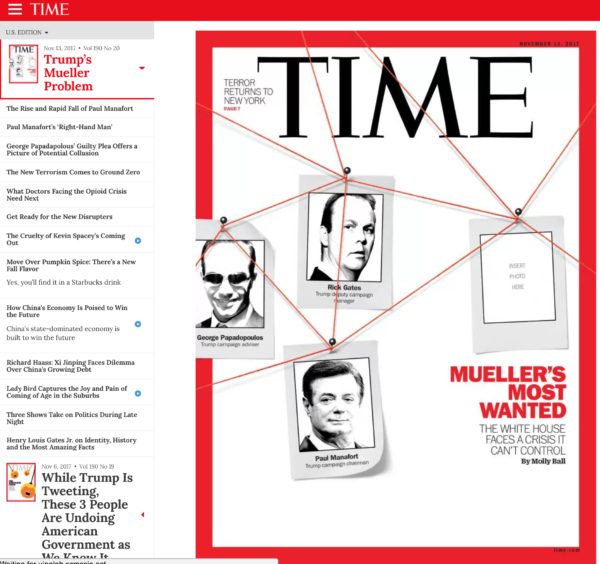
TIME’s Web Magazine
This isn’t the first and won’t be the last time we use TIME as a best practice web magazine example, but they do a heck of a job. The cover is to the right, and the TOC is to the left. When you click on an article, it displays to the right and can be scrolled, while the TOC on the left remains. While they currently allow people to view the content for free, this is something they seem to be switching back and forth between every month, going from a total paywall on the content, to free, to only free sponsored posts. They’ve come this far, and we’re all for testing, so they get a pass for now.
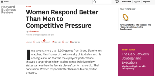
Harvard Business Review’s Web Magazine
A nice hybrid of the two above is Harvard Business Review. HBR has never been shy about monetizing content and has always maintained a good paywall. Their web magazine is no exception. Like the rest of their site, they allow users to read three free articles before they’re prompted to subscribe, and that is made clear on the bottom of the page when you visit on the table of contents of an issue.
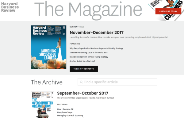
In an article from the magazine, HBR notes the issue month at the top of the article, and then again at the bottom with a clickable link back to the table of contents.
Is there a better example of a web magazine?
While these are all great examples of major brands creating web magazines, they don’t come without their flaws. For example, we don’t think simply citing and linking to the TOC of your issue is really the most effective way to offer readers a linear experience. Subscribers want to “complete” an issue, and the best way to do that is to offer them a consistent TOC as part of the navigation on each issue article, like our client Yankee magazine does below:
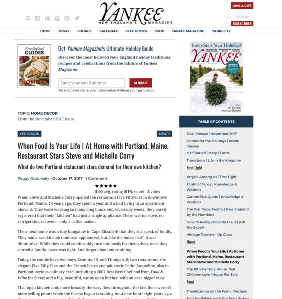
There is no question here for the subscriber what issue they’re in, and where in the issue they are. They only need to look at the table of contents on the right-hand side of each article that highlights the article they’re in, and shows them the rest of the articles in an issue.
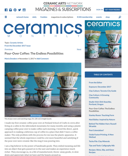
Another client, Ceramics Monthly, does an excellent job of keeping the traditional magazine user experience in tact while offering the benefits of digital issues.
Even though our big-brand examples above are doing a good job, I think you’ll see a stark difference between them and these niche players below who are clearly offering subscribers the best magazine user experience.
Would you like to build a web magazine that follows our best practices and that can provide you with a new source of magazine income? Schedule a time with me to talk more about your publishing business.


