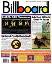
 Billboard‘s new look is leading the multiplatform pack, according to Folio:.
Gone is the practical newspaperlike cover, jam-packed with ink and charts. In its place is a sleek, stylized art portrait of a given performer and a vertical flag lining the left front in a bold new font. The redesign, while bearing more of a resemblance to your standard glossy, really sets itself apart with placement, type treatment, and image quality. It’s also versatile, conducive to any platform that Billboard might branch out to.
[text_ad]
“The logo frames the cover like a poster; it’s an acknowledgement that for a magazine like Billboard, the image on the cover is most important – especially as it travels across multiple platforms,” Robert Newman writes. “The concept of newsstand sales as the driver for the cover design is no longer valid; the most effective covers work as images on Twitter, iPads, Facebook, etc. And the new Billboard logo, its very modern and distinctive design along with its photography are perfectly suited for this new cover paradigm.”
To read more about Billboard’s redesign, visit Folio:.


