TimesSelect generated more than a half million new subscribers in its first 12 months
After previously having offered access to its archived content for free, and charging only for access to its celebrated, syndicated columnists, a new revenue model has emerged at the New York Times.
The Times now offers three levels of information. At the lowest level, most of the current day’s news is available without charge to all The New York Times website visitors.
However, many features of the newspaper—editorials and columnists, magazine features, wine and dining, the science section—are accessible online only to registered users—the second level.
Premium access, which the site now calls “TimesSelect,” is the third level. It provides users with news and information that isn’t available anywhere else online—Op-Ed and select news columnists; sports scores and statistics; market news and custom stock portfolios; etc.
Today, we offer excerpts of our review of the access challenge landing page that the Times website dishes up to non-subscribers of TimesSelect.
An access challenge landing page is the page that users encounter when trying to access premium (members-only) content from a site at which they are not members, or for which they are not signed-in.
The primary goal of this well executed access challenge page is to convert an unregistered user into a trial subscriber to TimesSelect.
[text_ad]
1. Headline (Strategic Intent) – A – Establishes the need to buy the service
The first thing we see upon arrival at this landing page is the headline of the story we are trying to access. It’s important to tell the user that she has found the content for which she was searching. It’s equally important to have a second headline that makes it clear that the user does not have full access to the article. This landing page does both well.
Additionally, the page displays a brief abstract of the article the user was seeking. Wisely, it also displays the phrase “DISPLAYING ABSTRACT,” both to attract attention and to make it clear that the user is not seeing the full article.
Our research shows that when confronted with premium content for which they must pay, users will lose interest and dismiss the site quickly if they can’t immediately discover the price and how to ante up.
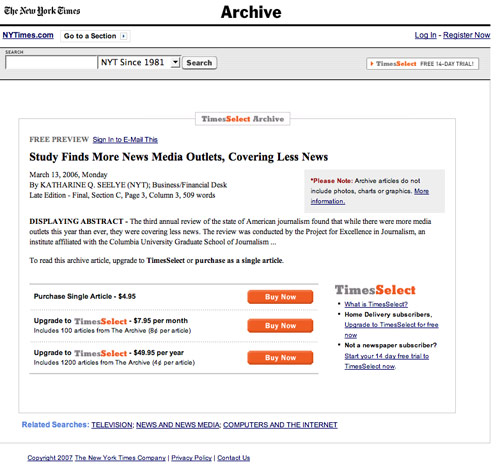
The design and architecture of this access challenge
landing page appear to be working well for the Times.
4. Email Capture (Relationship Building) – D – Poor execution
 TimesSelect offers a free 14-day trial, but users must first provide their credit card information. Additionally, TimesSelect offers the user an online opportunity to email the free article preview to a friend.
This option requires the user to register, which captures her email address. But the user must first agree to the 2,500-word New York Times Member Agreement. By doing so, the user agrees to many terms and conditions, including that the Times may “allow certain third party vendors to provide you with information about products and services.”
Registration for free online access to the New York Times enables the user to subscribe to any of eight free email newsletters.
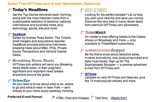
The Mequoda best practice here would be to display an offer for the free email newsletters more prominently, then, after capturing the user’s email address, offer him an upgrade to the paid TimesSelect trial.
There is a “Register Now” hypertext link at the top right of this access challenge landing page that eventually offers the free email newsletters. It should be much more prominent, and the offer should be much more clear. The link should probably be another orange button that says “Sign up for free email newsletters” or “Free online access to the New York Times.”
12. Order Options – B – No offline support provided
The TimesSelect “start free trial” order flow process is well engineered.
Inasmuch as this is an online product, the user is limited to ordering online, with no phone, fax, or other order options offered.
If we were ordering a physical product, such as home delivery of the The New York Times,, we would expect a toll-free phone number and a postal address. But for TimesSelect, the limited order options are mitigated by the limited delivery options.
However, a toll-free customer support phone number would be welcomed by users who have questions or problems with completing the sign-up procedure.
The user has no choice but to figure out the ordering procedure for himself. If he hits a brick wall of confusion, is unable to move ahead, or has a question, there are no “offline” remedies offered here. However, there is an online “Contact Us” link.
Our research shows that displaying a toll-free phone number increases conversion rates. Even when users don’t call, displaying the customer support number adds credibility to the online offer.
In focus groups, some users indicated they would write down the toll-free phone number in the event that they had questions later. The presence of a familiar contact channel for support simply made them more comfortable and encouraged them to complete the transaction.
Conclusion
Mequoda Contributing Editor Jane Zarem says, “TimesSelect has contributed $6 million in additional revenue since January 2006.”
That’s sound evidence that this access challenge landing page is working as intended. With a little tweaking, it might perform even better.


