
Usability and design are two key factors in publishing great websites. You may have a clear strategy and great content, but if your site is unusable and unattractive, it will be difficult for users to find what they’re looking for, difficult for you to get users to do what you want them to do and difficult to get users to become loyal customers and revisit again and again.
Creating user-friendly websites begins by following the 14 Mequoda Website Design Guidelines for successful website design. By reviewing a site’s score for each of the 14 items, along with the overall average score, the areas of the site that operate well, and those that need work, become evident.
Organization
Every part of the page—particularly the homepage—must be utilized to facilitate the strategic objectives of the site. Using marketing quadrants to build relationships and communities among users, or to generate brand-related revenue is the sign of a well-designed site. The site’s primary objectives—site navigation, internal and sponsor-driven advertising, and, of course, content—should be appropriated effectively to the four quadrants. Don’t waste any of the valuable real estate that a page provides with blank space.
[text_ad]
The primary links in all four quadrants should be easy to find, easy to understand and draw in the visitor. Actual eye-tracking tests have revealed that people use a “Z”-shaped scanning pattern when scouring webpages for information.
- The upper left quadrant of each page should consistently display the primary navigation links, with secondary links in a horizontal navigation bar repeated across the top of every page.
- The upper right quadrant should be used for logging in, printing or emailing an article, and registering or signing up for a newsletter. Newsletter signup on the homepage is a critical task for business needs in order to gain permission to contact the visitor again.
- The lower left quadrant can include additional site navigation, content links and sponsor ads.
- The lower right quadrant is appropriate for personalized content, as well as internal or sponsor ads.
- The most viewed area of any page is dead center. That is the place to put your most important message.
Prioritize the tasks that each page is required to fulfill for both visitor and business needs, but keep the strategic tasks for the site—including revenue-producing ads—in the top two quadrants. Moreover, it is essential to keep critical marketing information and contextual navigation “above the fold.” Users are less likely to scroll down the homepage than they are to move to pages that are several levels into the site.
No matter where on the page the eye wanders, though, it should land upon an action to take that will benefit the user—and also lead to revenues for the company.

Website Examples
Best Practice Websites

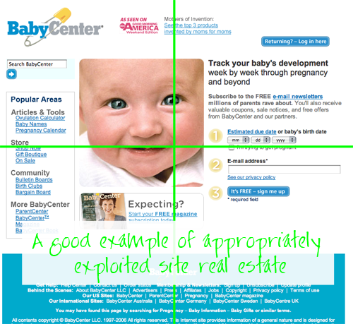
BabyCenter.com Website Design Review
Every quadrant is utilized to facilitate strategic objectives of the site—with site navigation for usability, advertising both internal and sponsor driven, and content presented in every quadrant. The BabyCenter homepage presents us with a good example of appropriately exploited site real estate.

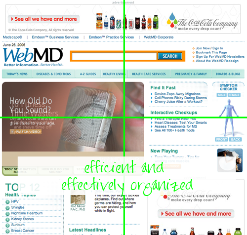
WebMD.com Website Design Review
WebMD has efficient, and effectively organized, pages. The primary links in all four quadrants were easy to find, easy to understand, and even drew me in. In addition, the tasks each page is required to fulfill for both visitor and business needs are prioritized well. In the basic WebMD Health template we see the primary user task—reading content—in the middle. The primary site tasks, such as printing/emailing an article, and signing in/up, are found in the upper right quadrant. Finally revenue-earning space is placed across the top quadrants, and across the right side quadrant for image ads and text ad space in the upper right.
Not-So-Good Example

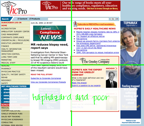
HCPro.com Website Design Review
The organization of these pages is so haphazard and poor that I could find little on which to award points. I get the feeling that there is a lot of information here but the organizing principle eludes me. When one clicks on one of the items in the “Information Center” the same information comes up… rearranged. To what purpose is anyone’s guess.

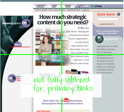
MeansBusiness.com Website Design Review
Marketing Quadrants were not fully utilized for primary tasks. Minuses include: the barren lower right quadrant, occasionally well utilized with a clickable book image but for the most part wasted space throughout the site, and on the homepage the newsletter sign up link falls below the fold. Putting a graphically confusing newsletter sign up where no one will see it is simply counterproductive.

