The redesign of this publisher’s landing page fails to address some website usability issues
Note: This is a mini-review. The full review can be found at the Mequoda Daily archive.
The Internet is a constantly evolving medium. Websites get redesigned, either owing to new graphics, new content, or because the essential architecture is inadequate to serve the site visitors.
If the human factors haven’t been properly addressed — if visitors can’t easily find what they’re looking for or can’t order your product easily — you’ve got insurmountable problems that mandate you to re-engineer your website. The issue here is website usability.
In the time since we first published a review of the landing page for Andrew Harper’s Hideaway Report, some elements have been redesigned, but some have only gotten worse.
Subscribers are now members
Subscribers to Andrew Harper’s Hideaway Report are now called members. This is a change that we recommended previously. The publisher now offers two levels of membership.
[text_ad]
All memberships include the exclusive Q Club, which entitles members to receive complimentary upgrades, plus special privileges and rates at more than 350 preferred hotels and travel partners.
“Q Club’s veteran travel planning experts, trained by Andrew Harper himself,” says the site, “are available to arrange everything from custom golf and fly-fishing excursions, African safaris, exotic tours, romantic rail journeys or getaways to our world-class villas or luxury yachts.”
This is not merely an upscale travel newsletter anymore.
Here’s an excerpt from our review of the new landing page for Andrew Harper’s Hideaway Report.
1. Headline (Strategic Intent) – C – Still not compelling
The name of your publication and its slogan or its unique selling proposition are important, but displayed together they generally don’t constitute a headline.
This landing page needs a headline that proclaims a big promise, makes an offer, establishes a need to buy the product or otherwise engages the casual visitor. Sadly, it does not.
2. Story & Content – B – Present but not obvious
In this busy multimedia world, inhabited by web surfers with short attention spans, your website’s primary landing page needs both an enticing headline (see #1 above) and an engaging story.
The Andrew Harper’s Hideaway Report publisher has a terrific story to tell, but he posts many of the intriguing details (“Who is Andrew Harper? It’s a mystery — for a reason!”) on the website under the About Us tab.
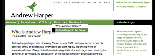
So yes, there is a short story on the site’s landing page, but the better, more fascinating story is a click away. Alas, some site visitors will never click to the About Us page and will miss it. It would be more effective to position that information on the sales letter landing page.
4. Email Capture (Relationship Building) – A – Sample issue offered
This landing page offers a free downloadable sample issue of Andrew Harper’s Hideaway Report in PDF format, in exchange for an email address. The site does not specifically ask for permission to contact the user, but we can reasonably assume that they eventually will do so. However, no immediate (autoresponder) email message is sent.
6. Links to Order Flow – F – No button present
A properly constructed sales letter landing page includes a well-designed order button. There is none in evidence here, nor is there a clearly labeled hypertext link to the beginning of the order flow.
However, if the user clicks on the “read more” link at the end of a teaser or snippet, she is transported to an access challenge landing page. There members are instructed to log in using still another link — they can’t do it from the page itself.
Non-members are offered a “click here to subscribe on-line” link that takes them to an order flow sequence.
Nothing here makes things easy for the user. This website architecture is cumbersome at best and ineffective at worst. Again, the issue here is website usability.
7. Labeling and Language – D – Overall ineffective
The architecture of this site is dismal because of how difficult it makes the process of joining. At least the very brief sales letter uses clear language and good grammar. But that is small consolation when everything else is so obfuscated.
12. Order Options – B – Most elements present
The order flow includes a toll-free option, fax number, email support and a Contact Us form. As many of the well-heeled target market for the Andrew Harper’s Hideaway Report might be older, less Internet-savvy consumers, we would advise adding a more obvious invitation to have the user call the toll-free number, especially for such a big-ticket item. This invitation should be prominently displayed on the landing page, not merely introduced later in the order flow.
Conclusion
Perhaps most of the members of Andrew Harper’s Hideaway Report join or renew by responding to a direct (postal) mail offer. We can’t imagine the publisher getting a lot of new members as a result of this website or its sales letter landing page.
Sure, it’s attractive. But what’s the value of being attractive if the visitor finds if difficult to purchase the products for sale here?
If you don’t make it easy for your customers to order, it’s as if you had a brick and mortar store with no checkout line and no cash register. You’re not really in business, you’re merely displaying your products.
So, while we applaud the publisher of Andrew Harper’s Hideaway Report for his willingness to try again, the new website design and landing page seem woefully ineffective for enrolling new members.


