Tips and tricks for increasing click-through rate on Google Adsense
One of Google’s corporate missions is to promote the creation of original content on the Internet, so finding a revenue model for quality content was a completely aligned goal. In June 2003, Google launched its AdSense program, through which a network of online publishers makes money directly off their content.
 Using its proprietary software, Google automatically matches advertiser-supplied text ads to the publisher’s page content and instantaneously places relevant ads on the page. It’s easy. It’s risk-free. And everyone benefits—more or less.
So, if you’re already using Google AdSense, you may or may not be seeing a substantial revenue stream coming from this source. Generally, the more pages your site offers, the higher return rate you will see. However, there are many publishers out there with thousands of pages that are still wondering “why not me” and “what am I doing wrong”?
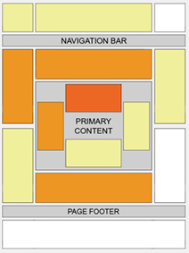
According to Google, certain locations tend to be more successful than others. This “heat map” illustrates the ideal placing on a sample page layout. The colors fade from dark orange (strongest performance) to light yellow (weakest performance). All other things being equal, ads located above the fold tend to perform better than those below the fold. Ads placed near rich content and navigational aids usually do well because users are focused on those areas of a page.
[text_ad]
Here are a few quick pointers to increase Google AdSense click-through rate:
- Place ads above the fold. This one should be obvious, but we’re still seeing publishers dropping most of their ads to the bottom of the page.
- Use text ads. Image ads might be eye-catching, but they’re also distracting and many users have contracted what we call “banner blindness”. Text ads blend in and have a much higher CTR.
- Choose colors that match your site. Your ads should blend in with the theme of your site, not stick out like a sore thumb and yell “I’M A GOOGLE AD!”
- Opt for white space. Make sure your ads stand out by surrounding your ads with a little white space as opposed to keeping them tightly cluttered with content.
- For short articles: place ads at the beginning and end of articles. Don’t ruin your content by placing it in the middle of a few short paragraphs.
- For longer articles: place your ads at the beginning, middle, and end. As sneaky as it seems, users are much likely to click on a text ad when they think it’s part of the content.
- Don’t go overboard. Placing more than 3 ad units and 3 ad links or 2 AdSense search boxes on one page will cause them not to show up. Google has set a limit and you should stick to it. Not only because rebelling against Google generally means losing your account, but because you’ll have some ghastly white boxes everywhere there’s an extra ad.
- Go wide! When it comes to Google Adsense, wider almost always outperforms thinner ads. If you’re looking at a skyscraper ad, always pick the “wide skyscraper” sized 160×600 over the lesser performing 120×600. Many sites claim that 300×250 are their best performing ads.
Implementing Google AdSense is extremely straightforward, but it’s no doubt that many folks get lost in the hype. Try out these Google AdSense design tips and feel free to let us know how they worked for you.


I?ll immediately snatch your rss feed as I can not find your email subscription hyperlink or e-newsletter service. Do you have any? Please let me realize so that I could subscribe. Thanks.