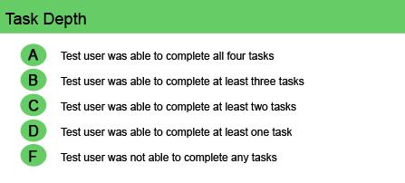
User Task Depth is a Critical Step that a Website Owner Must Succeed In—If a User Can’t Accomplish a Simple Task on Your Website, the Frustrated User Will Give Up and the Sale is Lost.
A user commonly will want to complete just five or six tasks on a website and those tasks account for 80 percent of online activity. Browsing and searching are common to all types of websites, but other tasks—finding an article, signing up for a email newsletter, buying a product, checking on an order, changing a profile, submitting information… whatever—are different for the various website archetypes.
Mequoda researchers have found that users often will complete a task in an unanticipated way. And when that happens, it’s good. It means that the global architecture of the site provides multiple paths to the finish line.
Creating user-friendly websites begins by following the 14 Mequoda Website Design Guidelines for successful website design. By reviewing a site’s score for each of the 14 items, along with the overall average score, the areas of the site that operate well, and those that need work, become evident.
User Task Depth
The primary requirement for a site owner is to understand the site’s overall goal, the important tasks the user expects to complete on the site, and the ease and urgency with which that can be accomplished satisfactorily. Most users are not going to just browse around a site—they want to get in, do what they need to do and get out.
[text_ad]
A user commonly will want to complete just five or six tasks on a website and those tasks account for 80 percent of online activity. Browsing and searching are common to all types of websites, but other tasks—finding an article, signing up for a email newsletter, buying a product, checking on an order, changing a profile, submitting information… whatever—are different for the various website archetypes. For example:
- Content sites—the top task is to get more detail on a news headline.
- Commerce sites—the user is most often trying to complete a purchase.
- Retail websites—users are increasingly seeking to take care of customer service tasks at the website, such as canceling or returning an order or reporting a problem with delivery.
Mequoda researchers have found that users often will complete a task in an unanticipated way. And when that happens, it’s good. It means that the global architecture of the site provides multiple paths to the finish line.
To succeed in user task depth, a website should encourage—and make it easy to take—next steps, such as previewing articles or requesting specific information and then subscribing to paid content or making a purchase. This type of “marketing funnel” allows visitors to build a gradual relationship with the firm before making a commitment and parting with personal information and ultimately, money.
One click on a highly visible link or shortcut should take the user directly to the location where the next steps can be accomplished—order now, shopping cart, checkout, customer service, member login, my account, etc.—and then back to the previous page, particularly if the click is to an offsite location. Links to free information should also be well organized and clear. And when registration is required for access, the process should be uncomplicated and quick, with immediate email confirmation of the user name and password so the person can immediately get to the task at hand. Users should be able to manage their offline accounts, as well as their online accounts, in a single online location. And websites should always remember user preferences.
Finally, don’t disguise or hide pricing information. If pricing depends on a lot of variables, give the customer a few samples to illustrate the pricing methodology. Customers definitely don’t like surprises that affect their wallets.
Website Examples
Best Practice Websites

DeniseAustin.com Website Design Review
There is never a problem in completing questionnaires or going through the steps to get to the offer or content you seek.
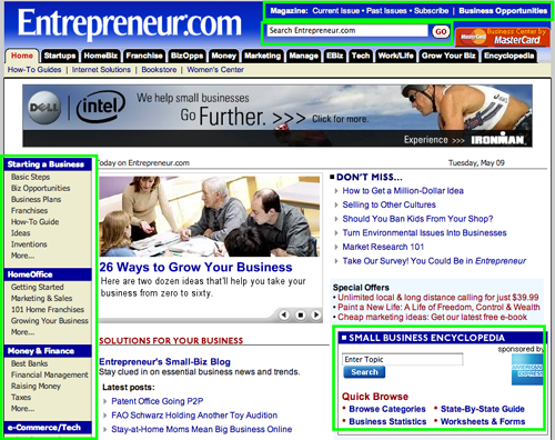
Entrepreneur.com Website Design Review
No problems were encountered when obtaining information, subscribing to the newsletter, locating content or subscribing to, or updating, a subscription to the print version of Entrepreneur Magazine.
Not-So-Good Example
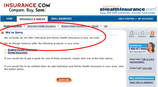
Insurance.com Website Design Review
The Term Life Insurance quotation calculator was impossible to complete. A pop-up kept asking me to enter family history information, although there was no place to provide this data. This is annoying and self-defeating. I imagine most users would give up and call the toll-free phone number at this point, or abandon the site altogether. A major, fatal design flaw! None of Insurance.com’s companies are currently writing health insurance in Massachusetts. Does this count as completing the task? Could an agency that owns the URL Insurance.com represent with some additional companies? Or are there absolutely no companies writing new health insurance policies for individuals residing in the Bay State?


