Usability and design are two key factors in publishing great websites. You may have a clear strategy and great content, but if your site is unusable and unattractive, it will be difficult for users to find what they’re looking for, difficult for you to get users to do what you want them to do and difficult to get users to become loyal customers and revisit again and again.
Creating user-friendly websites begins by following the 14 Mequoda Website Design Guidelines for successful website design. By reviewing a site’s score for each of the 14 items, along with the overall average score, the areas of the site that operate well, and those that need work, become evident.
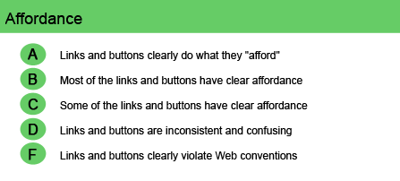
Affordance
Affordance is a term that simply means that something does what it looks like it will do, or behaves in the way that you think it should behave. If you see a round doorknob, for example, you expect it to turn. For websites, good affordance means having clear, intuitive and logical navigation with no confusing or misleading links. It requires something that looks like a link to link to something; conversely, things that are not linked should not look as if they are.
Site designers who are more interested in the “look” of a site than its functionality often make two huge mistakes.
- They turn off or hide the underlining of hypertext links, removing the visual cue to the user that the links even exist; and
- They create images for section headings that look like buttons but, in fact, don’t execute an action.
If the user is expected to execute an action, use a button with a clear, unambiguous label, placed in a logical location for the desired outcome. Text links should be underlined and change in appearance once the user has visited that page. Many times, site pages or search results display so much information that it’s difficult for the user to keep track of the pages already visited or articles already read.
A website publisher should also consider how people react to colors. Human beings associate the color red with “stop” or “danger”—but they will see something yellow before noticing the same thing in any other color. What color do you think your navigational buttons should be, then, if you expect the user to proceed on your website?
Once users become familiar with a few websites, they have a mental model of how a website should work. When they learn how to search at Google, for example, they think that’s the way search should work. Or when they learn how a product page works at Amazon, they think that’s how a catalog page should work. You can either fight the convention or go with it. But unless your site is big enough or strong enough to change a user’s mental model, you should ensure that the links and buttons on your site include good affordance.
Perhaps perversely, the sign of a good interface may very well be LESS time spent on the high-level pages of a website and more time spent several levels down. What’s important to the user, after all, is to get in, get the desired information and get out. Good affordance will dramatically improve the usability of your website and your user’s experience with your brand.
Website Examples
Best Practice Websites
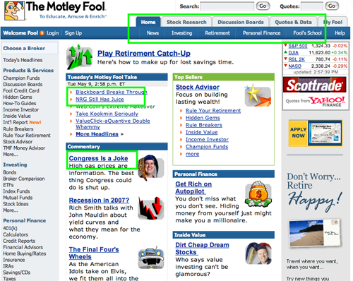
Fool.com Website Design Review
While the Motley Fool site is packed with content, the user is never confused about navigating the site. All links are text links. The site makes exclusive use of the standard blue underlined link labels. The site follows the absolute dictum—never make it the user’s problem. The visitor is never put in the position of having to guess where to go next or how to get there.
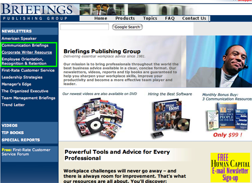
Briefings.com Website Design Review
With the exception of the Douglas Publishing site’s occasional appearance, the Briefings.com site held few surprises.
Not-So-Good Example
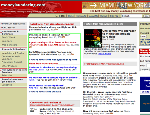
Moneylaundering.com Website Design Review
This site suffers from inconsistent identification of hypertext links. Especially egregious is the inconsistent use of underscoring for links. Additionally, the links do not change color after having been visited. The designer has made the links change color when moused over, but the color is the same red that is used for other text on the site—not a good choice.


