Integrity and professionalism abound on the Briefings Publishing Group’s website, but their “all business” approach may be responsible for letting a lot of potential business remain unsold. It seems Briefings.com’s future may be based on satisfied readers, not website “sell.”
Briefings.com, the website for the Briefings Publishing Group, is more similar to a print document than a contemporary Mequoda-type website. It’s more an order form for people pre-sold on the company’s wares, than it is an introduction to first-time visitors. If you know what you want, the site can competently sell it to you.
But, as a publisher’s website in the contemporary, and highly competitive, “communications, marketing, and customer satisfaction” arena, the site’s “all business” approach may be responsible for letting a lot of potential business remain unsold. In researching how well the site reflected the editorial integrity and professionalism to be found in Briefing’s numerous publications, we found that integrity and professionalism were there, but very little by way of introduction to the firm’s numerous other newsletters, audio cassettes, audio teleconferences, and video recordings.
- If you want to subscribe to one of the Briefings Publishing Group’s publications or you want to attend one of their audio conferences, the site works well
- Instead of offering a few pages of a sample newsletter–with an option of downloading the full newsletter in exchange for submitting your e-mail address and permission to receive future emails—the site makes no attempt to capture the visitor’s email address
- The sample newsletters are not actual issues, they’re specially compiled issues, detracting from their credibility and timeliness
- It’s a “safe” site, it’s an appropriately “concise” site, but it’s just not a “highly motivated” site
Introduction
I had long looked forward to preparing a website design review for the Briefings Publishing Group, publisher of the numerous Briefings newsletters.
Long before Frank Grazian, one of Communication Briefing’s founders and early editors, took my book, Roger C. Parker’s One-Minute Designer under his wing and wrote the cover blurb, I’ve been an enthusiastic reader. I looked forward to seeing how well the site reflected the editorial integrity and professionalism to be found in Briefing’s numerous publications.
[text_ad]
Integrity and professionalism were there, but very little by way of introduction to the firm’s numerous other newsletters, audio cassettes, audio teleconferences and video recordings.
The site is more similar to a print document than a contemporary Mequoda-type website. It’s more an order form for people pre-sold on the company’s wares, than it is an introduction to first-time visitors. If you know what you want, the site can competently sell it to you. But, as a publisher’s website in the contemporary, and highly competitive, “communications, marketing, and customer satisfaction” arena, the site’s “all business” approach may be responsible for letting a lot of potential business remain unsold.
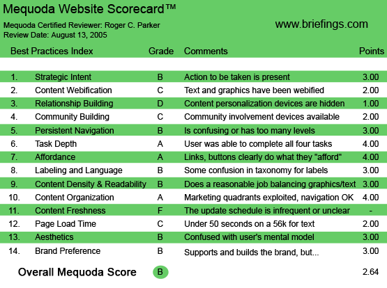
Briefings.com’s Mequoda Scorecard
[text_ad]
1. Strategic Intent – B
If, by “action,” you want to subscribe to one of the Briefings Publishing Group’s publications, like newsletters, tip books, audios and videos, or you want to attend one of their audio conferences, the site works well. However, you have to be self-motivated and ready to buy: the site doesn’t create its own market.
The firm’s mission statement appears in the tiniest of type on the homepage: “Our mission is to bring professionals throughout the world the best business advice available in a clear, concise format. Our newsletters, videos, reports and tip books are guaranteed to help you sharpen your workplace skills, improve your productivity and become a more effective team player and leader.”
From there, you’re on your own. Except for the properly placed left-hand navigation to the firm’s newsletters, and horizontal links to various product categories, there’s no “guide” or “sequence” to the site.
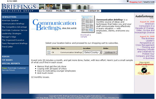
It’s nice to be concise and precise and all, but sometimes conciseness and preciseness takes the passion and the personality out of a brand… undermining the passion and personality available from the firm’s individual products. The Communications Briefings newsletter is a national treasure, for example, but it receives only the briefest of descriptions!
The Communications Briefings newsletter is a national treasure, but it receives only the briefest of descriptions!
2. Webification – C
No attempt has been made to portray the Briefings Publishing Group as a web-savvy publisher. Although the firm sells numerous audio and video programs, and offers audio teleconferences, there are no audio or video previews available on the site.
Nor are there audio recordings of testimonials from readers or attendees, etc.
Products are sold with brief, bulleted lists of content, but there is nothing to see or hear.
The only “technology” available on the site is the ability to download Adobe Acrobat PDF samples of each of their newsletters.
3. Relationship Building – D
Briefings.com does not take advantage of a visit to begin a relationship with the visitor. The site exists to sell a newsletter subscription, book, special report, audio or video if you’re ready to buy, but there is no attempt to begin a relationship with you—unless you’re ready to buy right now.
So, if you’re “just looking,” and choose not to buy, there is no way for Briefings to follow-up with you via newsletter, email or any other way. There’s no “marketing funnel,” in other words. There’s no incentive for visitors to take halting, little steps—which can escalate to a lasting relationship based on large, multi-product purchases down the road.
Instead of offering a few pages of a sample newsletter—with an option of downloading the full newsletter in exchange for submitting your email address and permission to receive future emails—the site makes no attempt to capture the visitor’s email attempt.
The primary personalization device is a fascinating one: a link to Alta Vista’s Babel Fish real-time translation feature. This fascinating link allows you to read translations of the site in several other languages. Again, the option is free, with no requirement to register.
Likewise, the site does not offer any “save this idea” feature. The only pages offering a “share this page with a friend” feature are pages describing the firm’s audio conferences. There are no “share this page” links with newsletters, tip books, videos, etc.
It’s true that Briefings.com offers a free weekly newsletter to those who subscribe to the site’s First Rate Customer Service forum, but the free newsletter is not promoted except as a secondary benefit of joining the Customer Service forum. In other words, unless you want to join a customer service forum—which might not interest you if customer service is not a priority to you—you won’t know about the free email newsletter!
4. Community Building – C
Change may be in the wind, however, as the Briefings.com website features their First Rate Customer Service Forum, a question-and-answer service associated with their weekly email newsletter.
Hopefully, there will soon be other forums in the many areas of Briefings.com’s competence. Until then, however, those interested in other fields are not being served.
The many directory-style resources found on other sites, i.e. links to vendors, members, etc., are not found here. This is an “all business” site!
5. Persistent Navigation – B
For the most part, the site works in a very straightforward method. I experienced only two problems.
First, if you click on “facilities management,” from the “Topics” at the top of the page, suddenly a new window opens and you’re at a new website, the site of Douglas Publications. This happens without warning or explanation—suddenly you’re somewhere else.
This might be OK, if Douglas Publications was introduced as one of Briefings Publishing Group’s “strategic partners,” but it is a bit disconcerting when it happens without explanation. Several other topics do the same thing.
Second, although I had visited a page containing biographies of the firm’s partners, when I returned to this site later that today, I couldn’t locate the page. Obviously, part of this may be my problem, but this shouldn’t happen: where’s the “about us” link?
6. Task Depth – B
Notwithstanding the above point, I was able to easily locate and download samples of the firm’s newsletters and the shopping cart seemed to operate very smoothly. A small icon at the top of the screen provided a running total of the amount of items in my shopping cart.
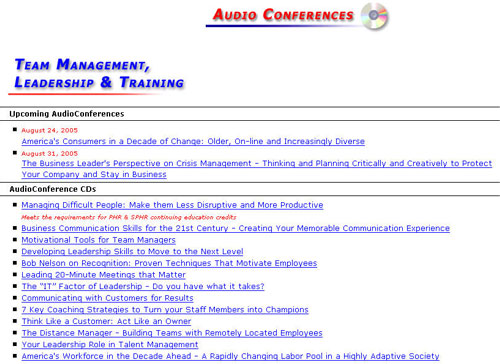
One of the big problems, however, is that visitors arriving on the homepage, and looking to register for an audio teleconference, cannot easily locate the “audio conference” link.
Audio Conferences are not listed in the vertically-placed, eye-catching navigation links to the left. Instead, Audio Conferences appears as one of the last entries in the “topics” drop-down menu. Indeed, Audio Conferences doesn’t appear first, but rather second from the end—not at all logical. The topics appear in a random order.
7. Affordance – A
With the exception of the Douglas Publishing site’s occasional appearance, the Briefings.com site held few surprises.
8. Labeling and Language – B
My primary problem was the sudden visits to the website of Douglas Publishing. Who are they, why am I here?
9. Readability (Content Density) – B
Text is relatively small, but line length is reasonable. Briefings.com is an easy-to-read site. Lots of subheads and lists speed reading.
The sample newsletters are easy-to-read read, multi-column formatted PDFs.
10. Organization – A
The primary navigation links are in a consistent location in the upper left of each page, with secondary links in a horizontal navigation bar repeated across the top of every page.
The primary navigation links are in a consistent location in the upper left of each page, with secondary links in a horizontal navigation bar repeated across the top of every page.
11. Content Freshness – F
Content freshness was a big disappointment.
First, the sample newsletters are not actual issues, they’re specially compiled issues. This detracts from their credibility and timeliness. It’s hard to get enthusiastic about content without a context.
As a visitor, I would prefer to see a sample—even, perhaps, an incomplete sample—of a recent issue, rather than a sample that (presumably) has been groomed to perfection.
Second, the site really does not have any content, in the sense of articles on timely topics.
Even if there was a “Best of (newsletter name)” download, or a “Best of 2004” download, it would be better than a site without freshness. As it is, the only “timely” topics were descriptions of the two upcoming Audio Conferences.
12. Load Time – C
Surprising, as it does not contain any large graphics or extensive text, the site was always relatively sluggish on a DSL line. Not so much as to be painful, but still much slower than it should have been for a relatively simple text pages.
Many of the product selection pages appear to be “assembled,” but the site’s overall performance was definitely not its strong point.
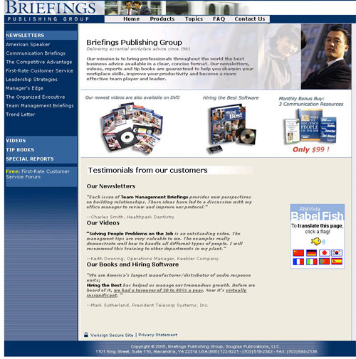
13. Aesthetics – B
If the target market mindset is one that glorifies a dark blue and gray, conservative, “all business” look, the site’s aesthetics are on target.
However, I feel that not everyone interested in corporate communications and productivity is in an IBM-mindset. Hopefully, there are some “primary colors” types of people who would respond to “fresh thinking” and “optimistic” color palettes.
The photographs on the page also project the look of originating in an “America At Work” stock photo CD, rather than a carefully scripted and photographed “this is us!” customization. The anonymity of the photographs somewhat detracts from the excellence of the content of the firm’s products.
In addition, there were several examples of places where small details undermined the firm’s image. One problem that several pages did fall into involved the “excessive blueness” of pages containing extensive text links.
One problem that several pages did fall into involved the “excessive blueness” of pages containing extensive text links.
Another problem concerned the lack of padding around the right-aligned titles and text describing upcoming Audio Conferences. A lack of cell padding results in the text bumping into the page border. On several occasions, I instinctively reached for the mouse to move the page to the left, to view the cut-off text, which actually wasn’t cut off.
A lack of cell padding results in the text bumping into the page border.
14. Brand Preference – B
There’s nothing wrong with this site that enthusiasm, passion and personality couldn’t cure!
It’s obviously a “safe” site, it’s an appropriately “concise” site, but it’s just not a “highly motivated” site. It’s a functional site, one whose “all business” functionality may—ultimately—be costing the firm some big bucks


have i told you that i love you very much thank you very very much, you