Consumer magazine websites are as diverse in content and execution as the magazines they represent. Some offer robust content and interactive functionality that begin to take advantage of the promise of online publishing, while some… do not.
Better Homes & Gardens website offers users a searchable recipe database and a selection of garden planners. Writer’s Digest offers its readers a subscription to a continuously updated, online edition of their bestselling Writer’s Market and online courses on fiction, non-fiction, poetry and getting published.
Other magazine websites are mere customer service portals for their print companion. Still others are online ad vehicles with only the barest connection to the print magazine. In all cases, there are best practices for website information architecture that lead to happy readers and repeat visits. We found wide variance in adherence to these best practices among America’s top magazine publishers.
For this in-depth research report, the the Library research team closely examined ten leading consumer magazine websites from ten top magazine publishing companies. The Library team focused on the overall homepage usability and several typical user tasks. We conducted a series of expert usability reviews and actual user test labs to determine what we believe to be the top ten “Best Practices” for homepage web design for the consumer magazine market. While the ten best practices we examined are by no means the complete list of design practices, they are essential to sound, effective website design. Successful implementation of these practices will result in more satisfied readers.
The websites reviewed varied in popularity, from SI.com, which ranked 60th, to WritersDigest.com, which ranked 83,166th (as tracked by Alexa). One would expect print circulation to be a driver of website traffic and popularity as savvy print editors use their pages to drive readers online for more content and interactive features. Sadly, this is not always the case. For example, Family Circle should be ranked in the top 5,000 websites based on its average issue circulation of 4.6 million. In fact, FamilyCircle.com is ranked 73,933rd. Our analysis indicates that most print magazines have no integrated strategy for driving website traffic and many magazine websites place little priority on driving paid print subscriptions.
| Circulation and Audience Reach |
ONLINE | ML Points | |||
| Paid Circulation | Reach per million users |
Page View Ranking |
Average Page Views per Person |
||
| Sports Illustrated | 3,238,974 | 15,950.0 | 60 | 4.2 | 83 |
| Better Homes & Gardens | 7,608,913 | 289.5 | 3,016 | 6.4 | 85 |
| Bon Appetit/Epicurious.com | 1,302,180 | 252.0 | 2,978 | 7.5 | 63 |
| Men’s Health | 1,686,195 | 112.5 | 8,488 | 6.5 | 75 |
| Motor Trend | 1,269,921 | 87.5 | 21,291 | 3.1 | 77 |
| Elle | 1,022,487 | 60.0 | 13,354 | 7.7 | 60 |
| Discover | 909,002 | 42.5 | 71,669 | 1.7 | 97 |
| Esquire | 721,758 | 34.0 | 47,069 | 3.4 | 73 |
| Writer’s Digest | 100,738 | 19.5 | 83,166 | 3.1 | 68 |
| Family Circle | 4,615,536 | 18.5 | 73,933 | 3.7 | 46 |
| Sources listed in references section | |||||
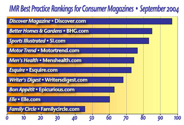
With other larger magazine publishing companies trailing far behind the pack, the folks at Disney Publishing’s Discover.com (Discover) take the gold in the Library’s Best Practice Ranking for Consumer Magazine Website Design. They scored almost a perfect 10 in each category, finishing with a total score of 97 out of a possible 100.
Other top websites include bhg.com (Better Homes & Gardens) and si.com (Sports Illustrated). They both scored perfect 10s in brand integrity, persistent navigation, task depth, labeling and language and aesthetics.
Motortrend.com (Motor Trend), mh.com (Men’s Health), and esquire.com (Esquire) scored consistently in the mid-range. All three did well with brand integrity and labeling and language, but fell behind in load time and affordance.
Writersdigest.com (Writer’s Digest) and www.epicurious.com/bonappetit/ (Bon Appetite) came close to being the worst in class. Bon Appetite‘s domain name alone posted an immediate red flag! They both scored extremely low on affordance, mainly because you couldn’t tell their clickable items were clickable. We must give credit to Writersdigest.com for scoring well in load time. They were the only other site besides discover.com to score a perfect 10 in load time.
Elle.com (Elle) and FamilyCircle.com (Family Circle) take the honors for the worst in consumer magazine website usability. Elle did score well in some categories, such as brand integrity and aesthetics, but scored horribly in affordance and load time.
Exploding the Myths
Myth #1: Brand comes first in magazine website design.
While brand is an important consideration in magazine website design, it is often used by designers and design firms as an excuse for poor information architecture. Website usability must be the number one consideration for any website—especially content rich sites that require complex navigation that must still be easy to use. For every task that a user can perform at your website, usability testing must be done to make sure users can follow the task from start to finish without confusion. Many of the marketers and publishers we interviewed told us they had little control over their website design as it had been outsourced to a “big-name” design firm.
—Beware of any site design or redesign plan that does not include website usability testing.—
[text_ad]
Myth #2: All magazine departments must share the home page.
While we’re all for democracy in the work place, a home page designed by committee will almost always be a bad home page. A website must have a product champion with a vision of serving the user. Balancing all the possible uses of the home page is no easy task, but it should flow directly from the business strategy driving the website’s business plan. Whether the website is reader or advertiser driven, a logical information architectural hierarchy must be created and executed.
Myth #3: Old content has little value to the consumer.
Perhaps the most important difference between print and online publishing is the value placed on “old” content. Even the phrase is misleading. Print publishers, with some notable exceptions, treat last issue’s content as being old and worth little. The Web changes everything. Old content, properly managed, becomes a valuable reference source that can generate substantial advertising and circulation revenues. Online publishers must be experts at creating easy-to-use systems that let users access information in a way that meets their needs. Consumer Reports Online is more valuable to a subscriber than any current print issue based on the user’s needs. Recipe databases, house plans, product reviews and all the other stuff magazines are made of can be made very valuable in an online publishing environment.
Best Practices
First impressions have never been more important than on the Web. The increase in broadband availability, and the accompanying increase in Internet users’ expectations, have resulted in a fantastic explosion of technology and complexity. And therein lie the pitfalls waiting to ensnare the overworked, over-extended web marketer. Brand integrity, clear messages, easy-to-use order flows, and intuitive navigation fall victim to the race to keep up with “technology.” It might give you some relief to know that best practices in homepage design and execution are often a simple case of common sense. That and a firm handle on your audience’s expectations and perspective.
For this report, we closely examined ten consumer magazine companion websites, focussing on the homepage and some typical user tasks. We conducted a series of expert usability reviews and actual user tests to determine what we believe to be the top ten “Best Practices” for homepage Web design for the consumer magazine market. While these ten are by no means the complete list of design practices, they are essential to sound, effective website design, and implementation of these practices will result in happier, more satisfied, readers.
1. Brand Integrity
You probably already have an existing strong print brand—are you clearly letting us know who you are and what you are about? Are you building and maintaining your brand? Or are you using valuable space on your homepage to promote someone else’s brand before getting your visitor to spend time and money on your product?
2. Strategic Intent
Is it clear that there is something we can do here? To communicate strategic intent you must know two things: 1) what your users are trying to do at your site and 2) what you want them to do at your site. Are you alerting them to the fact that they can accomplish their goal and is it congruent with yours?
3. Persistent/Consistent Navigation
With the exception of certain processes, like order flow, users of your site should be crystal clear about where they are in your site, where they can go, and how they can get back to somewhere they’ve been. Do you have a site map? How good a job does the persistent navigation do of allowing us to do what we want to do? Is it ubiquitous? Is it intuitive? Is it consistent throughout your site?
4. Task Depth
We have found that there are some fairly common tasks users want to do on a magazine companion site. Not surprisingly, the top task is to subscribe to the print product. If they are not yet sure about subscribing, they are generally there to sample the magazine’s content. To do this effectively, they need to be able to “Browse” and “Search.” Finally, we discovered that subscribers are increasingly seeking to take care of Customer Service tasks on the Web—changing address, renewing, cancelling, or reporting a problem with delivery.
5. Affordance
Over the past decade, Internet users have become conditioned to see formatted content on the Web a certain way. However, designers are compelled to want to make their website look and feel “different” from other sites. This inevitably leads to confusion and dissatisfaction. The most egregious of these design decisions is the removal of the underlining on links in a mistaken attempt to “clean up” the look of a webpage. The result is that users have to cruise around with the mouse, passing over text to see if the cursor can identify hot-linked content. Proper affordance means that something that is linked should look like it is—and that which is not linked has no underlining or color-coding.
6. Labeling and Language
Far too many websites use language that is better understood by the site’s sponsoring organization than by its audience. Attention needs to be paid to the labels used in navigation and page titles so that it is consistent with itself and with the audience’s mental models for the content. The added bonus here is that key phrases and words that your audience will understand will also improve your ranking in search engines as they have been designed to evaluate relevancy as a “human” would.
7. Content Density
We’ve known for ages in print that effective use of white space (number of columns, bolding, margins, etc.) increase reader pleasure. The same design principles apply on the Web. Actually, white space and employing the Gestalt principles of continuity, similarity, and proximity, are even more important when formatting content for the Web as web users tend not to read but rather scan pages to determine if the content is relevant to their information search.
8. Organization (Marketing Quadrants)
Actual eye-tracking tests have revealed that people use a “Z” shaped scanning pattern when scouring webpages for information. More importantly, they are less likely to scroll down on the homepage than they are on pages that are several levels down. Keeping critical information “above the fold” on the first few pages your users see is essential.
9. Load Time
How many seconds do you think you have to “hook” a visitor onto your page with your fantastic content? Less time than you think. Two phenomena contribute to this fact: 1) Broadband has upped the ante and download time and 2) people are no longer going to the Web to be entertained. They are looking for information. If they can’t get a bead on what they are looking for they will Google their way right off your site and onto someone else’s.
10. Aesthetics
That being said, people expect professional websites to be clean looking, information rich, and intuitive. They respond best when the aesthetics of the site support the purpose of the site and are consistent with the user’s mental model.
How 10 Consumer Magazines Scored
We chose the companion websites of ten popular consumer magazines that we felt reflected a broad cross-section of users and that were representative of their publishing house’s quality and resources:
|
|
In order to make the evaluations of these sites we established a user profile based on certain assumptions. We wanted a “new user landing experience”:
- First time visitor
- Not currently subscribed to the print or online product
- Someone looking for information that you are likely to provide
We identified four common user tasks:
- Subscribe to the print product
- Research information
- Browse for interesting information (sample)
- Find a way to change subscription address
The results provided some real surprises. However, a closer examination of what the scores mean tells a compelling story. Those sites that performed poorly in areas of navigation, consistency and brand integrity were the least satisfying for our test users and those numbers seem to be reflected in Audience Reach as reported by Alexa, Amazon’s web data service.
| Mequoda Library Consumer Magazine Web Design Best Practices – September 2004 | ||||||||||
| Magazines | DISC | BHG | SI | MT | MH | ESQ | WD | BA | ELLE | FC |
| Brand Integrity | 10 | 10 | 10 | 10 | 7 | 8 | 7 | 5 | 10 | 3 |
| Strategic Intent | 8 | 7 | 7 | 7 | 7 | 7 | 7 | 7 | 5 | 5 |
| Persistent Navigation | 10 | 10 | 10 | 8 | 8 | 5 | 8 | 7 | 7 | 7 |
| Task Depth | 10 | 10 | 9 | 8 | 6 | 10 | 8 | 6 | 5 | 4 |
| Affordance | 9 | 5 | 7 | 5 | 7 | 5 | 3 | 3 | 0 | 3 |
| Labeling and Language | 10 | 10 | 10 | 7 | 10 | 10 | 7 | 7 | 5 | 8 |
| Content Density | 10 | 10 | 7 | 10 | 8 | 8 | 5 | 7 | 10 | 5 |
| Organization | 10 | 5 | 6 | 7 | 5 | 10 | 6 | 7 | 5 | 6 |
| Load Time | 10 | 8 | 7 | 5 | 7 | 5 | 10 | 7 | 3 | 0 |
| Aesthetics | 10 | 10 | 10 | 10 | 10 | 5 | 7 | 7 | 10 | 5 |
| Score | 97 | 85 | 83 | 77 | 75 | 73 | 68 | 63 | 60 | 46 |
Brand Integrity
A homepage and domain name that clearly support the brand will get a “10.” Several of the sites we evaluated achieved a perfect score for this best practice, including: Better Homes and Gardens, Motor Trend, Elle, Sports Illustrated and Discover. Sites that dilute the brand or are so cluttered that the logo or brand name gets lost get a “7” while those that convey brand confusion or subjugate the brand to another authority get a “5.” As all of the magazines we selected had great brand recognition, we were surprised when any of them did poorly with respect to honoring the brand, in particular Bon Appétit, which redirected us to a food (and travel) site called Epicurious.com—not a term that springs to mind when one thinks of subscribing to Bon Appétit.
A special exception was made with regard to Family Circle whose homepage—if you are able to see it—does a good job of supporting the brand with a prominent logo and content that is consistent with the print product. Our feeling is that if we can’t see your home page because it is incredibly slow to load or we have to go to extraordinary lengths (like launching a different browser) to get to your site, then you are not supporting your brand. We can always Google another way to subscribe to your print product… or find another magazine out there that covers the same topics. Either way, you’ve lost me as a visitor and shopper.
 Best in Class—The Right Stuff:
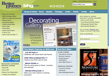
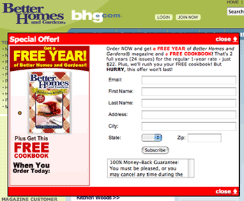
Supporting the brand is more than just displaying a prominent logo in the top left quadrant of the homepage. It means providing content and services that are consistent with the print product. Better Homes and Gardens leads the pack in this department. Not only is their online content consistent with their readers’ expectations, the interactive portions of the site are a seemingly inexhaustible supply of home décor, gardening and cooking activities ranging from slide shows of model rooms to custom plans for gardens.
Doing it right doesn’t necessarily mean doing it alone. Motor Trend uses Intellichoice as their vehicle database and Sports Illustrated uses CNN for the instant news sections of their website. As long as these “partner” sites are branded with your brand, you keep your user on familiar territory. Consider making your magazine’s title part of the URL when moving to a partner site, ex. http://motortrend.intellichoice.com, to assure users that they haven’t wandered away from your site.
Strategic Intent
What is the first thing you want a visitor to do at your site? Hopefully it is the same thing they came to your site to do. Informal surveys with magazine readers indicate that they go to a magazine’s website basically to satisfy one of the following goals:
- Subscribe: Younger readers who are used to purchasing on the web take it for granted that the web is where they can subscribe to their favorite publications.
- Find a recent article or timely information: Someone tells you they read a fascinating article in a recent issue of Business Week or your hostess tells you that she got that recipe for Balsamic Glazed Beets in the April issue of Bon Appétit, you are not going to head down to the public library to look it up if you don’t have it around. You go to the web.
- Contact Customer Service: Your issue didn’t arrive; you want to change your address; or you want to give a last minute gift to someone.
If your website’s strategy is to help satisfy these goals you’ve created a customer centric site that gets a perfect score of “10.” These are sites that:
- provide a subscribe pop-up on entry to visitors who are not cookied or in any other way “known” to the site,
- have search and customer service links on the first screen of the home page, and
- provide headlines and samples of content that are clearly linked to more content.
Unfortunately, none of the ten sites we evaluated got a perfect score, however, Discover came the closest. We had to deduct points for the lack of an entry subscribe popup and for some confusion regarding access to full content for members of the site vs. print subscribers. Seven of the sites we looked at got a rating of “7,” generally because the strategic intent of their homepage seemed to be to sell something other than the brand or print magazine, or because the navigation or content area of the homepage didn’t convey much about the content of the site or provide sufficient cues as to what could be found there. A few of the sites evaluated got a “5.” In the case of Elle this was because the ubiquitous Garnier ads took over as the dominant feature. They not only moved incessantly, they TALKED non-stop—even when we moved to other areas of the site. We were clear as to what brand was being pushed here and it wasn’t Elle. In addition, these links bring you off the site. Even the entry points to the content looked like cosmetic ads. The Subscribe link is in the top half of the home page but it is subdued. Links to Media Player and Real Player on the Meet the Editors page could have been more clearly defined as “helpful tools” by using the logos… as it is the links look like content, but aren’t. The video on Meet the Editors took so long to download on Broadband that we bailed.
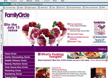 Our first impression from the Family Circle site sent us to the freezer for some raspberry sorbet. Cooking and cooking-related content is the dominant theme. But we were surprised when we discovered that the upper half of the homepage and the left column sidebar was ALL persistent navigation. That’s right—more than half the homepage was also more than half of every other page in the first and second levels of content we reviewed. This could fool users into thinking that they clicked and nothing much happened. Even when we used Internet Explorer to view the site, the first contact was a message telling us that our browser needed updating. This is not a user error—this is the result of poor design and execution.
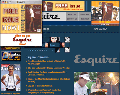
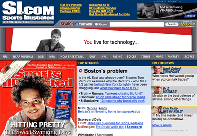
Getting back to the bulk of those that rated a “7,” Esquire rode off the rails a bit in the content department by pushing us off to KeepMedia.com for content. This is a content aggregation/gatekeeper site that allows subscribing members access to some 140 different publications. While this is very cool in and of itself, it is not the best strategic move one should make to monetize a visit to one’s site. Bon Appétit’s website has too many owners. Bon Appétit itself is only one of 12 menu items which also include Gourmet magazine and Concierge.com, a separate site for Condé Nast Traveler. An overall high performer in this report, Sports Illustrated’s number one call to action during the period we were evaluating the SI.com/CNN site was buying the Swimsuit calendar, either in print or for our phone. However, there’s quite a bit to do at this site, all well organized by sport. Demonstrating a high value for their print content, the “current issue” links make it clear that if you want to see any of the content in the current issue, you will have to subscribe.
Best in Class—Making readers’ goals your strategy:
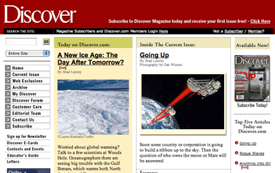
We loved the Discover home page! And we should have been pretty jaded considering it was the 10th website we examined. The strategic intent is subtle but clear:
- There are three invitations to subscribe, each focusing on a different element: “first issue free,” “Save 59 percent,” good-sized image of the cover. And on scrolling down just a little you also get a “Give a gift” element.
- There are free articles and premium articles for subscribers, clearly labeled, as well as a specific list of “Today’s top five articles.” We do take a point off for not having an entry popup… and there are problems with their order flow if you are already a site member but not a magazine subscriber—but that’s for another report.
- Getting Customer Service links and information is a breeze.
Persistent/Consistent Navigation
If content is the life’s blood of a website, navigation is just about everything else. It conveys the organization and framework for all that goes on and without it you can’t get anywhere. Here are a few simple rules about web navigation that designers ignore at their peril.
- Navigation should be always visible and unambiguous as to its function.
- Colored underlined text, usually blue, is a link that goes somewhere.
- Buttons are best for making something happen, for instance [BUY NOW] creates a purchase.
- The label on a button should mean the same thing and do the same thing no matter where it is on the website.
- The main navigation scheme should show up pretty much the same way in the same place throughout the website.
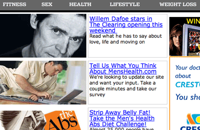
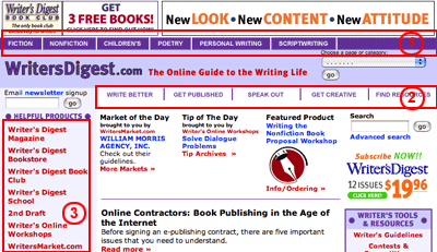 Only three of the sites we reviewed managed to get a perfect score because to get a “10” in this category, sites need to follow the above rules and provide search capability in the persistent navigation. Men’s Health’s side navigation featured a really nice search bar… unfortunately it was not visible on the homepage but only on pages one level down. Otherwise the ribbon menu across the top is well organized and consistent across all the internal pages, except in those like order flow where one doesn’t expect to see universal navigation. One of the reasons Writer’s Digest’s homepage feels so cluttered is that it features three, count ’em THREE, navigation bars: two horizontal bars and a contextual side bar. The top tabs are devoted to genre of writing. The second horizontal menu handles the user’s writing goal (Write Better, Get Published, etc.) It gets even more confusing when you click on “Write Better” because the very top horizontal bar items are repeated in the contextual side menu.
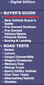 Motor Trend’s site navigation is a vertical sidebar—well categorized although it is not clear why the Buyer’s Guide and the Road Test sections aren’t grouped in some way as they both seem to be part of the Buyer’s Guide. The formatting of the first section of the navigation seems to be broken—probably a content management system problem. The rest of the navigation is left justified but this section is centered making scanning for the individual menu items erratic. Some space between the label “In this Issue” and the cover image with more space between the cover and the next three links would improve the navigation.
You got a “7” if the navigation was confusing, incomplete or had too many levels. Bon Appétit’s navigation on the main horizontal menu uses drop down menus that sometimes don’t align properly causing the user to get something they didn’t expect. If you choose any of the other items on the Epicurious.com site you are likely to get different navigation or, as in the case of the Travel tab, a completely different website.
As noted in the previous section, Family Circle’s navigation is more than half the page. However it was consistent. Elle’s menu bar doesn’t look like navigation until you mouse-over and the words become bolded. When you get down a level, a submenu shows up for nearly each item but only for the active section. We’ll get to the ambiguity of the labels later on in this report. This site’s menu ribbon navigation would benefit from some graphical element, however subtle, that indicates that this isn’t a string of words or a tag line but actual navigation.
None of the navigation at the Esquire site is persistent—or consistent. Once you click on any of the buttons or links your chances of having familiar navigation are about one in four. There’s a different look and feel for Cover Gallery, Esquire Gear, the Drinks Database, and the articles. We gave them a “5” for navigation and we think we were being generous.
 Best in Class—Follow the Breadcrumbs
The persistent navigation on the Discover.com site is exceptional. The sidebar navigation covers the site-wide navigation and there is a contextual menu that appears as breadcrumbs and a horizontal ribbon above articles, helping the user navigate or take action with the article. There is a second persistent navigation in the far right column that keeps the current issue present and acts as a subtle reminder that you can “Subscribe Today!” Search is prominently located and ever present. Other great examples of consistent persistent navigation can be seen at BHG.com and SI.com. The navigation on the Better Homes and Garden site is textbook. Horizontal navigation handles the main categories with the housekeeping in a subsection at the very top. The side navigation is contextual and provides a consistent framework for tools and guides, ads and subscribe opportunities. The SI site uses drop down navigation for the horizontal menus, but the execution is much better than Bon Appétit’s. There is subtle color-coding for each sports section and very complex sections get another layer of navigation.
Task Depth
Getting a focus group to tell you what web design they think is attractive is not nearly as useful to designers as watching real users sit down and struggle with accomplishing a few well chosen tasks on your website. A focus group provides opinion—a user test gives us FACTS. We asked typical users to complete four simple, but essential tasks on each of the ten sites we evaluated for this report. The test participants had to start from the homepage to complete each task. We first asked them to try to subscribe to the print publication that belonged to each site. They did not have to complete the subscribe process as we were not evaluating the order flow in this report. We then asked them to browse the site with the intention of sampling the magazine’s content. Whether or not Search was available on the home page, we ask the participants to search for a term consistent with the content of the site. For instance, we asked for “prostate” on the Men’s Health site, “mystery” on the Writer’s Digest site, “beets” on those sites that featured food, cooking or recipes. Lastly, we asked participants to see if there was a way to change their subcription address. We deliberately did not ask them to find the “Customer Service” link as other terms might have been used for this feature and it was the task we wanted to research.
To get a “10”, participants needed to complete all the tasks in a reasonable amount of time. Each task was rated on a scale from 1-10 and the scores averaged for purposes of the overall rating matrix. Half of the sites we reviewed scored higher than an “8”, two actually achieving a perfect score.
 Discover narrowly missed getting a perfect score (9.75) because of execution problems experienced when participants tried to subscribe. The problem wasn’t with finding a Subscribe link but with the fact that the system wouldn’t allow a member who wasn’t logged in to subscribe. Subscribe links were available all over the homepage. There were lots of free articles to sample and the difference between premium and free content was readily apparent. Search was in the top left quadrant just above the persistent navigation. Search results were informative and dated. Participants easily found the “Customer Service” link in the persistent navigation which was labeled at the same level as the other links… not relegated to housekeeping status.
On SI.com, the subscribe link is right at the top of the page, but it’s subtle. If folks don’t pick up on the entry pop-up, they probably won’t see an opportunity to subscribe until they try to get to Sports Illustrated’s print content. While the print content is under lock and key, there is plenty of CNN related content to work with as well as interactives like fantasy teams and forums. The search box is right up front and BIG. The “Customer Service” link is at the top of the page with some other housekeeping links. It brought us to an extensive magazine customer service page where participants could do just about anything. They earned a respectful “9.25.”
Writer’s Digest lost points with their search results. Most participants used the “Subscribe” block on the right of the home page. There was a satisfying amount of content to sample and browse through. The “Customer Service” link was at the bottom of the home page—better than not at all and possible to locate after much scrolling. Participants searched for the term “mystery” and the results were pretty useless. The listing was in techno-speak and gave too little information to help user know if this was what they were looking for.
From there things go pretty much down hill. Motor Trend’s “Subscribe” is there but it’s not as in your face as on other sites. Participants were able to get to some pretty good content. A search for the term “highlander” (as in the popular Toyota SUV) yielded the TV series in the first five search results! Sponsored links like that should not be placed at the top because it’s just not relevant to the user of this kind of site. There were no dates on the articles to indicate recency – how do we know which are the most recent and therefore have the most reader value? The “Customer Service” link was all the way at the bottom – but they got extra points for having a clear change of address flow including graphics to help me identify the subscription. On Bon Appétit there is only one “Subscribe” link visible on the homepage and another link in the dropdown menu. They bring the user to a one-page dead end order form. Seeing as there’s so much competition on the homepage, there probably should be a subscribe pop-up when someone types in “bonappetit.com.” We did manage to find a nice recipe for balsamic glazed beets, but we had to sign up for an online recipe box, which was described as a “special gift.”The search box did not work. All we got were server errors. Participants had to really poke around to find the “Customer Service” page, which we managed to get to via a tiny link at the bottom of the Subscribe page.

As Men’s Health was pushing a new publication in their prime “Subscribe” spots, our participants, after a bit of hesitation, used the link in the housekeeping menu above main menu. They did find lots of interesting content with good deep linking. Where MH really lost points was in the lack of search. Participants even tried the “Find Everything” tab at the end of the housekeeping menu only to find a list of departments. After the frustration of not being able to search from the homepage, participants were delighted to find the “Customer Service” link right up there in Quadrant 2 of the homepage—however this brought us to a page with a link to “Customer Service” that used to point to CDS and now leads to an error message that says that page is no longer there. It took a persistent user to go through the other links to finally find the online Customer Care Center.
Elle has two subscribe links, one each in the top two quadrants of the homepage, however both are so subtle they lost points on the time it took for participants to find them. The Garnier sweepstakes ads are so prominent that it took away totally from the impact of “Subscribe” block on the right. Participants were able to find content although, again, they lost points for the time it took for participants to find anything substantial. Fortunately for this test human beings can read graphic text. Not so with search engine spiders. The homepage is nearly all graphics. Even the text is graphic. Consequently, this site wouldn’t score well on providing search engine bait—if we were measuring that. However nearly everything you click would bring you to more content… except of course the Garnier ads. And did we mention that the soundtrack for the ad just kept on going like the energizer bunny. The search box was at the bottom of the page so we had to scroll down. And the search results were spare and cryptic. (Search term “mascara.”) There were no links whatsoever to “Customer Service”… and when we used Search to find it there were no results for the terms “customer service” or “change of address. “Surprisingly, on the mission page (found through the link to About Us) the editors state, “Elle.com is Elle’s service-oriented sibling.” From what we could tell there was not much service here. The “Contact Us” link however did yield an email address and a phone number.
There was a subscribe link and graphic in the top right quadrant of the Family Circle site, however, it brought you to a customer service page instead of putting the user into a targeted order flow. And there were way too many things to do… too many for getting the intended subscription. Participants were able to find plenty of recipes and crafts, but because the persistent navigation took up so much space, there was very little room left for content and the reader had to do a lot of scrolling. No search capability from the homepage… except, of course, searching for recipes. But even that was a level down from the home page and so did not count for “Search” scoring. At the bottom of the page, the sidebar navigation has the following: “Subscriber Services—click for info.” The item Subscriber Services is not a link. And we have to ask, “Why not?” If the web had a Ms. Manners she would categorically say, “Never use the word ‘Click’ unless it is absolutely necessary. Use a visual cue indicating that the words are clickable; save time, save space, be intuitive.” By the way, to add insult to injury, there was more customer service information on the page we got when participants clicked to subscribe than when they went to Subscriber Services. Family Circle should rethink this.
 Best in Class—Helping users do what they want to do
Esquire had at least four subscribe links in the home page’s two top quadrants—and an entry pop-up! Participants easily got into the order page. They were able to read teasers of the articles but the whole enchilada is reserved for subscribers. The search field was right in the most prominent quadrant of the homepage and results were not only dated, they had a sizable abstract to help the searcher determine its value and relevancy. Good thing too because you can’t get to the content unless you’re a subscriber. Although the label was “Contact Us,” participants were able to land on a page that allowed them to proceed to an excellent customer service page or simply send Esquire an email. There were also links at the bottom left of the home page screen under the current issue.
One of the participants chose to subscribe to Better Homes and Gardens from the link on left… but commented that if they were coming only to subscribe they would have used the pop-up. Participants found it easy to find sample content and there was a lot there… however the animated section in the middle of the home page froze our computer twice—a tale of caution for sites using advanced technologies. In addition to “beets” one of our participants searched for watercress and found some REALLY neat stuff—Watercress Chicken…yum! BHG.com’s “Customer Service” link was considered by all to be Best in Class! Not only was the link prominent but clicking on Change Address in the list of things to do at Customer Service gave participants a clear form to fill out to identify their subscription along with graphics so there was no doubt as to where their account number could be found. Bravissimo!
Affordance
Nothing irritates a user, or a usability expert, more than bad affordance, a term used by Donald Norman in his landmark book The Design of Everyday Things. Affordance is simply the case of does the thing (link, door handle, toaster) do what it implies… does it behave in a manner consistent with how it looks? Does it do what it is supposed to do in the manner in which it is supposed to, based on the way it looks to the casual observer? An example of bad affordance would be a light switch that turned a light off even though it is pointing to “on”—or text on a web page that isn’t linked to anything even though it is clearly underlined.
It is relatively easy to test the affordance of a home page. Print the page off on a black and white printer (because we can’t always rely on the color of a link to tell us if it is a link.) Grab a highlighter and approach a colleague, preferably someone unfamiliar with the homepage or the website. Ask them to highlight all the things on the paper that they would assume was clickable. It is amazing how many web sites have gone to a great deal of trouble in their design to give the impression that NOTHING is clickable by removing the underlining that has been the hallmark of a link for the last decade.
To rate a “10” in this category, links and buttons had to clearly do what they “afforded.” If most but not all links looked like links, the site earned a “7.” If only some of the links and buttons conveyed clear affordance the site got a “5.” We gave a “3” to sites whose links and buttons were confusing and inconsistent and a zero to sites whose links and buttons violated all web conventions.
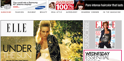 Starting at the bottom we have Elle whose affordance was consistently poor… the links at the top, which are actually the main navigation, do not say “I’m a link” or “I’m a button”—this is the downside of minimalist, design driven navigation. Mousing over the words does bold them… but they don’t change color and they don’t let us know where we’ve been. Ordinarily, this isn’t a problem as links in the body copy often help the user keep what was visited and what’s new territory straight. But there was no body copy on this homepage. Everything was a graphic—everything except the copyright notice at the bottom. We won’t even go into how they miss out on search engine optimization!
So much of the content on the homepage of the Bon Appétit section of the Epicurious site is clickable with absolutely no indication that it is, barring the change of our cursor from arrow to pointy finger, that we simply could not give this site high marks for affordance. And yet other text that you would assume would be clickable—topic headings, for instance—are not. Designers on a text heavy site like WritersDigest.com who take off the underlining for links are hampering the reader’s ability to see at a glance what is a link and what isn’t. They force the reader to play a game of hide and seek… brush the mouse over text to see if it does anything. That might be someone’s idea of a good time, but not ours. Users of a site like Writer’s Digest are most likely interested in finding something specific and this strategy does not help them. What is even more disturbing is that text in the horizontal menus doesn’t change as you pass over them while text in the side menu does. And the text features a paint box full of colors—red, blue, black, even purple! Links should be one consistent color, preferably blue, and visited links should be another so you can tell where you’ve already been. On Family Circle we again have designers ignoring the one thing that would boost the click rate on any of the content—the links are not blue, they aren’t even the same color, and, more importantly, they aren’t underlined unless we go hunting around. And once we’ve visited that link it, doesn’t change color telling us what we’ve already seen and what’s left to explore.
At BHG.com we have designers arbitrarily deciding to have some links underlined on mouse-over and some not. Consistency is key here to cueing the user about what is clickable and what isn’t. Assuming that folks want to cruise around with their mouse looking for your buried treasure is insulting to the user. Best approach is to not have them guess at all—change the color and underline all clickable text. There is so much content here, you have to provide some help to the reader. The best we could give them was a “5.” And the same for Motor Trend—the designers of this site violate one of the principle conventions of linking… making sure that the navigation and links tell me where I’ve already been. The other convention is underlining the links, but we’ve beat that one to death already here. They also overlook the benefit of using breadcrumbs for navigating between articles in a section. When we clicked on Wagon/Crossover in Road Tests and chose the Mazda Wagon, getting back to the Wagon/Crossover Road Test page meant either clicking on the side menu again or using the back button. Not particularly onerous you might think, but having recently been through the car research and buying process, we can tell you, you can get pretty lost. The interesting thing is that they actually have the right information at the top of the content area—they only need to link it to make it useful to the reader. Motor Trend did, however, give us underlined links in the body text and marketplace… unfortunately they didn’t exploit the color thing.
 Men’s Health managed to do better. The article links are clearly links—they are both blue and underlined. The navigation is less clear. It is not until you mouse-over that you know these words are links. They don’t have any graphic elements that clearly indicate that they are buttons or navigation either, unlike the navigation items just above the menu ribbon that handle housekeeping (customer service, etc.) The two gray sections under the main stories are also inconsistent in how they handle contextual links… although they are uniformly NOT underlined or blue. You have to mouse-over to find out what part of the text is linked… a treasure hunt strategy that is not interesting to anyone that is in a hurry to find information. At SI.com we thought, “Finally! Someone doing text links right!” Well, almost. The links don’t change color once they’ve been used, but they are blue (mostly) and they are most definitely underlined. However, some links were not underlined or blue and that is not so good. We gave both these sites a “7.”
Best in Class—Look Ma – no guessing!
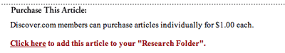
At Discover all linked content is underlined and navigation buttons look like navigation. The only point we would bring to the designer’s attention is that the link should change colors once we’ve visited it. That would give Discover a perfect score… something that none of the other sites we evaluated achieved! One other suggestion that would put them way ahead of everyone in the pack would be to find a way to eliminate the reference to “click here” by linking the appropriate action word and emphasizing that… as in “ADD this article to your Research Folder” instead of “Click here to add…”
Labeling and Language
We looked at the labeling and language of these ten sites to see if the lexicon (a stock of terms used in a particular profession, subject, or style; a vocabulary) and taxonomy (division into ordered groups or categories) was audience centric—consistent with that magazine’s readers’ mental model of the area of content. If the lexicon and taxonomy are right, then the keywords and phrases would be a good match for search engine queries made by the target audience. Half of the sites we looked at had this practice down to a fine art. The rest deviated by mixing parts of speech or confusing terms in the labels, or by introducing jargon that was more familiar to the publication’s personnel than to the audience. Here again, a little user testing would go a long way to highlight potential areas of confusion.
We found the language in the Elle menu confusing… and it’s only when you get down a level that you see what is actually in that level for content. What is the difference, we ask, between fashion and runway? We suppose one is what you might actually buy and wear and the other is something you couldn’t afford and probably wouldn’t wear on a bet. However the point is that the submenus that show up only once you’ve gone down a level go a long way toward helping the user actually KNOW what the difference is. They got a “5.” Writer’s Digest fared a little better. For the most part the language on this site was consistent with the audience’s vernacular. If we were to adjust anything on this page regarding labels, we would fix the location and the look of the label *Helpful Products* and would move the Newsletter Sign Up and Search bars around—not because they are in bad locations, but because we noticed users who wanted to search began to fill in the newsletter box by accident. Folks don’t really read labels, they scan for patterns and they’ve been conditioned to look in the top of the left navbar for search when they don’t see it at the very top right corner. Not to be too picky, but “Email newsletter signup” is a noun phrase and the rest of the labels on that “line” are all verb phrases… “Write better,” “Get published,” “find resources.”
Three sites could use some moderate labeling improvement. The labeling and language for the Bon Appétit section of the Epicurious site was consistent with the target user’s vernacular but more geared to a print product than a website. Labeling and language on Family Circle’s site was also consistent with the reader’s mental model, although the “circle” thing in the sidebar navigation is a bit too cute and gets old fast. On the surface of Motor Trend’s home page, what’s content and what’s sales oriented is not entirely clear. Our test participants spent a lot of trial and error time trying to figure that out. It might help the user if there was a cleaner separation of RESEARCHING and BUYING/SELLING. A little poking around with actual users regarding what they want to accomplish at this site would be beneficial and improve usability.
 Best in Class—Speaking the user’s language
Both Men’s Health and Esquire do a good job of keeping the language on their sites very clear and brief. They know their audience and they keep the taxonomy consistent. The SI/CNN folks know sports and speak sports all through their site. Labeling was consistent and helpful throughout the Discover site, although I think a couple of things that are member/subscriber related could use a glossary link. What’s a Permission Key? (found in the “My Discover” section)
Content Density
Density of content is more than an aesthetic issue. Some cultures are actually put off by complex, busy, jam-packed websites. From a usability perspective, the effective use of white space helps readers scan and group information, improves readability, and gives the eye places to “rest.” The proper number and arrangement of columns also helps readers scan for key information. Headings that are not too large, but clearly hierarchical, help readers categorize information. Fortunately, good design in this area usually leads to good usability as well.
Sites whose home page layout demonstrated an effective layout design, i.e. uncluttered, limited palette of colors, adequate white space, readable font faces and sizes, got a “10.” We seemed to have recovered from the “WIRED.com” era when font sizes were unreadably small and font colors, often tangerine or lime, lacked sufficient contrast. Nearly all the sites we reviewed used nice clean fonts in 11 points or higher. And with the exception of text that were really graphics, the fonts were browser scalable.
Men’s Health didn’t quite get a “10.” They could do a better job of space utilization and smaller graphics because we don’t get to the newsletter sign-up until we’ve scrolled down off the first screen. But the font size is generous and helps keep the teaser phrases bite-sized. The Customer Service link, while small, is in the top half of the first screen satisfying the requirements for one of our three task areas—finding customer service. Having too much “white space” is almost as bad as not having enough. Esquire seems to have a vacant space in the middle of the right column… just big enough for a missing small banner ad. However the font size, face and column widths make for a comfortable read.
Sites who managed to do a reasonable job of balancing graphics and text earned a “7” while those whose sites had too much of one or the other got bumped to a “5.” We reserved from “3” to zero for those that were confusing or a total mess. Happily, none of the sites we reviewed ranked so low.
Roughly half of Bon Appétit’s first screen is taken up with ads—not always for food related items. However the font size and the column width are effective and the use of shading to break up the page into sections works well. While SI.com is a very busy site, it is very well organized. Although it might overwhelm some users at first blush, they very soon find their way around without too much trouble. It helps that the font size and face are very readable.
The users’ first reaction to the Writer’s Digest site was that it was dense and cluttered—nearly all closely packed text. What white space there was when we were evaluating the homepage was default space for content that wasn’t there. On an earlier visit those areas had content. The designers should find a way to not show empty content buckets—at least on the homepage where space is a generally at a premium. In contrast, there was adequate use of white space in the Family Circle homepage layout, but the over reliance on graphics made the page seem ponderous and the font sizes were overlarge taking up too much space. This site layout needs to go on a diet.
Best in Class—Designing for usability
While the content on the Better Homes and Garden homepage is plentiful, there is ample “white” space on the page, and subtle color variations in the background clearly demarcate areas of the page. The type size is large enough to be clearly read and the use of a sans-serif font throughout the page, but particularly in the navigation, gives the reader the impression of an orderly, organized layout. Motor Trend provides a generous amount of white space for such a content rich homepage and the use of heading blocks clearly segregates content areas without too many lines. Elle’s minimalist style quite naturally demonstrates the use of white space, although it’s all graphic-based. However, the typeface on the content pages is a good readable size, which is unusual for websites that target a young audience. Discover also gets high marks for clean layout: a balanced use of white space, text and graphics with a readable font size, although some of the smaller fonts (“What are these” text graphic under the contextual navigation) are a bit fuzzy.
Organization Within Marketing Quadrants
Real estate on your homepage is a precious commodity—and often a source of fierce corporate wrangling. It is important that all corporate constituents recognize that the goal of the homepage is generating corporate revenue—no margin, no mission.
Based on eye-tracking data for the web, the Library analysts have divided the typical homepage into four marketing quadrants, all above the “fold.” The order of importance for these quadrants runs in a “Z” pattern.
| 1 | 2 |
| 3 | 4 |
While it is acceptable, particularly on information sites, to have lots of content, primary data should NEVER be placed below the fold. For an unknown visitor (one who isn’t currently a cookied “member” for your site), promotional elements in quadrants 1 & 2 should ALWAYS be for your own publication. Once you have converted the visitor to a buyer, use this space to generate revenue for sister publications or ancillary products.
Sites where the Marketing Quadrants are appropriately exploited and the navigation conventions are consistently observed earned a “10” in this category. A “7” went to those sites who featured a Subscribe link in only one top quadrant. If the Subscribe and Customer Service links were present but obscure, we handed that site a “5” and a “3” was given to any site where either of those links was missing from the Marketing Quadrants. Sites that displayed a total lack of organization earned a zero.
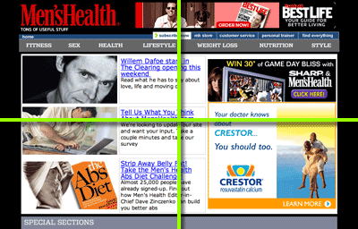 While none of the sites we reviewed earned such low points as a zero or “3,” several earned a “5.” There was heavy marketing in one of the top quadrants of the Men’s Health site for the new style magazine Best Life and almost half of the screen was taken with an outside ad rotation (hairloss, Jeep, Levitra). It surprised us that at least one of the rotation wasn’t an ad to subscribe to Men’s Health—if not exclusively used for that purpose! The only way to subscribe to Men’s Health was to use the small white Subscribe button in the “housekeeping” menu. It is impossible not to notice the significant placement and size of the interactive feature on the Better Homes and Gardens homepage. However, if we haven’t subscribed, and we’ve closed the pop-up, the publisher is losing a great opportunity to get us to subscribe. Technology is at the point where the site should know whether or not we’ve visited or subscribed. If it finds that we are not cookied, an extra panel in the interactive section should offer us a strong incentive to subscribe today as part of the animated rotation. And then there’s Elle. Although both the top two marketing quadrants sport subscribe elements, we have to take points off for the lack of customer service links on the homepage and for insufficient attention to navigation protocols.
Edging up slightly from those sites, the following three earned a “6.”While the marketing quadrants in Writer’s Digest‘s homepage are definitely exploited for subscribe links, the navigational elements lack organization… there are three navigation areas and, as mentioned before, a lack of consistency with regard to underlining the links when mouse-overed. This site could benefit from an overall examination of user goals and tasks. Family Circle gets points off for having too little content in the main marketing quadrants (those parts of the page seen without scrolling), and a little too much technology for technology’s sake. Again, we don’t know what will happen when we click on a presumed link in the top half of the page. The “In the July 13 issue” link doesn’t do anything and the content links to the right of the image have a slideout window that doesn’t give us much more information. If one clicks on the “read more” link, another window pops up… that’s three windows to manage. Although we do want to thank them for excellent pictures of poison sumac, oak and ivy. (“How to handle summer hazards…”) Subscribe only appears in one of the two top quadrants of the SI.com homepage… and not very prominently. Selling the swimsuit screensaver for your phone seems to be a higher priority so we can’t really give SI high marks for organizing their homepage to sell their print product. As a matter of fact, the only place the print product gets any graphic treatment is in the second screen. Too bad.
Motor Trend and Bon Appétit earn a “7” in this category. The Buyer’s Guide in Motor Trend‘s sidebar menu had us a little confused… mainly because the next section, Road Tests, also seem to belong to the Buyer’s Guide. In addition, this first section of links actually brings you off the Motor Trend site to Intellichoice (although it’s still Motor Trend branded.) However, the subscribe link was in the top left quadrant and there was a good balance of text to graphics. Bon Appétit would benefit from a branded site that used subscribe pop-up on entry and a focus on its own subscriptions before sending folks off to the sister publications.
Best in Class: KISS—Keep it simple, stupid.
Hats off once again to Discover. This is an extremely well organized site and is clearly Best in Class for displaying subscribe opportunities and for observing navigational conventions. As for Esquire—no problems here. The KISS principle at work, pure and simple.
Load Time
The amount of time a user is willing to wait to see your homepage is getting shorter by the second. A decade ago when we were all on dial-up modems, we’d patiently wait over a minute, maybe more. Now it’s unusual for someone to be willing to wait up to 5 seconds for your homepage to load. Users will wait longer if they feel the information will be worth it. We gave a “10” to homepages that loaded in under 15 seconds on a 56k modem for text with a low graphic load. We gave a “7” if text at that same speed took less than 25 seconds to load. If there was a moderate graphic load and the text took up to 50 seconds we awarded a “5” and homepages with a heavy graphic load that took longer than 50 seconds got a “3.” Needless to say, homepages that took so long we gave up waiting got a zero.
You would think that no site, in this day and age, would have earned a zero, but not so. Family Circle was by far the slowest site to load because of lots of text and even more graphics. At one point the homepage refused to load because it got stuck on a graphic being served up by JSP. We bailed and came back later. The fact that we had to use Internet Explorer to view this site did not sweeten our disposition either. Elle was marginally better. There was absolutely no text content on this homepage, excepting the copyright information links, so there’s no word count load… everything was a graphic. There were 28 images not including the ads that are served from elsewhere and the average size was about 15k—that’s more than 300k for the page putting the load time on a 56k modem well over 60 seconds.
Motor Trend‘s homepage is long… very long. And there is a fair number of graphics so load time is going to be slow. Word count alone came in close to 60k on top of roughly 25 small graphics and ads. On a 56k modem this could result in load times of close to a minute. But their graphics are good quality and it’s assumed that pictures of cars are what people are looking for here. Esquire is a little top heavy. While the text comes in at under 40k, the number of graphics, including the navigation elements comes close to 25. Bon Appétit‘s text comes in at under 40k and there are roughly 10 medium sized graphics taking roughly 10-20 seconds on a 56k modem. Converting the text graphics in the Epicurious menu bar to text would speed things up a bit, but they earned a “7” as did SI.com and Men’s Health.
There is quite a lot of text content on the Better Homes and Garden site making the word count come in at around 45k. The animated section is much slower to load, however the rest of the page loads up quickly, in about 8 seconds, giving the user lots to look at while the section is loading. The bonus here is that nearly all the navigation is text so that the number of actual graphics on this page is small.
Speed counts!
At 24k for the text, and a relatively spare graphics load, the Writer’s Digest site clocks in at under 10 seconds—excellent load performance. Since the horizontal navigation is all graphical text using a standard sans-serif font, they could benefit from a quick conversion to real text using style sheets to get the look they currently have with the added benefit of being able to underline the links in the same manner they use for the rest of the site. Once again, Discover earns a “10!” Weighing in well under 40k for text and a few graphics that might add another 50-75k, this site may well load under 15 seconds on a 56k modem. Much of the color and design is achieved in HTML reducing the overall load. They could concievably speed things up a bit by converting the side navigation graphical text to real text.
Aesthetics
The look and feel of a website’s homepage has to appeal to the site’s users and be consistent with their mental model. We gave a “10” to homepages that support the purpose of the site and are consistent with user mental model and a “7” to those that support the purpose of the site but seem a bit confused about user mental model. Sites that disregard user’s mental model got a “5” and those that were totally ad driven, a “3.” Fortunately, none of the sites got a zero… for being “totally ugly.”
We think Family Circle could do a much more efficient job of presenting their content. Family Circle readers are busy people and while we don’t know how many of them are on broadband, we imagine a goodly portion are still on dial-up. Less space taken up with graphics and smaller font sizes on the sidebar navigation would put more of the content in the first screen and raise their score from the “5” we had to give them. Esquire also got a “5.” The homepage itself is consistent with the reader’s mental model for Esquire… however the lack of consistency between the different sub pages is troubling. It seems to indicate that there are a lot of cooks working on this particular soup.
Two sites earned a “7.” We noticed at the bottom of the page a link to visit the sister sites of Bon Appétit. We couldn’t help notice that the other print products had their own branded sites—when we clicked on Glamour we also got a very nice Subscribe pop-up. We’re curious as to why Bon Appétit didn’t get the same treatment. With Writer’s Digest, one could argue that because it is a site for writers, the text heavy nature of the homepage is consistent with the user’s mental model. But users’ (writers every one) that we had test drive the site were put off by the torrent of text. One simple graphic image showing a writer at work or an author with great eye contact would warm up this page.
 Beauty is in the Eye of the User
The Discover site was such a pleasure to use that we found our test users lingering and browsing around reluctant to move on to the next task in the series. Everything about the Better Homes and Garden site is aligned with the print product. And they certainly use their content to sell print! Every article has subscribe opportunities sprinkled throughout. What we didn’t see is a teaser with a link to subscribe to premium content or a sign-in for existing subscribers. The aesthetics of the Men’s Health site are clearly male… and oriented to the three things that must be on guys’ minds. We’ll let you guess what they are. The overall aesthetics for Motor Trend‘s site are clearly in support of the car hunting/buying user, the auto afficionado. Load time aside, Elle knows its audience and, if they happen to be on a T1 or cable modem, they won’t mind the site’s over-dependence on graphics. It really is all about the pictures.
SI.com is a sports afficionado’s treasure trove. A quick glance at the homepage would have you on top of the latest sports news, a feat that even a daily newspaper can’t accomplish. That’s the CNN expertise. What SI brings to the table is brand credibility, language and categorization that makes finding information fast and easy, and, if you’re a subscriber, in-depth stories on your favorite sports and athletes. While the information on the page is densely packed, it is well organized and, more importantly, consistent.
Just Fix It
 Navigation—If they can’t find it, you don’t have it. It’s that simple. Use link and navigation conventions to exploit the cues your users have already learned. This is one place you can’t afford to fall into the “Let’s be different!” design trap.
Help them Subscribe! It may very well be the one thing they came to your site to do… and that can’t be a bad thing. Put that Subscribe button or link in the top two quadrants in two different formats—one graphic, one text. And for Pete’s sake use a small tasteful Subscribe Pop-up on entry. If that’s why they came to your site, you hit the jackpot!
Be consistent... please! That goes for navigation, colors, labels and branding.
Do some User Testing. Watch some typical users navigate your site. Give them specific tasks to complete and see if they can do so in a reasonable amount of time. Let your designers and developers see what happens. One video of a frustrated, confused user is worth a thousand words. Trust us on this one.
By the Way
We weren’t checking order flows for this report… we plan to cover that in another report. However, it surprised us that sites that did everything else so well had links to non-functioning order pages. Someone should be in charge of regularly checking the order pages by going through the order flow ESPECIALLY if your site hands off to a fulfillment service. And you should be checking with a variety of computer platforms and browsers. If you’re not getting many subs through your website, it could be because prospective subscribers couldn’t complete the order.
References and Resources
- Websites Reviewed In This Report
- Additional Websites and References Included In This Report
- Alexa
- Condé Nast Media Kits
- Hachette Filipacchi Media
- Hippo Direct
- Krug, S. (2000.) Don’t make me think: A common sense approach to web usability. Berkeley, CA:New Riders Press.
- Magazine Publishers Association – Circulation Trends & Magazine Handbook
- Meredith Corporation
- Norman, D. (2002). The Design of Everyday Things. New York: Basic Books, Inc.
- Spool, J. (1998). Web Site Usability. San Francisco: Morgan Kaufman.
- Resource Directory
[text_ad]


