Advertising-driven Entrepreneur.com makes the crucial mistake of forgetting that readers must first find the content they seek, or they won’t hang around long enough to maximize the valuable advertising inventory that publishers crave
Entrepreneur.com, the online arm of Entrepreneur Magazine, is a valuable resource for a wide range of business owners. However, there’s no avoiding that it is an advertising-supported site. On arrival at Entrepreneur.com, visitors first encounter a large banner ad that occupies a great deal of the initial screen’s real estate.
- Within ten seconds, the large, rotating banners, are replaced by a homepage with a smaller banner
- In those first, valuable seconds, one’s attention is focused on the advertising, not the content
- While articles are easily read, and contain numerous subheads and visual enhancements, the persistent and continuous presence of advertising banners hamper the site’s effectiveness
- Entrepreneur offers several focused newsletters, but they are not described in detail
- Lack of product description undoubtedly reduces visitor subscriptions
- Clearly this is a professional site offering numerous valuable resources, yet it’s not particularly warm and friendly
Entrepreneur.com, the online arm of Entrepreneur Magazine, one of the leading small business resource publications, has received a lot of attention since I first visited. Looking at it for this website design review, I found the site less cluttered and more focused than I remember from previous visits.
With resources based on thousands of quality articles from the archives of Entrepreneur Magazine, Entrepreneur.com is a valuable resource for a wide range of business owners. However, there’s no avoiding that it is an advertising-supported site!
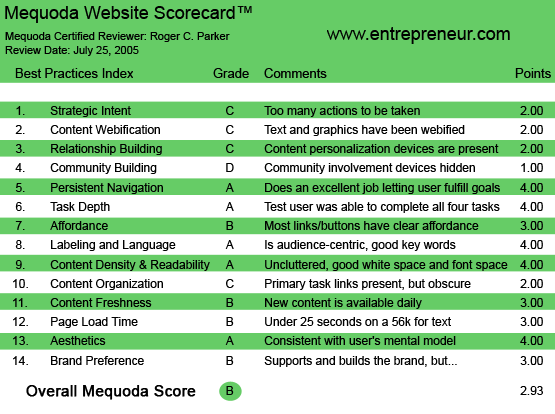
Entrepreneur.com’s Mequoda Scorecard
[text_ad]
1. Strategic Intent – C
On arrival at Entrepreneur.com, visitors first encounter a large banner ad that occupies a great deal of the initial screen’s real estate. Within ten seconds, of course, the large, rotating banners, are replaced by a homepage with a smaller banner, but in those first, valuable seconds, one’s attention is focused on the advertising, not the content.
The site’s primary explanation of what the site is all about is a small motto tucked above the flush-left Entrepreneur.com logo: “Solutions for growing businesses.” Nice double entendre, though… “growing” as a verb, or “growing” as an adjective.
Content categories are organized at left by primary headings, “Starting a business,” “Home office,” etc., which leads to secondary pages with text links to specific articles.
Below the logo, in the center of the screen, is a box with rotating graphics and teasers to four “articles of the day,” followed by links to recent articles and blog listings.
There’s no “theme” to the homepage, however, and navigation is pretty much a self-guided tour.

On arrival at Entrepreneur.com, visitors first encounter a large banner ad that occupies a great deal of the initial screen’s real estate. Within ten seconds, of course, the large, rotating banners, are replaced by a homepage with a smaller banner, but in those first, valuable seconds, one’s attention is focused on the advertising, not the content.
2. Content Webification – C
Although I spent a good amount of time at the site, I did not encounter any use of audio, video or interactivity. Although the site features several marketing coaches, I didn’t find any audio interviews or audio/video snapshots of them explaining their area of competence, and how the articles they have written can help business owners.
The only exception is the Entrepreneur Media Center which contains links to several online weekly radio shows with downloadable archives that can be accessed through the site. Notwithstanding the importance of these archived broadcasts, they are primarily accessed through the site, rather than created for the site.
I did not find any online assessments or “personal working areas.” The website is primarily hyperlinked static pages.

Although the site features several marketing coaches, I didn’t find any audio interviews or audio/video snapshots of them explaining their area of competence, and how the articles they have written can help business owners. The only exception is the Entrepreneur Media Center which contains links to several online weekly radio shows with downloadable archives that can be accessed through the site.
3. Relationship Building (Personalization) – C
Entrepreneur offers several focused newsletters, but these newsletters are not described in detail, not are sample issues available. This undoubtedly reduces visitor subscriptions.
Likewise, visitors can subscribe to newsletters published by Entrepreneur’s coaches, but these newsletters, too, are neither described nor displayed. Visitors can, of course, also subscribe to an RSS feed of Entrepreneur’s “Almost Daily” blog.
4. Community Building – D
In contrast to sites like Firehouse.com that attempt to build close relationships with visitors by offering a variety of community tools, like forums, and question and answer opportunities, classified ads and daily surveys, the Entrepreneur.com website is primarily one-way (site to visitor).
This is not to discount the value (quantity or quality) of the articles that can be accessed, but puzzlement over the exclusive focus on top-down communications.
5. Persistent Navigation – A
As a site filled with resources, the resources are easily located. At a glance, visitors can easily locate where they are in the site’s hierarchy of pages.
6. User Task Depth – A
No problems were encountered when obtaining information, subscribing to the newsletter, locating content or subscribing to, or updating, a subscription to the print version of Entrepreneur Magazine.
7. Affordance – B
There were no confusing or misleading links. Everything worked as it should.
My only concern was that links frequently took me away from the site, and in some cases I didn’t know whether the site I was now at was an advertising site, an Entrepreneur.com sister site or a co-branded site. Advertising sites often turned up when I thought I was going to visit content pages.
8. Labeling and Language – A
Clear, simple labeling. No problems. Articles are grouped under the correct categories, which are stated in clear terms. (Topics can also be located through alphabetical listings.)
9. Readability – A
Articles are easily read, and contain numerous subheads and visual enhancements (such as lists).
The only concern is the continuing top- and right-hand presence of advertising banners, and the lack of a “printer-friendly” versions of articles, or provisions to “Share this article with a friend.”
Somewhat making up for this is the option to obtain printed copies of article reprints (for a fee.)
10. Organization (Marketing Quadrants) – C
Scrolling is necessary on almost all pages. This is partly because of the primary banners that appear at the top of the home- and category-specific pages linking to articles.
11. Content Freshness – B
Because of homepage RSS links to headlines from Entrepreneur’s “Almost Daily” blog, content is updated, er, almost daily.
However, it’s important to note that the “daily content” is not “fresh news,” in the sense of commentary of current events—oil prices, pending legislation, interest rates, etc.—most blog postings could be called “soft news” in the sense that they are more “lifestyle” and “trend” oriented, rather than specific, newsworthy events.

Because of Entrepreneur’s “Almost Daily” blog, content is updated, er, almost daily. However, it’s important to note that the “daily content” is not “fresh news,” in the sense of commentary of current events—most blog postings could be called “soft news” in the sense that they are more “lifestyle” and “trend” oriented, rather than specific, newsworthy events.
12. Load Time – B
With the exception of certain animated graphics, pages loaded fine on my home computer with simply a fast dial-up connection.
13. Aesthetics – A
Although the site supports a plethora of advertising banners, and these are often animated, the majority of the pages are simply designed. Contributing to this is a relatively limited color palette for the various elements of text architecture, i.e. headlines, subheads, body copy, etc.
A simplified, more consistent, less “electric” color palette is one of the major changes I noted from previous visits.

The site supports a plethora of advertising banners, and these are often animated, but the majority of the pages are simply designed. Contributing to this is a relatively limited color palette for the various elements of text architecture, i.e. headlines, subheads, body copy, etc.
14. Brand Preference – B
This is clearly a professional site and it offers numerous valuable resources.
Yet, it is not a particularly warm and friendly site. This is partly because there is so much going on. This reflects the lack of visitor customization and opportunities to engage with others on a personal level.
The site is more “cold” than “friendly.” Although the Entrepreneur Coaches section contain photographs and brief statements, the site doesn’t engage on a personal level.
The lack of even one “daily” in-the-news posting also supports the site’s “valuable resource” rather than “necessary daily visit” orientation.
Closing Comment
With numerous, short, easily-located, background articles, Entrepreneur.com is a great site if you want to learn, but it doesn’t particularly encourage consistent or frequent visits.


