Understand the 7 Major Mistakes Made by Industry Leader HCPro.com and the Simple Solutions that Could Put Them Back on the Road to Good Health.
I am generally of the opinion that it is better to show many examples of good ways to do things than to spend ink critiquing badly-done websites—particularly as there are so many ways to do things badly on the Web that I could spend my entire career reviewing bad sites and what would we know at the end of the day? However, once in a while there is a site that does things so wrong it’s like the death of a million tiny cuts—no single flaw is bad enough to do serious damage, but taken together… well, the prognosis is pretty bleak.
HCPro.com is a classic example of an editorial hub that should be providing both free and premium content as a way to showcase the company’s publishing expertise for their consulting and training division. However, somewhere along the way they also took on the task of monetizing their showcase website by taking in advertising for other companies. This is a clear indication that the website is not considered a marketing investment and the Web team might be trying to cover their costs any way they can. Their layout and navigation are also a mixed bag. Throw in a gratuitous polling tool for webification and you end up with a website that is largely all form and no substance. Let’s see how they do on the Mequoda Website Scorecard.
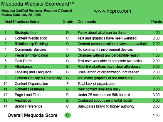
HCPro.com’s Mequoda Scorecard
[text_ad]
1. Strategic Intent, or Purpose – D
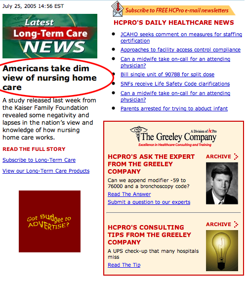
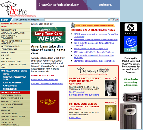
Why is it important for the purpose of your site to be clear and prominent in that first screen? So people who belong there know what to do, and people who don’t belong there know right away that they’ve taken a wrong turn on the information highway. Nowhere on this homepage is it clearly expressed what this site is about, what people can do here and why they should care. As a matter of fact, the most prominent headline, “CMS releases FAQs about HIPAA security” has nothing to do with HCPro and following the information trail takes you off-site to a government website for the Center of Medicare & Medicaid Services (so shouldn’t that be CMMS?) Right underneath this headline is a large red block seeking advertisers.
Improvement Alert: Make the most prominent items on this page be about this site. Tell us why we’re here and what we can do.
2. Content Webification – C
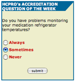
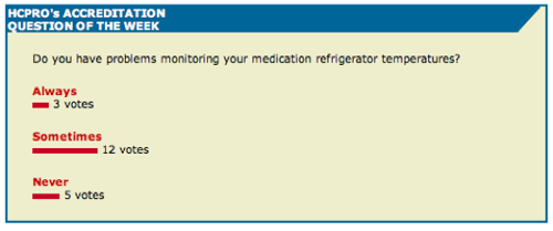
Much of this website is composed of short tips and bulletins. And that is absolutely appropriate. Each topic main page features a poll, located in the second screen and, unfortunately, not imbedded in the main story. This would ordinarily get HCPro some points. It’s what happens when you take the poll that is such a waste. The user gets to see immediate feedback but it shows up on a new screen, often irritating to PC users, and it has nothing wrapped around it! No content, no navigation, no nothing.
Improvement Alert: If you are going to have a poll, make sure the results are presented in a way that doesn’t embarrass you—show percentages, not actual respondents. When you only have 12 respondents, the results just don’t impress anyone. Make sure the results show up on a regular page with logos, navigation and a related call to action.
3. Relationship Building – C
HCPro.com gets points for having a free newsletter sign up… but they lose points for making me, the user, jump through hoops: “Before we create a new user account for you, we’re just going to verify that you aren’t already in our records. Please enter the information below and then click on the ‘continue’ button.” Why don’t we let computers do what they do so well—collect and compare data—and let the poor user just enter their email address, whichever one they are using today, to get the newsletter? After all, the reason you have the sign up is to collect the user’s email address and the permission to contact them. Do you really care if it’s not the same address they used when they were last at your site? If they do use the same email address again, use this as an opportunity for them to update their information.
Improvement Alert: Get that email sign up process down to one screen.

4. Community Building – F
I couldn’t find any blogs, bulletin boards or other user forums. If they are there, they are so well hidden they may as well not be there at all.
5. Persistent Navigation – D
The navigation on the HCPro site is confusing. Clicking on any item in the left navigation opens up a section in red at the top of the menu with the same three subsections: information center, newsletters and special reports. If you click on “information center,” you are brought to the bottom of the page. However, if you click on “newsletter,” a new menu appears and a new page is generated. Ditto for special reports. The behavior seems erratic and the navigation loses any semblance of consistency. If the site needs to have the second level of navigation show up, it should show up UNDER the link originally clicked—as if that link “opened up.”
Improvement Alert: Arrange the material on each of the topic pages consistently so that all the subsection headings are visible above the fold. Eliminate the red subsection menu in the left margin navigation altogether.
6. Task Depth – C
It helps to approach this metric as a user with something urgent or important to do. Most users are not going to just browse around your site—they want to get in, do what they need to do and get out. We chose three typical tasks for this kind of site.
- To find out how HCPro can help my (fictional) health practice.
Given how little information on the homepage is targeted at telling me what this site is about, it took a bit of poking around to find out that this website is the free information hub for a consulting and publishing services company. - See if there’s any free information I can get access to.
The invitation to sign up for free newsletters is right there in the top right marketing quadrant—very good. But as I mentioned before, there were too many steps to signing up. The titles of the newsletters were full of jargon and acronyms, which might shut out new people to the field—the very people who could best benefit from their newsletters. A more descriptive title, or a blurb describing the newsletter under each title, would improve this page and make it better SEO spider bait. - See if they can help me publish some health information for my practice.
This was the easiest task… and fortunately the item I was looking for was right there in the homepage left navigation menu—”Custom Publishing”—under HCPro’s Services.
7. Affordance – B
If there is one bright shining star on the horizon of this website it is their affordance. Well, almost. All the articles in the bulleted lists are blue underlined links. That’s very good. However, their headlines are linked but are neither colored nor underlined. It was entirely by accident that I noticed my cursor changing from the arrow to the pointed finger.
Improvement Alert: HCPro.com should make the links change color when I’ve already visited a page. There are so many articles on this site it’s really difficult to keep track of all the places I’ve been and all the articles I’ve read.
8. Labeling and Language – C
As is often the case, people who provide services to a specific industry or sector assume that everyone in that business shares the same language. This is generally far from the case. There are always new people coming in and seldom is one person an expert in every aspect of that business or discipline. The website publisher needs to be careful not to overdo the jargon in their language and labeling.
9. Readability – C
The layout on this website could benefit from a bit of widening to the full 800 (780 pixels) width of the wider screens. This would allow them to do more with their center column, which feels too narrow and cramped.
10. Organization (Marketing Quadrants) – F
The organization of these pages is so haphazard and poor that I could find little on which to award points. I get the feeling that there is a lot of information here but the organizing principle eludes me. When one clicks on one of the items in the “Information Center” the same information comes up… rearranged. To what purpose is anyone’s guess.
11. Content Freshness – B
HCPro.com benefits from the bulletins published by various government agencies, so that there is likely to be fresh content somewhere on the site most days of the week.
12. Load Time – B
The pages on this site load at a reasonable speed, less than 25 seconds on a 56k modem. This is most likely because most of their navigation is text and the images that are there are small and fast to load.
13. Aesthetics – B
The colors of this site are fairly clean and it successfully projects the image of a news site. There’s room for improvement, and it’s a site that could really benefit from some user testing, but it doesn’t violate the user’s mental models.
Improvement Alert: Ease up on the red a bit. Western cultures associate the color red with “stop” and “danger.” Use a little dash of yellow to bring attention to the call-to-action.
14. Brand Preference – C
There are three brands that show up on the homepage: HCPro, The Greeley Company and whatever gets the ad space in the center column. As the Greeley Company is identified as “A Division of HCPro”, and the location of the brand material is the lower right quadrant, we don’t have a big problem with this. But the ad space in the center of the homepage has got to go. Not until you know you’ve sold everything you can to your visitor should you be passing them on to someone else.
Improvement Alert: Use the center column to feature news that’s related to a premium product or service and then put contextual marketing copy and a link to that product or service near it.
Conclusion
The downside of this website is that it has not been thought through. A lot of good ideas have been thrown together, but they are not working synergistically. The good news is that there’s a ton of possibility and upside potential. The Web team needs to step back and develop a consistent user-centered strategy for the site. Then they need to do some user testing to see where they might be blocking users from getting to their products and services.


