Mequoda Revisits a Review of Better Homes & Gardens’ Website Design to See What’s Been Improved Since Last Year, Finding its Strategic Intent Clearer, its Interactive Content Better, but its Affordance Still Lacking
Last year we reviewed 10 consumer magazine websites, including the Better Homes & Gardens website and rated them against 10 heuristics or rules, the foundation guidelines of what would become the Mequoda Website Design Guidelines. We thought it would be interesting and instructional to go back to the Better Homes & Gardens website, or BHG.com and see if there have been changes made in their website design over the past 12 months and where they stood regarding the four additional heuristics we’ve added in that time.
- Interactive content makes your site stickiest when it’s all about the user
- Getting clear on the strategic intent of your site is critical… figure out what the first, second and third intents of your site are and make them the focus of your visitor’s initial experience
- Underline your links when you really want users to use them
- Improving load time is important in overall website design—despite the complexity of the site, Better Homes & Gardens website loads incredibly fast
- The real beauty of Better Homes & Gardens is that the print product and the website are consistently complimentary—they’ve tackled the tricky problem of differentiation in a manner that makes both of their versions valuable to their readers
Introduction
According to our report Consumer Magazine Website Design (September 3, 2004) BHG got top scores for Brand Integrity (now Preference), Navigation, Task Depth, Labeling and Language, Content Density (now Readability), and Aesthetics. Areas where they really needed to improve were Affordance and Organization. Load time, while not super-fast, was adequate and Strategic Intent, the first item on our scorecard, was acceptable but could easily be improved.
In order to make this a fair comparison, we went back to our original report notes and filled in the other four Mequoda scorecard items awarding BHG.com the following grades for last year’s site:
Content Webifications – A
Our report at the time noted “…the interactive portions of the site are a seemingly inexhaustible supply of home décor, gardening and cooking activities ranging from slide shows of model rooms to custom plans for gardens.”
Personalization – A
Better Homes & Gardens really knows their audience. Why? Because they have a million ways to find out where their audience’s interests lie.
[text_ad]
Community – ?
Because we weren’t looking for Message Boards our first time around we did not make notes about what we might have found. In fairness, we cannot give them a make-up grade on this item.
Content Freshness – ?
Unlike a news site, where one would expect content to be updated daily—perhaps even hourly, Better Homes & Gardens is a monthly magazine. What daily content freshness exists is as a result of their message boards. As we didn’t investigate those last year, we cannot give them a grade for this category.
Let’s take a look at where they are now!
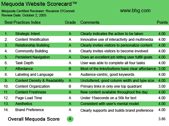
BHG.com’s Mequoda Scorecard
1. Strategic Intent – A (2004 – C)
BHG.com does an excellent job of communicating their strategic intent. The three top things we get from this site, in order of importance, are: they want us to get the magazine, they want us to sign up for some newsletters and they want us to save recipes and designs on their website so we will come back. This is a big improvement over last year.
2. Content Webification – A (2004 – C)
They have built on their success. They use Flash applications and javascript extensively and, even on our Safari browser, it all works. Everything from recipe books to designing my closet or garden is intuitive and purposeful. The best one is a Custom Calendar that we can simply fill in and then share. We can email it to someone, print it off, save it… and there’s a mouthwatering recipe on each page. This is a great tool for a busy family!
3. Personalization – A (2004 – A)
Every major section: food, garden, home, has a way for us to create and save something and retrieve it later. This is an incredibly sticky site. It can keep us there for hours playing with my stuff and we can come back later and work on it more.
4. Community – A (2004 – N/A)
Not only can members help each other, there are section moderators called Community Managers who chime in with helpful tips. Usually the problem a user brings to the Message Board has a solution somewhere in the vast database of articles at this site. The Community Managers act as skilled research librarians, combing through all the available material and posting links in the problem thread for the member and others to use.
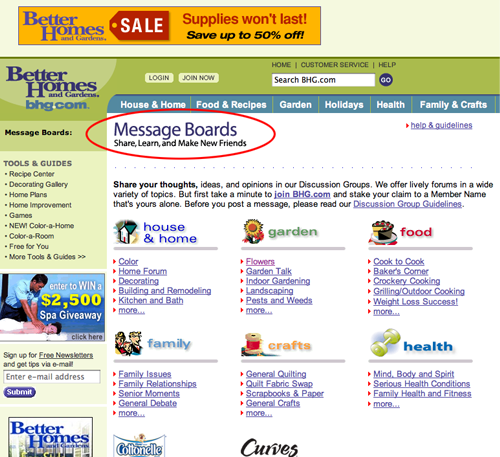
BHG.com has extensive message boards, moderated by staff members, where users can go to ask questions and get tips.
5. Navigation – A (2004 – A)
They still get excellent marks for navigation. The tab metaphor works very well. And they use a second group of tabs in the recipe section that is sufficiently distanced from the primary tabs to work. We were particularly pleased with the navigation in the animated image on the homepage, which lets you move back and forth between the images so you can click on what you wanted to see in the slide show. They also feature slide shows for recipes, fitness and decorating, with a simple “back/forward” interface.
6. Task Depth – A (2004 – A)
Task depth was largely the same. They use a great one step subscription page and allow the subscriber to pay later. However, they don’t incentivize using a credit card in the version we tested.
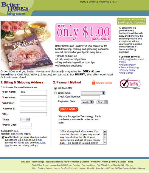
They use a great one step subscription page and allow the subscriber to pay later.
7. Affordance – B (2004 – C)
I still cannot give them highest marks for affordance as they still don’t use underlined text for links. Since none of the text is underlined until I pass over it with my mouse, I’m led on a link scavenger hunt—especially on those items that are a little ambiguous, like category labels.
Since none of the text is underlined until I pass over it with my mouse, I’m led on a link scavenger hunt—especially on those items that are a little ambiguous, like category labels.
8. Labeling/Language – A (2004 – A)
The labeling on the BHG.com site is excellent. The language that they use in their articles, instructions and customer service pages is clear, concise and contextual. They speak their readers’ language.
9. Readability – A (2004 – A)
The amount of white space, even on the most content-rich pages, kept the areas clean and contained. They need to work a little at keeping dynamic content from overlapping, but that is largely a browser issue.
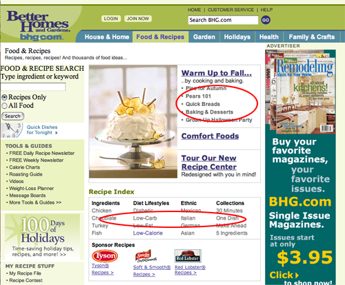
10. Organization – B (2004 – C)
While there were several pop-ups—a new one every time we clicked for the first five or six pages—there still isn’t anything in the upper right-hand corner that could lead to a subscription form except Customer Service. A simple text link “Subscribe” here would have their bases covered. So while the page is improved from last year—the subscription cover and the subscription and customer service links a little higher up in the lower left marketing quadrant—they still haven’t hit a home run for this item in the scorecard.
11. Content Freshness – A (2004 – N/A)
There is so much content here that even if they didn’t refresh the content weekly, a reader STILL wouldn’t be able to see it all. However, they don’t need to rely on quantity to get points… they have their readers and Community Managers who post to the Message Boards, creating helpful, interesting content on a continual basis. And the content that gets refreshed is in multiple formats: text, photos, slide shows. It’s a substantial investment in content.
12. Load Time – A (2004 – B)
Despite the complexity—the number of graphics, the interactive sections—this site loads incredibly fast. And when a delay is anticipated, the instructions on the page clearly set the expectations.
13. Aesthetics – A (2004 – A)
This is still a beautiful site. Food presentations that make your mouth water, flowers you can almost smell and plenty of decorating advice that you can SEE.
14. Brand Preference – A (2004 – A)
This is the Grand Dame of the magazine world, one of the original “seven sisters.” The Web version, BHG.com, continues to provide essential home and garden information and advice, creative ideas and tools. But the real beauty of Better Homes & Gardens is that the two versions, the print product and the website, are consistently complimentary. The website allows you to do things no print magazine could. And the print magazine does what it has always done: provides gorgeous full-size images, helpful advice and great ideas in a portable, long lasting format. BHG has tackled the tricky problem of differentiation in a manner that makes both of their versions valuable to their readers… so that brand loyalty logical extends to both media.
Conclusion
A year is a long time in the Internet world, and yet, once you’ve tackled the low hanging fruit of Web improvements exemplified in the Mequoda scorecard, it becomes difficult to make those incremental gains through your site while maintaining an intuitive, user-friendly interface. The one thing that did annoy us the second time around with BHG.com was the endless stream of pop-ups that preceded every click for the first five minutes of our browsing test. In 2004 we chided them for only having one subscribe pop-up. They seem to have made a pendulum swing to the opposite extreme, using pop-ups everywhere. Fortunately, the cookies that were set (we went to check) eventually registered the fact that we didn’t want to deal with them and the pop-ups stopped—but not soon enough. If a user has clicked the pop-ups closed three or four times in a row, marketers can pretty much rely on the fact that the user’s message is, “Not NOW!” Had we not been testing the site, we probably wouldn’t have stayed.
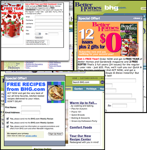
The one thing that did annoy us the second time around with BHG.com was the endless stream of pop-ups that preceded every click for the first five minutes of our browsing test.
The only scorecard item BHG.com needs to address is what has become known in our corridors as “the link thing.” No amount of design can alter the fact that it is the underlining first and then the color that telegraphs to users that the text is linked—so much so that those who post underlined text on the Web that isn’t linked create a huge affordance error. Do the affordance test. Print the page off on a black and white laser printer and ask people what’s linked… and what’s not. Without the underline it’s sometimes hard to tell—and that can make all the difference.


