CooksIllustrated.com has Earned High Marks in Relationship Building and Readability. Other Areas Such as Community Building Display a Good Infrastructure that Could Really be Impressive with a Little More Promotion.
Just to re-cap, the media network integrates content across all their outlets. Thus the TV show will use a recipe from the magazine, etc. … The pyramid includes:
- America’s Test Kitchen TV show and website
- Cook’s Illustrated magazine and website
- Cook’s Country Magazine and website
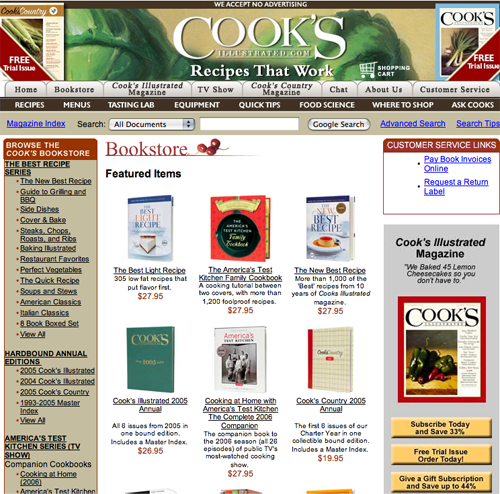
- Online bookstore with 40 titles of cookbooks and DVDs
The company sees itself as a database business—they seek to gather a database of names with a specific set of interests for further marketing efforts. The target audience is comprised of educated home cooks and smart shoppers who want to know that they’re cooking the best recipes with the best tools. This group isn’t satisfied with any old brownie mix, they want to know the best brownie recipe—with scientific proof! How do they do it? The content is cooked up—literally—in Boston where “a team of highly qualified test cooks and editors perform thousands of tests every year… to develop the best recipes and cooking techniques, recommend the best cookware and equipment and rate brand-name pantry staples for home cooks.”
[text_ad]
This Mequoda Website Scorecard review shows some excellent scores in readability and relationship building. On a membership website, this is exactly where we’d expect to see good scores. The audience won’t pay for something that’s hard to read. And the site won’t get a paying audience without paying attention to getting email addresses and subscriptions—building the relationship—from the get-go. The areas that are weak are also not unexpected—for example content that comes from a bi-monthly magazine often fails to figure out how to re-slice itself to fit a website’s daily schedule—content freshness is not a strong suit here.
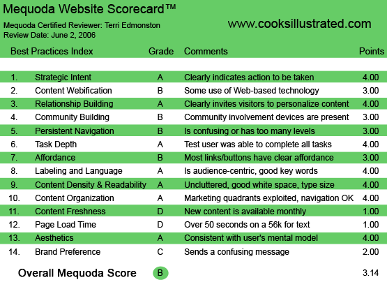
CooksIllustrated.com’s Mequoda Scorecard
1. Strategic Intent – A
They’ve made this one easy to call. Since the site doesn’t accept advertising, all revenues have to come directly from the users. The revenue streams come from selling site subscriptions, magazine subscriptions and ancillary products such as books and DVDs of their content.
The user is coming to the site for reliable, trustworthy information. They know that since the site doesn’t accept advertising, they can rely on the content here to be unbiased, following the Consumer Reports model. But this is a cautious audience (I mean they want someone to cook 30 pies so that they know which recipe works best—these are not big risk-takers here.) and a cautious audience will want to try before they buy.
The site has done a great job of balancing these needs. Some content is given away free—and clearly marked as free with a red “Free” over each headline. The site can still monetize the free content pages by advertising their own products (books and DVDs). And the paid content, both print magazines and website subscriptions, are offered on a soft-sell with free trials and no-risk offers.
All of this is visually very clear.
- Magazines: the user sees pictures of the two magazines (Cook’s Illustrated and Cook’s Country) at the top with “Free Trial” written over them.
- A large, separate box for “14 Day Free Trial” for the website subscription ad. Website subscriptions come with flexible terms—with monthly or yearly options.
- More product offers down the right side as internal ads, separated graphically and with benefit-rich headlines.
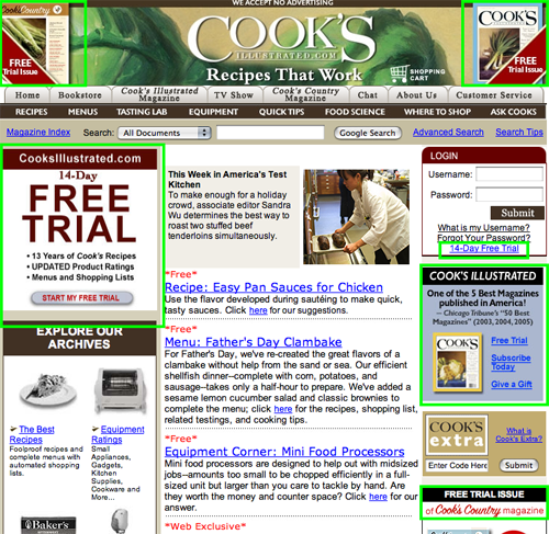
The “Free Trial” is made very visually clear throughout the site.
2. Content Webification – B
The key benefit of a website like Cook’s Illustrated is the vast searchable archive of information. Therefore, good webification in this case is directly related to advanced search capability. On CooksIllustrated.com, search comes in many flavors:
- General keyword
- Department specific, such as the Equipment Corner or Quick Tips,
- Magazine Index—for those rare people who remember things by date
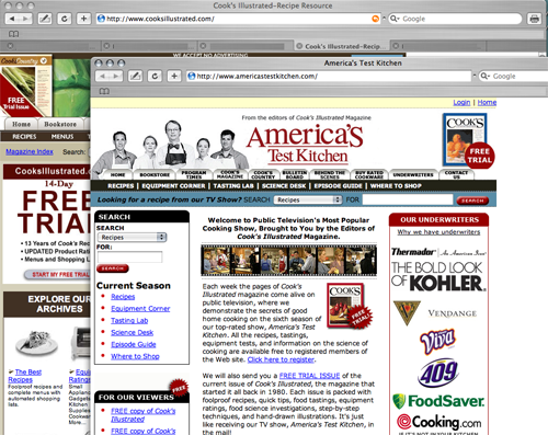
Since Cook’s Illustrated shares content with their TV program, America’s Test Kitchen, a little more integration of the two would be a welcome addition. We’ve seen sites like MarthaStewart.com put the TV version front and center alongside print content. CooksIllustrated.com has included at least one streaming video from the show next to an article on the site… I would love to see more to really cook up a great user experience.
3. Relationship Building – A
Since Cook’s Illustrated doesn’t accept advertising, building the relationship with the visitor is the first priority. If the user isn’t convinced by the large pitch for a 14 day free trial for a website membership, then perhaps they will be induced by some of the many magazine subscription offers (with free trial issues) on the site. The free newsletter eNotes is given low priority as the form is below the fold. When a user signs up for the free newsletter, they find themselves on a form asking for an address to send the “NO-RISK Free Trial” of Cook’s Illustrated.
Once a user has started the relationship they can personalize the site by saving their favorites—articles, reviews, recipes—and even print out personalized shopping lists.
4. Community Building – B
On a membership website we want to see members talking to each other, feeling connected, sharing their experiences. This interaction makes the site more real, more personal and makes the thought of leaving as hard as leaving a cherished school or neighborhood. Community ties members to the site as well as to each other.
On CooksIllustrated.com we’ve got a busy forum. Members here don’t just talk about the recipes on the site, they talk about their own experiences cooking them. They also come up with ways to meet each other in real life, and then post the photos of the events online. They create PR for the site as well as enjoying themselves.
There should be more promotion of this great community building tool. For example, there were people cooking the key lime dessert recipe within hours of its first appearance on the homepage. That immediate feedback from the community should be viewable right next to the recipe. Great tool, but it needs more promotion and integration with the site to reach its full potential.
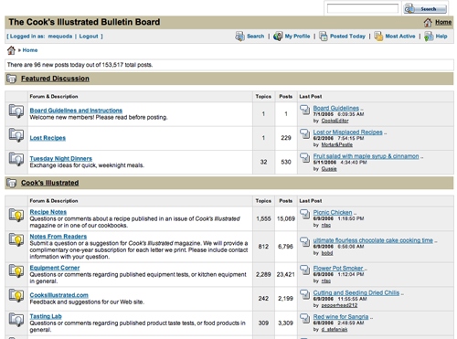
On CooksIllustrated.com we’ve got a busy forum.
5. Persistent Navigation – B
The navigation on Cook’s Illustrated is for the most part persistent. Users can get where they’re going and back again. The one design decision that causes confusion is the choice to put two links that open new windows on new sites on the top navigation bar. The two links (mentioned in Affordance) are “TV Show” and “Cook’s Country Magazine”. It makes no intuitive sense when most of the links at the top stay within site, and two take you somewhere else with no way back.
The one design decision that causes confusion is the choice to put two links that open new windows on new sites on the top navigation bar.
6. Task Depth – A
User tasks on Cook’s Illustrated include searching for content, signing up for email, subscribing and participating in the community. All were easy to find, and easy to complete. Search is on every page, with several advanced search options. Subscription entry points to email and magazines were on every page and standard forms. Ditto for the community boards.
7. Affordance – B
The typical user will have no problem figuring out what is a link, what isn’t , and where it will take them on CooksIllustrated.com. The site uses the convention of underlined blue text, and a rollover on the navigation links.
A common problem for a network site appears here. On the top navigation some links stay on CooksIllustrated.com and some go offsite, which is unexpected and frustrating to users. The first few and last few buttons in the top navigation— ‘Home’, ‘Bookstore’, ‘Cook’s Illustrated Magazine’ ‘—‘ ‘—‘ ‘Chat’, ‘About Us’ ‘Customer Service’—stay on CooksIllustrated.com while the middle two links—’TV Show’ and ‘Cook’s Country Magazine’ both go to new sites. The new sites have changes in look and feel and navigation. When clicking on these buttons that seem to be a part of the in-site navigation, the user will spend a few seconds (or minutes) confused, wondering how they got her and how to get back. The site could alleviate this problem by making it obvious (a.k.a., affordance) that these links will go to a new site.
8. Labeling and Language – A
Cook’s Illustrated labeling and language reflects the everyday words expected by their audience. A sample of language and button labels:
- Shopping list
- Ingredients
- Add to Favorites
- Tasting Lab
- Equipment
- Quick Tips
- Food Science
With the exception of using the word “Chat” to refer to a message board (chat typically refers to an IM interface, not a forum) the language on the site is clear. Even to the uninitiated, unusual phrases like “food science” are easily understood.
9. Readability (Content Density) – A
This site was a pleasure to read as all content is given plenty of white space, fixed column widths and illustrative images when necessary but not excessively. Additional bonuses include: breaking up content for easier reading by subheads and bulleted lists, different methods of viewing content (cool tool: printable shopping lists organized by supermarket department) and related content links with each story.
10. Organization – A
The average user eye will zig-zag across a screen, which is why the Mequoda Scorecard divides the screen into four quadrants to check that all primary and marketing tasks are balanced throughout. The top two quadrants of Cook’s Illustrated are almost entirely internal navigation and subscription offers. The content starts at the center of the screen. The left and right edges have more subscription ads and content navigation. All four quadrants are well-utilized.
11. Content Freshness – D
With so much information, Cook’s Illustrated could be forgiven for thinking of themselves more as a library and than a news outlet. But even libraries have to compete for an audience’s short attention span. Without date stamps on the content, the editorial schedule is unclear on the website. As the magazine is monthly, we can only assume the website is the same.
12. Load Time – D
Download time is too slow, at 58 seconds on 56K modem as measured by the Webpage Analyzer.
13. Aesthetics – A
No-nonsense, sincere and fun is the aesthetic impression I get from Cook’s Illustrated. The color palette of grey, brown and deep red is very grounded—conveying a sense of earthy honesty. Photos of products, foods and the real people doing the tests adds to the feeling of neighborly helpfulness that the audience expects.
The color palette of grey, brown and deep red is very grounded—conveying a sense of earthy honesty.
14. Brand Preference – C
There is some confusion between the two brand names America’s Test Kitchen and Cook’s Illustrated. While they publish the same content in different ways, they seem to be two separate brand entities. Yet, both sites have similar top navigation buttons, and they link to each other. (Affordance note here: it is extremely confusing that the link to America’s Test Kitchen simply says “TV Show”. It should say “America’s Test Kitchen” since that what they user sees when they click on it. ) With different URLs, and different logos, it’s confusing that so much of the content is shared. It isn’t clear who’s in charge. This uncertainty weakens the strength of both brands.
Design-wise, the reasons for the confusion are easy to pinpoint. For example, the navigation bars on each site are almost exactly the same—implying that the two are part of the same site, yet the nameplates and URLs are different. Two sites can partner content, they just have to make the relationship visually clear. The links that go to Cook’s Illustrated should be visually differentiated from the ones that are used for America’s Test Kitchen.
The use of totally new navigation on the Cook’s Country magazine site is actually better since it avoids this confusion. Even though it shares a URL, the site is visually very different, and even states in an advertisement “from our sister magazine Cook’s Illustrated,” so that the relationship is clear. It is obvious that Cook’s Country magazine is a separate entity from Cook’s Illustrated.
Conclusion
CooksIllustrated.com has earned high marks in relationship building and readability. Other areas such as community building display a good infrastructure that could really be impressive with a little more promotion. Finally there are some common pitfalls that even the best sites fall into, and content freshness is the Achilles’ heel on this site.


