An Online-Only Membership Website is a Good Idea for Melcrum, and The Hub is Taking the Right Steps to Bring the Promised Value to Both the Company and to the Audience.
The Hub for Internal Communicators is a membership website with research, information and tools for communication professionals. The product and the audience are identified in the tagline: The most comprehensive resource available for employee communication professionals.
Produced by Melcrum, an information and research company with offices in the UK, North America and Australia, The Hub for Internal Communicators (The Hub) has been online as a UK site since 2005 and launched a North American version shortly after.
Melcrum is wholly owned by founders Victoria Mellor and Robin Crumby and currently publishes a number of editorial journals, research products and workshops, conferences and events. The Hub, which is the most recent addition to the group of Melcrum’s information products, has no print version, but is a membership website/resource with a yearly subscription fee of £395/$595 (full price).
The Hub has shown a fantastic aptitude for some of the Mequoda Scorecard criteria. We expect that the well-defined strategic intent, the excellent readability and lovely aesthetics will quickly endear the site to readers. There is also room for growth as other criteria such as content webification, relationship building and brand preference are lacking some oomph. Overall, the scorecard shows that The Hub has a good foundation to serve their audience well, and bring value to English-speaking business communicators across the globe.
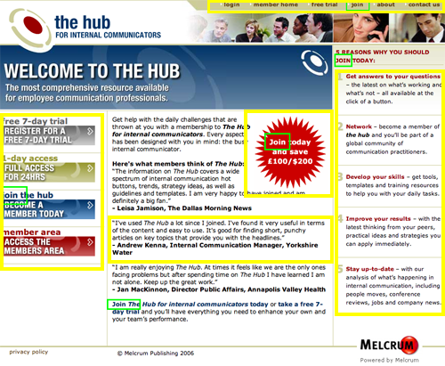
- Internalcommshub.com is a landing page for an unknown user, and a homepage for a current customer who is not logged in. The layout has to balance the needs of two kinds of visitors, and this layout does.
- How could the site get an A in the content webification category? Here are some examples: expand the content mix with podcasts, blogs and video to bring the content to users in additional channels, and engage the audience more intensely.
- Facilitating communication between members could directly affect revenues for Melcrum. For example, Melcrum hosts events, and it would be a natural for members to be able to reconnect with other members who they had met in person at those events.
- The Hub is truly a lovely site. There is plenty of white space to rest the eye and allow users to focus on the content.
- While a paid membership site does have an obligation to reduce the marketing push because members will expect more content and less marketing, the site design shouldn’t make it hard to find other Melcrum products either.
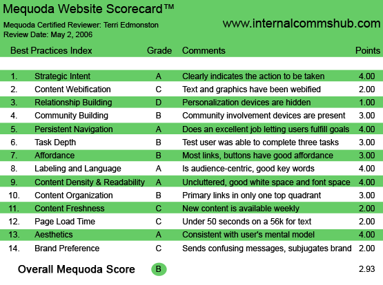
The Hub for Internal Communicators Mequoda Scorecard
1. Strategic Intent – A
Mequoda constantly argues that strategic intent is the most important guideline in our scorecards. Does the user know from the first 10 seconds of looking at your site what they can get here, and what they need to do to get it? The Hub does an outstanding job on this one. This is an information website for a specific audience of business communicators and membership is required to get to the content. The methods:
- The user sees the word ‘join’ five times
- “Join Today” starburst graphic
- Purchase options in colored blocks
- List of five reasons to join
- Testimonials in the center text
- Primary navigation for current members and company info
This is a landing page for an unknown user, and a homepage for a current customer who is not logged in. The layout has to balance the needs of two kinds of visitors. The elements listed above have different priorities and the design has to visually communicate this to every visitor. For example: after the logo, the first thing that most eyes will be drawn toward is the “Join today and save ‘£100/$200’ in a red starburst.” The graphic is well placed to grab the eye without ruining the page. The testimonials flow around this starburst, with full name and title attributions. Then there are the three purchase options clearly displayed: a 7-day trial, 24-hour full access pass and full membership. Current members can enter the site with the graphic “member area” via the login/member home navigation on the upper right. And all of this is above the fold (no scrolling required).
[text_ad]
Strategic intent doesn’t stop with the unknown user homepage. Once logged in, the site cookies my browser and the homepage is no longer a sales landing page, but the content that I actually signed up for. The Member Homepage—which one can navigate to if the technology fails, starts with “This Week on The Hub.”
Does the user know from the first 10 seconds of looking at your site what they can get here, and what they need to do to get it? The Hub does an outstanding job on this one.
2. Content Webification – C
While The Hub is billed as being interactive, with lots of downloadable tools (toolkits), how-to guides, templates and training resources, the simple offering of a PDF, Excel sheet or PowerPoint download is really just old media and doesn’t take full advantage of the interactive opportunities that the Internet provides. On the plus side, The Hub does offer a variety of information including training resources, a vendor directory and job listings. In addition, as the site serves both a UK and North American audience, the user can select their preference in a drop down on the upper right corner. The content will then be filtered for the audience—for example an article on UK legal issues will not appear for a North American reader.
How could the site get an A in the content webification category? Here are some examples: expand the content mix with podcasts, blogs and video to bring the content to users in additional channels, and engage the audience more intensely.
The Hub does list Melcrum’s Webinars under Events, but these should be Hub-branded Webinars to really increase the value of a Hub membership. Another example is found in the several types of checklists in the toolkits. These PDF printouts could instead be offered as interactive forms. By making these into online forms the user could see results immediately, and experiment with possible changes by changing some entries and seeing the new results. The gist is, that The Hub could offer a richer experience to the user, and keep the user involved with the site longer, by providing more truly interactive tools.
3. Relationship Building – D
On The Hub there is almost nothing that builds a relationship with the user. At the basic level, the site recognizes that I’m logged in, but doesn’t say my name anywhere on the page. As a member, I expect to see my membership displayed a la “Welcome Terri,” rather than the generic “logout.”
Relationships between a site and a user are built with personalization features. A finance site would do this via a personal portfolio; a commerce site with a wish list. A content site should allow me to save a library of favorite articles, or show a list of headlines on topics that I’ve selected as being of interest. Or, if I’ve posted a comment or question, I would love to see new responses to those right on the homepage, in a side navigation box. Just to list a few examples of common relationship building tactics.
4. Community Building – B
To facilitate communication between a geographically far-flung audience on very specific topics is exactly what the Internet was created for (scientists and researchers). This type of communication is community building. And this conversation between community members is an aspect of a site like The Hub that is very important to their audience. This should be well-served by The Hub as an online, virtual location. The Hub promises this, with their Comms Network: “global practitioner, share your experiences, evaluate new trends and problem solve pressing issues.”
However, the Comm Network is actually a fairly basic email discussion group. While a group list-serv is a valuable communication tool, it does fall short on the building communication between members. The Hub’s Comm Network stores content online and makes it searchable, but doesn’t take advantage of more integrated technology, for example Yahoo! groups makes it possible to contact other members directly from the site. This isn’t simply a technophiles criticism. Facilitating communication between members could directly affect revenues for Melcrum. For example, Melcrum hosts events and many of the users of The Hub will have attended some of these conferences and workshops. It would be a natural for members to be able to reconnect with other members who they had met in person at those events, to post comments publicly and to find each other online. This would have the benefit of encouraging new users to attend an event. We go to sites like this to meet people like ourselves, and the option to meet someone face to face that you have already met online is a powerful incentive to go to an event. This is a clear example of how a business goal (higher attendance at events) could be served by improving the community building aspect of the site.
5. Persistent Navigation – A
The Hub is easy to navigate. User goals of browsing or searching content, and managing their account are easy to fulfill. Specifically:
- Basic tasks (logging out or managing your account) are ubiquitously present at the top right, and take almost no visual attention away from other elements.
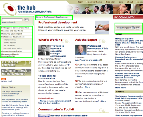
- Simple Search is easy to find, appearing at all times directly under the logo, with an Advanced Search link as well.
- Content is easy to browse, either by department on the left side, or by type with news headlines and events listed on the right.
- Breadcrumbs always alert the user to where they are, and allow the user to click home easily.
The Hub is easy to navigate. User goals of browsing or searching content, and managing their account are easy to fulfill.
6. Task Depth – B
We’ll attempt these four important user tasks at The Hub: Join, Read content, Manage Account preferences, Share information. The first three were very easy to complete. Finding out how to join or My Account was easy, content is well organized and the layout and technology do not get in the way of fulfilling the tasks.
However, it was hard to share information. Many readers will want to share this work-related content with colleagues. Allowing the member to send an article to a friend, or print it out easily, would make this task easier. These options were not available. The Hub earns a B, for the user-friendly completion of 3 out of 4 tasks in this criteria.
7. Affordance – B
The affordance on The Hub is mostly clear. Some of the links are a bit on the subtle side. For example, the pale tone used for the department navigation links make it uncertain whether this is indeed a link, until you rollover. However, all links are bold type, and often there is another visual indicator such as an arrow bullet or list format.
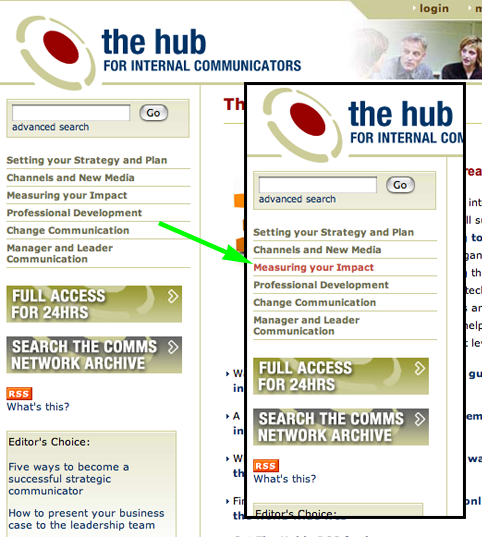
Some of the links are a bit on the subtle side. For example, the pale tone used for the department navigation links make it uncertain whether this is indeed a link, until you rollover.
8. Labeling and Language – A
The Hub has an audience that lives for language. Communicators all, they will have vocabulary levels a few percentage points higher than the average. The site does use a bit of lingo and brushes with allowing the newbie to feel a bit like they walked into a party where they don’t belong. Here’s one silly example to illustrate the point: the department title “Change Communication” is obvious to someone who knows it refers to communicating about change, but someone not used to seeing Change used as a noun could be forgiven for reading it as a verb, as in “alter the communication.” (Don’t laugh, it happens.) It’s a pitfall of many trade journals to forget that the words they use every day can have different meanings outside their bubble.
Alternatively, since this audience loves words, to simplify the language too much would lose credibility with them. In general, as a newbie on the site I felt drawn in more often than left out. For example, I understood immediately what I would see when clicking on “Communicator’s Toolkit,” “What’s Working” and “Ask the Expert.” The use of lingo on The Hub is just lingo-y enough to please the audience, without scaring off newcomers.
9. Readability (Content Density) – A
The Hub is truly a lovely site. There is plenty of white space to rest my eye and let me focus on the content. At the same time the images along the top, and sprinkled throughout the content, brighten what could be a drab page. The index pages full of links and short blurbs hang together just as well as the pages with a single article with graphic quotes.
10. Organization – B
Primary navigation links and content links are available in the very top right, along the lower right side and within the left side navigation bar of the page, covering all four quadrants. Content is available in the middle, covering part of all four quadrants again. The trouble is with marketing links. These are found only in one quadrant, the lower right (events). As a site within a network, The Hub should pull its weight more by helping Melcrum sell their other products, for example Events. While a paid membership site does have an obligation to reduce the marketing push because members will expect more content and less marketing after paying a hefty subscription, the site design shouldn’t make it hard to find other Melcrum products either. Using only one quadrant for marketing links is being a little too shy.
11. Content Freshness – C
It was hard to define exactly how often content was updated on The Hub. Looking through the dates of the news headlines, it seemed a bit arbitrary—sometimes two in a day, sometimes there might be a week between headlines. However, the site sends out a weekly e-update, and the homepage says “This Week on the Hub.” This leads me to conclude a weekly content schedule must exist on the managing editor’s desk. A weekly schedule earns a C on the Mequoda scorecard, because users online expect new content throughout the day. They need a reason to visit the site frequently, to feel that they are missing something if they skip a day.
12. Load Time – C
The hub loads at 31 seconds on a 56K modem, earning the site a C on the Mequoda Scorecard.
13. Aesthetics – A
The Hub is a pleasing site with a simple, yet nuanced design. The basic three-color palette of blue, red and tan fits a business aesthetic. The use of light tones and grey shading adds layers of depth to the visuals. This design supports the serious business sense of the site, as well as being consistent with the audience of communications professionals’ mental model of the importance of an attractive presentation.
14. Brand Preference – C
The Hub, as a part of Melcrum, should do everything it can to promote other Melcrum products. The Hub also has to stand on it’s own two feet. The tricky line to walk is how to use the resources of the parent company, bring additional sales to the parent company and yet create a strong brand—with the name recognition and customer loyalty that come with it. The Hub sends confusing messages to the user. Melcrum has a logo in the lower right footer, and the events and webinars advertised are all Melcrum branded. Even many of the downloads in the toolkit include the Melcrum name, with no mention of The Hub. Is The Hub something worth paying for on it’s own merits, or is it simply a sales vehicle for Melcrum, the user begins to wonder?
Another nitpick, the URL and the product name are inconsistent. The URL name www.internalcommshub.com (which unfortunately creates a new word within it, the odd sounding ‘shub’) isn’t the same as the logo name “The Hub for Internal Communicators.” Obviously one can see how they are related, but the URL string should be exactly the same as the title. Some even argue that it’s worth changing the title in order to get the right URL. The brand value is hurt every time an inconsistency causes confusion in a reader’s mind.
Conclusion
An online-only membership website is a good idea for Melcrum, and The Hub is taking the right steps to bring the promised value to both the company and to the audience. The basics are there with navigation, strategic intent and many other aspects earning As on the scorecard. With some time and feedback from members, the site will most likely find itself growing into As in the other categories, such as Content Webification, that currently are a bit weak. The Hub might have to grow into its name, but we think it’s starting on the right track.


