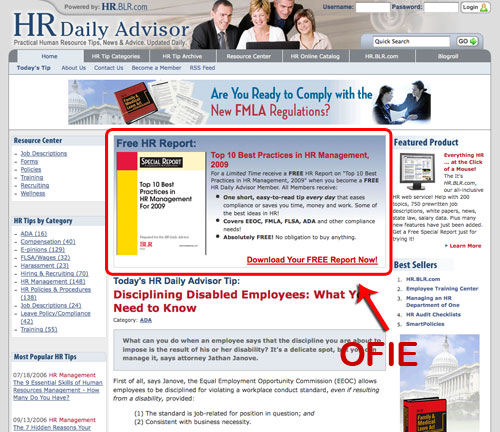
How to create an OFIE that effectively turns website visitors into email subscribers
We’re big fans of acronyms over here at Mequoda, and the conversion architecture element we affectionately call the OFIE is no exception.
OFIE stands for Order Form in Editorial. It’s an embedded subscription form that appears on web pages and looks like a fairly large, coupon-style ad, usually placed in an unused space at the top or bottom of a webpage. In general we aim for a 4% site-wide conversion rate, and a good OFIE can get us halfway there with a 1.5-2% conversion rate.
When used at the top of a page, the OFIE usually offers a free report or product. The goal of the free product OFIE is to build email circulation.
There are four necessary elements of a successful free report OFIE, the action headline (“Get your free copy of {insert product name here}), the action box (“enter your email here”), the action button (“Yes I want my free special report”), and the product shot.
Below I can tell you what has worked fairly consistently in the past, but these four elements are the items that we’re really just suggesting that you test on your own site.
[text_ad]
The action headline
The action headline should be action-oriented. It should say something like, “Claim your free copy of….”. The name of the product should be in the title, and some publishers choose to hyperlink the title to the full Rapid Conversion Landing Page. One thing we’ve tested learned NOT to do is to mention that they’ll receive a newsletter in the OFIE, because, as Don says “nobody wants another email newsletter”. Testing is always critical, as results do vary from market to market.
OFIE action headline tests you can try:
- Add the name of the report/product into the headline
- Link the name of the product to the landing page
- Add a blurb about your email newsletter that they’ll receive
The action box
The action box is necessary for maximum conversions. The action box allows the reader to enter their email address; after all, this is an order form. If your system can support it, the email address should be captured from this initial phase, whether or not they choose to fill out the more elaborate form on the next page.
OFIE action box tests you can try:
- Remove the action box and direct user straight to the landing page
- Remove/add “enter your email address” from the empty action box
The action button
The action button is probably our most tested OFIE element. In our experience, orange and blue buttons accomplish the most conversions, but we’ve seen red & white work on one of our client sites. You really need to test for your audience. When you’re testing buttons, remember that 1/3 of the time, the button that gets clicked most is not always the button that converts most.
OFIE action button tests you can try:
- Highlight the button when it’s rolled over
- Switch button text between short and long copy
- Try using the name of the report/product on the button
- Change the color of the button and text
- Remove the button and use hyperlinked text
The product shot
The product shot in your OFIE should be easily read and understood. It should also reflect the actual cover of your report or product. In the past, we have come across instances where a test that has no product shot and only a headline wins the A/B split. We assume that’s because the main emphasis is on the headline. If you want to try that route, make sure you have a great headline! In most cases, the reader prefers a visual.
OFIE product shot tests you can try:
- 3-D version of the book/product
- Remove the product shot
- Make the cover fancier, but less readable
One last bit of knowledge we’ve gained that will make your designers cry: don’t match your OFIE to your site design. When we’ve tested, the best results come from OFIEs that stand out from the existing site design and don’t blend in. Just take a look at Knitting Daily.
When I consulted Don about this tip, he reminded me that best practices are always changing, and OFIEs are no exception. You should be continually changing the design of your OFIEs so that your readers don’t get “banner blindness”.
Don told me something Steve Sachs, President of the Real Simple brand told him, which was that “this kind of creative fatigues rapidly. What’s winning now is winning because it’s new”. In other words, what works now, might not work in a month, so keep your supply of testing elements on hand.
We have tons of conversion architecture tips in our new Mequoda Pro online training library. The cost to subscribe today is just $197 for 12 months of access. Learn more…
Care to share any surprising results you’ve discovered in your own tests?


