Naturally, investors of all shapes and sizes want a great ROI, which is why they spend a lot of money on investment newsletters. And as you’re well aware there’s no shortage of it online and off. The majority of investment newsletters we know and love primarily use long-copy landing pages to sell their products. This review is of an excellent company that’s been giving a plethora of information since 1997: 21st Century Investor.
This is not a landing page which usually uses a long sales letter as a vehicle to sell customers. Instead it’s a main portal page site that also includes sister subscription services such as 21st Alert, 21st Century Options,Erlanger Squeeze Play and Jim Patterson’s Tactical Trading Outlook among others.
- The headline combines a strong, benefit-oriented promise and gives its targeted audience a Unique Selling Proposition
- Because this isn’t a standard sales letter landing page, I would enjoy longer copy—although I am impressed with the premiums they offer on the product page to sign up for their other sister newsletters
- One thing is certain about 21st Century Investor: they want you to order… and they want you to order NOW
- This website certainly has their ordering options down very well—they have the Big Three: fax, toll-free phone and email, a practice we strongly suggest for landing pages
- 21st Century Investor tells you how many issues you’ll get, and the standard 30-day money back guarantee is presented—a more compelling guarantee would have likely increased response
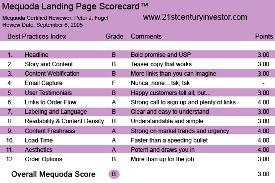
21stCenturyInvestor.com’s Landing Page Scorecard
1. Headline – B
“100% Unbiased, Independent And Professional Analysis For Individual Investors,” is 21st Century’s headline, which is located in its masthead.
This headline not only combines a strong promise with a benefit for the reader, but 21st Century Investor gives its targeted audience (drum roll, please) a Unique Selling Proposition: a sense of empowerment so they can make their own investment decisions.
[text_ad]
Now don’t forget: a landing site delivers a compelling headline for a single product or service to compel the prospect to buy it. Now a main portal website, such as with this particular headline, shows us that its goal here is to give a strong benefit and brand itself into the hearts and minds of its future prospect.
Now I’m sure there are other subscription services that deliver unbiased, independent and professional analysis throughout their copy, but 21st Century is the one company that decided to present it right up front to its reader as its USP. The headline in the masthead is a broad promise, but it tells the future subscriber what’s in it for them. If this was for a particular product, such as at a mini site for a particular newsletter, then I’d make the headline more specific.
“With Our 100% Unbiased, Independent Professional Option Analysis We Had 23 Out of 24 Winners.” (Psst! We have four more that are ready to explode but you have to act NOW!)

2. Story and Content – B
This particular portal website does not rely on long copy to sell its services. In fact, this publisher uses editorial copy to lure the prospect in with brief teases of information of what a particular issue of 21st Investor will look like. Then when you click on it for more information, you’re then taken to a new page where you’re asked to put in your username and password (if you’re already a member) or the opportunity to subscribe. Personally, I’m a proponent of giving a longer story for copy, but again, that’s me.
Past experience has shown me that successful marketers such as 21st Century probably tested this model over and over again, which is why they’re using this teaser type of copy for their site. What concerns me is that they have on the side bar a headline that says: CHECK OUT ALL OF OUR NEW AND UPDATED SPECIAL REPORTS. Online prospects love to get information and 21st Century uses power buzz words to get you interested in reading more. But I imagine the reader goes there thinking they’re going to get “some steak,” but instead they get a nice little appetizer.
And that’s because when you click here for more information (after reading the enticing lead), you’re whisked to a page that asks for—you guessed it—your password and user name again or the opportunity for you to whip out your Visa card and sign up. With this strategy the publisher’s letting the prospect know, “See? If you were a member now… you’d be privy to this important financial information that our other cool subscribers have right now that will help them pay for the children’s education. So here’s your chance to sign up, have your kids LOVE you and join other hip and profitable investors.”
I would enjoy being courted by 21st Century Investor with longer copy—although I am impressed with the premiums they offer you on the product page to sign up for their other sister newsletters.
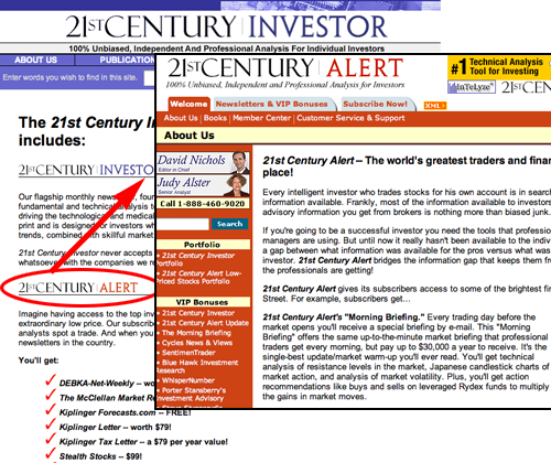
I am impressed with the premiums they offer you on the product page to sign up for their other sister newsletters.
3. Content Webification – B
OK, call the cliché police: 21st Century Investor “kills two birds with one stone.” Here’s why: some marketers prefer putting a column along the right margin with more information for the reader. Others prefer having a “click here for more information” (this usually works very well with long copy) through the sales piece. This newsletter does both and does it well. The marketer is always trying to get the reader to sign up for their newsletter.
4. Email Capture – F
There’s no pop-up window that appears when I click away from the site, nor is there any email capture on the home page. Please note for your own website: you should do your best to grab the email address of any human that visits your website either for your blog, ezine or to follow-up with auto responders.
5. User Testimonials – B
Strong testimonials. Yes, today’s customers are quite incredulous about any offers that are shoved down their throat and they’re especially incredulous when it comes to parting with their hard earned money. That’s why it’s important to have testimonials from other like minded people that’ll help the prospect make a wise purchasing decision. Testimonials found on this site are strong endorsements from happy subscribers. (Would you put disgruntled ones?) Although I feel they were “general” in their accolades—I would’ve preferred some specificity where they mention a particular stock play and the gains they had made on it. Testimonials are found on the subscription page. But, as you know, you go with what you get when it comes to testimonials.
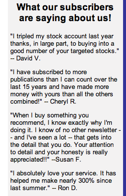
I feel they were “general” in their accolades—I would’ve preferred some specificity where they mention a particular stock play and the gains they had made on it, but you go with what you get when it comes to testimonials.
6. Links to Order Flow – A
Excellent links to order. One thing is certain about 21st Century Investor: they want you to order… and they want you to order NOW. Links to order are strategically placed throughout the site. There is a strong call-to-action on each page.
7. Labeling and Language – B
Even though this is a financial services website, it uses clear and easy-to-understand language. Not overtly hard sell or “hypey,” the use of the language gets you excited about the cutting investments that are on the horizon.
8. Readability and Content Design – B
Effective use of typeface and a design that is both inviting and not distracting. On the investor education link the designer used an animated photo of Alan “Mr. Happy Face” Greenspan which is probably more animated than The Fed Man is in real life. It certainly gets your attention and shows that 21st Century Investor has a sense of fun, particularly when it comes to investor education.
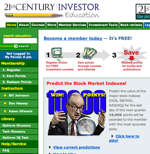
On the investor education link the designer used an animated photo of Alan “Mr. Happy Face” Greenspan which is probably more animated than The Fed Man is in real life. It certainly gets your attention.
9. Content Freshness and Urgency – A
Some investor subscription sites, believe it or not, don’t keep up with economic trends or mention them at all. 21st Century Investor does. They’re extremely aware of what is going on in the geopolitical arena and address it right out of the gate on their homepage where they tantalize the reader about hurricane stocks. In fact, the whole essence of 21st Century Investor is identifying investment trends of the future so YOU, the prospect, can capitalize on them whether it’s in stocks or options:
- Discover Tomorrow’s Technology Leaders, Telecommunications Giants, And Breakthrough Biotechs Today Become a 21st Century InvestorEach month, over 30,000 individual investors and financial professionals rely on 21st Century Investor for original insight, unbiased recommendations, and impartial advice on the technology, telecommunications and biotech companies that are reshaping.
10. Load Time – A
Quick and precise. Something I wish my family would be when telling me a story.
11. Aesthetics – A
The design presented is to keep the reader involved with the copy and it accomplishes its goal. Again, most investment newsletters use long copy to engage the reader, overcoming any resistance they have, right up to the call-to-action. 21st Century Investor uses short “teaser copy” to get you to subscribe. It doesn’t highlight key words which you’ll find in hard sell landing sites.
The writer uses strong headlines for the small chunks of copy they present to the reader and gives them exciting and profitable trends in the investment world. BUT again, they don’t give you the whole story. It’s almost “tabloidesque” as they draw you in, get you excited of what your financial future is… and then… and then… THEN ask you to subscribe if you want the whole story. (Sigh.)
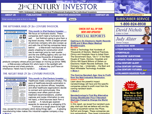 21stCenturyInvestor.com’s Homepage
12. Order Options – B
This website certainly has their ordering options down very well. They have the Big Three: fax, toll-free phone and email. Not only that, but on every page there’s a “click here to order button to subscribe NOW!” They don’t offer any freebie reports that other investment newsletters ethically bribe you with to get you to subscribe—except with 21st Alert where they provide over (count ’em folks) 15 investment freemiums.
This investment newsletter also tells you how many issues you’ll get, and of course, the standard 30-day money back guarantee is presented. I’d be curious to see what their response rate would be if their guarantee was more compelling.
If you are not completely delighted with 21st Century Investor, as a first-time subscriber you may cancel within 30 days and receive a full refund. You’ve got nothing to lose. Your subscription is fully guaranteed, and may be tax-deductible* as an investment expense.*Consult your tax advisor for details.
21st Century Investor also gives you an option to try any service for one month at $9.95 a month. This RISK FREE offer is to allow the subscriber a test drive. Works for me.
Conclusion
I liked this site and the information it presented to the reader. It involves the reader with its very extensive product list of investment newsletters. I would like to see more of the track record for each of the other newsletters, but again, this publisher uses teaser copy for its offer. I’d be interested in knowing what its conversion rate is. Overall, I give it a B.


