Stuck in 1995: Computerworld’s E-mail Newsletter Needs an Update
When you’re writing about technology, it’s good to deliver that information via the latest channels. Computerworld, published by International Data Group (IDG), does just that, offering their content via a website, blogs, webcasts, podcasts, RSS feeds and email newsletters, in addition to the original print publication.
I applaud their embrace of so many different formats as well as their breadth of information (they offer 46 email newsletters in all). But I wonder if they haven’t spread themselves too thin.
While the content of their free “Computerworld First Look” email newsletter was impressive, the presentation was, well, familiar. It looked a lot like the first email newsletters I developed for another publisher, way back in 1995. Thankfully, that publisher has upgraded the format a number of times, most notably moving to HTML once that was an option (sometime before the year 2000). Unfortunately, Computerworld hasn’t made the leap into the 21st century of email.
I even checked to see if the email was HTML and just looked like text. Nope. There was no source code to be had. It was plain text, no bells, no whistles, no bold, no highlight, no images, no way to track opens, no HTML.
Even so, Computerworld’s First Look did have some successes:
- The advertising is evident but not in your face
- The from line quickly and decisively identifies the sender and the content
- The subject line highlights the contents of each specific issue
But it also missed the boat in some key areas:
- The text-only format appears dated
- The preview pane doesn’t engage the reader
- The information listed in the table of contents doesn’t actually appear in the email itself
Bottomline:
Although the content is good, this email newsletter covering the latest in technology issues appears to be a relic from the mid-1990s. Updating its look and feel and incorporating current standards and best practices would go a long way toward improving the reader’s experience and may even help generate more ad revenue for this publisher.
[text_ad]
1. Delivery—B
Almost all the news here was good. The email consistently made it to my inbox at around 7:30 each weekday morning. The only thing missing was a white list request – which is one reason this email newsletter seemed stuck in the past. Spam Filters, false positives and white listing didn’t become critical issues for email senders until a few years ago; prior to that no one included white list requests in their emails.
2. From Line—A
This (Figure 1) is one of four areas where Computerworld earned a perfect score. Their primary brand is featured prominently in both the display and actual from addresses. In addition, they include the name of the email newsletter, which is a nice touch and eliminates the need to include it in the subject line. The from lines remain consistent from send to send and are easily recognizable.
Figure 1: From and Subject Lines
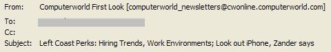
3. Subject Line—A
Another perfect score. The subjects lines (Figure 1) were engaging, benefit-oriented and they highlighted key elements of each issue. Each day brought new content and a unique, non-spammy description where the most important information was presented first.
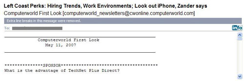
4. Preview Pane—D+
All the momentum built by the from and subject lines is lost when readers see the preview pane (Figure 2). Since it’s text-only, it reads exactly the same when images are blocked (since there are no images to block). That earned them a half point. The fact that their brand and the name of the email newsletter appear prominently earned them an additional full point.
But the real story here is what’s missing and what’s here that shouldn’t be. We’re not seeing anything that provides a clue about the content – no headline or anything else to back-up the expectations set by the subject line. There’s also no link to view the email online, which would at least offer an opportunity for readers to benefit from a more readable HTML version. This surprises me a bit, since back in 1995 these links were standard operating procedure. You see, it was pre-HTML email and so everyone sent a text version and usually included a link to view a webpage with the same content.
What’s here that shouldn’t be? An advertisement – or a note from the email newsletter “Sponsor,” just like we did in 1995. Even in an ad-supported email newsletter like this one, this isn’t the best use of prime real estate.
Figure 2: Preview Pane
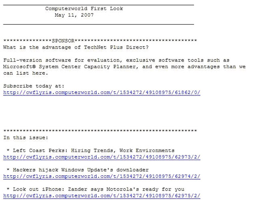
5. First Screen—F
Computerworld earned another below average grade for the first screen (Figure 3). It appears to include a detailed table of contents (“In this issue”) so readers can see at a glance if there’s anything of particular interest in this email. But on further inspection you realize that the only place these items are mentioned is here – they aren’t actually in the email, they are on the website. Without blurbs, it’s hard to know what’s of interest. While this may have passed muster in 1995, it doesn’t in 2007. No credit.
[text_ad]
Although there are links, Computerworld didn’t receive full credit here either. While they are useful and necessary, given that this is the only place in the email these articles are mentioned, the long URLs are ugly and clutter up the screen. In 1995, pre-HTML email, links had to look this way. Today it just looks clumsy.
While the copy has a friendly, engaging voice, the email newsletter would benefit from an opening paragraph. Including some sort of information about the editorial team that pulls this together would also help make it more personable (there aren’t even any bylines, which seems like a slight against their writers).
Figure 3: First Screen
6. Look and Feel—D
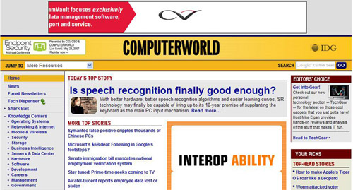
Back in 1995 this would have earned an A – there’s lots of white space, asterisk borders are used to separate content areas and the paragraphs are short. But today, it just looks dated. The omission of images is a huge loss. There’s no opportunity to tie the look and feel back to the Computerworld website (Figure 4) since this is plain text, which is a shame. And it’s simply not engaging to the eye.
Figure 4: Computerworld Website
7. Content and Tools of Engagement—B
As I mentioned earlier, most of the content is good. The headlines are punchy but informative. I wish there were more blurbs, but the ones that are here are well-written and they do make you want to click to read the story. There are interactive opportunities for readers via blogs and invitations to share stories.
The newsletter strictly adheres to the 60/40 rule, with 59% of the content being editorial in nature, 21% being promotional in the form of third-party advertising and an additional 20% being housekeeping. The only downside: the newsletter typically runs a full four printed pages, which is a bit too long to be read comfortably online.
On a positive note, if Computerworld were to take this newsletter to HTML they could probably up the ratio of advertising without overwhelming the audience and without increasing their editorial.
8. Business Goals—A
Computerworld is clearly focused on advertising revenue to keep their business afloat. The third-party ads were well spaced out and not pushy. While the current thinking is NOT to lead with an ad (Figure 3), back in 1995 this was a best practice.
9. Footer—A
The copyright, U.S. Postal Service address, link to a subscription management page and an unsubscribe mechanism all appear at the end of the newsletter.
10. Other —C
Computerworld would benefit from including a “forward to a friend” call to action somewhere in the email. While a good viral marketing call to action will engage, at best, 10% of your readers, it’s inexpensive and a good way to grow your list.
They do include a subscription mechanism, but it’s positioned as a way for current subscribers to sign-up for one of Computerworld’s other 45 email newsletters, not as a way to get your own subscription if this newsletter was forwarded to you. Half credit.
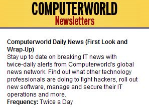
Subscribers are told that they will be receiving emails twice a day, but the title of this email program is a bit confusing. When I went to my inbox to find copies of “Computerworld Daily News,” which is how we had this listed on the editorial schedule, I couldn’t find it. I thought that maybe I had neglected to sign-up for it or that perhaps it had gone missing in my spam folder, even though I had been receiving other Computerworld newsletters on a regular basis.
Low and behold – I went to sign-up again and saw the note about First Look and Wrap-Up. And then went back to decide which of these to review. Am I the only person who would be confused by this? I don’t think so. Half credit for delivering what was promised. I understand that this email program has a primary title and two secondary titles, but the primary title, as well as the secondary titles, should have been featured on what was sent.
Figure 5: Sign-up Description
Conclusion
Computerworld First Look offers great content, but it’s desperately in need of a makeover to bring it into the 21st century and maximize its revenue potential.


