This Email Newsletter is a Study in Extremes. With Four A’s, an F and a D, a Little More Attention to Small Details Would Improve the Reader Experience and Should Lift Response.
Daily International Pharma Alert is a free email newsletter published by FDAnews. It’s one of seven free emails they offer and promises to deliver:
“Daily pharmaceutical news affecting companies around the world”.
In writing this review I analyzed five recent issues, published February 7th, 8th, 9th, 12th and 13th (they only publish on weekdays).
I found a lot to like about the newsletter:
- The from line is used very effectively.
- It does a good job of supporting the business goals.
- FDAnews includes a word-of-mouth call to action to help grow their list.
And a few things that could be improved upon:
- A table of contents would help readers quickly identify articles of interest.
- An opening paragraph would give the newsletter a more personable feel.
- Shifting the ad spaces so they don’t overload the preview pane would make it more engaging.
Bottom line: Daily International Pharma Alert is a study in extremes. On our scorecard it earned four A’s but also an F and a D. A little more attention to some small details will help improve the reader experience and should lift response.
[text_ad]
1. Delivery – B
The Daily International Pharma Alert hits my inbox every day around 11:00 eastern time, which is a good time to catch busy professionals (at least those on the east coast) at their desks. One recommendation: it would be worth testing a later send (around 1:00 eastern time) to see if also catching west coast folks in the office lifts open and click-through rates.
The only thing it’s missing is a white list request to get readers to add the FDAnews from address to their address books.
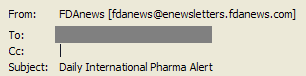
2. From Line – A
The FDAnews from line (Figure 1) is everything it should be. Both their display and actual from addresses feature their very recognizable brand prominently. Also, it’s consistent—not only for every issue of the Daily International Pharma Alert but for every email, be it a newsletter or promotional, that they send. If a reader white lists this one address they’ll be sure that everything FDAnews sends gets to their inbox.
Figure 1: From and Subject Lines
3. Subject Line – C
As good as the from line is, the subject line just doesn’t measure up. I understand why the email newsletter title is here—FDAnews sends so much email that you need a way to tell the different email newsletters and promotions apart. But it’s not taking full advantage of this prime real estate for engaging readers.
FDAnews should develop abbreviations for each of their email newsletter titles and use these either (a) in the display from address or (b) at the start of the subject line. This would alert readers to which “flavor” of FDA email they were receiving.
This would also free up the subject line for something unique to each issue – something more engaging, like a little peek at one or more of the editorial headlines. Revamped from/subject lines might look something like this:
From: FDAnews Int’l [fdanews@enewsletters.fdanews.com]
Subject: Cancer drugs, Pandemic Vaccine Guideline and more
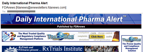
4. Preview Pane – D
The Preview Pane (Figure 2), aside from the email newsletter header (which is good), is all advertising. In the early days of email the space just below or just above the email newsletter header was your highest price ad spot. This type of layout was very common; it maximized your ad revenue. What it doesn’t do is engage your reader and pull them in to read your email newsletter.
I know the ad revenue is important to FDAnews, but it would be worth testing different formats to see if a more user-friendly preview pane would pull in more readers and lift overall revenue generation. They might even be able to shift these ads lower (after the first news item) and charge the same price for them.
And what would a more user-friendly preview pane look like? It would have an editorial headline, a link to view the email online and something that wasn’t an image, so that if images were blocked it would still engage the reader.
Figure 2: Preview Pane
[text_ad]
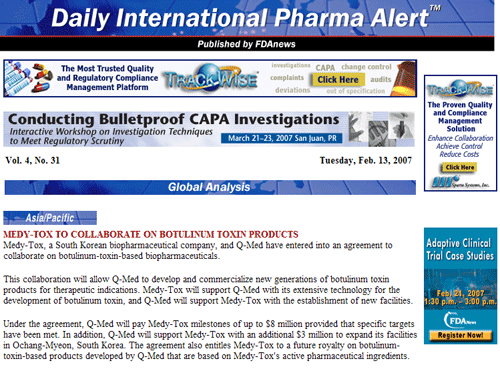
5. First Screen – F
The first screen of this email newsletter could use a little work as well. There’s no opening paragraph, no sign that this was compiled by a person (the news stories don’t even have bylines, although there is a contact name and phone number after each section). Also missing—a table of contents. If this first story doesn’t interest the reader they will have to scroll through the rest of the email newsletter to see if anything else grabs them.
Figure 3: First Screen
6. Look and Feel – B
The look and feel of this email newsletter isn’t bad. It’s easy to skim, with lots of white space and short paragraphs and engaging to the eye. It does a pretty good job at looking like the FDAnews Website (both are blue), but I’d like to see it tied a little more closely; the FDAnews logo would probably be enough to do it.
With the exception of the header, all the images in this email newsletter are ads. I wonder if FDAnews couldn’t pull in some images to support the editorial content – maybe logos of the companies featured.
7. Content and Tools of Engagement – C
The content of this newsletter is very appropriate for the audience. It’s a quick synopsis of analysis, which looks like it’s taken from company press releases, plus short news blurbs with a link to the original source to read the full story. I gave it full credit for meeting the 60/40 editorial-to-promotional content guideline (the actual average ratio was 57% editorial / 41% promotion / 2% housekeeping).
What was missing were engagement tools for readers—no surveys, no polls, no link to a discussion board, not even an email address to contact the editor (there was a phone number, but it’s unlikely people will pick up the receiver and call). Daily International Pharma Alert is also a bit long to be read online—each issue runs 4 or more pages when printed out. Also, the type is smaller than most font sizes used online, adding to the difficulty of reading it on-screen.
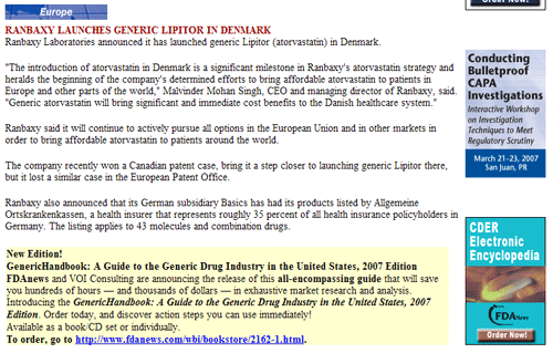
8. Business Goals – A
This newsletter does a good job of supporting the company’s business goals. The editorial shows FDAnews’ knowledge of the pharmaceutical industry. It’s clear that while this email newsletter is free they want you to buy a paid product, be it a report or an audio conference. There are calls to action throughout, both text ads in the body and banner ads in the right column (Figure 4). They are straightforward without being pushy.
Figure 4: Text and Banner Ads
9. Footer – A
FDAnews does a great job of including everything the reader expects to find in the footer. There are links to unsubscribe and to change your email address or update your preferences. There’s a U.S. Postal Address for FDAnews, along with a copyright notice to protect their intellectual property.
10. Other – A
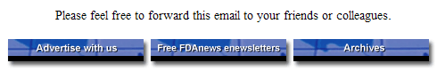
FDAnews earns another perfect score here. They deliver what they promise when readers opt-in with respect to content and frequency. They also encourage readers to share this email and provide a link so that those it’s forwarded to can learn about and subscribe to their email newsletters (Figure 5).
Figure 5: Word-of-Mouth Marketing
Conclusion
The Daily International Pharma Alert, published by FDAnews, is a good free B2B email newsletter. It provides quality editorial content while effectively marketing paid publications and audio conferences for FDAnews and generating ad revenue from outside sources. A more engaging subject line, a personable opening paragraph, a table of contents and less focus on ads in the preview pane would improve the readers’ experience and should provide a lift in clicks and response.


You would have saved me 30 seconds if you had included a link to the signup page 😉 Thanks for the article!