Doctor Douglass’ Real Health Breakthroughs Landing Page by Agora Demonstrates How Traditional Long Copy, Captivating Headlines and Effective Story Telling Convince Readers to Buy
Let me preface this review by confessing that I’m a big fan of the Agora Company’s approach to Internet marketing. Maybe it’s because I started out as a direct mail copywriter and I appreciate the way they’ve taken some of the best parts of that copywriting style and applied it to the age of electronic communications. Maybe I admire the millions of dollars they earn doing it. Or perhaps I just like the way they tell a story.
Whatever the reason, I found the landing page for Doctor Douglass’ Real Health Breakthroughs extremely interesting and very appealing. But that’s just me. Let’s see how the landing page stacks up when seen through the eyes of the Mequoda Scorecard:
- This kind of shotgun approach to headlines and subheads in landing pages is quite effective—you can almost hear the paradigms shifting
- The most important technical gizmo needed here is the scroll bar so that readers can cut to the chase and order the product—with that in mind, I’d like to see more “order now” buttons sprinkled through the letter copy
- The lack of testimonials works against Real Health Breakthrough’s credibility—as a prospect, I would find considerable comfort in knowing that somebody else in the world has tried the doctor’s advice and come through it a more healthy person
- There is a lot of blue copy, which I, and almost everyone else who surfs the Internet, take to be clickable links—in this case, they are not… just pretty blue type that looks good but has no additional function
- This landing page is another in a long line of effective, money-generating landing page sales letters by the Agora folks
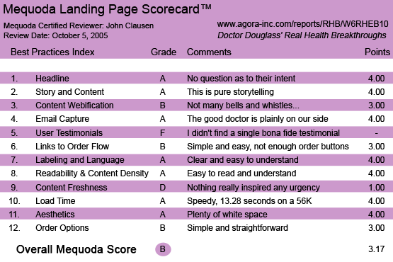
Doctor Douglass’ Real Health Breakthroughs Landing Page Scorecard
[text_ad]
1. Headline (Strategic Intent) – A
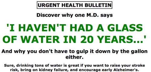
It’s a little hard to isolate a single benefit headline on their first page. The obvious headline proclaims “I haven’t had a glass of water in 20 years…” and follows up with the news that drinking too much water can bring on strokes, kidney failure and early Alzheimer’s. Okay…you have my attention with that. Several other subheads ponder questions like “Is your cholesterol high enough?” “Are you eating enough salt?” and “Do you take in enough eggs and bacon?” So it’s pretty clear that the site’s strategic intent is to shake up the way the reader thinks about health and lifestyle-related issues. I might have encouraged the copywriter to move up the headline, “Believe it or not, you can live long and love every minute of it!” That’s some pretty heavy benefits-oriented writing. Nevertheless, this kind of shotgun approach to headlines and subheads is quite effective the way it is. You can almost hear the paradigms shifting.
This kind of shotgun approach to headlines and subheads is quite effective—you can almost hear the paradigms shifting.
2. Story and Content – A
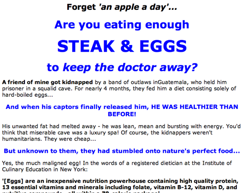
When the Agora copywriters get their hands on an audience of “like-minded individuals” they know how to pour it on. If you’ve ever suspected that the health-care industry has been less than candid with you, you are going to love this sales letter. If you’ve ever distrusted the purveyors of “Mass Media Medicine,” you’re going to be standing up and cheering. Here’s a health-care professional—an M.D., no less—who advocates drinking beer and coffee, wants you to eat juicy steaks and says that vegetarians are “full of tofu.” The health-care industry, he says, has never been about making you healthy. It’s about making billions of dollars for giant corporations. In other words, a healthy individual is not a profit center… at least not as much as a sick person is. Even if you don’t totally believe the message, it’s easy to get on Dr. William Campbell Douglass’ side. It’s them against us… and apparently “they” are winning. Dr. Douglass is here to help. What could be a more compelling story?
3. Content Webification – B
You won’t see a lot of the latest Internet technology used on this site. No streaming video, etc. But I don’t really miss it. This is direct response copywriting in a long-copy format. About the most important technical gizmo needed here is the scroll bar so that readers can cut to the chase and order the product. With that in mind, I’d like to see more “order now” buttons sprinkled through the letter copy. I’ve noted this shortcoming in other Agora sites… often enough so I’m inclined to think they’re doing this on purpose. Given their financial successes, it’s not hard to give them the benefit of the doubt. Still, if I were writing the letter there would be more of said buttons.
4. Relationship Building – A
I like the tone of the letter, the “Aw, come on” attitude toward the people who tell us how to live, eat, drink, etc. There’s no question that the good doctor is on the reader’s side against the scoundrels who would erode our good health and happiness for mere money. I also like the free sign-up for the Daily Dose and the fact that the daily email messages include politics along with health and medicine issues. Keeping in mind the reader’s relative level of paranoia is a good tactic here. Frequently pointing out the scary, duplicitous nature of medicine and politics is a very effective way to keep the prospect’s attention… especially if he or she already believes that there is mischief afoot in the corporate world.
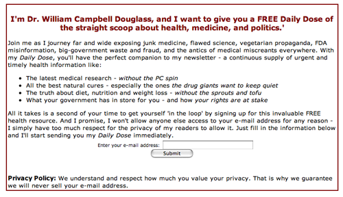
I like the free sign-up for the Daily Dose and the fact that the daily email messages include politics along with health and medicine issues.
5. User Testimonials – F
I was very disappointed to find no testimonials whatsoever on this site. The very nature of the claims made by Dr. Douglass would seem to scream for testimonials. He’s telling us to cook our spinach in bacon grease and push Q-Tips up our noses to cure back pain. There is an abundance of pretty wild stuff throughout the letter. Conventional wisdom is taking a serious beating here and I—as a prospect—would find considerable comfort in knowing that somebody else in the world has tried the doctor’s advice and come through it a better, more healthy person. In fact, the lack of testimonials works against the letter’s credibility. That’s a shame, because if Dr. Douglass really has been saving (or at least improving) lives, it shouldn’t be difficult to find people who will testify to that fact.
6. Links to Order Flow – B
Although I would have liked more “order now” buttons throughout, there is no confusion as to the function of the order button and the order language once you get to the appropriate button at the end of the 27-page sales letter. It’s well done… I’d just like to see it done more often in the letter.
7. Labeling and Language – A
The language throughout is easy to understand. However, there is a lot of blue copy, which I—and almost everyone else who surfs the Internet—take to be clickable links. In this case, they are not… just pretty blue type that looks good but has no additional function. These would be great opportunities to zip the reader to an order form or to a testimonial section.
There is a lot of blue copy, which I—and almost everyone else who surfs the Internet—take to be clickable links. In this case, they are not… just pretty blue type that looks good but has no additional function.
8. Readability & Content Density – A
I found this to be an extremely readable letter. The language is very “common man” which plays well with the message of “us against the big corporations.”
9. Content Freshness & Urgency – D
I saw nothing here—other than the need to fix one’s health before it’s too late—to inspire any kind of order-now urgency. There’s no ticking clock counting down a snappy price reduction or any other reason I could see that would make me order today rather than wait until tomorrow or next month.
10. Load Time – A
The site loaded up quickly on my broadband service, and when checked on the Web Page Analyzer, it loaded in 13.28 seconds on a 56K, well within the 15 seconds specified in the Mequoda guidelines.
11. Aesthetics – A
This site is not hard to look at. I can’t say it’s a total thing of beauty, but there’s plenty of white space and the design does not get in the way of the letter’s message.
12. Order Options – B
I like the easily-understood order options… and they do provide a fax number and a toll-free number as an alternative to ordering electronically. Perhaps those options could have been a little more prominent… but at least they were there. That’s more than a lot of landing pages can claim.
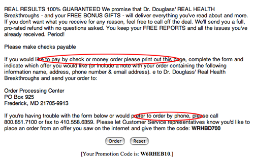
They provide a fax number and a toll-free number as an alternative to ordering electronically.
Conclusion
This is another in a long line of effective, money-generating landing page sales letters by the Agora folks. Any shortcomings I’ve noted are probably more than overwhelmed by the sheer volume of information storytelling. Good job.


