If You Want a Landing Page that Excites the Senses and Hits all the Hot Buttons with Ample Proof, Then This is the One to Mirror.
We are back now with another offer from her highness, Alexandria Brown, “The Ezine Queen.” After seeing this site I have decided that I might want to be a loyal subject. “The Queen” has brought you into her kingdom by earlier selling you her ezine course. This is good. This is how you get folks into your funnel. NOW, Ali is joining other Internet Marketers (with one main difference that I shall discuss later) and upselling them to a hands-on business marketing seminar.
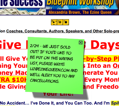
Now by the time I got to this landing page, there was the cute Post-It note to inform people that it’s sold out.
The Queen informs you—using scarcity—that you can go on the cancellation list. Of course, everyone wants what they can’t have and now we have the technique of scarcity working here.
- This is a classic headline that works. It targets its audience, delivers a strong benefit and throws in dashes of greed.
- This landing page was for a limited time offer of a seminar. Regardless, Ali was smart enough to have a drop-down box that offered her newsletter. Good work!
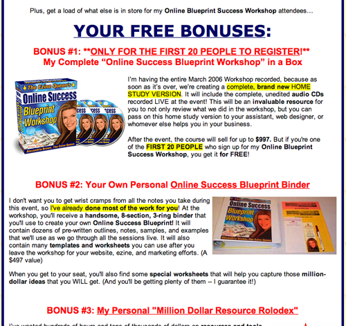
- Exceptionally strong graphics, powerful audio testimonials, PLUS convincing copy along with photos proves once again that these people exist.
- Good use of colors (especially red) that keeps you riveted to the page(s) and offer. Nothing is boring here. Copywriter and graphic designer worked well together on this site—obviously, seeing that the seminar is sold out.
- Good use of testimonials and benefits… with lots of proof galore (the Queen’s earnings). Ali is a marketer that “walks her talk.”
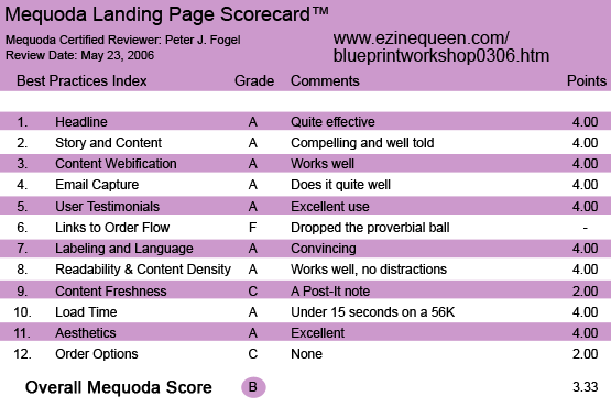
EzineQueen.com’s Online Success Blueprint Workshop Landing Page Scorecard
1. Headline – A
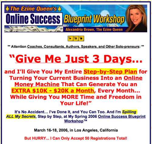
Attention Coaches, Consultants, Authors, Speakers, and Other Solo-preneurs: **
“Give Me Just 3 Days… and I’ll Give You My Entire Step-by-Step Plan for Turning Your Current Business Into an Online Money Machine That Can Generate You an EXTRA $10K – $20K a Month, Every Month… While Giving You MORE Time and Freedom in Your Life!”
It’s No Accident… I’ve Done It, and You Can Too. I’m Spilling ALL My Secrets, Step by Step, at My Spring 2006 Online Success Blueprint Workshop™.
March 16-18, 2006, in Los Angeles, California
But HURRY… I Can Only Accept 50 Registrations Total!
This is a classic headline that works. It targets its audience: coaches, consultants, speakers and other solo-preneurs—basically anyone who can market a specific product or business service. She delivers a strong benefit, throws in dashes of greed ($10K-$20K) and tells you that she can only except 50 people. Not only that, but she is going to spill her guts on how she does it—in just three days.
This is a classic headline that works.
2. Story and Content – A
What I liked about this landing page is that Alexandria Brown has branded herself into the hearts and minds of her customers. Most Internet marketers seem to be males. Again, Alexandria stands out because she is intelligent, articulate, attractive and successful. You come upon the site, you click on the personal message and you hear Ali’s soothing voice telling you how this seminar is going to change your business life.
[text_ad]
She hits the right buttons from the get-go (although, to this day I don’t really know what a get-go is). It’s important to note that Ali’s USP is that this seminar is NOT another Internet marketing seminar where everyone is just selling the same product to each other… which is other Internet marketers. No, this is for the professional who wants to explode their business online so that they can make huge profits offline. Alexandria’s goal is NOT to make you into another Internet marketer. Instead she’s going to show you, step-by-step, how to explode your offline business—online.
3. Content Webification – A
Very easy to surf, with all the right bells and whistles. Audio, graphics and copy work synergistically well together.
4. Email Capture – A
This site was for a limited time offer of a seminar. Regardless, Ali was smart enough to have a drop-down box that offered her newsletter. Good work!
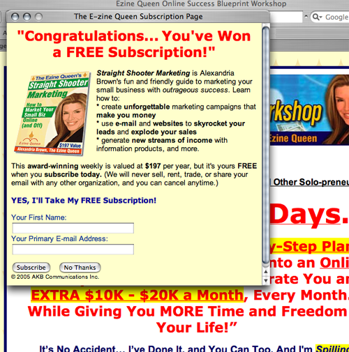
Ali was smart enough to have a drop-down box that offered her newsletter.
5. User Testimonials – A
Exceptionally strong graphics, powerful audio testimonials, PLUS convincing copy along with photos proves once again that these people exist. Each testimonial is very compelling within itself—and helps sell Alexandria.
6. Links to Order Flow – F
None. Ali has created a great offer that goes right up to the call to action, but no “click here now” buttons that will get the prospect to order right now.
7. Labeling and Language – A
Easy to understand and fun to read. It accomplishes it’s goal. Ali makes you feel she is talking to you one-on-one from her audio note to you and throughout the copy.
8. Readability and Content Density – A
When presenting an offer online you have to make it user friendly. Just like creating the perfect meal, you want the right amount of ingredients so the sum will be greater than the parts. That’s what you have here. Convincing copy and effective use of graphics that gets you excited about signing up for the seminar that will (drum roll) change your life. It’s all done in an easy-to-understand manner.
Convincing copy and effective use of graphics that gets you excited about signing up for the seminar.
9. Content Freshness – C
This part of the scorecard is sometimes tough to evaluate only because it’s a point-of-purchase landing site. The offer is only for a specific time period. There is no fresh content, but there is the strong sense of urgency that every offer must have.
There is no fresh content, but there is the strong sense of urgency that every offer must have.
10. Load Time – A
Under 15 seconds which meets Mequoda’s guidelines.
11. Aesthetics – A
Good use of colors (especially red) that keeps you riveted to the page(s) and offer. Nothing is boring here. Copywriter and graphic designer worked well together on this site—obviously, seeing that the seminar is sold out.
12. Order Options – C
Now, I gave it a C because there are no ordering options. But understand, the seminar was finished at this point—so there was no need to have any ordering options. There is a contact address, email and toll-free number. If there was a fallout, then the prospect could contact Ali or Liz to be put on a list.
Conclusion
This landing page delivers a strong offer. If you want a site that excites the senses and hits all the hot buttons with ample proof, then this is the one to mirror. Good use of testimonials and benefits… with lots of proof galore (the Queen’s earnings). Ali is a marketer that “walks her talk.”


Love the landing pages. Thanks for the examples. I want to buy some for me. do you know where I can get them at? thanks for the article. 🙂
I do like the looks of these they are crisp and clean. But I worry that they look to well spammy for a lack of better word. is the response on them really good?