Andrew Harper’s Hideaway Report® is a privately published newsletter dedicated to the discovery of peaceful vacation retreats for the sophisticated traveler. The publication claims 85 percent of its executive subscribers hold the title of CEO/President/Owner/Partner.
I’m not surprised. The $99 initial annual price is steep enough, and the resort destinations that Hideaway Report reviews are clearly for the well-heeled, or those traveling on a generous company expense account.
I suspect very few stumble onto Hideaway Report by accident or as the result of a Google search. This newsletter, in its print form, has been continuously published since 1979 and has a very credible word-of-mouth reputation among the gentry.
Some could argue that Hideaway Report’s landing page probably doesn’t need to do a hard sell; most people arriving here may have already made up their mind to subscribe.
If so, that’s a good thing for Andrew Harper, because this landing page is more laid back than a bikini-clad sunbather on a private Caribbean island. In fact, at 225 words, this landing page is really on vacation (or at least, not working) by Mequoda standards, and earns a score of only a C.
If, on the other hand, the average visitor is not already convinced to subscribe when landing on this page, they’ve got work to do to improve that visitor’s likelihood of signing up. We expected to see a lot more from the Hideaway Report’s landing page, as they are leaders in the print publishing industry.
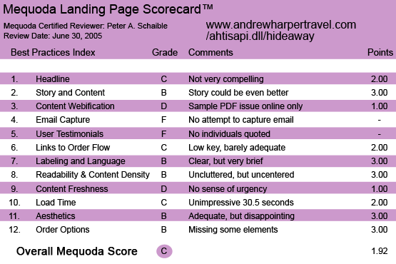
TheHideawayReport.com’s Landing Page Scorecard
[text_ad]
1. Headline (Strategic Intent) – C
“The Ultimate Harper Travel Guide to Luxury Hotels, Resorts & Hideaways” is not my idea of an effective headline. While it’s descriptive of the product, it doesn’t a) offer a promise, or b) explain why or c) state a compelling reason to plunk down my credit card and subscribe.
Is selling to the uber rich any different from selling to the average Joe? Yes, it probably is, however the rules of ethical persuasion still apply. But they aren’t in evidence here.
2. Story & Content – B
Hideaway Report has a terrific story to tell, but the landing page sales letter tells it here in only three short paragraphs. Brief and to-the-point, for certain, but I would have spun it out longer.
As I recall (I could be mistaken), when Hideaway Report launched as a print newsletter many years ago, it promised to be a limited circulation publication. Does it still? Not that I can confirm from looking at an online issue.
Wouldn’t this newsletter be ever-so-much-more attractive if you knew it was only going to 3,500 select subscribers? And couldn’t you charge so much more if that were the policy? Exclusivity and scarcity really add value!
I imagine Mr. Harper writing something like this:
- “We have a waiting list for Hideaway Report. It’s almost as tough to get as tickets to The Masters Tournament. Only 3,500 fortunate families can subscribe.
“That’s a promise we made to our readers many years ago, in order to keep the best vacation resorts from being overrun by the nouveau riche and the great unwashed.
“Now, owing to some deaths and retirements, we can accommodate a few additional subscribers for 2005. If you hurry, you could be one of only 228 individuals initiated into Hideaway Report’s family this year.
“But you must act right now! Just send your check for $99 today or call 800-000-0000 with your credit card in hand and speak to one of our Hideaway Report associates. We’ll gladly accept your membership if there are still vacancies.”
I’d make it a membership, not a subscription. There’s nothing very exciting about being a subscriber, but being a member—well, that’s got a different panache to it. And to his credit, that’s what Mr. Harper calls his online customers—members.
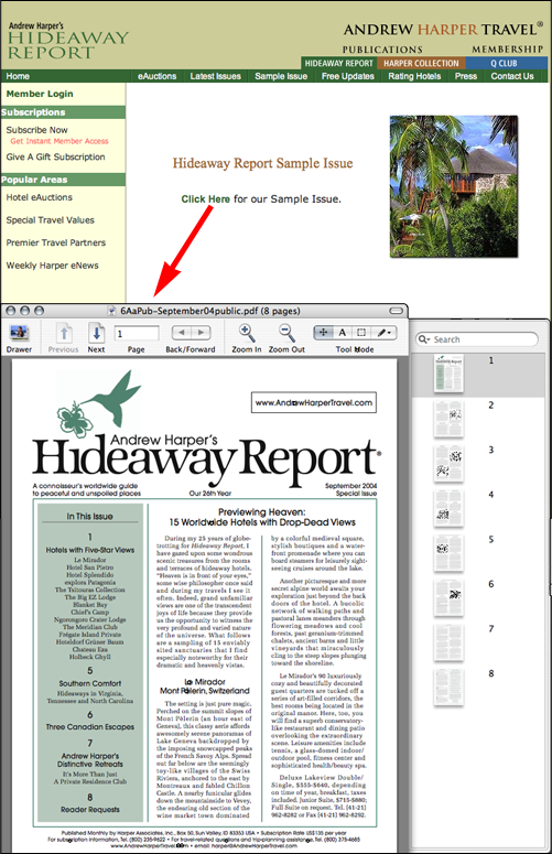
3. Content Webification – D
Hideaway Report’s landing page offers a hypertext link to a PDF file of a sample eight-page copy of the print newsletter. No other interactive or multi-media technology is employed. Again, Hideaway Report has chosen a more laid back, soft sell.
4. Relationship Building – F
There is no attempt by Hideaway Report’s landing page to capture the user’s email address. No offer of a free e-zine or special report. No pop-up or pop-under at work here. In fact, no aggressive sales techniques at all are in evidence, which supports my earlier stated premise that no one stumbles on this site by accident.
5. User Testimonials – F
Testimonials? We don’t need no stinking testimonials!
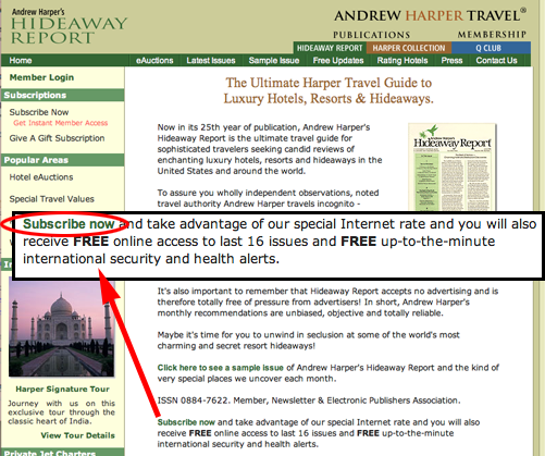
The landing page does offer that “So while you may have seen Hideaway Report favorably mentioned in Forbes,Fortune, Mirabella, Vogue, The New York Times and other such publications, his [Mr. Harper’s] identity has never been revealed.”
Perhaps the mystique of the secret shopper is enough to create the required allure and capture the imagination of the prospective subscriber/member.
6. Links to Order Flow – C
No button or underscored link is used, just a simple (bold typeface) hypertext link to the order page. More evidence of Hideaway Report’s belief in minimalism. Less is more—even on a landing page, according to Mr. Harper.
7. Labeling and Language – B
“Hideaway Report accepts no advertising and is therefore totally free of pressure from advertisers! In short, Andrew Harper’s monthly recommendations are unbiased, objective and totally reliable.”
This appears to be the major selling point of the Hideaway Report landing page. Mr. Harper can’t be bought. In fact, because he travels incognito, he generally can’t even be identified.
In any event, the language used here is clear and straightforward.
8. Readability – B
Hideaway Report’s landing page designers have made good use of typography, graphics and white space. But more incomprehensible than The Da Vinci Code is why the site is offset to the left rather than centered. Point deducted.
9. Content Freshness – D
Nothing on Hideaway Report’s landing page smacks of urgency. There is no reason—impending price change, scarcity, timely information alert—to join today vs. some other time or whenever the spirit moves you.
10. Load Time – C
Hideaway Report’s landing page downloads in 30.5 seconds at 56K according to the Webpage Analyzer. There are 14 objects on this page including 12 graphics totaling 49514 bytes. There is a case to be made for optimizing the cascading style sheets (CSS) for size by eliminating white space, using shorthand notation, and combining multiple CSS files where appropriate.
11. Aesthetics – B
The graphic design of Hideaway Report’s landing page is comforting and trustworthy, but lacks the excitement the user might associate with luxury travel. Additionally, a couple of non-functioning links do not add to my confidence about the site.
Personally, I feel disappointed because the site doesn’t really match my mental model, but then again, I’m not Mr. Harper’s target audience (i.e. frequent luxury traveler).
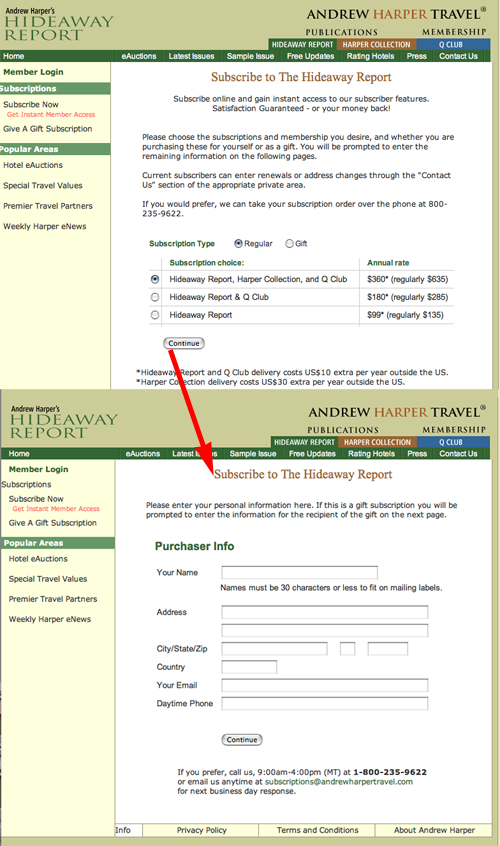
12. Order Options – B
There is a nice flow from Hideaway Report’s landing page, to selecting options on a radio button page, to a name squeeze page, to a secure page for entering credit card information. An optional toll-free number is offered, although it is only available during business hours in the U.S. (MDT). No printable form or fax option is available.
Conclusion
Many newsletter professionals regard Harper’s print publication as a best practice. Harper sets their standards high, and delivers a high-quality product. The website, we feel, should hold the same high standards set for its print publication. It was a surprise to encounter such a disappointing landing page, especially when we’ve expected to get so much more. It seems as if the marketing team ignored some of the most important traditional marketing practices when converting their efforts online.
The last frame of the Hideaway Report online enrollment process asks this question: “How Did You Hear About Us?”
I’m betting that referrals are at the heart of this business model and that Hideaway Report has many enthusiastic members who spread the word among their peers. However, there are numerous weaknesses on Hideaway Report’s landing page that would discourage the casual visitor from joining.


