This week we’re looking at the landing page for Jose Silva and his Jose Silva UltraMind System. Here we face a particular challenge that pops up frequently in information marketing: how to best sell an author, expert or system that has been around a long time. On the plus side, Silva’s longevity means his methods have been extensively tested, read and used by thousands of people, and featured in major media for decades. These credentials make it easier to promote Silva as a credible expert vs. someone who is just trying to break into this market… as new people are doing all the time.
On the other hand, some readers may not know Silva at all, or worse, think of him as yesterday’s news. Consumers have an obsession with what’s new, and so the difficulty here is to introduce these ideas as new to the reader, yet tested and proven so you know they work.
- The first problem here is one of strategic intent: I am not sure what the landing page is trying to sell me or what it is supposed to do
- The main section of the landing page tells the story of Silva and his method, but it is poorly organized and disjointed, jumping from topic to topic
- There are too many order options for too many offers and products, and they are confusing
- The type is reasonably clear and readable, although the odd spacing and random changes in type size, font and style make the page graphically unappealing
- Two words that best describe this site and its promotion of the Silva UltraMind System are “unfocused” and “schizophrenic”
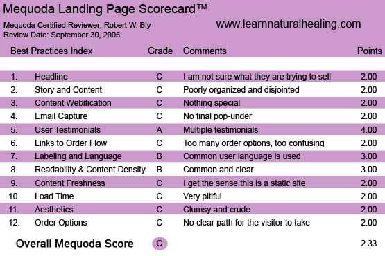
LearnNaturalHealing.com’s Landing Page Scorecard
[text_ad]
1. Headline (Strategic Intent) – C
The first problem here is one of strategic intent: I am not sure what the site is trying to sell me or what it is supposed to do.
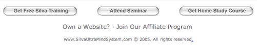
The main panel focuses on a free self-healing program. A photo at left of a meditating woman offers a free eBook and audio program. At the top, there are buttons for seminars and home study programs. Where is one supposed to start?
There are a number of ways to address this. If Silva has one lead product that they want to sell—such as the $129 home study course you can read about when you click the Home Study Button—they could do a traditional long-copy micro-site to sell that product (that’s actually what you see when you click on Home Study).
Or, they can offer a self-assessment test (like DeniseAustin.com) and then recommend the right product for you based on the result.
(For more information on the Denise Austin website, read Bob Bly’s DeniseAustin.com Website Design Review.)
The headline, “Master the Techniques of Holistic Faith Healing,” is weak. “Master” is a strong verb, but the phrase “the techniques of” is unnecessary.
“Faith healing” is a negative: it conjures images of Bible-belt preachers in tents healing crazed parishioners with snake bites. And it’s not what Silva means.
“Holistic” is equally weak. Most readers really don’t know what it means. And even for those who do, there’s little appeal or promised benefit.
What the headline lacks is the benefits you get from Silva’s system as it pertains to health: living longer and healthier lives, with less illness and pain.
This page will convert unique visitors at a high rate only if the majority of traffic was driven by searches on the term “holistic faith healing.” If traffic comes from other search terms—immune system, health, healing, mind body healing—it probably won’t work well.
[text_ad]
A banner above the headline contains the name of the method, “The Jose Silva UltraMind System,” with a picture of Silva. I would add a subhead or tagline under the product name that gives a capsule description of the system. And I would use a different photo of Silva; he looks kind of “out of it” in the one shown.
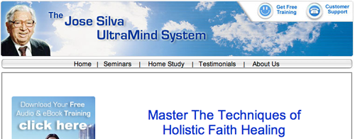
A banner above the headline contains the name of the method, “The Jose Silva UltraMind System,” with a picture of Silva… I would use a different photo, he looks kind of “out of it” in the one shown.
2. Story and Content – C
The main section of the website tells the story of Silva and his method, but it is poorly organized and disjointed, jumping from topic to topic. It lacks cohesiveness, does not flow well and just “presents information” without telling a compelling story or drawing the reader into the system.
The messy typography—with its seemingly random use of type styles, sizes, faces, boxes, indents and layout—reflects the out-of-kilter style of the copy.
I haven’t read Silva in a while, but from what I recall, his method can lead to widespread improvements in all aspects of your life, only one of which is health. If the intent of this site is to promote the Silva method only for health improvement—and the URL of www.learnnaturalhealing.com indicates that it is—then the site copy, graphics and design should be much more oriented toward health and healing.
For instance, the main page should have, within the central body copy, a group of testimonials from Silva readers who claim better health, more energy and less sickness as a result of following Silva’s methods.
I would include photos of these people along with their testimonials so we can see them. Show me the Silva user who can now dance even though before she was crippled by arthritis, or the former heart attack patient who just ran a marathon after doing the Silva method.
3. Content Webification – C
While the content has been well adapted for the Web through the use of images, layout and typography, they have made the page graphically unappealing due to odd spacing and random changes in type size, font and style.
4. Email Capture – C
When you are on the website, there are numerous free offers where you are given content in exchange for your email address. However, if you leave without taking any of these offers, you are not served a pop-under that makes a final offer (e.g., “Don’t leave yet … you can still claim your FREE REPORT”). According to our Mequoda guidelines, that’s a flaw.
5. User Testimonials – A
The website has multiple testimonials and related facts (e.g., a list of famous people who have used the system) that firmly establish Silva as an expert in his field.
But it’s not exactly crystal clear what that field is: self-help, holistic faith healing, visualization, mind-body healing, alpha, ultra mind, goal setting, mind training and almost a dozen other buzzwords are peppered throughout the copy. So although I know people are happy with Silva’s programs, I don’t know exactly what he can do for me.
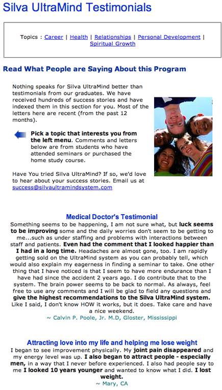
The website has multiple testimonials and related facts (e.g., a list of famous people who have used the system) that firmly establish Silva as an expert in his field.
6. Links to Order Flow – C
There are too many order options for too many offers and products, and they are confusing. Also, not all the links and pages work.
When I clicked on the CLICK HERE text superimposed on the image of the meditating woman to get my “FREE Audio and eBook Training,” the page I was supposed to be served had expired.
When I clicked on “Get Free Training” at the top right of the banner with the clouds in the sky graphic, I was served a long-copy landing page on something called “Alpha Life.” Was this the same offer as the “free audio and eBook” training? It seemed so, but I couldn’t be sure.
On the Alpha page, a box in the left column instructs you to “Claim Your Free eBook” by just filling in your name and email address. But when I tried to scroll down the box to fill in my information, the box kept moving down with my cursor, and I could never get to the form, fill in the missing fields and submit my request.
7. Labeling and Language – B
The buttons on the website are clearly labeled in common online language the user understands: home, seminars, home study, testimonials, about us. The naming of the various products—both free and paid—is not clear. In one section, you are offered the “Alpha System.” In another, there’s the “ESP System.” And which of these is the “Holistic” system mentioned in the headline?
Does this inconsistency matter? Yes, because it confuses readers and makes you look uncertain of what you’re doing. Good writing is consistent in use of spelling, abbreviation, terminology, grammar and punctuation, and Web copy is no exception.
8. Readability and Content Design – B
The site elements are sensibly laid out: a banner at the top of the homepage, with a menu of click buttons underneath. Click on those buttons and you go to various major sections.
The layout under the banner has a column at left and the main text at right—a common layout for webpages.
The type is reasonably clear and readable, although the odd spacing and random changes in type size, font and style make the page graphically unappealing.
The odd spacing and random changes in type size, font and style make the page graphically unappealing.
9. Content Freshness and Urgency – C
I don’t see any of the common methods—a free e-zine, a blog, a “what’s new” section, a media room, an articles library, a streaming RSS news feed—for delivering fresh content to the reader. I get the sense that this is a static site: what’s on there now will be there months from now. If there is new content, it is not labeled as such.
10. Load Time – C
To measure how quickly a website downloads on various Internet connections, we turn to our trusty online tool at WebsiteOptimization.com.
The Silva URL scored a pitiful 91.53 seconds over a 56 K connection and even took 28.17 seconds over an ISDN 128K connection.
I’m slightly suspect of the measurement I got, because when I accessed the URL over my broadband connection, it loaded in a flash. Usually, sites that load instantly on my highspeed connection score 20 to 30 seconds on the tool for 56 K download. So maybe there was a glitch in the system that day, which is why I am giving Silva a C instead of an F—the benefit of a doubt.
11. Aesthetics – C
As I already mentioned, the long-copy typography in the main section of the site’s homepage is a bit clumsy and crude, randomly mixing type sizes, positioning and fonts. It’s not awful, but neither is it professional or appealing.
12. Order Options – C
Also as mentioned, there’s no clear path for the visitor to take, no guidance on which product you need, too many choices and multiple paths for what seems to be the same materials even though they are not clearly identified as such.
There’s no clear path for the visitor to take and too many choices.
Conclusion – C
Two words that best describe this site are “unfocused” and “schizophrenic.”
By unfocused, I mean that although they are clearly a health site, as indicated by the URL and the products they are offering, this doesn’t feel like a health-specific site. It looks and reads like a general Silva Method site with some casual health references thrown into a write-up of the system that is probably generic and reused from other sources.
By schizophrenic, I mean that I can’t tell where the site wants me to go, where they want to lead me and what they want me to do or buy. Is it a $129 information product? A live seminar? A free course?
Silva is a top expert in “mind control,” but he or his webmaster need to be in better control of the site.


