
“We don’t turn back our odometers.”
When I first logged on to the sales letter at SuperAffilateHandbook.com, I liked the clean design and the bright colors. However, I can’t say I feel the same about the brief, but very negative, intro copy the author offers at the top of the letter.
Ms. Gardner starts off criticizing the “huckster” who hype their programs for earning huge amounts of money on the Internet… and then she spends a whole letter telling people about her program for earning huge amounts of money on the Internet. The hypocrisy and hyperbole of those shady operators sickens her, she says, and she would like to offer the reader the non-BS scoop on how to make a lot of money on the Internet.
Okay, I’m sure she is utterly sincere… but this approach is like a used car dealer saying, “We don’t turn back our speedometers.” The car dealer may be telling the pure truth, but such an announcement puts a very negative thought in the prospective buyer’s mind… it reminds him or her that car sales may well involve some chicanery and prevarication. Likewise, prospects reading the Handbook sales letter could easily be swayed by that copy into a negative frame of mind about people who offer to show them how to make scads of money ($435,000+, for example) on the Internet.

SuperAffiliateHandbook.com’s Landing Page Scorecard
[text_ad]
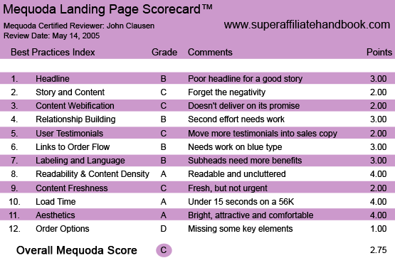
1. Headline – B
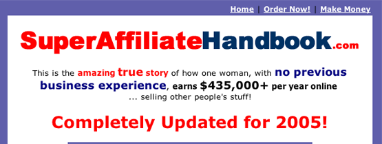
There is little or no question regarding the purpose of SuperAffiliateHandbook.com. The author would definitely like for you to purchase her book. She’s provided a nice photo of the book, along with a quick description: “This is the amazing true story of how one woman, with no previous business experience, earns $435,000+ per year online…selling other people’s stuff!” The book has been “completely updated for 2005” and “could change your life.” Not much doubt about intent…this is an unabashed attempt to get you to order the Super Affiliate Handbook. The headline could have offered a stronger benefit instead of simply stating the name of the website.

2. Story & Content – C
The sales letter definitely tells us a tale…how Ms. Gardner made her fortune and how we can do likewise. The story is clearly in her voice and she painstakingly establishes her credibility by sharing some financial documents that probably wouldn’t hold up as evidence in court, but nonetheless look quite convincing. As I implied earlier, I don’t like the negative lead about “hucksters” who “never earned a dime” and their “sickening” business practices. These might be great attention grabbers, but they certainly don’t put me in a grab-my-credit-card-and-order frame of mind. The story concludes with a pretty strong inducement to purchase.
3. Content Webification – C
The site does a fairly good job of using the unique elements of Internet marketing. The date on the sales letter, for example, changes daily to provide a nice up-to-date feeling. The author also offers an audio message next to her still shot photography. Two criticisms here: the “brief message” is way too long, and she should have gone whole-hog and given the prospect a video clip of her delivering her intro message. I was annoyed by the gratuitous use of boldface in the bulleted copy sections. A little discreet boldface can be very effective, just as it is in any direct mail application, but too much is too much. It ends up working against you, making the copy harder to understand.
Also, when I tried to use the “Contact Rosalind” function, it shuttled me over to a page that said she was getting so much SPAM that I’d have to go to another link to contact her. It seems to me, if she had time to build a message to bounce me to, she had time to re-do her “Contact Rosalind” button. Few things on the Internet irritate a prospective customer as much as links that don’t work or pages that aren’t available.
4. Relationship Building – B
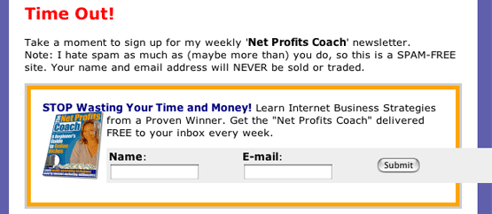
Ms. Gardner’s site has a nice, easy-to-use newsletter signup section…and when I signed up, the welcome message came back on my email very quickly. The acknowledgement message was very warm and friendly, if perhaps a little too similar to the sales letter in terms of language. Visitors have a couple chances to sign up for the newsletter in exchange for their email addresses.
However, I didn’t find the copy especially compelling and probably wouldn’t return to the site. Also, I couldn’t find any second effort or free offer as a fallback when I abandoned the order process. The site did, however, capture my email and I’ve received a handful of updates and special messages from Ms. Gardner in my email box since signing up.

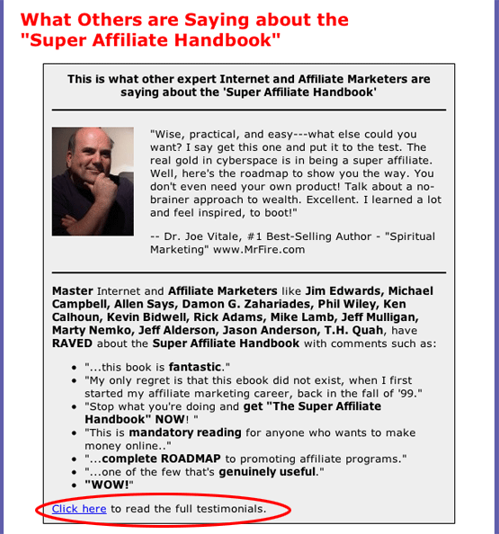
5. User Testimonials – C
This letter is linked to a large section of testimonials, many of them quite compelling. I would have liked to see more reference to these happy, prosperous folks in the letter. Listing testimonials is fine, but I like to see at least a few of them worked into the copy as part of the story. Also, it would be nice if we could have full names and contact information on all of these people. The Dr. Joe Vitale testimonial gives contact info, but it is really more of an ad for his book than a testimonial for the Gardner tome.

6. Links to Order Flow – B
SuperAffiliateHandbook.com does a good job with its links. The buttons are well designed and easy to identify and use. There was, however, some blue type in a bulleted list and elsewhere that appeared to be links but weren’t. This was mildly confusing, but not enough to drive someone away from the site.
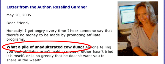
7. Labeling and Language – B
I definitely could have done without the rather rude statement early in the copy: “What a pile of unadulterated cow dung!” Again, it’s not a good idea to put negative ideas in the prospect’s head while we’re trying to sell him or her what could look very similar to that very same “dung.” I understand that she is trying to position herself as the person to go to for the straight information, but a more positive approach would almost certainly be more productive.
Other than the unfortunate negativity, though, the letter seems to be written in accessible, familiar language. Some of the subheads could have been more strongly benefit-oriented. For example, instead of asking the prospect, “How much is all of this information worth to you?” it would have been much better to tell the prospect exactly how much this stuff is worth…hundreds of thousands of dollars if we are to believe the earlier copy.
Likewise, the subhead that ponders, “Is there a guarantee?” should have said something like, “You bet this offer is fully guaranteed.”

8. Readability and Content Density – A
As I mentioned earlier, this site is very readable with nice typography, an uncluttered layout, and plenty of white space. The graphics are well integrated with the copy and the whole site is very easy to read and to follow.
9. Content Freshness and Urgency – C
The content here seems relatively fresh with a date stamp on the sales letter. Other than that, though, I didn’t feel much urgency in the sales letter. Even the up-to-date, good-for-today-only stamp on the Gold Upgrade offer didn’t seem very credible. Anyone looking at the offer would probably realize that the same today-only offer would be up there the next day and the next and so on.
10. Load Time – A
SuperAffiliateHandbook.com loaded with impressive speed on my machinery, well under our 15-second standard for excellence.
11. Aesthetics – A
Clean design and attractive graphics make SuperAffiliateHandbook.com a very aesthetically pleasing website. Visitors will no doubt feel very comfortable poking around in the sales letter and links. Nothing too grating or disturbing aesthetically.
12. Order Options – D
SuperAffiliateHandbook.com is a bit weak in order options. I saw no toll-free numbers to call in your order. Nor was there an easily printable form for ordering by fax or snail mail. Also lacking was an offer to have a representative call upon the prospect via phone or email or in person.

