
Mequoda guidelines outline the 12 characteristics a landing page needs to successfully close sales online. And to incorporate all 12 characteristics typically, at least for a consumer product, requires medium-to-long copy on that landing page. But should you send your traffic directly to that long-copy landing page? Or will visitors be put off by its length?
Here’s a rule of thumb to follow: when you are generating traffic from an ezine ad or solo email sent to your eList, you’re reaching an audience “trained” to read your stuff… and you can send them directly to your long-copy landing page. But when you generate traffic through Google Adwords and other pay-per-click advertising—or through organic search—those visitors have much less familiarity with you, and no demonstrated inclination to read long copy on your subject. An example of this two-step landing page approach is TaxLoopholesoftheRich.com.
- For pay-per-click and search traffic, many successful Internet marketers use a two-step landing page process- you are first sent to a relatively short landing page requiring you to enter your email address and continue to read more and get more information
- Once you enter your email address, you are taken to a traditional long-copy landing page selling the main offer, which promotes an information product, aimed at consumers, on how to save money on your taxes
- When you visit the URL, you see a relatively brief landing page with a headline and six bullets promoting a free CD, which you have to enter your name and email address to receive
- When you click, you are taken to a longer landing page where you are told how to get the free CD and are given two options for doing so
- If you want to set up a two-step promotion, TaxLoopholesoftheRich.com provides a great model for you to follow and adapt
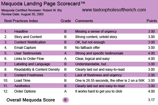

TaxLoopholesoftheRich.com’s Landing Page Scorecard
1. Headline (Strategic Intent) – B
The long landing page has a strong multi-part headline that, a) briefly credentializes the author, b) presents a strong testimonial up front, c) has a headline “Stop Over Paying Your Taxes and Throwing Your Money Away” and d) is followed by a subhead making a big promise—that the product is guaranteed to reduce your taxes by $10,000 or more—and also offering $547 worth of free bonus gifts.
The headline offers big benefits in an interesting and compellingly stated offer. The only reason I rate it a B instead of an A is that it’s missing a sense of urgency: there’s little reason to order now instead of later, aside from the vague, not-very-credible claim “quantities very limited.”
And it would be easy to add a real sense of urgency. You could put a time limit on the offer of the free bonus gifts. Or remind the reader that he has to put these tax-savings strategies into action NOW if he is to reduce his next tax bill. If he waits, he misses out on the tax savings for the year.
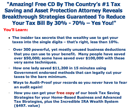
This is the headline for the short-copy landing page.

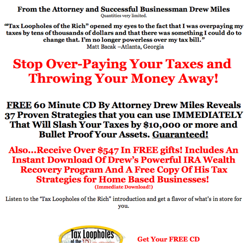
This is the headline for the long-copy landing page.

2. Story and Content – B
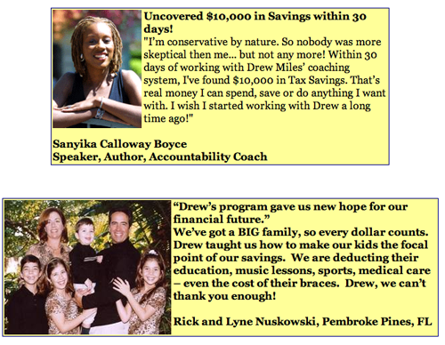
The content is strong, presenting a coherent argument on why you are paying too much in taxes, why you need this product right away and how it can reduce your tax payments and put more money in your pocket. Long, specific testimonials with photos of satisfied customers help convince the reader that the product does what the copy says it can do.
The story is not quite as strong. The promised theme is “Tax Loopholes of the Rich,” and the copy could have been made much stronger by telling a believable story of why rich people pay less taxes because they take advantage of loopholes others don’t, and how the product can help you benefit from these same loopholes even if you are not rich.
But this story is never told, and so the “big idea” behind this promotion—”Tax Loopholes of the Rich”—is never fully exploited.
3. Content Webification – B
The copy has been well adapted for the Web through the use of images, layout and typography. The free bonus CD has a graphically attractive cover, and this image is repeated throughout the landing page to stimulate visitors to click through to the order page.
4. Email Capture – B
If you enter this online promotion through the short copy front-end landing page, you must enter your email address to read further and go to the full sales letter on the long-copy landing page and order the product.
When you attempt to leave without doing so, you are served a pop-under that says “WAIT!” and once again makes the offer of the free CD.
The pop-under contains a button you can click, “ORDER NOW,” that takes you back to the order page. But it does not ask you to enter your email. No fallback offer is made (e.g., a free bonus report), in exchange for just the email address.
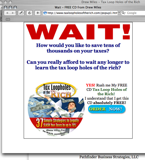

This pop-under is offered when users attempt to leave the page without signing up.
5. User Testimonials – A
The page has numerous strong, specific testimonials with pictures of satisfied customers.

6. Links to Order Flow – A
The sequence of events is clear, logical and easy to follow: a) you go to the front-end short landing page and enter your email address, b) you click to the long copy landing page, c) click to the order page where you can order the product, choosing from one of two offers and finally, d) you are taken to the transaction page where you can buy the offer you selected using your credit card.


The language is very familiar and easy to read.
7. Labeling and Language – B
Throughout the promotion, the language is in terms that online shoppers understand and respond to, e.g., “Order Now,” “Yours Free,” “Enter your name and email address to get your free CD that will quickly change your financial life.”
8. Readability and Content Design – B
The entire sequence of pages—front-end, short-copy landing page, main long-copy landing page, order page—is clearly laid out and easy to read. All pages also have the publisher’s snail mail address and toll-free phone number, further enhancing credibility.
9. Content Freshness and Urgency – C
The landing page is powerful, but if there is a flaw, it is the lack of content freshness and urgency.
To increase content freshness, you could add to the section “you will become aware of” a few bullets referencing important new changes to the tax code.
To add a sense of urgency, see my comments in section #1 of this review about an expiration date for the offer—a deadline by which you must respond to get the free bonuses—or stressing that you will lose tax benefits unless you implement the strategies in the program in a timely manner (e.g., by the end of the current calendar year).
Here’s another technique that could add a sense of urgency to this site: put a counter at the top of the long-copy landing page that shows the countdown (number of days) until one of the two significant tax deadlines: December 31 or April 15.
In tiny type at the top of the long copy landing page it says “Quantities are limited.” But do you really believe it? The product is a CD, and if they run out, can’t they just burn more copies? If you say quantities of an information product are limited, you have to make that claim believable by explaining why this is so (e.g., “we have a limited supply, and once the inventory is gone, we will not be going back to press”).
10. Load Time – B
This is a fast-loading website. When tested on Web Page Analyzer, the front-end, short-copy introductory landing page downloaded in just 1.67 seconds over a 56K connection, while the long copy version downloaded in 26.55 seconds.
11. Aesthetics – B
The copy is clearly laid out, and the type is large and easy to read.
The landing page makes good use of relevant graphics, including showing an image of the free CD to stimulate orders, and photos of satisfied customers next to their testimonials.
What other visuals could possibly have been shown? Maybe images of big tax refund checks from the IRS, or a head shot of the product author.
12. Order Options – A
The long-copy landing page asks for the order several times throughout the page, showing an image of the FREE CD with a caption urging the visitor to order: “Get Your FREE CD Now! Tax Loopholes of the Rich! Yours Absolutely Free, Without Commitments, or Obligations.”
This is accompanied by prominent buttons labeled “ORDER NOW!” So the landing page is working hard to get you to click to the order page.
On the order page, you have two options for ordering. The first option sells you a “Wealth Accumulation” program for $47.99, which includes the promised “FREE CD” as a bonus. When you click on this option, you go to a clear, easy-to-use transaction page where you can order using your credit card.
The second option enables you to get just the CD for free as promised, although there is a $5.94 shipping and handling charge, which means the promoter is still making a sale and getting your credit card information.
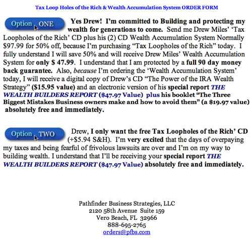

Both options enable the promoter to get your credit card information due to the shipping cost on the free product.
Conclusion
This is a really strong promotion: good layout, good graphics, great copy, attractive offer.
If most of your traffic is generated from search engine optimization or pay-per-click traffic —and not email marketing to your house eList or online ads in your ezine – then you may want to test a two-step approach like this vs. sending your visitors directly to your long-copy landing page.
And if you want to set up a two-step promotion with a short, upfront landing page followed by a long-copy traditional landing page, TaxLoopholesoftheRich.com provides a great model for you to follow and adapt.

