It’s really quite difficult to find fault with an organization that devotes its time and resources to helping people train and care for their dogs using natural techniques and products. Dogs are our best friends, right? And who isn’t in favor of natural techniques and products under just about any circumstances?
So it is with the utmost respect for dogs, dog trainers and dog people in general that I unleash the Mequoda Landing Page Scorecard on the gentle folks who wrote and designed the landing page for The Whole Dog Journal.
TheWholeDogJournal.com’s Landing Page Scorecard
[text_ad]
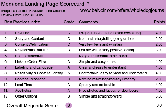
1. Headline (Strategic Intent) – A
There’s no question what this page is about or what they want you to do. The logo, with its big friendly dog’s face and the subhead—”A monthly guide to natural dog care and training”—tells you exactly what the publication is about. The headlines below the logo are equally clear – Get Your First 2 Issues of The Whole Dog Journal as a “treat”—ABSOLUTELY FREE. The subheads urge the reader to “Save at Home! Save at the Vets! Save at the Pet Store!” This is good old-fashioned benefits and features copywriting, which warms the cockles of my direct mail copywriter’s heart. Obviously, they want you to try the magazine and are willing to let you look before you buy. Plus, they’d also like to save you some money. That can be a very potent combination. Hey, I signed up and I don’t even own a dog.
2. Story and Content – C
The homepage is really quite sales-like in content. They really aren’t trying to “tell a story” in this section… unless you define “story” as reiterating the features and benefits and then asking the reader to sign up. I’m inclined to like serious offer copy more than the average reader does, so this really didn’t offend me very much. The site does offer a “preview of what The Whole Dog Journal can do for you dog,” if you click on the photo to the left. What you’ll find there is basically a table of contents for the magazine. I didn’t find it very compelling, but it did introduce the story of Hera, a “highly reactive Bulldog” who was vastly improved by natural training techniques. When you sign up for the free sample, you’ll get the complete story of the heroic Hera and her struggles. Actually, I read it and thought it was a nice piece of service journalism… but you do have to sign up to read it in its entirety.
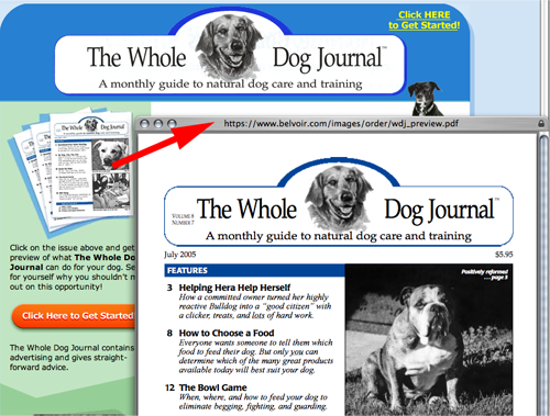
The site does offer a “preview of what The Whole Dog Journal can do for you dog,” if you click on the photo to the left. What you’ll find there is basically a table of contents for the magazine.
3. Content Webification – C
There’s not many bells and whistles involved in this site… just a couple of links to a table of contents and a “click here to get started” that speeds you to the free sign-up form at the bottom of the page. You’ll see no streaming video of cute puppies undergoing training in the “natural” way. Really, this site could have been designed a decade ago in terms of technology and webification. Ironically, that doesn’t greatly detract from the effectiveness of the site… people who love dogs and are sympathetic to natural training and care issues probably won’t mind at all that the site designers didn’t load the site with snappy functions. They might even appreciate the lack of gizmos.
4. Relationship Building – B
I like the immediate access to the electronic version of the free issue. However, it was only a little over 20 pages long, which made me wonder how substantial the actual printed product might be. Nevertheless, they did offer it for free and it is a good way to judge the content and style of the magazine. And they did use it to capture my email address… and they have sent me other emails to keep me thinking about their product. I also like the yes-or-no option regarding sharing your contact information with people who sell dog-related products. The overall feeling of the landing page is that these are legitimate special interest journalists who love dogs and are willing to give you a fair chance to see if you fit with their editorial product before you spend your dough.
5. User Testimonials – F
If there were any testimonials on this site, I have to confess I failed to find them. A pity, really, because the kind of information their magazine offers should really inspire all kinds of grateful reader comments. Stories about how readers used the magazine to heal and train their pets using natural, money-saving methods… that would be very compelling. The only thing even remotely resembling a testimonial is the “Helping Hera Help Herself” blurb in the table of contents sample… and, of course, that’s not really an objective comment from a happy user.
6. Links to Order Flow – A
While the links really don’t have much “gee whiz” value, they do get the job done easily and quickly. There’s no doubt what the links are for and they take you to the order form very quickly. And there’s no confusion about how to order your free issue.
7. Labeling and Language – A
The language on the site is clear and easy to understand. There is a refreshing lack of dog-related puns (with the exception of a reference to the free issues as a “treat”) and overly cute copy. The sales language is strong and leaves no question about what the offer is all about.
8. Readability & Content Density – A
This site’s typography is very comfortable with nothing strange or weird. The layout is clean and crisp with reasonable use of white space and graphics that are completely appropriate for the task. I found the site to be a nice preview of how the electronic version of the magazine looks.
9. Content Freshness & Urgency – C
Other than using the current issue as a free premium, there’s really nothing to indicate that the folks behind this site visit it every day or even every week. Something as simple as the current date on the site would help. As long as they keep putting up the current issue and the current issue’s table of contents the lack of urgency probably won’t damage them, though. The magazine is clearly identified as a monthly publication, so perhaps readers won’t expect the content to turn over any more frequently than that.
10. Load Time – A
The site loaded up quickly on my broadband service, well within the 15 seconds specified in the Mequoda guidelines.
11. Aesthetics – A
The site is full of pleasing photographs and illustrations of dogs, which ought to make it attractive to people who appreciate canine beauty. The layout is very accessible and easy to enjoy.
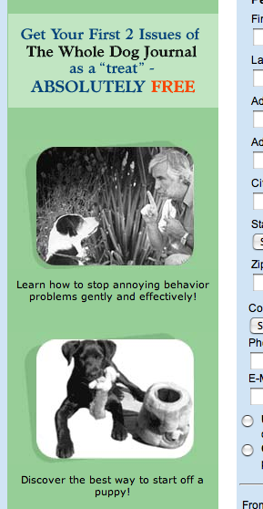
The site is full of pleasing photographs and illustrations of dogs, which ought to make it attractive to people who appreciate canine beauty.
12. Order Options – B
Since this is a classic “soft offer” that doesn’t require the prospect to send cash or checks or credit card info, the order options probably aren’t as critical as they would be in a “hard offer” that demands payment with order. The order language is relatively simple and straightforward. The 800 number and the customer service email address were, in my opinion, a little too hidden away at the bottom of the order form. I will be curious to see what kind of order options show up when I get my invoice from them in the next week or two.

The 800 number and the customer service email address were, in my opinion, a little too hidden away at the bottom of the order form.
Conclusion
This is a nice, friendly sales pitch that will probably generate a nice flow of subscribers… especially if they do a good job of driving dedicated dog enthusiasts to the website. They could have been more technologically advanced… but I don’t think that would have made much difference. They do a really nice job of making the reader feel safe doing business with them.


