Plain-English Compliance and Training Tools
Having never visited this site before, and having only heard of them briefly, I think I’m a good candidate to review BLR.com. I’m coming in with a completely clean slate; I don’t know what to expect so I’m on the lookout for any and every thing I can find.
Based on their tagline, I can make the presumption that they provide compliance and training tools for business professionals. Upon first glance at their homepage, it’s immediately obvious to me that they serve four markets:
- Human Resources
- Compensation
- Safety
- Environmental
This is made clear to me in two ways. First, they’ve got four different URL links at the very top of the homepage, one for each market. Second, they’re promoting four free ezine sign-ups, one for each market.
I’m heavily drawn to product information. In the middle of the homepage, I see images of resource guides, books, and newsletters. In the left hand navigation I see a Product Locator and a listing of BLR Products by market. Just under the tagline, I see additional navigation that leads me to Catalog Fast Order, My Account, Check Out, Shopping Cart and Login.
Whew! I certainly have a lot of options. The site clearly has a retail component, but it looks like there are also links to four membership websites. BLR Home is very clean and simple, yet I’m not entirely sure what they want me to do here. For the purpose of this review, I will treat it as a retail website. Let’s run it through the Mequoda Website Scorecard and see what we find.
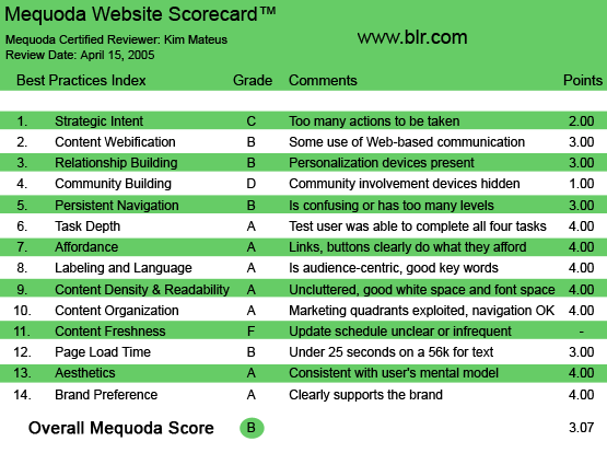
BLR.com’s Mequoda Scorecard
[text_ad]
1. Strategic Intent – C
I hate to be so judgmental so early on, but I can honestly say that there are too many actions to be taken on this website. I can search for and buy products, I can sign up for free e-zines and I can read news. I can also venture off into four other sites that serve specific markets, but I have to subscribe to see most of the information. These all seem like great resources, except I’m not sure which one they really want me to do. I can assume they want me to search for and buy products, since that seems to be most prevalent, but I’m tempted to just sign up for a free e-zine, of course, because it’s free.
2. Content Webification – B
I waffled back and forth between a B and C on content webification. The text and graphics on BLR.com are certainly webified, which grants them at least a C. I decided after all that I would give them a B because the site does use some form of interesting and uncommon Web-based communication technology. It’s called BLR Live and can be found in the customer service section on the Contact Us page. The problem I had: it wasn’t working! Or at least it didn’t seem to be when I tried, which was during the business hours they claimed for operation. BLR Live is supposed to provide you the option of chatting with someone live, but when I tried it, no one responded. I waited for a good five minutes, and I got no response. I kept getting an “All operators are currently assisting others. Thanks for your patience. An operator will be with you shortly” message. It felt worse than being on hold!
I decided to give them the benefit of the doubt… maybe all operators were assisting others. Plus, it looks like they have a VIP tour that I can sign-up for. That gives them some extra points for webification.
3. Relationship Building (Personalization) – B
Relationship building for a retail site can be tricky. Essentially, the number one goal is to sell visitors your products and to make the buying process as inviting and painless as possible. But on the Web, the goals for retail take on a different spin. Retail site owners now have the opportunity to build relationships with their customers to encourage return visits.
In a brick-and-mortar store, you encourage return visits by providing top-notch customer service or by having a great location. On the Web, you encourage return visits by providing free valuable information your customers can refer to time and time again. You get their email address so you can send them promotions. All retail sites must provide a way to reach their visitors and encourage their return visit. There is no other way to do this than by providing a way to capture email addresses.
BLR Home does this through their free newsletter sign up. They give the sign-up box appropriate placement and prominence, so they deserve kudos for acknowledging this importance. However, they could be doing more. They could be deploying their newsletter content into it’s own editorial hub; a single website where business and legal professionals could come to search, read, bookmark, and comment through a blog or a forum about business and legal issues – all for free.
This way, BLR would have the opportunity to target the thousands of business and legal professionals who may not be ready to spend hundreds of dollars on BLR products, or spend hundreds of dollars on membership websites, but are nonetheless highly interested in business and legal reports information. It would be safe to believe that over time, these skeptical visitors will be ready to purchase high-priced products from BLR.
If they went this route, the retail component of BLR would then be broken off into its own website, maybe called the BLR store, where the primary tasks, mission and functionality of the site would be directed toward searching for and buying products.
4. Community Building – D
It might be a stretch giving them a D here, but I did find one, tiny form of community involvement hidden on this site. On the Contact Us page, they give users the option to provide new product suggestions by sending them an email. They also encourage site feedback. But aside from that, there are no community involvement devices on this site.
Seeing that this is primarily a retail site, perhaps some reader reviews would benefit BLR. If I were able to read what other buyers had to say about the products, perhaps I’d be more inclined to buy their products. This is especially true for a first time buyer debating whether or not to spend $300 on a product.
5. Persistent Navigation – B
There are two reasons we gave them a B. One is because there are unclear in what it is they want you to do at this site. With the product locator on the left, the newsletter sign-up on the right, and the links in the high-level navigation that go off into 4 other membership websites, there is just too much navigation.
Secondly, in the high-level navigation, or what we will also refer to as their “Network” navigation, the positioning is inconsistent.
For example, if you are on BLR.com, above the tagline, you see 5 links: BLR Home, HR.BLR.com, Compensation.BLR.com, Safety.BLR.com and Enviro.BLR.com.

If you click on BLR Home, you are brought to the same page you were just on, BLR.com, so that link is useless. If you click on HR.BLR.com, you are brought to the HR membership website, and this is what you see:
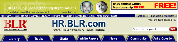
There is now an ad above the network navigation, which drops the high-level navigation down, and there are added links, one for free newsletters, one to log in and one to become a member.
If you click on Comp.BLR.com, you are exposed to yet another form of network navigation:
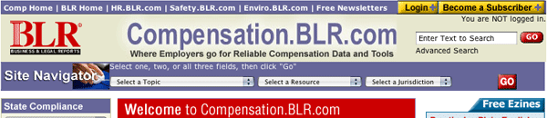
The network navigation is located back at the very top of the page, with no ad, the option to log in and subscribe. They want you to be a member of hr.blr.com, but they want you to subscribe to comp.blr.com… what is the difference?
They are in clear violation of the usability rule called consistent positioning.
6. User Task Depth – A
To determine their grade on user task depth, I assigned myself four tasks:
- Search for product
- Purchase product
- Contact Customer service
- Get follow-up information
Searching for products was very easy. In the upper left hand quadrant is the Product Locator. This allows me to search by topic, format or keyword. Results are user-friendly and product headlines are linked to product pages.
Buying products was just as easy. They have a basic shopping cart function that is very effective.
The customer service function, with the exception of the long wait I experienced earlier, is pretty good. They give you a couple of options to get help. First and foremost is the 1-800 number to call, but you also have the option to send an email, have someone call you back or attempt the live chat.
Getting follow up information was convenient, I was able to sign-up for the free ezines as a way to stay in touch, and was encouraged to submit comments or questions.
I was successfully able to complete all four tasks.
7. Affordance – A
The links and buttons on this site clearly do what they afford. Most links are underlined only when you mouseover, but this is OK, considering the number of links that are available going down the left hand navigation. They cover all bases by putting mini arrows to the left of the product links, reinforcing the fact that they are links. All product images are linked as well.
8. Labeling & Language – A
Their tagline is “Plain English Compliance and Training Tools” so it was no surprise to me that their site is also written in plain English. Benefits, Compliance, Policy & Practice, Training and Salaries are all words that are understood by everyone. I would imagine that they do a fairly good job at organic SEO rankings thanks to their human-friendly labeling and language.
9. Readability (Content Density) – A
The readability of BLR.com homepage is great. Their use of white space is just right, the colors are outstanding and they do a good job of balancing graphics to text. One criticism I do have is that once you navigate deeper into the site, you realize how little their type size is. It looks like they may be using a 10-point, which is standard, but it looks small on screen. It could possibly be 12-point, but due to lack of space in between lines, it looks painfully small.
10. Organization (Marketing Quadrants) – A
While we don’t agree entirely with the way they’ve designed their network, we have to be fair in giving them an A here, because they have, in fact, perfectly exploited their marketing quadrants. If, from the BLR homepage, they want you to buy products, then they’ve done a great job by placing their product locator in the upper left hand quadrant. If they also find it very important to capture your email address, then they’ve consciously placed the sign-up box in the upper right hand quadrant. If another one of their primary missions is to divert you over to the four membership websites, then they’ve also carefully created links in the high-level navigation that will take you right there.
11. Content Freshness – F
Nowhere on the site am I given any indication of how often products are updated on the site. Even in the News portion of the site, they don’t provide any dates, so you’re not entirely sure when the article was written, or posted.
12. Load Time – B
BLR.com downloaded in 21.52 seconds on a 56K modem, giving them a B in load time. This is very good in comparison with other retail websites I’ve seen.
13. Aesthetics – A
The design of this site, I believe, is very appropriate for the audience the website serves. Business people come to this site searching for plain English compliance and training tools, and when they arrive, they get a plain English website, with simple, clean colors. The site’s personality fits with its user’s mental model.
14. Brand Preference – A
This site clearly supports and builds the BLR brand and encourages return visits. They offer free ezines in each of their target areas, and the option to sign up is visible in two places on the homepage; in the upper right hand quadrant, and running across the bottom of the page. Very smart. The BLR brand is very strong, as they’ve made it a part of each of their four membership sites’ URL. They don’t subjugate to a higher authority… in fact they make it pretty clear that they are the authority when it comes to compliance and training tools.
Conclusion
Thanks in part to our theory about the role and definition of website networks, we immediately recognized BLR as a website network in need of some strategic Mequoda planning and distribution. Currently, this is what the BLR network looks like:
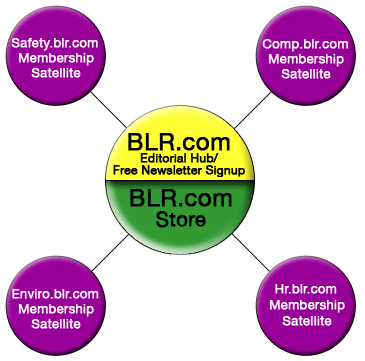
This graphic demonstrates them as having the retail site and the newsletter sign-up in one confusing interface, otherwise known as the current BLR.com. They then spin traffic off to each of the four membership websites.
In order to classify it as a Mequoda Website network, they would have to take their newsletter content and deploy it into its own editorial hub, where users can search for, bookmark, comment and subscribe to updates of free valuable information. Then, this hub would spin traffic off to 5 satellite websites, (the 4 membership sites and a retail site).
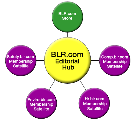
With a final score of B, BLR.com is a site, or a “network” of sites, that is already far better than average, but could be truly outstanding if only they implemented a few simple changes. Creating an editorial hub alone would be enough to spiral more opportunities for traffic, revenues and happier users.


Please tell me where/how to UNsubscribe from the BLR emails.
So far I have gotten no response from sending requests to ‘service@blr.com’- This is the first site that I have encountered that fails to unsubsribe you with one ‘click’.
Please advise/or simply remove me from all related ‘BLR’ emails.