
From some perspectives, it’s a bit intimidating to review BookReporter.com as it is an obvious success, and—as such—has been the subject of a previous Mequoda Library case study.
After all, how many websites earn substantial revenues with just a handful of employees and the bulk of their content created by visitors?
Yet, we can’t allow complacency and obvious success interfere with analyzing BookReporter from the perspective of the 14-point Mequoda Website Scorecard™. There’s always a chance that a fresh look may reveal opportunities for refinement, which could increase the site’s performance and revenues.
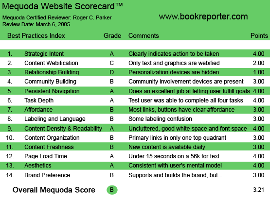

BookReporter.com’s Mequoda Scorecard
[text_ad]
1. Strategic Intent – A
The first criteria is to analyze how quickly and clearly the site’s intention is communicated to first-time visitors. The BookReporter.com banner is immediately followed by a clear and unambiguous tagline: “Where readers and writers click.”
The tagline is reinforced by the close proximity of the site’s links, all of which involve authors, books, or reading—so, we can conclude that the site’s intent is immediately obvious to those who enjoy reading or are searching for a closer connection with their favorite authors.
2. Content Webification – C
How effectively does BookReporter.com leverage Web technology?
Unfortunately, the site is primarily a text site. It is a “silent” site. Given the dropping price of online audio and video, it would be relatively easy to have audio links to author interviews. It might even be possible to post some video links to C-SPAN author readings, etc. Readers can take a survey, but the updated results are displayed to readers very simply and unimaginatively.
One disappointment was that I could not personalize the homepage to display the current bestsellers within a genre, or from my choice of several newspapers. The ability to scan bestsellers from the home page would greatly please me, and would probably be relatively easy to implement. Indeed, my “Mystery and Suspense Best Sellers” from “America’s Top Independent Bookstores” could be an RSS feed to both the BookReporter.com blog, as well as the homepage.
3. Relationship Building (Personalization) – D
Just about every page of the BookReporter.com website includes a link to an email newsletter sign up form. Although the banners to the sign-up link are frequent, the site doesn’t aggressively “sell” the benefits of newsletter sign-up:
- There is no visual of what the newsletter looks like
- There is no description of the newsletter’s content
- Visitors cannot immediately access a sample of the newsletter.
- The newsletter sign-up page begins with a description of a monthly drawing: each month, one individual signing up that month will receive five books. This devalues, rather than enhances, the content of the newsletter and makes me wonder why they have to have a drawing. And, since only 12 individuals a year are going to win, the odds of winning seem rather remote.
Although the newsletter is not particularly “advertised,” the sign-up form appears fairly complex, with fields for complete mailing address and phone numbers—although only names, salutation and postal code are required.
Further, the newsletter sign-up form inquires about reading preferences, i.e. genres, but does not indicate whether or not responses to this field will personalize newsletter content. 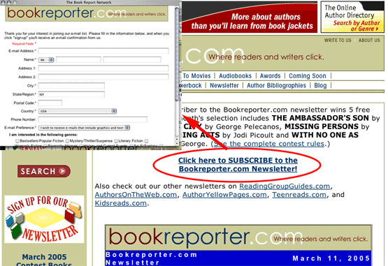

4. Community Building – B
Readers provide the book reviews that form the essence of BookReporter.com’s content. Yet, coming to the site as a first-time visitor, I was surprised to find that the reader-origin of the reviews was not particularly emphasized, nor was I prominently asked if I wanted to submit book reviews!
It’s very easy to locate individual book reviews, but relatively hard to find out how to become a reviewer! I had to select the “Write to Us” link, and then scroll through the FAQs until I came to the “How can I become a reviewer?” topic.
This took me to an ASP page written in 2001 describing the requirements to become a reviewer, which ended with a request for me to provide a sample review.
5. Persistent Navigation – A
Navigation is straightforward and unchanging. The same links appear at the top of every page.
6. User Task Depth – A
Straightforward navigation, plus extensive use of alphabetized lists, makes it easy to locate information within a category, i.e. reviews, author websites, author newsletters, etc.
7. Affordance – B
For the most part, links are clear. However, on the Word of Mouth page, which contains one to five short reader ratings of books, book titles are underlined—yet they are not links! This is a surprising oversight, as the tendency is to click on underlined text. 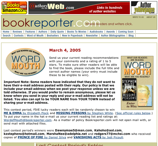

8. Labeling and Language – B
The majority of navigation labels are clear, except for some inconsistencies. I was a bit disappointed with the Word of Mouth page, and didn’t quite see a clear distinction between that and the longer Reviews.
9. Readability – A
Text is easy to read: lines are comfortable in length and distractions are few. The only possible improvement would be to include printer-friendly pages for longer reviews and book extracts.
10. Organization (Marketing Quadrants) – B
Organization is enhanced by the efficient banner and consistent navigation at the top of each page. However, I was frustrated at several points by the presence of above-the-fold “administriva”—information that would only some users would likely need—that interfered with my primary mission. 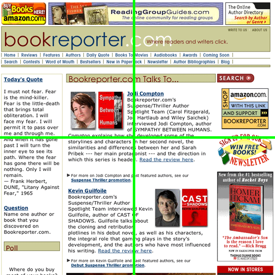

One example has already been mentioned: a contest (which I’m likely not to win) distracting me from my goal of signing up for the newsletter. The same space could have been used to reinforce my desire to sign-up for the newsletter.
Likewise, on the Word of Mouth page, the page begins with yet another contest/book giveaway, plus a bold-faced paragraph discussing email addresses. If I visit this page every week, I’m probably going to get tired seeing the same caveats and offers repeated over and over again.
11. Content Freshness – B
BookReporter.com offers a Daily Quote. Although it’s just a small portion of their content, this gives them a B for content freshness. By clicking on the Daily Quote tab, you are led to a page with the day’s quote boxed out in larger text, followed by a list of recent quotes. 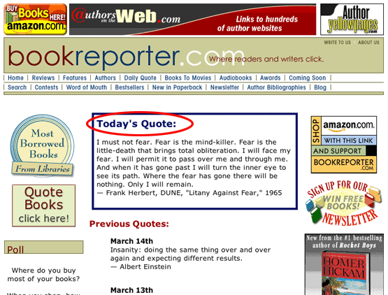

BookReporter.com’s primary content appears to be updated weekly, yet the “freshness score” was diminished by stale content on several links. The blog contained a March 3, 2005, posting, but only two postings appeared in February!
The lesson, of course, is that visitor attention and enthusiasm can be very short-lived. A few out-of-date links can undermine the image of even the most up-to-date website.
12. Load time – A
BookReporter.com is a fast site. Graphics are small.
13. Aesthetics – A
The overall image is consistent with a reader’s devotion to their obsession.
14. Brand Preference – B
The overall design and content of BookReporter.com supports the brand, but as an author and buyer of 10-12 books a month, the site failed to install a sense of loyalty or sense of urgency motivating me to return.
At too many points, the site tried to engage me with contests, rather than focused, concise persuasion. Since the site is obviously successful, one can either conclude that “contests and giveaways sell better,” or…that a more focused, personalized, and straightforward approach might help the site generate even higher revenues.
Conclusion
After spending time at the site, I felt the BookReporter.com story still hadn’t been completely described to me. As an author, there is a very reasonably-priced sign-up (for the AuthorsYellowPages.com), but the sign-up doesn’t tell me to how many readers my listing could possibly be exposed to. As a reader, I got the impression that the site’s emphasis is on fiction more than nonfiction, and the site was geared for a different type of reader.
Editor Don Nicholas and Managing Editor Kim Mateus recently interviewed Bookreporter.com and learned more about their business model. They learned that my impressions were correct: the site’s emphasis is more on fiction than non-fiction and they have no problem claiming that. The bulk of their revenue comes not from BookReporter.com, but from another website in The Book Report Network, AuthorsOnTheWeb.com, where they build and maintain author websites. See The Mequoda Network™ for a brief discussion of The Book Report Network. Also, read an in-depth profile of The Book Report Network.
Overall, this is a classic example of a successful website that could only be more profitable if they implemented a few simple changes.

