
Established print publications, especially trade publications, typically have a hard time letting go of their print roots and embracing all the new functionality and usability features that are required for a great content website. This is why we use a tool like the Mequoda Website Scorecard, to give us unbiased rules to sleuth out the good and bad of the online design. However, my father was one of the first employees of IDG’s Computerworld, which meant that I grew up with this leading technology trade publication lying around the house, along with random promotional pieces emblazoned with the logo. So, hearing the name brings me warm fuzzies—as much as a computer trade magazine can. In deference to my childhood memories of Computerworld, I will wield the unforgiving scorecard gently for this 37-year-old veteran of the computer industry.

Computerworld.com’s Mequoda Scorecard
[text_ad]
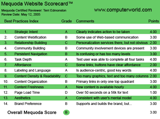
1. Strategic Intent – A
IDG publishes over 300 magazines and newspapers in 85 countries, with revenues of 2.4 billion in 2004. (Full disclosure—I am a previous employee of IDG). Computerworld, (CW) is one of the oldest and most respected publications in this stable, with a target audience of Senior IT management at mid-to-large size companies.
In a controlled circulation trade publication potential subscribers are carefully screened. If the readers match certain professional criteria making them attractive to the advertisers, they get the publication for free. This took the “paid content” question out of the equation early on for Computerworld. The print content is free, therefore so is the website. However, the Web is wide open, creating an inevitable lessening of control over the ability to collect information about readers. A significantly lower number of readers will fill out the long forms asking specific questions on professional data, such as company, job title, budget responsibilities etc…. This brings down the value of the Web reader to the paying customers of the publication—the advertisers.
What, then, is the strategic goal of a free content B2B website? There are several answers, here are just a few:
- Subscriptions and Subscriber Services. One of the key tasks of a print publication’s website is to drive print subscriptions. In addition, print subscribers expect the website to behave as a customer service point, where they can manage tasks related to their subscription.
- Content. Readers expect the same content online as off, and to find everything on a given subject, quickly and easily. They want to use the site as an archive and research tool. They read an article in print and want to find it online to quickly email it to a colleague. These tasks are no longer negotiable. If you fail in any of these tasks you’re going to lose brand loyalty.
- Data Acquisition. Advertising rates are not just a simple volume calculation, they depend on the quality of the publication’s readership. The more information the publisher has, the better they can maximize their pricing strategy.
- Advertising Inventory. Deeper content and wider distribution = more readers and more inventory. Don’t forget to make room for the advertisements to bring in revenues.
ComputerWorld manages the above goals pretty well. As seen by:
- Subscriptions and Subscriber Services
- Subscribe link on the top menu bar
- Services link for subscription management, top menu bar
- “Subscribe” Pop-over Advertisement and internal ad placement
- Search (3 different methods)
- Content
- All content accessible online, current and archives
- Same content and editorial sections from the print magazine immediately visible, including specialized features such as “Knowledge Centers”—content by IT subject and constantly updated Latest Headlines
- Web-only content
- RSS and newsletters
- Data Acquisition
- Pop-over survey
- Long subscribe form
- Advertising Inventory
- Interactive Banners—at least three per page
- Text ad links
- Newsletters
- “Partner Zones”—special advertising sections
Any reader or advertiser understands the business model from page one. Computerworld has even been innovative with their award-winning Partner Zones for advertisers. However, I think Computerworld could do even better by optimizing the site for increasing subscriptions and reader data. I would like to see more space allotted to encouraging visitors to fill out the long data collection forms for their free subscription. Additionally, there is plenty of room to experiment with a registration wall (for example archived or “premium” content) to gain more information on Web visitors.
2. Content Webification – B
Computerworld just barely misses falling into the trap of creating a website that behaves like old print media. Here’s the quick lowdown:
- Learning tools. Online we can have a “Quick Study” at the end of an article, something that would take too much paper to be cost effective in print. This lets the reader learn more about a new trend or technology.
- Webcasts. I watched an “On Demand Online Presentation” from an industry expo, complete with the PowerPoint slides used by the speaker. A great way to showcase content that’s hard to get without a plane ticket.
- Interactive Tools. ROI is notoriously hard to prove for IT departments, these downloadable ROI Calculators are right on target for the audience.
- Interactive Buyers Guide. Run by a third party with a registration wall for detailed reports, this potentially brand-building feature is a missed opportunity. It was clunky to use, and could have been far more interactive. I felt like I was flipping through an online yellow pages, with a few filtering features. I had to do a lot of drilling down to find the information I sought, and once I got there I read long detailed reports, which were not well presented (too much reading, not enough sorting).
Webification options could include:- Links to Computerworld articles on a given product, company, or category
- Different methods of displaying search results, i.e. selecting a few specific results to compare, a database format to select certain criteria
- Community and relationship building such as User Ratings for products or customer testimonials for vendors.
In general webification of the site followed established standards, with some lag-time on features that are still too innovative to try.
3. Relationship Building – C
I’m sorry—do I know you? With a variety of newsletters segmenting the content, RSS feeds, and storable research, I do see some relationship building functions. But I can’t get over the most obvious missing relationship-building device—I can’t personalize my headlines. For a publication that covers a variety of very specific fields, that would seem an obvious first step to building the relationship with time-pressed professionals who want to read only what they need, quickly.
4. Community Building – B
For community building options I see the ubiquitous Polls and Forums. The Forums are not incredibly fancy or highly promoted, however, they are well populated. These are the guys who were on Usenet in high school after all. I would like to see a blog for the immediacy of interactive conversation-building to give them an A in this category.
5. Persistent Navigation – B
Navigation through a 3-level top menu bar was consistent, if ungainly, throughout the site. Navigation changed slightly for Partner Zones and the About pages, but these changes will be understandable to the typical Web visitor.
However, the second navigation bar on the left column was not absolutely positioned; it often moved from the top left to much lower down on the page. Not certain about what was going on, I made some hypothesis about when it would move down, and then tested it by clicking around. It seemed to be determined by the rest of the content on the page, and I think must be an error. I tried another Web browser and got the same results. Erroneous or intentional, it’s confusing and should be fixed.

6. Task Depth – A
My tasks:
- Click on a Headline. No problem here. The homepage is chock full of easy to read, clickable headlines, bulleted under section heads. Each click takes me directly to the article.
- Search for a specific keyword. I used the search box and got over 1000 results for my keyword, with the headline, a teaser sentence and the date. Great. I also clicked on a specific IT subject area and found my keyword quickly by scanning the page.
- Change my email. This wasn’t fun. I had some trouble figuring out how to get to the email newsletter change address form. I kept clicking on the wrong links, services, or subscriptions. I feel a little stupid about how many rabbit holes I accidentally went down, considering I do this for a living. Imagine the less Web-savvy reader’s feelings. (The task was completed, but I wish I could give them an additional “F” for “Frustrating”).
- Subscribe. Since there is a Subscribe tab, I thought this would be easy. But there are different conditions for subscribers, and I had to figure out which I was. Paid or Free? US or Other? For Computerworld’s business model, each type of subscriber requires different information. Being in the publishing business I understand why they do this, and assume most readers of a trade pub understand why they get a free subscription if they meet certain professional criteria, but there is almost no messaging around the multiple subscription links explaining this to the un-initiated.
7. Affordance – C
The top menu bar uses tabs, with second level links and a third level drop down (blue links on a blue background—hard to read). Content navigation used underlined titles and bulleted items, which are good standards. Additional navigation was clear using a grey box around the links. However, while the content links were clear, much of the navigation wasn’t underlined and required mouseover. I especially disliked the second level menu links—you don’t know there’s a third level of submenu items until you mouseover them. Because of the need to scroll around to find links, and the blue on blue links, I have to give the site a C.

8. Labeling and Language – A
Navigation labels use Web standards—services, subscribe, home, news, etc… There is some use of labels specific to Computerworld, such as “QuickLink” or “SharkTank,” which builds the brand to the returning reader. The IT audience uses a large volume of specific labels for their constantly changing industry. These are represented on the site, which is audience appropriate. A non-industry reader might feel a little lost, but the true audience will appreciate a publication that speaks their language.
9. Readability (Content Density) – C
HTML was originally designed not to control look and feel issues like column width. That’s why some line lengths can go on forever, far past a comfortable reading width. CW doesn’t use a fixed line length, which means the column width exceeds the standard 50–80 character range, depending on the width of the browser window and the screen resolution of the reader’s computer.
Having designed for trade publications I know there is an art budget for photos and illustrations, but I don’t see any of it spent on this site—it’s even less visually oriented than a typical computer manual. My eyes hurt.
10. Organization – B
The screen is too wide. I surfed on both a PC desktop and a Mac laptop, and both screens cut off the third column on the homepage. Site design should never treat homepage real estate so callously. Why accept that any percent of readers won’t see some of the homepage content? If it doesn’t need to be seen by everyone, then put it somewhere else.
Primary tasks are available, but almost exclusively in the top quadrants within the menus. Everything is compact, above the fold, and pretty clean. However, keeping the strategic tasks for the site in the top two quadrants is a missed opportunity. They should take the people who designed the award-winning “Partner Zones” and spend some mental energy on their own pages.
11. Content Freshness – A
Knowing what’s going on as soon as it happens is important to industry execs. Updating the latest headlines several times a day, five days a week is essential, and here Computerworld gets an A.
12. Load Time – D
On a 56k modem the homepage takes over 90 seconds to download. This is too long, and for an editorial content front page it’s unnecessary. Clean up the code and stop losing readers.
13. Aesthetics – A
Let’s see—what would a trade publication look like?
- Two-toned blue menu bars? Check!
- White background, minimal images? Check!
- Grey text search boxes, using drop downs and simple icon go buttons? Check!
- Small text breadcrumbs? Check!
- Computer beige-grey boxes to call out menus and special sections? Check!
- HR tags (in brackets) to make horizontal rules? Check!
- Sans serif font (Arial) in the minimum number of colors and sizes? Check!
Computerworld gets an A. It matches the audience perfectly.

14. Brand Preference – B
The site supports the print brand well. There is extensive editorial content available, and the strategic tasks we listed in the first section are attended to.
But the Web is not print. They haven’t taken any risks and nothing gets me excited about being here. They even give away the opportunity to impress me, since the interactive parts of the site are powered by someone else. I want more. Instead of being faithful to my stable family life, I feel drawn to the flashier upstarts. A missed boat.
Conclusion
With As in Strategic Intent, Labeling and Language, Task Depth, Content Freshness and Aesthetics (only five of the 14 criteria) there is definitely room for improvement. I would focus first on improving the user-friendly criteria such as Navigation, Content Density and Load Time, and then look to improvements such as increased Relationship Building and Organization.

