With A’s in Strategic Intent, Relationship Building and Brand Preference, it’s Hardly Surprising that this Non-Profit is an Online Leader in the Paid Membership Website Category.
Consumer Reports’ successful membership website strategy has earned them over two million online subscribers (as of November, 2005). Averaging well over 20,000 new online subscribers per month, it’s obvious this site is doing something right.
The site started with a clear product position—a valuable information resource that could not accept advertising. That led to only one choice in strategy: a paid membership website offering large archives of information.
- The print product would still present long, in-depth articles on, say, reducing energy costs and the products that would help, while the Web would be sold as a research product.
- Members could look through years of reviews to find the exact product and model they were interested in.
- The differences between the print and online product made sense, both to the business and to the end consumer.
- Even as a paid membership site, CR has some free content.
- The hardest design question has always been how to make it immediately visually obvious what is free and what is paid content on the site.
ConsumerReports.org’s Mequoda Scorecard
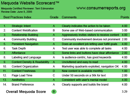
1. Strategic Intent – A
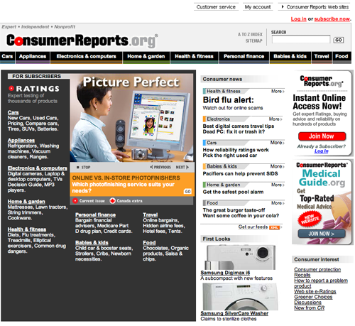
“Instant Online Access Now! Get Expert Ratings, buying advice and reliability on hundreds of products. Join Now” is the front page pitch. Knowing the brand’s long non-profit history, and knowing that they don’t take advertising, is the unspoken power behind this argument. Just in case the visitor lives in a media cave and hadn’t heard of Consumer Reports, they can browse the free consumer news to get a taste of the quality of content available here.
The site makes the pay-me-for-information proposition well inside the first-glance test. The red “Join Now” button, plus the “for Subscribers” heading and “Log in or Subscribe now” links are obvious cues even to the clueless.
[text_ad]
After the first glance, CR doesn’t give up on encouraging subscription. When a user clicks down into a headline, the content wall pops up. The page then offers a login box and a subscription pitch. If the user is reading free content, there is a “For Complete Access” pitch next to the content, as well as the constant red “Join Now” ad. After subscribing, the new online member is hit with an upsell to the print magazine. On the site as well, there are constant house advertisements for additional CR products, including “Consumer Reports on Health”, “Consumer Reports Money Advisor” and “New Car Buying Kit” among others.
The site strategy is clear to a visitor: CR is a reputable non-profit offering a lot of valuable content, the business makes money through direct sales and subscriptions alone, and that there are several content products offered.
When a user clicks down into a headline, the content wall pops up. The page then offers a login box and a subscription pitch. If the user is reading free content, there is a “For Complete Access” pitch next to the content, as well as the constant red “Join Now” ad.
2. Content Webification – B
The depth of content available—over four years of Ratings on thousands of consumer products—is mind-boggling. Searching is well managed, even browsing is a viable method for digging to find specific content. The site is using the deep database style of Web content very well. Content webification lags on the more interactive opportunities. CR has started down these innovative paths:
- Video/Games: I enjoyed the animated scrolling of featured headlines on the front page. I also watched a short spot showing a man’s burned-down house that was due to a faulty dryer and played a flash quiz on when to buy organic, based on the feature story about best organic food choices.
- Tools: The Product Selector is currently being re-furbished, to be released later this month. New functionalities promoted include customization and sorting of charts, and ability to see non-Consumer Reports-rated products alongside the rated ones.
In the first category, I would like to see more videos, and better promotion of the video and games to really enhance the experience of using the site. It still fits with the site content strategy, because watching the video brings the user’s attention to additional topics. For example after watching about the house I immediately started searching on the safety of the dryer I use. Not only did this entertain me and keep me on the site longer, but it increased the overall value of the site to me and my interest in returning more often.
In the second category I expect the Product Selector will be a great tool, but I can’t rate it if it isn’t functioning. I would like to see more tools like this so that the site feels a little less like browsing through a library and more like searching for a solution-finding tool.
3. Relationship Building – A
As a paid membership site, there isn’t a lot for the unknown user to do on CR until they’ve subscribed or logged in. The relationship building criteria is looking for the prominence of an email capture, which in this case goes hand-in-hand with the subscription. Opting-in for email is part of the subscribe process. There is an additional RSS option for all users, which is rightly given second priority and visually placed below the subscription offers.
4. Community Building – C
Even without good community building devices, the site has loyal and enthusiastic visitors on the strength of the brand and the product. People who read CR have a similar profile, they are the person their friends go to to ask “Which of XYZ should I buy?” They already know that they are a unique group. They relate to each other in the same ‘wavelength’ kind of way that a particular band’s groupies would. On a membership website, a space for members to communicate their enthusiasm publicly, to share thoughts on the content and to talk directly to editors publicly, should be a high priority. Humans thrive on a sense of belonging and contribution.
That’s why it’s such a pity that the discussion forum is not well promoted. I had to search pretty hard to find it (I was sure that some sort of forum had to be there after all). Integrating forums into site content is never easy, as the content comes from different places and is usually on different platforms. One method could simply be to post most recent threads in a house ad space on most content pages. In any case, the community building tool on CR is present, but not well promoted.
5. Persistent Navigation – A
CR has a top navigation bar for browsing by product type (Electronic & Computers, Home & Garden, Babies & Kids etc…. ). This brings the user to a topic index page with deeper levels of sub-topics (Batteries, Video, Mobile etc…. under Electronics).
Truthfully, people use CR for research and will have a good idea of the product they want to find out about before they even turn on the computer. Therefore Search is the key navigation tool. Search is available on every page in the same place, in the upper right hand corner. Navigation bars will play a secondary role to getting to content for CR members. That being said, the persistence of the top navigation bar, use of breadcrumbs and primary links for membership housekeeping earn CR an A in this category.
The persistence of the top navigation bar, use of breadcrumbs and primary links for membership housekeeping earn CR an A in this category.
6. Task Depth – A
User tasks on CR center mostly around finding content and subscribing. Secondarily users will send information to friends, or print information to bring with them to the store. All of these tasks are easy to find, start and accomplish via standard Web usability practices.
7. Affordance – C
There are two basic affordance issues on CR.
- Color choices on links
- Indicating type of content
In the first, the problem is simply one of letting the designers ignore basic affordance rules. (A thought that is surprising in this test-manic publisher.) The homepage is divided in half—content for subscribers and free content in the form of ‘news.’ That makes sense, but the separation is made using color and this design decision hurt affordance. The left side of the page has a brown background, and the right side is white, with a list of links. The text on the brown side is white, and the white side has black text. The overall effect is visually pleasing, but white text on a dark background is hard to read, and the non-underlined black text on a white background doesn’t read as a link. Furthermore, when you mouse over the links (on both sides), the text changes color—to off-white! This isn’t linking convention and to many people it looks like the text just disappears. Luckily on other pages—such as an index page for a specific topic—underlines are used on every link to the articles.
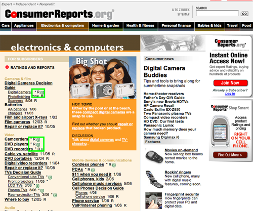
On the second point, symbols are used next to article links to indicate additional information. These include an asterisk, an “R” and a dollar symbol in a green circle. There is a key at the bottom (it should be at the top) that says: “* indicates a product that is frequently updated. R indicates a Ratings report. $ indicates Shop Online for comparison pricing. The design also seems to imply that the red circle with a white dote will indicate ratings, but it doesn’t, the simple “R” does. In all, this is useful information and I’m mentioning it not because it’s a bad idea, but because the presentation is confusing. Confusion = bad affordance.
Confusion = bad affordance.
8. Labeling and Language—A
The labeling and language on CR is written with the average consumer in mind. Any industry jargon would be out of place. Words such as “Reports” and “Ratings” represent the only instances of “lingo” on the site, and here they exert power to build brand strength.
9. Readability (Content Density) – A
CR has articles broken up with short paragraphs and tables and they are easy to read online. The use of black sans-serif text on a white background, with one occasional, relevant image per article, make each bit of content a pleasurable online experience.
10. Organization—A
The 2×2 overlay on CR shows that the quadrants are “appropriately exploited.” Content and/or content links are found in all four quadrants, while marketing links (for other CR products, such as special reports, books or a print subscription) are displayed in three out of four quadrants on most pages.
11. Content Freshness—D
Monthly content updates are very frustrating online. Even on a product review site, we still want to know what’s going on, what’s new? As for research, online content must always have a viewable date stamp to put the information in context. The reader needs to have a way to tell if the information is outdated or not. CR doesn’t do that well on the first count, and is just OK on the second.
ConsumerReports.org earns a D on content freshness because the News section on the site updates monthly and many of the articles under the News heading are actually a few months old. As for research, all content does have a (month/year) date stamp. A blog would be one way to put some informal news online that would increase the user’s interest in frequent returns and build traffic.
12. Load Time – C
ConsumerReports.org earns a D on load time, with 46 seconds on a 56K modem recorded on the website analyzer. This is caused mostly by too many images, large image sizes and extensive use of external CSS.
13. Aesthetics – A
With lots of images, attractively designed headlines and intelligent use of color to separate sections of content, ConsumerReports.org has made a site that is more aesthetically pleasing than it needs to be for the audience. CR is designed with a stronger sense of alignment than many of the more image-conscious online publications. This high level of design is built without losing the sense of non-profit objectivity that the brand needs to visually convey. Quite a neat trick.
With lots of images, attractively designed headlines and intelligent use of color to separate sections of content, ConsumerReports.org has made a site that is more aesthetically pleasing than it needs to be for the audience.
14. Brand Preference – A
The familiar Consumer Reports logo is found on all the different media products by the company. While sometimes abbreviated to CR in text, there is really no danger of confusing the user as to the source of the content anywhere on the site. The objectivity and independence of the brand is a key component of the value of the product—the CR Reviews and Ratings. Based on the importance of trust to this audience it would really be a disaster to mess with this criteria, luckily the website design earns a high score in Brand Preference.
Conclusion
With As in strategic intent, relationship building and brand preference, it’s hardly surprising that this non-profit is an online leader in the paid membership website category. Low grades in affordance and load time are surprising, but obviously not stopping the two million subscribers who are willing to put up with a little usability glitches and shell out the dough for the certainty of having the best information available when buying a new product.


