Denise Austin’s website is in great shape
Waterfront Media has developed a series of profitable websites, one of which is Denise Austin’s fitness and health website, DeniseAustin.com.
All of these sites are based around what I call the “Waterfront Model,” a business model for e-commerce that Waterfront has pioneered and perfected. Let’s look at the model, using Austin’s site as the example.
In the Waterfront Model, the homepage is what I call a “tabloid style” homepage: lots of interesting tips, items and factoids. But prominent on the page is a section with an offer—in Austin’s case, “Get your complete online fitness plan!”—with a large START HERE button.
The primary goal of the site is to get you to click on START HERE. When you do, you are offered some sort of an evaluation of your problem—as well as a plan or solution—in return for filling in the online questionnaire.
On DeniseAustin.com, this is naturally a health and fitness evaluation, since Austin is a fitness guru. The evaluation centers on weight loss, although it touches on other topics, such as exercise. You click through a few screens, answering simple questions and giving some personal information, like how much you weigh now and your target weight.
After completing the assessment, you are offered the solution, which is typically customized (or seemingly customized) content delivered online. This is not a free offer, but the first step in converting you into a customer.
Since this is the “front end” (first) sale, cost is typically low: just a few dollars a week or month. Once you buy, you get emails offering you add-on products, both Austin’s and related items. 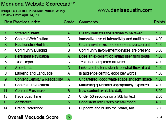
DeniseAustin.com’s Mequoda Scorecard
[text_ad]
1. Strategic Intent or Purpose – A
The beauty of the Waterfront Model and all websites built using it, including DeniseAustin.com, is that the action to be taken is loud and clear: click on the button labeled START HERE! 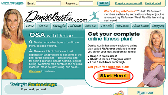
2. Content Webification – A
The core of the Waterfront Model used at DeniseAustin.com is innovative use of an interactive self-assessment questionnaire. The visitor must complete the questionnaire before she is offered the fitness plan, for which she has to pay. This creates the perception that the site is delivering personalized advice, not boilerplate content.
3. Relationship Building – A
As stated in point #2, not only does the site invite you to personalize the content—you are actually not offered the fitness plan until you do so. The site actually forces you to personalize the content, which makes the advice more genuine. How can you help me improve my health without asking questions (as DeniseAustin.com does) about my health, exercise, diet, height, weight, etc.?
4. Community Building – B
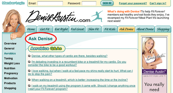
The most prominent involvement devices are several free online newsletters addressing various areas of health and fitness. There is also an “Ask Denise” page where you can post questions and have Denise answer them for you. I could see adding some forums or discussion groups on health issues from which people get emotional and seek information and support: weight loss, diet, exercise, health, cardiac fitness.
5. Persistent Navigation – A
Actually, I’d give it an A minus. Overall, the choices and pathways are clear. A few screens are slightly overloaded with offers, ads and links.
6. User Task Depth – A
There is never a problem in completing questionnaires or going through the steps to get to the offer or content you seek.
7. Affordance – A
There are lots of links to a multitude of services and content on the Denise Austin site, with all links clearly marked and easily accessible.
8. Labeling and Language – A
All terms are in the target prospect’s language: weight, exercise, diet, meal plans, recipes, fitness, personal trainer. There’s no nutrition or medical jargon of any kind. Everything is written in plain English aimed at a lay audience, which is what you would expect, given that Denise is a fitness instructor and not a medical doctor or pharmacist.
9. Readability (Content Density) – A
Again, I’d actually rate this an A minus instead of an A. The pages are relatively clean and easy to read. In some instances, however, a tad too many options and items are jammed onto the screen, creating a slightly cluttered look. But it never gets confusing, and you can always figure out how to find what you want—and what to do next.
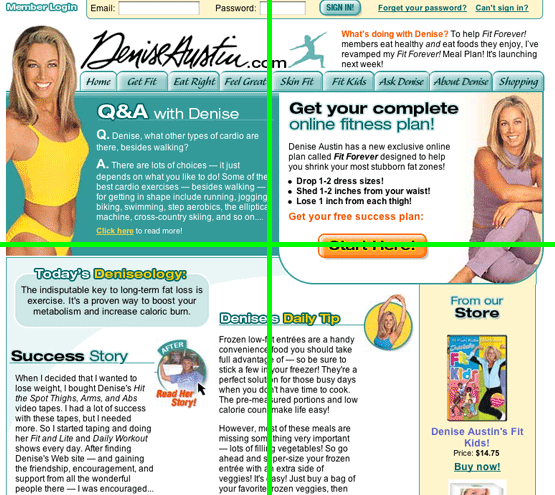
10. Organization (Marketing Quadrants) – A
The site is sensibly organized into quadrants and sections. A horizontal bar at the top of the homepage gives us clearly labeled, one-click hyperlink access to the major site sections.
In the upper right quadrant of the homepage, we have the cornerstone START HERE section of the Waterfront Model. There’s no mistaking that the site wants you to click START HERE, and encourages you to do so by (a) offering a fitness plan and (b) promising a number of bulleted benefits (e.g., “shed 1-2 inches from your waist”).
In the upper left quadrant, you gain access to “Ask Denise,” a Q&A section where Denise Austin answers your fitness and exercise questions.
In the lower left quadrant, you get a mix of free content: success stories, news (“What’s doing with Denise?”) and daily tips.
In the lower right quadrant, you are given a window where you can buy some of Denise’s new videos and related fitness products online.
11. Content Freshness – B
As mentioned in #10 above, the lower left quadrant contains daily tips. There is another feature with updated content (a single tip of the day) here called “Today’s Deniseology.” Through these, the site always features fresh content in a place where it’s clearly identified as such and easy to find.
12. Load Time – C
When tested using the Web Page Analyzer, DenisAustin.com took 36.61 seconds to download at 56K. With a high-speed Internet connection, you breeze through the site and its functionality without delay.
13. Aesthetics – A
The primary graphics are various images of toned, fit, slim, attractive Denise Austin in exercise clothes, clearly communicating that (a) the site offers help with fitness and exercise, and (b) the methods used obviously achieve the results desired (at least for Denise).
Copy on the site indicates that it is aimed at women (for instance, it talks about reducing your dress size). If men were an equal target, I could see using more photographs of Denise and other fitness competitors in slightly more revealing exercise outfits. Not only does sex sell, but such outfits clearly show the tone and fitness achieved.
14. Brand Preference – B
One minor problem with DeniseAustin.com is that it seems to assume that you already know who Denise Austin is and view her as a credible, trusted guru in her field.
But I think the site could add a little of this credibility on the homepage—perhaps a short bio, video clips of Denise on the talk show circuit, images of magazine covers featuring Denise or covers of her best-selling exercise videos. (There’s an “About Denise” page, but perhaps a few key items should be condensed from this page and placed at the top of the home page, to immediately build the brand with visitors.)
The visitors who already know Denise won’t be slowed down by these small additions, and will be further sold on using her as their health advisor. Those less familiar with Austin may be convinced—where otherwise, they would just say, “Who’s this person?” and click away.
Conclusion
Overall, DeniseAustin.com received an A. The Waterfront Model has been proven to make money selling content online, and has been refined and tested by Waterfront Media in several of their websites including Dr. Andrew Weil, The South Beach Diet, and The Zone Diet. DeniseAustin.com is a superior execution of this proven online business model.


