
For many consumers, the business of buying insurance is a confusing, albeit necessary chore. The jargon of the industry smacks of legalese and adds to the chaos.
What exactly is whole life vs. term life? What are deductibles, premiums and annuities?
What do “comprehensive,” “Personal Injury Protection (PIP)” and “bodily injury liability” mean in the context of automobile insurance?
What’s a direct writer? What’s the difference between an independent agent and a captive agent? And why does it matter?
What does a person of average intelligence and education need to know in order to be an informed consumer of insurance products? How do you know if you have adequate coverage? Or if you’re being ripped off on price?
It might be that only an experienced consumer would have the confidence to shop for, and purchase, their insurance policies online. Is that the intended audience of Insurance.com?
The site is one of several online destinations owned by ComparisonMarket, Inc., an independent insurance agency based near Cleveland, Ohio. ComparisonMarket acquired Insurance.com from Fidelity Capital, a venture capital arm of Fidelity Investments, of Boston, in July 2003.
Insurance.com claims to be the largest online auto insurance agency in the United States. In a May of 2004 press release, it announced results of a survey showing that its customers have saved $600 or more a year on auto insurance. Through its marketing partnerships with AOL, MSN, Yahoo, eBay and Google, Insurance.com said it has sold more than 100,000 auto insurance policies, resulting in millions of dollars saved by consumers.
Through a simple online process, visitors to Insurance.com are supposed to be able to obtain and compare accurate quotes from any of more than a dozen leading insurance carriers, including Liberty Mutual, Safeco, The Hartford and Travelers. When ready to purchase insurance, users have the option of completing the transaction online or talking directly to a licensed agent.
In October of 2004, ComparisonMarket redesigned the Insurance.com website, making it easier for consumers to learn about, shop for and buy a wide variety of insurance products, and offering instant online competitive auto insurance quotes directly from more than a dozen leading insurance carriers.
The site’s stated goal is to enable financial institutions and their customers to shop for, and buy, auto, life, health and homeowners insurance over the Internet in a highly competitive marketplace.
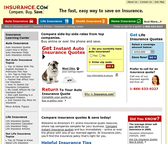
Unfortunately, the strategic intent is poorly executed. Although this is an attractive website, Insurance.com does a mediocre job of communicating what it wants users to do when they arrive at the site’s homepage.
A prominent feature, “Meet Otto,” the Insurance.com spokesdog (an English Bulldog), and star of its new television ad campaign, is unnecessarily distracting and does not move the process along. And from there the confusion continues.
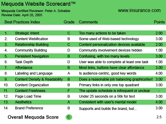

Insurance.com’s Mequoda Scorecard
[text_ad]
1. Strategic Intent – C
The site has too many options. Should I meet Otto, enter my zip code, enter the amount of life insurance coverage that I think I need or visit the Insurance Learning Center? Insurance.com would be better served with a homepage that merely gives users the option to choose the single product for which they are shopping.
Let them pick life, health, auto or homeowners, and then spirit them away to a separate section devoted solely to that product. Or, using the Mequoda Website Network model, create a different satellite for each profit center.
2. Content Webification – B
Interactive online calculators are provided to enable the user to enter the criteria necessary for the agency underwriters to prepare a price quote. Some of these take the user off the Insurance.com site and onto the sites of individual insurance providers (companies).
Alternatively, and to its credit, Insurance.com invites overwhelmed and low-tech visitors to call a toll-free number and speak personally to a licensed agent for an insurance quote. Not very high-tech, but certainly customer-oriented.
3. Relationship Building – C
The bottom right quadrant of the homepage invites the user to enter an email address in order to signup for the Insurance.com newsletter. Not the best location for the sign-up box, but at least it’s there.
Unfortunately, it is not until after we take that action that we learn the newsletter is “filled with helpful insurance tips to save you time and money.” It’s just assumed you know what benefit the newsletter provides; there is no description of it to entice us to sign up and no promise of a reward for doing so.
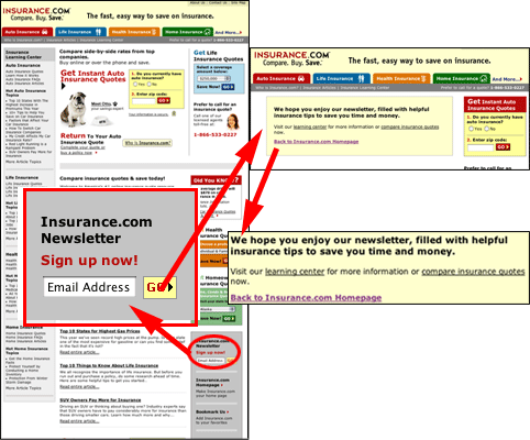

Unfortunately, it is not until after we sign up that we learn the newsletter is “filled with helpful insurance tips to save you time and money.” It is assumed you know what benefit the newsletter provides.
4. Community Building – D
Insurance.com is strictly a commerce website. It does offer an affiliate program, administered by a third party, but no other way to participate. There is a contact (feedback) form, but no other devices that encourage the user to ask a question or contribute a comment.
5. Persistent Navigation – B
The user can obtain competitive price quotes on numerous types of insurance if they are prepared to enter a considerable amount of information into the interactive online calculator screens. That may require them to know detailed information about their existing insurance policies, if they have any.
Additionally, selecting an insurance carrier from which to get a price quote may take them off the Insurance.com website with no easy way to return. Not a smart idea. A small amount of HTML configuring would direct the carrier’s site to open in a new window and leave the Insurance.com site open as well.
See #1 (Strategic Intent). The Insurance.com website has too many options.
6. User Task Depth – D
The Term Life Insurance quotation calculator was impossible to complete. A pop-up kept asking me to enter family history information, although there was no place to provide this data. This is annoying and self-defeating. I imagine most users would give up and call the toll-free phone number at this point, or abandon the site altogether. A major, fatal design flaw!
The Individual & Family Health Insurance Plan calculator provided me with proposals from two carriers—a total of 11 different plans—provided I move back to New Jersey. None of Insurance.com’s companies are currently writing health insurance in Massachusetts.
Does this count as completing the task? Could an agency that owns the URL Insurance.com represent with some additional companies? Or are there absolutely no companies writing new health insurance policies for individuals residing in the Bay State?
Similarly, getting a quote on homeowner’s insurance was impossible. First, Insurance.com offered up Amica, which is not currently writing homeowner’s insurance in Barnstable County, Massachusetts, and would not allow me to return to the Insurance.com homepage after informing me of this fact.
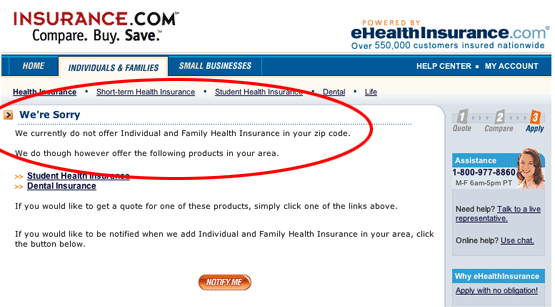

None of Insurance.com’s companies are currently writing health insurance in Massachusetts.
State Fund Insurance was a little more friendly, but required an agent to personally get back in touch with me. No genuine online quote was available—only the submission of my requirements was conducted online.
Finally, my attempt to obtain an online quote for auto insurance succeeded, as I worked my way through the various dropdown menus on the Amica.com website. Once again, however, this process permanently took me off the Insurance.com website with no way to return. This design flaw is wholly avoidable with the following minor modification to the HTML code:
This simple HTML coding change can help keep visitors on your website while they explore outside links.
Note these two links, with the code in parentheses. Each is a hypertext link to Mequoda.com.
(a href=”https://www.mequoda.com”) Mequoda Group
(a href=”http://www.Mequoda.com” target=”_blank”) Mequoda Group
Click the first link and it takes you off the Mequoda Daily site to Mequoda.com.
Click the second link and it opens up a new browser window for your sojourn to Mequoda.com, without making MequodaDaily.com disappear off your computer screen. The MequodaDaily.com page remains open for you to return to by simply closing the new window.
It’s the addition of the target=”_blank” HTML code that opens the destination document in a new unnamed window.
7. Affordance – B
Some hypertext links on the Insurance.com are underlined and some are not. Some buttons and graphics are clickable, others aren’t. Underlined links did consistently change color when the mouse pointer hovered over them, and again after they were clicked. The traditional colors of blue, red and maroon are used consistently for these links.
8. Labeling and Language – A
Considering the complexity of the insurance industry and the mind-numbing jargon it generally uses, this website does a better-than-average job of speaking to its potential customers using a vocabulary that is familiar. When the use of some insurance industry terms is unavoidable, Insurance.com does a good job of defining them for the site user.
9. Readability – B
Insurance.com is a busy website: there is no getting around that. Nevertheless, it does manage a design format that uses white space, columns and typography to its advantage. The site reflects a conscious attempt by the designer to achieve continuity, similarity and proximity.
10. Organization – B
As previously mentioned, Insurance.com might better achieve its goals if it operated a different satellite website for each of its products—life, health, auto and homeowner’s. Because it lumps all the products on its homepage, organization and optimal use of marketing quadrants is strained.
(See #1. – Strategic Intent.) Insurance.com does a reasonable job, given the parameters of its scope.
11. Content Freshness – F
The Insurance.com site appears to be static. Presumably, the rates it quotes through its interactive calculators changes over time. Otherwise, there does not appear to be any attempt to provide new content. This may be unavoidable, given the nature of the business.
The Insurance Learning Center, for example, answers more than 100 frequently asked questions and offers well over 200 articles. Topics range from “10+ Tips to Help You Save on Auto Insurance” and “How to Switch Auto Insurance Companies” to “Top 10 Things to Know About Life Insurance” and “Top 10 Ways to Cut Your Medical Bills,” as well as “Protection from Winter Storm Damage,” “Insurance Advice for Engaged Couples” and much more.
The site claims that information is continually updated, and topics are added regularly. That may be the case, but evidence of this was lacking.
12. Load Time – B
The minimal use of graphics files means the pages of the Insurance.com site load relatively quickly.
13. Aesthetics – A
Despite the ambitious intent of this site, and all the information it attempts to make available to the user, it is still attractive and inviting. Colors have been chosen with care. The typefaces and sizes were thoughtfully selected. I imagine that a graphic designer with extensive experience in print publications was responsible for the aesthetically pleasing layout and overall harmony of the site.

Despite the ambitious intent of this site and all the information it attempts to make available to the user, it is still attractive and inviting.
14. Brand Preference – B
Insurance.com suffers from the branding problems associated with all independent agents. The agency is one brand, and it sells the products of dozens of insurance companies, each of which is its own brand. Insurance.com doesn’t have strong roots in the physical world, but with its invaluable URL (“insurance.com”) it has a leg up on all its online competition.
The Future of Online Insurance Shopping
In January of 2005, Insurance.com released its 2004 Auto Insurance Pricing Report, highlighting the average change in auto insurance premium quotes on a state-by-state basis, based on actual pricing information from 12 of the nation’s leading auto insurance companies.
This information was collected from more than 100,000 auto insurance quotes provided by Insurance.com to its customers in 2004.
In March of 2005, Insurance.com announced that consumer car insurance quote requests increased over 40 percent in 2004, marking the fourth straight year that the company’s Internet-originated car insurance quote requests grew by 40 percent or more.
The company also announced that it has closed on a new round of venture capital to support future growth initiatives, including local expansion of the company’s call center, information technology and marketing staffs, and the launch of a national cable television advertising campaign to promote Insurance.com’s services. The company plans to add more than 100 new employees to support its expansion, with the sales center alone hiring 15 new insurance agents each month through the summer. ComparisonMarket is actively recruiting for both licensed and non-licensed property and casualty insurance agents.
Conclusion
Clearly, using the Internet to compare insurance premium rates is catching on among consumers, and Insurance.com is on the cutting edge. While the site could be improved, it is attractive and informative, and it has an invaluable URL (website address).
This market is extremely competitive, with some online insurance agencies paying more than $31 per click for Google AdSense words such as “life insurance quotes” and “auto insurance quotes.”
There is evidence that consumers are getting more comfortable doing business with online insurance agencies and companies.
The insurance industry is doing slightly better than other industries when it comes to respecting its online customers, according to a report from The Customer Respect Group. Their Q1 2005 “Online Customer Respect” study reports insurers have an overall Customer Respect Index (CRI) rating of 6.1, slightly above the overall industry average of 5.9.
The CRI measures both qualitative and quantitative aspects of a company’s online presence and includes attributes such as privacy, responsiveness and simplicity.


One reply on “Insurance.com Website Design Review”
there are insurance agencies that are scam too so make sure that you deal with legit insurance agencies ,.”