
Reader’s Digest Online Version is a Great Example of an Old Brand Taking their Show Online Successfully
Reader’s Digest is so well known and widely read that almost everybody has picked up a copy at some point in their lives. Founded in 1922, the family friendly, feel-good favorite is also the flagship of a billion dollar public company. The Reader’s Digest is the largest-selling magazine in the world, and the company uses their circulation power to sell a plethora of books, magazines, games and children’s titles, and recently music video and audio books.
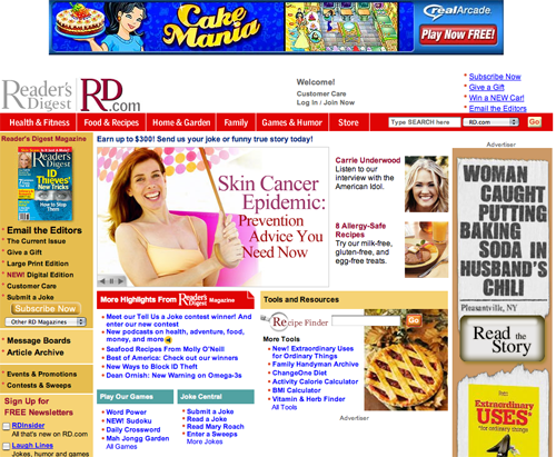
RD.com draws in over 600,000 monthly unique users. We’ll see in this review how the site RD.com expands the value of the print brand by bringing their trademark interactivity and community strengths right onto the small screen.
- It isn’t obvious to a casual user that subscribing is a priority action. RD.com doesn’t ignore this goal, but the design places subscription offers in the background, and is unnecessarily subtle compared to the rest of the site.
- They’ve done a great job in content webification. The homepage has a TV-screen like display, they’ve got “RD Out Loud,” which is a podcast service, they have a ton of interactive tools and lots of games.
- Throughout the site, when reading articles, the user is often prodded to submit a joke or comment—to participate. The site has the same community feel that the magazine has always been famous for.
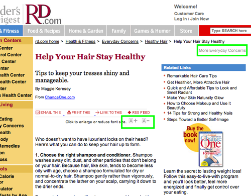
- With a slightly older age range of readers, RD.com is ahead of the curve with their super-usable “click to enlarge or reduce font sizes” A+ A- [[icons]].
- RD.com integrates well with Reader’s Digest on paper, each one references the other. The user will “get” that these are two ways of naming the same brand.
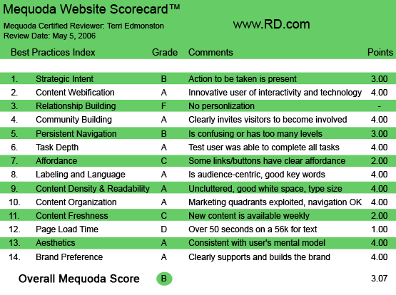

RD.com‘s Mequoda Scorecard
1. Strategic Intent – B
Reader’s Digest is of course well-known as a publisher, but it is also very much a direct mail company with some of the largest in-house customer lists in the world. While creating additional advertising inventory is part of Reader’s Digest‘s corporate goals, gathering a snail mail address and demographics is also a high priority for RD.com.
[text_ad]
It isn’t obvious to a casual user that subscribing is a priority action. RD.com doesn’t ignore this goal (see the list below), but the design places subscription offers in the background, and is unnecessarily subtle compared to the rest of the site. RD.com has three subscribe entry points:
- A Subscribe link above the fold, which is in the upper right in a bulleted list—easy to ignore.
- OFIE (Order Form In Editorial) either a full form the bottom of each page, or a shortened form in the left navigation.
- Pop-up advertisement, currently with a sweepstakes offer gathering email first and then a soft offer for a Reader’s Digest subscription.
Those are the carrots. The stick is held lightly here, most of the site is open, with a free registration required for some functions, such as games. RD.com has chosen a content wall balance that maximizes free traffic and advertising inventory. However, just because you’re keeping most of the site open doesn’t mean you have to ignore subscriptions. Some simple design changes could convince quite a few more users that registering/subscribing is a good idea without reducing page views.

RD.com has three subscribe entry points.
2. Content Webification – A
When I find myself playing around on a site instead of taking notes and writing the review, I know they’ve done a great job in content webification. Some of the highlights:
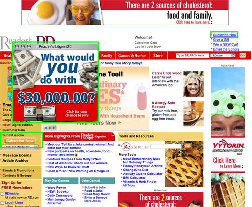
- Watch: The homepage has a TV-screen like display that automatically scrolls through some well-designed feature spreads for articles and content within the site. Sit back and watch, thenclick when you see something you like. This is a fun, visual, attractive way to promote site content, and a surprisingly underused technology.
- Listen: Even the podcast newbies will find it easy to experience “RD Out Loud.” The page offers simple instructions to subscribe to the podcast and some sample streaming stories to get you hooked.
- Learn: Interactive tools let the user test their stress, find their BMI, count calories and calculate plans for saving for college. Nothing new to the editorial at a magazine like Reader’s Digest. But the interactive aspect of putting these old-standbys into forms with instant feedback somehow makes it a lot more compelling to actually take a turn.
- Play: Games, games and more games. Sudoku, crosswords, solitaire, mah jongg—play to your heart’s content, and oh, interact with some other online players if you’re feeling lonely. If you lose a few hands, then cheer up with the jokes in the humor section. And yes, everything is rated G.
3. Relationship Building – F
RD.com is kind of like a great first date. There are lots of fun things to do and talk about, but very little in the way of a deep relationship. The site doesn’t remember previous conversations (no ability to save articles in a library) and doesn’t let me direct the conversation (no method of personalizing the content). In fact, I’m considering it lucky that they remember my name—”Welcome Terri” is about as far as they go.
4. Community Building – A
Of any print world magazine, I would say Reader’s Digest is one of the greats when it comes to community. Readers are treated with the same respect as paid writers as their names are often seen in print next to stories they send in. On RD.com we see the same ethic. Throughout the site, when reading articles, the user is often prodded to submit a joke or comment—to participate. Message boards, promoted in the left hand navigation on RD.com, are well-populated, fun to browse and easy to post (on my wish list here would be the ability to contact other members through a private message option). The site has the same community feel that the magazine has always been famous for.

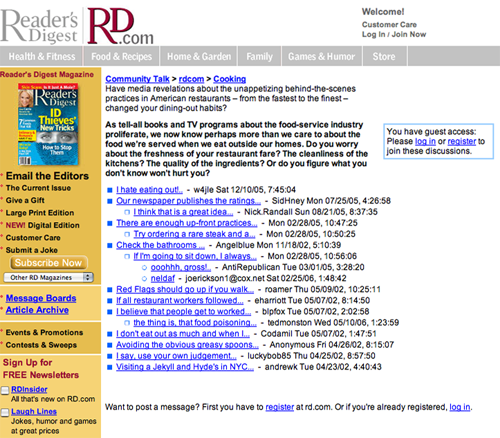
Message boards, promoted in the left hand navigation on are well-populated, fun to browse and easy to post.
5. Persistent Navigation – B
Is the glass half-empty or half-full? The top navigation bar always stays the same. That’s half-full. But the left hand navigation bar changes based on where in the site you are, and it isn’t obvious why. Sometimes we see an ad there and sometimes content navigation for within a department. That’s half empty. Addition elements that cloud the glass: site colors change based on department, which is always pleasing to the visually advanced, and ignored by everyone else. The link to “store” in the top opens a new window (a new site), which is inconsistent with the behavior of the other links in the same hierarchy level and a surprise to the user. The conclusion is that the user can drink the water, but the glass is a little opaque.
6. Task Depth – A
RD.com makes task accomplishment easy for users. The four tasks I selected for RD.com include registering for free site access, subscribing to a paid print subscription, changing my user profile and posting a comment in the editorial of the site. The entry points were easy to find, the forms were clear and in all the experience was pleasant for each task. This good user experience directly affects RD.com‘s conversion rates and site stickiness.
7. Affordance – C
While RD.com mostly uses standard Web conventions for links, the inconsistency causes unnecessary problems for users. The link indication methods include bold or colored text bulleted lists, blue underlined links and rollover changes in color of the text or the background. Sometimes linked text is black, sometimes red and sometimes blue, and sometimes even grey. (Grey is a big link no-no. Grey usually means “don’t click here,” as in when an unavailable option is greyed out on the menu in many MS software applications.) A user has to learn how to use your site to make it effortless, you don’t want them thinking “is this a link?” they should know without having to think. By changing the way that a link is indicated, it requires extra thought from the user, hurting the user experience.

Grey is a big link no-no. Grey usually means “don’t click here,” as in when an unavailable option is greyed out on the menu in many MS software applications.
8. Labeling and Language – A
As simple as an elementary school reader, RD.com restricts their language choices to the most basic. Illustrating the traditional American linguistic style with direct phrases and plain and simple words, this site is accessible to all. A perfect fit to the audience and values of the site.
9. Readability (Content Density) – A
RD.com makes great use of a most underused aspect of the Web. The miracle of HTML provides the ability to increase text size on a page. With a slightly older age range of readers, RD.com is ahead of the curve with their super-usable “click to enlarge or reduce font sizes” A+ A- [[icons]]. In addition each article has a “Print This” option.
10. Organization – A
Balancing advertising, in-house marketing, content and housekeeping links on a single page is always a challenge. The goal of dividing the page into four quadrants is to help determine if the links above will be seen even with a quick skim of the page. A user’s eye will zigzag about and typically rest for less than a second on any given quadrant—making it easy to miss something. RD.com has done a great job of putting the flowers in front of the busy bee, with the different types of links in at least three quadrants each.
11. Content Freshness – C
While content from the editors is not on any clear schedule (there aren’t even any dates on the articles), thanks to the hundreds of thousands of users, the message boards are continuously updated. This new content provides an incentive for other users to visit more frequently—although not a very strong one. With so much content available to RD.com, it would be easy to make a “Today’s Spotlight” sort of item (including a date stamp), making it clear to any visitor that new content is posted daily. Readers need to know that there’s a reason to return before they leave.
12. Load Time – D
RD.com has a page load time of 58 seconds on a 56K modem, earning the site a D in this category. Even a great site is going to lose a lot of users at almost a minute a page.
13. Aesthetics – A
Reader’s Digest is a colorful, cheerful magazine, and the site RD.com follows suit. This family-friendly entertainment site engages our attention, filling our eyes and hearts with bright colors and joyful stories. The candy-color palette agrees with both the user mental model and site purpose.
The candy-color palette agrees with both the user mental model and site purpose.
14. Brand Preference – A
With a print Reader’s Digest in front of me, I notice the acronym “RD” appearing throughout. This saves the site from my usual whine about the separation of Web and print brands. RD.com integrates well with Reader’s Digest on paper, each one references the other. The user will “get” that these are two ways of naming the same brand. The digital edition adds another component, with Zinio software helping RD put the exact same print product onto the computer screen. Consumers have been less enthusiastic than publishers about these digital editions so far. But the Internet is all about options, and RD.com isn’t slouching.
Conclusion
Reader’s Digest online version is a great example of an old brand taking their show online successfully. The brand has kept its earned goodwill not only by keeping the same flavor of editorial and design, but also by using the Web tools to build on the community and interactivity that made the print brand famous. With some improvements on relationship building, allowing their users to create a more personal site and affordance, RD.com would be earning top score.

