
The Motley Fool Website Provides Relevant and Engaging Content in a Readily Accessible Fashion, Combining Effective Use of Content Webification, Relationship and Community Building and Proper Navigation
Tom and David Gardner have made a career of being foolish, and foolishly brilliant. They have created a brand that is well recognized within the investment community and without. They created this brand by respecting their audience and by offering real value to those tens of thousands of viewers, listeners and readers.
Their website, www.Fool.com, extends this ethos by providing visitors with a gratifying experience from which they derive real value. The Motley Fool demonstrates respect for visitors by doing the simple things well. The design of the site is intuitive. The content is relevant and the navigation is consistently usable. The Motley Fool website successfully brings the brand that Tom and David Gardner created to the Web.
- To the experienced investor, this site is a treasure trove, but to the novice investor, or to experienced investors new to the site, figuring out where to focus attention can be a challenge
- This site does an excellent job of leveraging the data process and interactive capabilities of the web
- The Motley Fool site is really all about community, a community of investors that have a belief in David and Tom Gardner as luminaries in the investment community
- The Motley Fool website presents a clear and consistent navigation scheme that is anchored by the global navigation menu at the top of the page – this menu is persistent, remaining unchanged from page to page
- The Motley Fools don’t pretend to be the smartest guys in the room, but instead offer a common sense perspective with humor and humility – the website conveys this same demeanor, making a substantive contribution to the Motley Fool franchise
Introduction
- “The fool thinks himself to be wise. The wiseman knows himself to be a fool.”
William Shakespeare, As You Like It
Tom and David Gardner have made a career of being foolish, and foolishly brilliant. They have created a brand that is well recognized within the investment community and without. They created this brand by respecting their audience and by offering real value to those tens of thousands of viewers, listeners and readers. Their website, extends this ethos by providing visitors with a gratifying experience from which they derive real value. The Motley Fool demonstrates respect for visitors by doing the simple things well. The design of the site is intuitive. The content is relevant and the navigation is consistently usable. The Motley Fool website successfully brings the brand that Tom and David Gardner created to the Web.
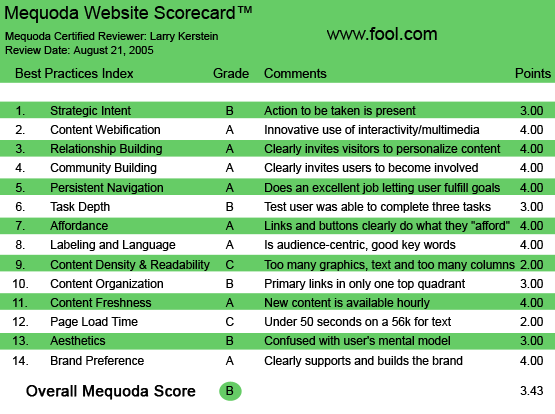

Fool.com’s Mequoda Scorecard
[text_ad]
1. Strategic Intent, or Purpose – B
For the seasoned investor who has visited the Motley Fool site a number of times, the choices are numerous. The Motley Fool is a financial publishing site that provides a tremendous volume of relevant information to a variety of investors. The site also provides various tools, including a portfolio management tool. The Motley Fools, David and Tom Gardner, have created a strong brand through the strategic use of various media, including the Web. They position themselves as the “alternative” source of investment advice, and as such, achieve a degree of visibility and credibility that makes them instantly recognizable. And the website makes it immediately and unmistakably evident that all of this valuable information is beyond the visitor’s reach unless, and until, the visitor “signs up.” You must register with the Motley Fool before you can do anything of value on this site. Unlike other similar sites, this site does not allow unregistered visitors to access any content of value.
As a registered visitor, you will have access to volumes of free information, as well as services such as the TMF Money Advisors, for which there is a fee. There is a lot to wade through on this site. To the experienced investor, this site is a treasure trove. To the novice investor, and even those experienced investors new to the site, figuring out where to focus attention can be a challenge.
2. Content Webification – A
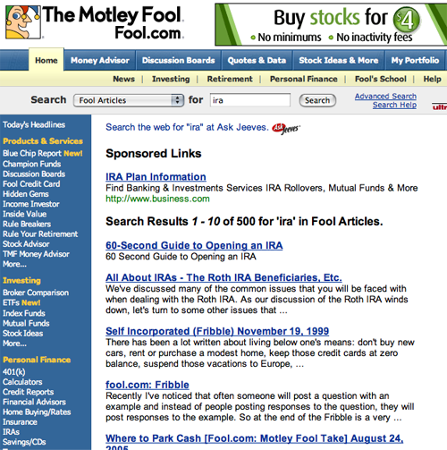
This site does an excellent job of leveraging the data process and interactive capabilities of the Web. As an online publisher, the Motley Fool provides large volumes of information targeted for a variety of audiences that is timely and constantly refreshed. The site also provides efficient onsite search, making the large volume of information available to visitors manageable. Note that search results are well annotated, giving visitors an excellent sense of context and helping visitors make relevant selections from the results page.

The site provides efficient onsite search, making the large volume of information available to visitors manageable.
In addition, this site capitalizes on the immediacy that is an inherent element of online communications. When you register, you are offered, as part of the registration confirmation, the opportunity to select for free one of six interesting and relevant financial reports. As such, the visitor derives immediate benefit from having become a registered member. The Motley Fool offers value in exchange for the visitor’s email address.
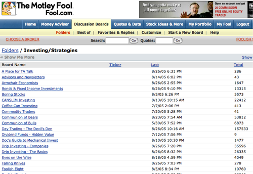
This site also smartly leverages the interactive nature of the Web in the form of discussion boards. The site offers registered visitors the opportunity to participate in a large number of discussion boards covering a broad range in topics. One might conclude, as a visitor, that there are too many boards to choose from, but that’s typical of this site. The Motley Fool makes a concerted effort to speak to multiple audiences, including the equity investor, the retirement planner, the income investor, the novice investor, and more.


When you register, you are offered to select one of six free interesting and relevant reports. As such, the visitor derives an immediate benefit.
3. Relationship Building – A
The Motley Fool gives visitors the opportunity to personalize their site experience by creating a customized landing page. This page offers subscribers the opportunity to select among selected headlines, email subscriptions, discussion boards and personalized links. Subscribers can also identify tickers (stock symbols that they would like to track, further personalizing the presentation. Subscribers are given the opportunity to create the ultimate personalization by creating their own portfolio. Using this functionality, subscribers can create a customized portfolio through which subscribers can track price changes, trades and positions. The Motley Fool site is really all about community, a community of investors that have a belief in David and Tom Gardner as luminaries in the investment community.
4. Community Building – A
Being a subscriber to the Motley Fools site is being a member of a worldwide community of investors. Through their frequent commentaries and appearances through various media channels, Tom and David Gardner have created a following for themselves that transcends the mere fact of successful investing. By visiting the Motley Fool website, subscribers can participate in this community passively through consumption of the unique perspective of the Motley Fool, and actively by contributing to the many discussion groups hosted by the Motley Fool. As noted earlier, the site explicitly offers community building activities in the form of a series of discussion boards, in which subscribers can exchange posts about various topics, including investment-specific topics as well as general topics like technology, education, sports and health and fitness. On the finance side, subscribers can join discussion focused specifically on individual public companies.

The site explicitly offers community building activities in the form of discussion boards.
5. Persistent Navigation – A
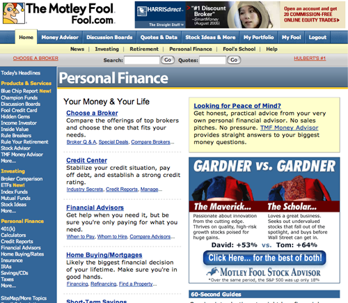
The Motley Fool website presents a clear and consistent navigation scheme that is anchored by the global navigation menu at the top of the page. This menu is persistent, remaining unchanged from page to page. When you click on one of the menu items, the page that is served includes content-specific sub-navigation in the left hand column. This type of architecture is typical of content-based sites. And because the model is carried throughout the site, with one exception, it produces minimal confusion for the visitor.
In addition, the site makes extensive use of inline linking in which active links are embedded within the page content. This technique is a particularly effective technique as eye scanning studies indicate that visitors typically focus their attention on the active window (content area) of the page. If the page presents relevant content with embedded links, visitors will typically rely on this type of navigation in the first instance. As these links are embedded within page content, they provide the best opportunity for site publishers to give visitors the most context as they traverse website content, all of which leads to greater visitor satisfaction.

The website presents a clear and consistent navigation scheme that is anchored by the global navigation menu at the top of the page. This menu is persistent, remaining unchanged from page to page.
6. User Task Depth – B
The Motley Fool website is all about transactions. As a non-registered visitor, you cannot view any content without registering. The registration process is somewhat confusing, in that you are asked for a password initially. When you complete the registration and try to log in, you can’t. Subsequently, you will receive an email with a link for creating a password. Once you have created a password a second time, you can log in successfully. This process is redundant and probably quite confusing to most visitors.
Browsing the Motley Fool site is an adventure. There is so much variety of content on the site that the visitors can always find something interesting and engaging. Navigating through the site content is intuitive. And when the visitor chooses to take advantage of an offer, it is always clear to the visitor how to achieve his objective.
7. Affordance – A
While the Motley Fool site is packed with content, the user is never confused about navigating the site. All links are text links. This works for two reasons. First, text links typically give the user more content and context for understanding. Text links create the opportunity for information scent, in which the visitor can follow a path of relevance to achieve her objective on the site. Second, text links are preferred by search engine spiders, giving the site more visibility in the search index. Also, all links are immediately identifiable as such. The site makes exclusive use of the standard blue underlined link labels. The site follows the absolute dictum—never make it the user’s problem. The visitor is never put in the position of having to guess where to go next or how to get there.
8. Labeling and Language – A
Investing is a complicated and technical discipline with a language all its own. To the credit of the Motley Fool, the language presented on the site is not overly technical. In fact, the Motley Fool goes to great lengths to present its sage and alternative advice in colloquial terms, presenting their pithy nuggets in a way that resonates with all manner of investor, from novice to expert. It is the common good sense and the highly accessible language in which it is presented that gives the content on this site its unique and compelling quality.
9. Content Density and Readability – C
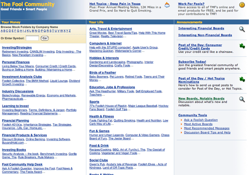
As noted, the content presented on this site is engaging and resonant. The site operators have chosen a range of topics that is immediately relevant and interesting to a wide variety of audiences. The site uses a three column grid design, which is typical of most successful websites. However, the right hand column, in which banner ads are presented, is given too much page geography. Because so much of the page is devoted to advertising, the page content gets squeezed. It is often harder to read the copy than it should be. Limited page space in the center column, where page content is presented, produces painfully short lines of text. This condition increases the difficulty in maintaining continuity in eye scanning, and reduces the overall readability of the content presented on the site. Too often readability on this site is sacrificed to the need to cram as much advertising per page as possible. To its credit, the site does employ bolding to highlight some words and phrases throughout the copy. This technique recognizes the fact that visitors will tend to scan a page to determine relevance before reading in detail.
10. Content Organization – B
As noted earlier, this site uses the typical three column grid for its page layout. The top banner includes advertising space and does so on a consistent basis. The main menu is displayed across the top of the page and presents two levels of navigation in an effective and efficient fashion. You would be surprised how many sites do this badly. The use of the right hand column is somewhat unusual, in that it includes a listing of products and services that visitors can buy or subscribe to. The right hand column displays promotional material, including banner ads, investment tools, and other confidence building content. The main, active (center) window presents relevant content in the form of articles, statistics, tools and other resources. The active window also displays banner ads and other promotions, sometimes to the detriment of site readability.
When first exposed to the Motley Fool homepage, one can easily be overwhelmed. Content and navigation are organized in a logical and accessible fashion. However, it takes some browsing of this site to create a mental map. Many of the links on the homepage lead to specific offers, while others provide access to good, useful content. So, if you are willing to take the time to investigate, you can learn where the nuggets are.
11. Content Freshness – A
This site updates its content on a regular basis by definition. In those areas of the site and the homepage which display ticker information, it’s updated hourly. In addition, as content is added to the site, it is flagged on the homepage as “new.” As a publishing site, the content on the Motley Fool and its freshness is an inherent aspect of the business model upon which the site is based. Ads change, offers change and content is updated regularly. The world of investment is nothing if not dynamic, and the Motley Fool keeps up with the changes.
12. Load Time – C
The load time for the Motley Fool home page is 32.77 seconds over a 56K connection. While the total number of HTML requests is limited, there are 40 images that are loaded with the page, including banners and navigation menu rollovers, and this is increasing the download time for the homepage, as well as interior pages. The total size of the homepage is over 100K, while the optimum size for rapid download is below 100K. Layering content by loading the most relevant content for users first will help reduce the perceived delay in download time.
13. Aesthetics – B
The look and feel and overall design of the Motley Fool website is utilitarian. There are few if any extraneous content or design elements. No large and cumbersome images to get in the way of the main function of the site, which is information presentation. Motley Fool is a publisher and the design reflects the information-oriented nature of the site. While there is a great deal of visual information on the homepage, it is organized in a logical fashion and reflects good alignment, contrast and proximity. It is clear to the casual observer how the information presented on the page is categorized. As noted above, banner ads are displayed prominently in the active window and the right hand column. There is also a series of sponsored links, but they are presented at the bottom of the page, and probably receive very little attention and get very few click throughs.

14. Brand Preference – A
On the Web, brand preference is established and reinforced by providing visitors with successful user experiences. Ease of use, relevance, visual consonance, credibility and confidence all contribute to a successful user experience. Unlike traditional media, indirect branding is seldom effective in the online environment. The Motley Fool does an excellent job of reinforcing brand by leveraging the brand visibility established through other channels. The site also does an excellent job of online branding by providing valuable and highly relevant content to visitors in search of investment advice. The perspective that visitors obtain from interacting with this site is not available anywhere else. And on the Web, this perspective is highly consumable. As such, visitors keep coming back for more, and with each visit, the Motley Fool brand increasingly develops top-of-mind visibility.
Conclusion
The Motley Fool is a tremendously successful franchise that has momentum and originality. In an area like investment advice, where there is an ever-present danger of either confusing visitors or boring them to death, the Motley Fool does neither with an engaging style. The Motley Fool website does what all good content websites must do. It provides relevant and engaging content in a readily accessible fashion. Another trademark of the Motley Fool franchise is humility.
Too often in the investment world, investment advisors hold themselves out to be gurus, having an exclusive monopoly on the “truth.” The Motley Fools don’t pretend to be the smartest guys in the room, but instead offer a common sense perspective with humor and humility. The website conveys this same demeanor, making a substantive contribution to the Motley Fool franchise.


2 replies on “The Motley Fool Website Design Review”
[…] From here you can explore and employ Linux Mint, but this doesn’t happen be particularly fast compared to a full installation. Double click the Install Linux Mint icon on the desktop managed services pricing and delivery models evolve. […]
Hi there, I discovered your web site by the use of Google even as looking for a comparable topic, your website came up, it looks great. I’ve bookmarked it in my google bookmarks.