
Winespectator.com is a great example of a successful Mequoda Membership Website Publishing Model™. The website, while similar to the print magazine, offers more functionality and added features than their print counterpart. Wine ratings and tasting notes on the website are sortable by score, price and vintage and there is web-exclusive content and commentary. A website user can also create a personal cellar, where they can save the wines reviewed by winespectator.com to a personalized list. A quick glimpse of the “Join our website” page suggests they know exactly how to enhance an online product to give print subscribers proper incentive to “dually subscribe.” So, without further ado, let’s see why they scored a “B” on the Mequoda Website Scorecard™.
 |
|
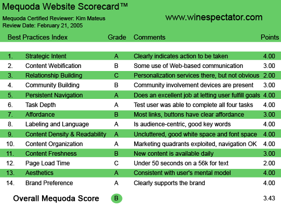
Winespectator.com’s Mequoda Scorecard™
|

1. Strategic Intent, or Purpose – A
The first thing I notice on the Winespectator.com homepage is an inviting orange box just to the right of the logo asking me to sign in. Now, knowing I’m not a member, I decide first to navigate the homepage, to see what they allow me to view. Turns out about 97 percent of their content is blocked, clearly indicating the purpose of this site is to get me to sign up. So what did I do? I signed up!
2. Content Webification – B
Winespectator.com does a pretty good job of using Web-based technology. They offer a Basic and Advanced wine search and a personal wine list. They offer a food and wine matching tool and a restaurant, hotel, resort and winery search. Their most advanced use of technology is in their forums, which are the main attraction in their open access area. The reason I gave them a B and not an A is because they don’t actively promote their interactive features, nor is their use of forums that “innovative” anymore. At time of press, there were six separate forums going on:
- Wine Conversations
- Tasting Notes
- Dining and Cooking
- Buying and Selling
- Off-Line Events
- Madder Than Hell
While this portion of the site is free and open for all to view, in order to reply to a message, you must at least be registered. This is the way Winespectator.com enjoys the benefits of the Mequoda™ Product Pyramid (see The Mequoda System™ by Don Nicholas to view the Product Pyramid). At the minimum, they’re getting you to register, and eventually, they will make offers to subscribe to their print magazine or join their website.
3. Relationship Building – C
Winespectator.com allows subscribers to form a personal wine list, where users can save wines reviewed by winespectator.com and a personal library, where users can store their favorite articles. This is a neat and interesting feature… if the user can find it. Aside from the free user forums, these seemed to be the only personalization devices available on the website, and it’s not prominent on the site. The personal wine list feature is listed under the Wine Ratings tab, and mentioned in the “Join our website” page, but nowhere on the homepage is this device promoted. The personal library I didn’t find until I subscribed and started reading some content.
4. Community Building – B
The two community devices I noticed were the user forums, and Ask Dr. Vinny. Ask Dr. Vinny is an area on the site where known and unknown users can submit questions about wine. Questions can be specific or general, ranging from etiquette questions to technical winemaking questions. While the Ask Dr. Vinny call-to-action button is prominent on the site, I had to give them a B because the user forums call-to-action is buried below the fold. Nowhere above the fold on the homepage do they actually “encourage” users to participate in user forums.
The only time I was encouraged to participate in user forums was immediately after I signed up for a membership, on the “Thank You” page. Ironic, however, since one of their primary goals should be to identify users and grab email addresses.
5. Persistent Navigation – A
The navigation on this site is clear and consistent. Wherever you are on the site, the navigation bar at the top remains the same, allowing you to go back to where you just were or skipping ahead to another section quickly and easily.
Additionally, if you navigate deep into the site, they offer a “personal” navigation bar, that demonstrates where you’ve just been in case you want to immediately jump back.
For example, if you do an advanced search for a particular wine, a “mini” navigation bar under the normal navigation bar will say Home> Advanced Wine Search> Search Results, allowing you to get right back to a new Advanced Search.
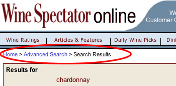 |
“If you do an advanced search for a particular wine, a “mini” navigation bar appears under the normal navigation bar, allowing you to get right back to where you started.”
|

6. User Task Depth – A
Signing up for the site is a breeze. If you’re not a member, they make it very easy for you to become one, by giving you a teaser page every time you click on a headline or task bar in the navigation. For article pages, they offer a one-paragraph teaser followed by a text box that reads “Not a member?..”.

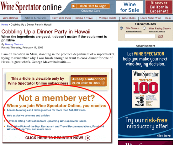
If you’re not a member, they make it very easy for you to become one, by giving you a teaser page
every time you click on a headline or task bar in the navigation.
Searching for information is equally as easy. They prominently invite you to do a site search. A site search for Shiraz netted me 27,000 results, proving the content on this site is very robust. They also invite you to do a wine ratings search through their tasting notes database of over 142,000 wines. A ratings search for Shiraz netted me 2,484 results. Next they offer you the opportunity to search for their daily wine pickings.
For members of the site and subscribers to the magazine, the Customer Service section is very well done and helpful. Magazine subscribers can renew their subs online, change their mailing address, check payment status, make payments, update credit card information, report missed issues and buy gift subscriptions. Wine Spectator Online members can renew their online subs, update their credit card information and get password reminders. This section also allows users to order back issues, read FAQs and read the privacy policy.
So whether the intention is to subscribe, search, renew or cancel, Wine Spectator Online does an excellent job of helping users complete their tasks.
7. Affordance – B
This was a tough call because technically, all links and buttons do what they “afford.” But if you’re traditional Web surfer looking for the blue underlined links, you’re not going to find them on this site. Instead, you will find headlines in bold, which are underlined only after you mouse over, and snippet copy that does the same.
The buttons in the top navigation are highlighted only after you mouse over them, and they offer a pull-down menu, which is also highlighted as you mouse over. For me, this was clear and easy to follow. But for an audience who may only be used to blue underlined links, navigation may be more difficult.
Since I have to score on mass appeal, I give them a B.
8. Labeling and Language – A
While the site is aimed at all types of wine aficionados, from the consumer to the distiller, distributor, importer, retailer, hotel or winery owner, the language is kept simple enough for the basic consumer to understand. Not that wine terminology is very advanced or technical by nature, but the simplicity of the language was helpful for me as a recent convert to wine-lover land.
The navigation bar seems to be prioritized by popularity to the basic consumer, with Wine Ratings taking the lead, followed by Articles & Features, Daily Wine Picks, Dining & Travel, Vintage Charts, Wine Shops, Learn About Wine and Help. All terms extremely easy to understand.


The navigation bar is composed of simple language that the everyday-consumer can understand.
9. Content Density and Readability – A
The homepage is separated into three columns, Opinion & Commentary, News & Features, and Search. They do a great job of pairing images with snippets on the homepage, as every article teaser is accompanied by an image.
They’ve managed to control the width of the text (using big ad spaces), which is very helpful for online reading. One criticism I do have is that their news articles tend to lack art. Granted, they are relatively short pieces, but I always appreciate some artwork to accompany text. For example, in a news article announcing a popular winery that has just expanded into new areas of Chile, I would have loved some pictures!
But in general, the readability of the site is pleasant and organized.
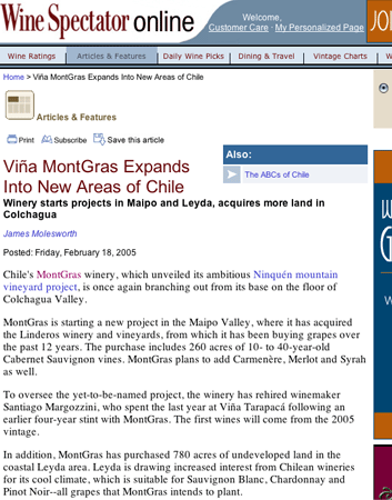 |
“One criticism I do have is that their news articles tend to lack art. In this news article announcing a popular winery that has just expanded into new areas of Chile, I would have loved some pictures!”
|

10. Content Organization (Marketing Quadrants) – A
I waffled back and forth on whether to give them an A or a B. They get an A, because right away they make great use of their real estate by offering an opportunity to subscribe in the upper right-hand quadrant.
Since this is their primary goal, they have positioned the sign-up box perfectly.
The reason I at first leaned toward a B is because barely visible in the lower right-hand quadrant is the option to sign up for the free “Wine of the Week” newsletter. I decided, finally, that this was OK, since their primary goal is to get the unknown user to join the website. But if a website is to follow the Mequoda System™ carefully, they would try and provide an opportunity to establish a FREE relationship with a non-subscriber without making them scroll below the fold.

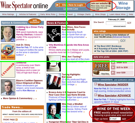
The four marketing quadrants for WineSpectator. Note the “Join” in the upper right-hand quadrant,
and the “Sign up” in the lower right-hand quadrant.
11. Content Freshness – B
Aside from the forums, the only clue I get that new content is available daily is with the Daily Wine Picks tab in the navigation, and the Daily Wine Picks search box on the right hand side of the homepage. Other than that, I get no mention of how often the Opinion & Commentary column is updated or the News & Features column is updated.
12. Page Load Time – C
According to the Web Page Analyzer™, they barely make it to a C, as it took 49.17 seconds to load on a 56K modem. On my high-speed cable connection, it took about 8 seconds, which felt a little longer than the average site.
13. Aesthetics – A
The aesthetics of this site are great—it’s very clean-looking, information-rich and intuitive. By separating the site into three columns, it supports all of the target user’s mental models. If you’re a basic consumer, you may be most interested in the search column. If you’re a distributor, or a retailer, you may be more interested in the News & Features column. A winery owner may be most intrigued by Opinion & Commentary.
14. Brand Preference – A
The Wine Spectator brand is very strong. The simple action of labeling their website Wine Spectator Online demonstrates their knowledge and respect of their own brand. All the advertisement on this site is for their own branded products; Wine Spectator print magazine, Wine Spectator School, Wine Spectator Grand Tours, and Wine Spectator Mobile Companion.
All the way at the very bottom of the screen, they offer a link to Cigar Aficionado, a magazine published by the same company as Wine Spectator, M. Shanken Communications. That is their only mention of another brand on the site.
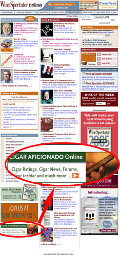 |
“All the way at the very bottom of the screen, they offer a link to Cigar Aficionado, a magazine published by the same company as Wine Spectator, M. Shanken Communications. That is their only mention of another brand on the site.”
|

Conclusion
Their final score is a very high B. Overall, the site is a great example of a successful Mequoda Membership Website Publishing Model™. They generate revenue primarily from selling memberships to their website. Their lack of outside advertising revenue further plants them in this model. The only additional form of revenue will come from selling their ancillary products; print subscriptions to the magazine, registering users for Wine Spectator School, Wine Spectator Tours, or Wine Spectator Mobile Companion. They may also generate some affiliate revenue from selling subscriptions or memberships to Cigar Aficionado.
In general, this site is a best practice example of how to successfully manage and design a Mequoda Membership Website™.
[text_ad]

