
Mequoda finds the reflow-plus digital magazine design the most readable of all

Mequoda is big into identifying and quantifying things so we can study them, understand them, and use them to enhance our clients’ publishing businesses. And with digital publishing starting to settle in a little bit, we’ve identified four models of a digital magazine.
There’s the simple replica and the replica plus. The other two are the reflow plus and the digital-only, which has no legacy print publication to compare it to or to constrain its designers. There’s also the web magazine, which we wholly recommend to every publisher.
You might wonder how I skipped from replica plus to reflow plus, without considering the reflow by itself. That’s because we haven’t found anyone doing just a reflowed version of a magazine. Everyone who’s invested the time and money into reflowing their publication seems to have also added the bells and whistles that make their magazines “pluses.”
If you know of any magazines that do just the reflow, and have no other technological enhancements, let me know in the comments!
[text_ad]
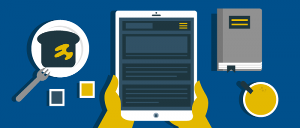
What’s a reflow?


This means the reflowed version is vastly superior to a simple replica where a magazine page-full of content is shrunk down enough to fit as one page on a mobile device screen, especially to folks whose eyes aren’t quite what they used to be.
And there are two ways to reflow your content: Keep it flowing horizontally so the reader simply reads your entire magazine horizontally from newly-flowed page to newly-flowed page as she would a print magazine.
Then there’s the vertical reflow, also known as vertical swipe. In this version, the content in each article, if it doesn’t fit on one page, flows downward, and is accessed by swiping up.
The reader swipes horizontally to navigate from article to article, and vertically to read articles longer than one tablet-sized page. Note that when you reach the bottom of a vertically swiped page, you don’t have to scroll back to the top to swipe horizontally to the next article. That can be done from anywhere within the long vertical page. Magic!
[text_ad]
Reflow-plus: Pros

And we’re definitely not fans of the replica-plus, a simple PDF with added bells and whistles. Why spend your money on extras when readers have to squint to see them?
In addition, a reflow is also an excellent use of the technology digital natives seems to want in digital products. Users accustomed to digital media become impatient with low-tech PDF replicas.
Finally, the “plus” part of Mequoda’s name for this version tells you that the magazine uses technology to enhance the reading experience with video, additional popup content, audio and more. That means more engaged readers, happier advertisers and a more profitable magazine.
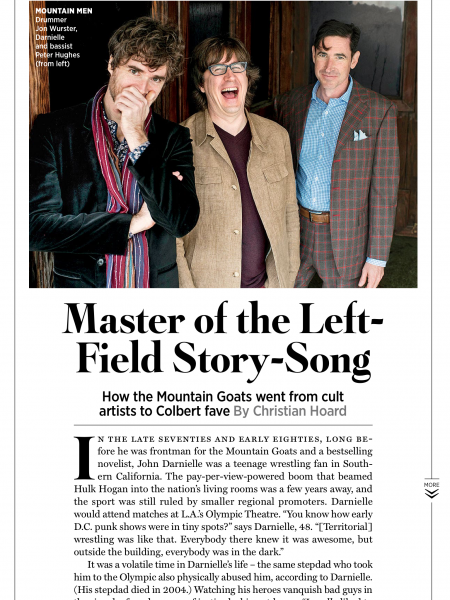
Vertical reflow is illustrated by Rolling Stone. It’s a “plus” with features such as audio for readers to sample new music.

Reflow-plus: Cons
Yes, a reflow-plus costs more than a simple replica. I can’t share provider prices with you because they’re usually negotiated with a sales rep, but Mequoda partner Mag+ says that on average it takes about 10 minutes per page to reflow the content – five minutes for a short piece such as a letter from the editor, and a few hours for an eight-page feature.
And Mag+ tells me many of their customers who start out with the simple replica move to custom design, including reflow, after only a few issues.
The only other disadvantage we can come up with for the reflow is potential confusion for readers of vertical reflow magazines – but that’s easily remedied by explaining how it works in your user’s guide (which of course you have, because it’s a Mequoda Best Practice) and by including visual cues or icons, such as arrows, in vertical articles to tell readers how to find the rest of the content.
It’s not hard to see why the reflow and reflow-plus is Mequoda’s Best Practice. We certainly believe it’s worth the extra cost if you can swing it, and certainly a better way to spend your money than tacking fancy features onto a simple replica. Do you have any other unusual vertical swipe/reflow designs I should look at? Do you like the design, or find it hard to navigate?
Editor’s note: This article was originally published in 2014 and has been updated.


2 replies on “Reflow-Plus Digital Magazine: Easy on the Eyes”
You are wrong.
The best practice is a pop up page to see the end of a story. With a big X on right top corner is the easiest way to go back to were we are. Pinterest use this practice .
Please send me your comments
The Pain of Paging
I just learned a lot from your article, but i am left disappointed about the current state of things. In an attempt to switch to e-magazines, I recently bought an iPad mini and nexus 7. Neither device delivers, and from your article I learn my disappointment is mostly because of the lack of good reflow. But even with reflow, one cannot swipe (or even click) to the next page, as I would in an e-book, b/c that functionality is reserved for switching to the next article.
Instead, why not reserve one-finger swipe for paging, and use a two-finger swipe for article switching. Yes, two fingers is more cumbersome than one, but it would be used less often. One-finger swipe for paging would be far more efficient than scrolling down the page to just the right spot to then start reading the “next” page, only to soon scroll again.